This article covers the process of remaking an 8-bit game into a brand new mobile game, adapting the game everywhere it needs to fit the new screen and control methods.
Alcatraz is an old Brazilian game, for an 8-bit system called MSX - a text-adventure game, with a twist: it uses a simple one-screen tile map to show the player avatar and some elements of the game. The premise of the game is quite simple: you’re a prisoner on Alcatraz, and you have to escape.
The game was fairly known at the time, completely made in BASIC, with its listings even published on a MSX games book. One of the special attractions in the game was that the obvious solution for some of the problems never really worked, and you had to think about other means to get the job done.
I always wanted to remake this game – in some form or another, especially translating it into English, so it could reach a broader audience.
Seeing the rise of mobile games, most of them very simple in their nature, I couldn’t see a better opportunity to bring this very addictive game into the light.
So, after choosing the mobile platform, one huge question remained: the original game was a text adventure. You had to type commands to get things done, and this obviously wasn’t desired or even feasible on mobile. So a new way to play the game had to be created.
This article is all about it: showing how the game was redesigned – with new visuals and improved gameplay, inspired by the old game on an 8-bit machine, to be able to run just about everywhere.
Also, please take into account this game was developed just by me, in the time-span of exactly 2 months, so don’t expect some AAA quality graphics on the screenshots :)
The first thing noticed was that the whole game visual wouldn’t work on mobile – having the whole map on a single screen may have worked on MSX – but on mobile the graphics would be too small to be seen. This set the first game decision: the map would scroll with the player – so the game could have bigger graphics.
In the original game the map was revealed as you walked by – but you could only see the tile where you were and 1 tile around it. I never liked that about the game, so I decided to make it a little better – the player would have a “view radius”, and through some visibility checks (some basic ray casting) I would make the tiles far away fade into the darkness accordingly to their distance to the player – and even taking into consideration some other tiles (light passes through the prison bars, so you can actually see a little bit of the tile behind it, even if your passage is blocked). As in the original game, once you visited a tile, it would remain visible.
As you can see by the screenshot above, the graphics style has been kept – but enhanced a little bit so it wouldn’t look so outdated. Still the 8-bit style is kept, especially in the game’s characters.
Then comes the next challenge: a new way to input actions, since there is no keyboard to type commands on mobile games. The first option was a given: a virtual joystick to move the player avatar around the map.
The next option was inspired by the old-school graphic adventures: using icons to represent the actions the player could take. And since I can’t just throw a huge number of icons on screen (the player would be lost) – I had to think about the whole game solution, and reduce the icons on screen to just a few selected actions.
What those actions are? I managed to reduce all game commands to 6 actions (7 if you count the one used to pause the game): look (used as an ‘examine’ command), get, drop, talk, use and give. With this, you can take every action in the game, and it actually works pretty well. To examine the bed, you touch the look icon, then the bed icon, and it’s done.
Of course, sometimes you need to interact one object with another – this was done in a two-step process: you select one action (ex: “Use”), then you touch the first object (ex: a mug). You will see the selected object to the right of the selected action, and the game will wait for you to select another object (ex: the cell bars) to use the first object on. Sounds complicated, but it’s really simple.
In the original game you had to press a key to see the objects on your current position. The same was true for your inventory items. This was also changed with two panels on screen: one that shows objects on your position, and another that shows what you’re carrying.
And just for the sake of it, you can also select objects that are shown in the map. So touching a door in the lower panels or touching it on the visible map has the same effect – in fact, there is a part of the game where an object doesn’t show in the panel, and you have to touch it on the map.
One of the problems that appeared later in development: the game was intended for the mobile world, but still, it should be ready to be ported to desktop – so the Virtual Joystick had to be optional. The whole GUI was re-designed to be “moveable” – if the Virtual Joystick is enabled, the GUI Icons and objects are placed more to the left, otherwise they are centered on screen.
The original game was very fun – but probably due to memory restrictions (less than 32k!), it was rather short and the ending was a little abrupt. To improve things, the story was changed and expanded into three levels – the first one in the prison itself, and a second one, on the sewers below and a final third just outside the prison, but still on the island.
Some parts of the original game were kept, so if you played the original, you will recognize some puzzles. But beyond that, the game got other improvements, especially regarding the NPCs.
You could barely interact with NPCs in the original game: most of the time you could only give them something. This was changed, and now you can actually talk to them, and they react to a number of actions.
Not only the possible interactions increased, but you also have more NPCs: in the original you were the only prisoner on Alcatraz (or if there were others, you never saw them) – now there are others which may or may not help you in your escape, and in some cases you won’t be able to progress in the game without talking to someone.
Besides NPC interaction, the game has now more interactions with the level itself: You can break a wall, blow up stuff, events occur when you step on certain positions, or over an amount of time; the level now can have some animations, and even trigger some effects according to player actions.
The game, which took place entirely on a single map – now it's expanded into 3 levels, which gives more depth to the story and the way you escape. In order not to alienate players with lots of texts, all dialogs were kept as simple as possible.
Later during development, some other ideas popped up: the best of them was the high score list. The game has no points, but the high score will store the name of players who finish the game. The first 10 to win the game (per platform) will have their name on the “eternals” list – their name will be held there forever, or as long as the server is online ;)
The high score list has also a top 10 for daily players, monthly and yearly. Those lists are reset every day, month and year as their name implies, so even players who don’t get a slot in the “eternals” list, still can see their names listed.
Another idea that made it into the game was to have 2 different endings. It’s not something very elaborate, just the ending text that changes a bit if you do (or didn’t do) something during your escape.
As in most games, one plague haunted me: the feature creep. Even as I’m writing this article, new ideas for the game are popping up in my head. Some of them were implemented in the game (like the high score, the different endings, some new objects to interact with, even some jokes…) but there is a point when you must say: “that’s it. It’s done”.
When I first started this remake, the idea was to do it almost like the original, and in just a month. But so many ideas appeared, I couldn’t let them all slip away. So what was supposed to be a 1 level game, became a 3 level one, with tons of extra stuff… and it took 2 months to get everything done.
If you are curious about the game, you can play it for free on your Android device, and soon enough also on iOS. You can check other games I’ve developed on my site: Icon Games.
The primary tools used to develop this game were Photoshop for graphics, and for the programming, I used a language called "Monkey", which is free for HTML5 games and allows a game to be easily ported to several platforms.
1st June 2013 Changed article image and added Wikipedia link to MSX
The Original Game
Alcatraz is an old Brazilian game, for an 8-bit system called MSX - a text-adventure game, with a twist: it uses a simple one-screen tile map to show the player avatar and some elements of the game. The premise of the game is quite simple: you’re a prisoner on Alcatraz, and you have to escape.
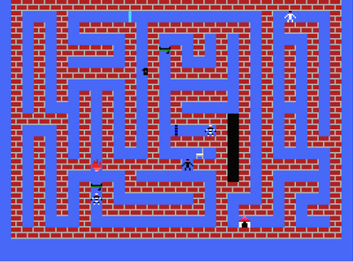
Alcatraz game map – the whole map.
The game was fairly known at the time, completely made in BASIC, with its listings even published on a MSX games book. One of the special attractions in the game was that the obvious solution for some of the problems never really worked, and you had to think about other means to get the job done.
The Remake
I always wanted to remake this game – in some form or another, especially translating it into English, so it could reach a broader audience.
Seeing the rise of mobile games, most of them very simple in their nature, I couldn’t see a better opportunity to bring this very addictive game into the light.
So, after choosing the mobile platform, one huge question remained: the original game was a text adventure. You had to type commands to get things done, and this obviously wasn’t desired or even feasible on mobile. So a new way to play the game had to be created.
This article is all about it: showing how the game was redesigned – with new visuals and improved gameplay, inspired by the old game on an 8-bit machine, to be able to run just about everywhere.
Also, please take into account this game was developed just by me, in the time-span of exactly 2 months, so don’t expect some AAA quality graphics on the screenshots :)
The New Visuals
The first thing noticed was that the whole game visual wouldn’t work on mobile – having the whole map on a single screen may have worked on MSX – but on mobile the graphics would be too small to be seen. This set the first game decision: the map would scroll with the player – so the game could have bigger graphics.
In the original game the map was revealed as you walked by – but you could only see the tile where you were and 1 tile around it. I never liked that about the game, so I decided to make it a little better – the player would have a “view radius”, and through some visibility checks (some basic ray casting) I would make the tiles far away fade into the darkness accordingly to their distance to the player – and even taking into consideration some other tiles (light passes through the prison bars, so you can actually see a little bit of the tile behind it, even if your passage is blocked). As in the original game, once you visited a tile, it would remain visible.
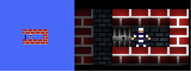
Visibility comparison: on the left, the original – you can’t see beyond your position. On the right, the new version – you can see beyond the bars, the tiles to the left are a little darker, but visible.
As you can see by the screenshot above, the graphics style has been kept – but enhanced a little bit so it wouldn’t look so outdated. Still the 8-bit style is kept, especially in the game’s characters.
Then comes the next challenge: a new way to input actions, since there is no keyboard to type commands on mobile games. The first option was a given: a virtual joystick to move the player avatar around the map.
The next option was inspired by the old-school graphic adventures: using icons to represent the actions the player could take. And since I can’t just throw a huge number of icons on screen (the player would be lost) – I had to think about the whole game solution, and reduce the icons on screen to just a few selected actions.
What those actions are? I managed to reduce all game commands to 6 actions (7 if you count the one used to pause the game): look (used as an ‘examine’ command), get, drop, talk, use and give. With this, you can take every action in the game, and it actually works pretty well. To examine the bed, you touch the look icon, then the bed icon, and it’s done.
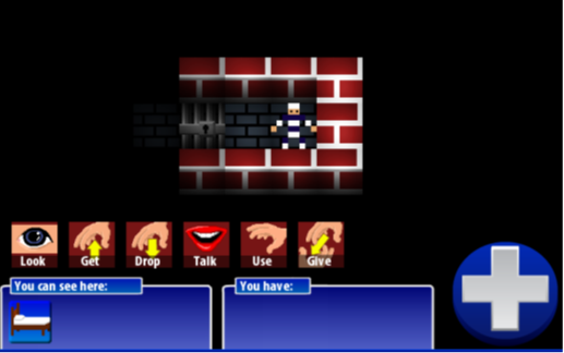
The new game interface: 6 possible actions the player can select with a touch.
Of course, sometimes you need to interact one object with another – this was done in a two-step process: you select one action (ex: “Use”), then you touch the first object (ex: a mug). You will see the selected object to the right of the selected action, and the game will wait for you to select another object (ex: the cell bars) to use the first object on. Sounds complicated, but it’s really simple.
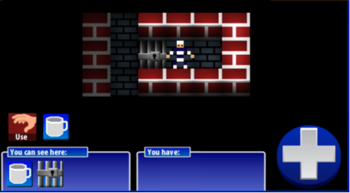
The game is waiting for you to use the mug somewhere.
In the original game you had to press a key to see the objects on your current position. The same was true for your inventory items. This was also changed with two panels on screen: one that shows objects on your position, and another that shows what you’re carrying.
And just for the sake of it, you can also select objects that are shown in the map. So touching a door in the lower panels or touching it on the visible map has the same effect – in fact, there is a part of the game where an object doesn’t show in the panel, and you have to touch it on the map.
One of the problems that appeared later in development: the game was intended for the mobile world, but still, it should be ready to be ported to desktop – so the Virtual Joystick had to be optional. The whole GUI was re-designed to be “moveable” – if the Virtual Joystick is enabled, the GUI Icons and objects are placed more to the left, otherwise they are centered on screen.
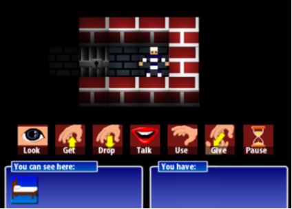
The interface, without the Virtual Joystick
The New Gameplay
The original game was very fun – but probably due to memory restrictions (less than 32k!), it was rather short and the ending was a little abrupt. To improve things, the story was changed and expanded into three levels – the first one in the prison itself, and a second one, on the sewers below and a final third just outside the prison, but still on the island.
Some parts of the original game were kept, so if you played the original, you will recognize some puzzles. But beyond that, the game got other improvements, especially regarding the NPCs.
You could barely interact with NPCs in the original game: most of the time you could only give them something. This was changed, and now you can actually talk to them, and they react to a number of actions.
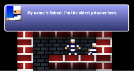
Not only the possible interactions increased, but you also have more NPCs: in the original you were the only prisoner on Alcatraz (or if there were others, you never saw them) – now there are others which may or may not help you in your escape, and in some cases you won’t be able to progress in the game without talking to someone.
Besides NPC interaction, the game has now more interactions with the level itself: You can break a wall, blow up stuff, events occur when you step on certain positions, or over an amount of time; the level now can have some animations, and even trigger some effects according to player actions.
The game, which took place entirely on a single map – now it's expanded into 3 levels, which gives more depth to the story and the way you escape. In order not to alienate players with lots of texts, all dialogs were kept as simple as possible.
Later during development, some other ideas popped up: the best of them was the high score list. The game has no points, but the high score will store the name of players who finish the game. The first 10 to win the game (per platform) will have their name on the “eternals” list – their name will be held there forever, or as long as the server is online ;)
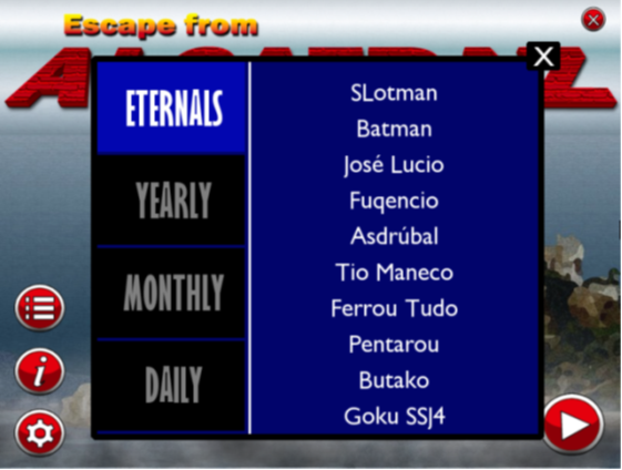
The game high score list, showing fake player names during testing :)
The high score list has also a top 10 for daily players, monthly and yearly. Those lists are reset every day, month and year as their name implies, so even players who don’t get a slot in the “eternals” list, still can see their names listed.
Another idea that made it into the game was to have 2 different endings. It’s not something very elaborate, just the ending text that changes a bit if you do (or didn’t do) something during your escape.
Conclusion
As in most games, one plague haunted me: the feature creep. Even as I’m writing this article, new ideas for the game are popping up in my head. Some of them were implemented in the game (like the high score, the different endings, some new objects to interact with, even some jokes…) but there is a point when you must say: “that’s it. It’s done”.
When I first started this remake, the idea was to do it almost like the original, and in just a month. But so many ideas appeared, I couldn’t let them all slip away. So what was supposed to be a 1 level game, became a 3 level one, with tons of extra stuff… and it took 2 months to get everything done.
If you are curious about the game, you can play it for free on your Android device, and soon enough also on iOS. You can check other games I’ve developed on my site: Icon Games.
The primary tools used to develop this game were Photoshop for graphics, and for the programming, I used a language called "Monkey", which is free for HTML5 games and allows a game to be easily ported to several platforms.
Article Update Log
31 May 2013: Initial release1st June 2013 Changed article image and added Wikipedia link to MSX