Quantcast
Channel: GameDev.net
Viewing all 17825 articles
Browse latest View live

Creating a Very Simple GUI System for Small Games - Part I

$
0
0
If you are writing your own game, sooner or later you will need some sort of user interface (or graphic user interface = GUI). There are some existing libraries lying around. Probably the most famous is CEGUI, that is also easy to integrate into OGRE 3D engine. A good looking system was also LibRocket, but its development stopped in 2011 (but you can still download and use it without any problem). There are a lot of discussion threads that deal with the eternal problem “What GUI should I use?”.

Not so long ago I faced the very same problem. I needed a library written in C++ that would be able to coexist with OpenGL and DirectX. Another requirement was support for classic (mouse) control as well as touch input. CEGUI seems to be good choice, but the problem is in its complexity and not so great touch support (from what I was told). Most of the time, I just need a simple button, check box, text caption and “icon” or image. With those, you can build almost anything. As you may know, GUI is not just what you can see. There is also functionality, like what happens if I click on a button, if I move mthe ouse over an element etc. If you choose to write your own system, you will have to also implement those and take into account that some of them are only for mouse control and some of them are only for touch (like more than one touch at a time).

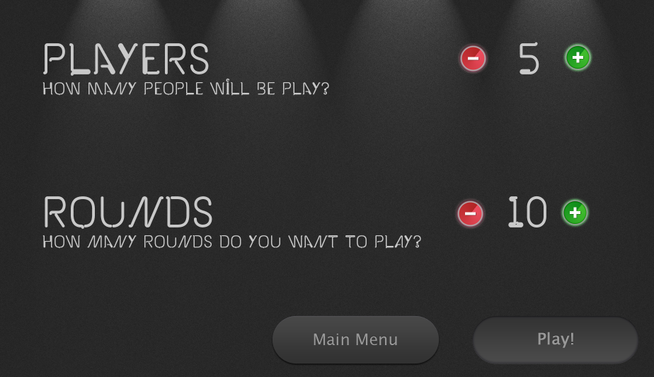
Writing a GUI from scratch is not an easy thing to do. I am not going to create some kind of super-trooper complex system that will handle everything. Our designed GUI will be used for static game menu controls and in-game menus. You can show scores, lives and other info with this system. An example of what can be created with this simple system can be seen in figures 1 and 2. Those are actuals screen-shots from engines and games I have created with this.


Attached Image: 0C__Martin_Programing_OpenGL-ES_Tutorials_GUI_simple_gui.png

Attached Image: 1C__Martin_Programing_OpenGL-ES_Tutorials_GUI_screen3.png


Our GUI will be created in C++ and will work with either OpenGL or DirectX. We are not using any API-specific things. Apart from plain C++, we also will need some libraries that make things easier for us. One of the best “library” (it's really just a single header file) - FastDelegate - will be used for function pointers (we will use this for triggers). For rendering of fonts, I have decided to use the FreeType2 library. It's a little more complex, but it's worth it. That is pretty much all you need. If you want, you can also add support for various image formats (jpg, png...). For simplicity I am using tga (my own parser) and png (via not so fast, but easy to use LodePNG library).

Ok. You have read some opening sentences and it's time to dig into details.

Coordinate System and Positioning


The most important thing of every GUI system is positioning of elements on your screen. Graphics APIs are using screen space coordinates in range [-1, 1]. Well... it's good, but not really good if we are creating / designing a GUI.

So how to determine the position of an element? One option is to use an absolute system, where we set real pixel coordinates of an element. Simple, but not really usable. If we change resolution, our entire beautifully-designed system will go to hell. Hm.. second attempt is to use a relative system. That is much better, but also not 100%. Let's say we want to have some control elements at the bottom of the screen with a small offset. If relative coordinates are used, the space will differ depending on resolution which is not what we usually want.

What I used at the end is a combination of both approaches. You can set position in relative and absolute coordinates. That is somewhat similar to the solution used in CEGUI.

Steps described above were applied on the entire screen. During GUI design there is a very little number of elements that will meet this condition. Most of the time, some kind of panel is created and other elements are placed on this panel. Why? That's simple. If we move the panel, all elements on it move along with it. If we hide the panel, all elements hide with it. And so on.

What I write so far for positioning is perfectly correct for this kind of situations as well. Again, a combination of relative and absolute positioning is used, but this time the relative starting point is not [0,0] corner of entire screen, but [0,0] of our “panel”. This [0,0] point already has some coordinates on screen, but those are not interesting for us. A picture is worth a thousand words. So, here it is:


Attached Image: 2C__Martin_Programing_OpenGL-ES_Tutorials_GUI_positioning.png
Figure 3: Position of elements. Black color represents screen (main window) and position of elements within it. Panel is positioned within Screen. Green element is inside Panel. It's positions are within Panel.


That is, along with hard offsets, the main reason why I internally store every position in pixels and not in relative [0, 1] coordinates (or simply in percents). I once calculated pixel position and I don't need to have several recalculations of percents based on an element's parent and real pixel offsets. Disadvantage of this is that if the screen size is changed, the entire GUI needs to be reloaded. But let's be honest, how often do we change the resolution of a graphics application ?

If we are using some graphics API (either OpenGL or DirectX), rendering is done in screen space and not in pixels. Screen space is similar to percents, but has the range [-1,1]. Conversion to the screen space coodinates is done as the last step just before uploading data to the GPU. A pipeline of transforming points to the screen space coordinates is shown on the following three equations. Input pixel is converted to point in range [0, 1] by simply dividing pixel position by screen resolution. From point in [0, 1], we map it to [-1, 1].

pixel = [a, b]
point = [pixel(a) / width, pixel(b) / height]
screen_space = 2 * point - 1    

If we want to use the GUI without a graphics API, lets say do it in Java, C#... and draw elements into image, you can just stick with pixels.

Anchor System

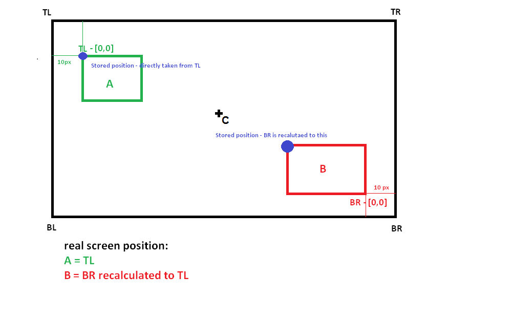
All good? Good. Things will be little more interesting from now on. A good thing in GUI design is to use anchors. If you have ever created a GUI, you know what anchors are. If you want to have your element stickied to some part of the screen no matter the screen size, that's the way you do it - anchors. I have decided to use a similar but slighty different system. Every element I have has its own origin. This can be one of the four corners (top left - TL, top right - TR, bottom left - BL, bottom right - BR) or its center - C. The position you have entered is than relative to this origin. Default system is TL.


Attached Image: 3C__Martin_Programing_OpenGL-ES_Tutorials_GUI_gui1.png
Figure 4: Anchors of screen elements


Let's say you want your element always to be sticked in the bottom right corner of your screen. You can simulate this position with TL origin and the element's size. Better solution is to go backward. Position your element in a system with changed origin and convert it to TL origin later (see code). This has one advantage: you will keep user definition of GUI unified (see XML snippet) and it will be more easy to maintain.

<position x="0" y="0" offset_x="0" offset_y="0" origin="TL" />     
<position x="0" y="0" offset_x="0" offset_y="0" origin="TR" />     
<position x="0" y="0" offset_x="0" offset_y="0" origin="BL" />     
<position x="0" y="0" offset_x="0" offset_y="0" origin="BR" />  

All In One

In the following code, you can see full calculation and transformation from user input (eg. from above XML) into internal element coordinate system, that is using pixels. First, we calculate pixel position of the corner as provided by our GUI user. We also need to calculate element width and height (proportions of elements will be discussed further in the next part). For this, we need proportions of the parent - meaning its size and pixel coordinate of TL corner.

float x = parentProportions.topLeft.X; 		
x += pos.x * parentProportions.width; 		
x += pos.offsetX; 
		
float y = parentProportions.topLeft.Y; 		
y += pos.y * parentProportions.height; 		
y += pos.offsetY;

float w = parentProportions.width; 		
w *= dim.w; 		
w += dim.pixelW;
		
float h = parentProportions.height; 		
h *= dim.h; 		
h += dim.pixelH;	

For now, we have calculated the pixel position of our reference corner. However, internal storage of our system must be unified, so everything will be converted to a system with [0,0] in TL.

//change position based on origin 		
if (pos.origin == TL)  		
{ 
   //do nothing - top left is default 
} 		
else if (pos.origin == TR)  		
{ 
	x = parentProportions.botRight.X - (x - parentProportions.topLeft.X); //swap x coordinate 				
	x -= w; //put x back to top left 			
} 		
else if (pos.origin == BL)  		
{ 			
	y = parentProportions.botRight.Y - (y - parentProportions.topLeft.Y); //swap y coordinate 			
	y -= h; //put y back to top left 					
} 		
else if (pos.origin == BR)  		
{ 			
	x = parentProportions.botRight.X - (x - parentProportions.topLeft.X); //swap x coordinate				
	y = parentProportions.botRight.Y - (y - parentProportions.topLeft.Y); //swap y coordinate
	x -= w; //put x back to top left 			
	y -= h; //put y back to top left		
}
else if (pos.origin == C)  		
{
	//calculate center of parent element 			
	x = x + (parentProportions.botRight.X - parentProportions.topLeft.X) * 0.5f; 
	y = y + (parentProportions.botRight.Y - parentProportions.topLeft.Y) * 0.5f; 			
	x -= (w * 0.5f); //put x back to top left						
	y -= (h * 0.5f); //put y back to top left
}
		
//this will overflow from parent element 		
proportions.topLeft = MyMath::Vector2(x, y); 
proportions.botRight = MyMath::Vector2(x + w, y + h); 		
proportions.width = w; 
proportions.height = h;

With the above code, you can easily position elements in each corner of a parent element with almost the same user code. We are using float instead of int for pixel coordinate representations. This is OK, because at the end we transform this to screen space coordinates anyway.

Proportions


Once we established position of an element, we also need to know its size. Well, as you may remember, we have already needed proportions for calculating the element's position, but now we discuss this topic a bit more.

Proportions are very similar to positioning. We again use relative and absolute measuring. Relative numbers will give us size in percents of parent and pixel offset is, well, pixel offset. We must take in mind one important thing - aspect ratio (AR). We want our elements to keep it every time. It would not be nice if our icon was correct on one system and deformed on another. We can repair this by only specifying one dimension (width or height) and the relevant aspect ratio for this dimension.

See the difference in example below:

a) <size w="0.1" offset_w="0" ar="1.0" /> - create element of size 10% of parent W
b) <size w="0.1" h="0.1" offset_w="0" offset_h="0" /> - create element of size 10% of parent W and H

Both of them will create an element with the same width. Choice a) will always have correct AR, while choice b) will always have the same size in respect of its parent element.

While working with relative size, it is also a good thing to set some kind of maximal element size in pixels. We want some elements to be as big as possible on small screens but its not neccessary to have them oversized on big screens. A typical example will be phone and tablet. There is no need for an element to be extremly big (eg. occupy let's say 100x100 pixels) on a tablet. It can take 50x50 as well and it will be enough. But on smaller screens, it should take as much as possible according to our relative size from user input.

Fonts


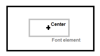
Special care must be taken for fonts. Positioning and proportions differ a little from classic GUI elements. First of all, for font positioning it is often good to put origin into its center. That way, we can center very easily fonts inside parent elements, for example buttons. As mentioned before, to recalculate position from used system into system with TL origin, we need to know the element size.


Attached Image: 4C__Martin_Programing_OpenGL-ES_Tutorials_GUI_font_center.png
Figure 5: Origin in center of parent element for centered font positioning


That is the tricky part. When dealing with text, we are setting only height and the width will depend on various factors - used font, font size, printed text etc. Of course, we can calculate size manually and use it later, but that is not correct. During runtime, text can change (for instance the score in our game) and what then? A better approach is to recalculate position based on text change (change of text, font, font size etc.).

As I mentioned, for fonts I am using the FreeType library. This library can generate a single image for each character based on used font. It doesn´t matter if we have pregenerated those images into font atlas textures or we are creating them on the fly. To calculate proportions of text we don't really need an actual image, but only its size. Problem is size of the whole text we want to display. This must be calculated by iterating over every character and accumulating proportions and spaces for each of them. We also must take care of new lines.

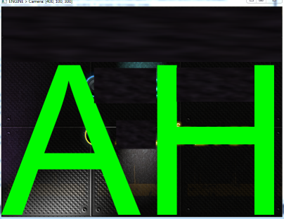
There is one thing you need to count on when dealing with text. See the image and its caption below. Someone may think that answer to “Why?” question is obvious, but I didn't realize that in time of design and coding, so it brings me a lot of headache.


Attached Image: 5C__Martin_Programing_OpenGL-ES_Tutorials_GUI_HL2zV.png
Figure 6: Text rendered with settings: origin is TL (top left), height is set to be 100% of parent height. You may notice, text is not filling the whole area. Why ?


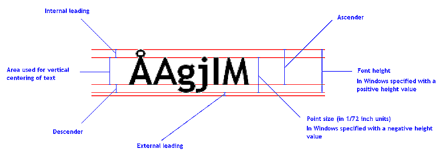
The answer is really simple. There are diacritics marks in the text that are counted in total size. There should also be space for descendents, but they are not used for capitals in the font I have used. Everything you need to take care of can be seen in this picture:


Attached Image: 6C__Martin_Programing_OpenGL-ES_Tutorials_GUI_tEt8J.png
Figure 7: Font metrics


Discussion


This will be all for now. I have described the basics of positioning and sizing of GUI elements that I have used in my design. There are probably better or more complex ways to do it. This one used here is easy and I have not run across any problems using it.

I have written a simple C# application to speed up the design of the GUI. It uses the basics described here (but no fonts). You can place elements, change their size and image, drag them to see positions of them. You can download the source of application and try it for yourself. But take it as “alpha” version, I have written it for fast prototyping during one evening.

In future parts (don't worry, I have already written them and only doing finishing touches) I will focus on basic types of elements, controls, rendering. That is, after all, one of the important things in GUI :-)

Article Update Log


3 May 2014: Initial release

Tips For Exhibiting Your Games

$
0
0
Last weekend I was at the EGX Rezzed show at the NEC Birmingham.

Since our game is as yet unannounced and in very early stages we weren’t exhibiting any of our own stuff this time round. I was actually there to help out my good friend Byron Atkinson-Jones of Xiotex Studios to demo his fantastic new game Containment Protocol.

Even though we weren’t showing a game ourselves I still found the whole experience extremely valuable and it was a whole lot of fun. Over the weekend I learnt quite a bit from being on the Containment Protocol stand and from talking to the other exhibitors about their experiences.

Here are a few things I learnt, along with some advice:

  1. Exhibiting on a stand is a full time job. You get very little time to nip to the toilet, let alone get food or drink.
  2. With an exhibitor stand you usually get some free exhibitor tickets (I believe at Rezzed you got 5). I strongly recommend you make full use of them.
  3. Make sure your helpers know some key details about your game so they can answer basic questions. At a minimum I’d say:
    • Elevator pitch for the game? I.e describe the game in 1-2 sentences.
    • When is the game coming out?
    • What platforms is the game on?
  4. The air con in the hall made the air quite dry and as such you can get dehydrated very easily if you don’t keep yourself topped up. Make sure you stock up on some water before the day begins so if you’re really busy (you will be) you can at least have a drink in arms reach. It’s thirsty work!
  5. Get some sleep. Don’t stay up too late into the early hours drinking shots with the lead level designer on XYZ game. There are better times for that. It’s a very long day and you need your energy.
  6. Try your best to eat properly. If you can’t during the day, get a proper meal after the show has finished. Don’t eat junk food, your body will punish you.
  7. Get into your stand early every day to make sure everything is running and you’re prepped for the day ahead.
  8. Your exhibitor board is a massive advert. PUT YOUR TWITTER & WEBSITE HANDLE ON IT. Seriously. So many people did not do this and it’s a big missed opportunity. Not everyone will play your game (might be busy or have little time) but by having your key details people will know where to go to find out more if they like the look of it. However keep it simple – don’t overfill your board with all your contact details like Facebook, YouTube etc. I’d recommend sticking to Website, Twitter and the Logo of your game. Make sure the text is big enough to be readable from a distance.
  9. This year at Rezzed badges were a big thing as an alternative to leaflets. I think they’re a great idea but remember that their primary purpose is for marketing. If nothing else put your flipping twitter handle on it!
  10. The number one most valuable thing you will get from exhibiting is player feedback (no it isn’t publicity). Give players space but pay attention and watch them. Learn. Your eyes will open to a huge amount of details that you never thought about. You’ll find out that 75% of players can’t get past the level one end boss because they didn’t understand the bomb needed to be picked up. Or the run speed you spent 5 hours tweaking is too fast for most people and they keep falling off the ledges.
  11. Ideally lock down your public build a few days before the event. DO NOT make changes the night before or god-forbid during the show. Anything can go wrong, and trust me – it will. You could introduce a new bug into the game, it might crash for players on level three because of a typo, or your Engine keys might accidentally get cancelled and your game stops working. If you have time, get some friends to play test your build to make sure any game-breaking bugs are fixed before the show.
  12. The press are everywhere and these events are full of Indie Press teams, YouTubers and the like. Many will just pop by your stand unannounced. Recognise them (at EGX events they usually have white wristbands) but treat them all equally regardless of the site they cover. Even the tiny YouTubers with 100 subscribers should be taken seriously because they can grow, and if you speak to 20 of them who all post footage to YouTube your game’s visibility will grow with them.
  13. Some of the press will arrange interview slots. This is usually (but not always) done by the more professional outfits who have busy schedules. If you do agree on an interview time slot with the press, DO NOT MISS IT. Don’t become that guy that was a no show for a journalist’s interview. They will remember.
  14. Some players will like your game and some won’t. Don’t take it personally but if you can, try to find out WHY. Was it just too slow, too frustrating, or was it not their sort of game? Were they expecting guns and your game is actually about flowers (maybe your marketing message is off?).
  15. Some players will REALLY like your game. In-fact they might like it so much that they won’t stop playing it. That’s brilliant because it means your game is heading in the right direction! But it’s also a problem at the show because you only have a limited number of demo machines and lots of people who may want to play. I would recommend timing your demo to around 10 minutes long. Don’t be afraid to add a small count-down timer if the natural pacing of the game won’t end within that time. As an extra option you could consider adding a option into a debug menu so you can enable/disable and tweak the timer part way through the show if you find people are playing too long.

Well I think that’s it for now! If you ever fancy a chat about my experiences exhibiting or anything else then hit me up on Twitter: @onimitch.

You can find some photos of the event on our Facebook page.

Article Update Log


7 May 2014: Initial Release

5 Core Elements of Interactive Storytelling

$
0
0
Over the past few years I have had a growing feeling that videogame storytelling is not what it could be. And the core issue is not in the writing, themes, characters or anything like that; instead, the main problem is with the overall delivery. There is always something that hinders me from truly feeling like I am playing a story. After pondering this on and off for quite some time I have come up with a list of five elements that I think are crucial to get the best kind of interactive narrative.

The following is my personal view on the subject, and is much more of a manifesto than an attempt at a rigorous scientific theory. That said, I do not think these are just some flimsy rules or the summary of a niche aesthetic. I truly believe that this is the best foundational framework to progress videogame storytelling and a summary of what most people would like out of an interactive narrative.

Also, it's important to note that all of the elements below are needed. Drop one and the narrative experience will suffer.

With that out of the way, here goes:

1) Focus on Storytelling


This is a really simple point: the game must be, from the ground up, designed to tell a story. It must not be a game about puzzles, stacking gems or shooting moving targets. The game can contain all of these features, but they cannot be the core focus of the experience. The reason for the game to exist must be the wish to immerse the player inside a narrative; no other feature must take precedence over this.

The reason for this is pretty self-evident. A game that intends to deliver the best possible storytelling must of course focus on this. Several of the problems outlined below directly stem from this element not being taken seriously enough.

A key aspect to this element is that the story must be somewhat tangible. It must contain characters and settings that can be identified with and there must be some sort of drama. The game's narrative cannot be extremely abstract, too simplistic or lack any interesting, story-related, happenings.

2) Most of the time is spent playing


Videogames are an interactive medium and therefore the bulk of the experience must involve some form of interaction. The core of the game should not be about reading or watching cutscenes, it should be about playing. This does not mean that there needs to be continual interaction; there is still room for downtime and it might even be crucial to not be playing constantly.

The above sounds pretty basic, almost a fundamental part of game design, but it is not that obvious. A common "wisdom" in game design is that choice is king, which Sid Meier's quote "a game is a series of interesting choices" neatly encapsulates. However, I do not think this holds true at all for interactive storytelling. If choices were all that mattered, choose your own adventure books should be the ultimate interaction fiction - they are not. Most celebrated and narrative-focused videogames do not even have any story-related choices at all (The Last of Us is a recent example). Given this, is interaction really that important?

It sure is, but not for making choices. My view is that the main point of interaction in storytelling is to create a sense of presence, the feeling of being inside the game's world. In order to achieve this, there needs to be a steady flow of active play. If the player remains inactive for longer periods, they will distance themselves from the experience. This is especially true during sections when players feel they ought to be in control. The game must always strive to maintain and strengthen the experience of "being there".

3) Interactions must make narrative sense


In order to claim that the player is immersed in a narrative, their actions must be somehow connected to the important happenings. The gameplay must not be of irrelevant, or even marginal, value to the story. There are two major reasons for this.

First, players must feel as though they are an active part of the story and not just an observer. If none of the important story moments include agency from the player, they become passive participants. If the gameplay is all about matching gems then it does not matter if players spend 99% of their time interacting; they are not part of any important happenings and their actions are thus irrelevant. Gameplay must be foundational to the narrative, not just a side activity while waiting for the next cutscene.

Second, players must be able to understand their role from their actions. If the player is supposed to be a detective, then this must be evident from the gameplay. A game that requires cutscenes or similar to explain the player's part has failed to tell its story properly.

4) No repetitive actions


The core engagement from many games come from mastering a system. The longer time players spend with the game, the better they become at it. In order for this process to work, the player's actions must be repeated over and over. But repetition is not something we want in a well-formed story. Instead, we want activities to only last as long as the pacing requires. The players are not playing to become good at some mechanics, they are playing to be part of an engrossing story. When an activity has played out its role, a game that wants to do proper storytelling must move on.

Another problem with repetition is that it breaks down the player's imagination. Other media rely on the audience's mind to fill out the blanks for a lot of the story's occurrences. Movies and novels are vague enough to support these kinds of personal interpretations. But if the same actions are repeated over and over, the room for imagination becomes a lot slimmer. Players lose much of the ability to fill gaps and instead get a mechanical view of the narrative.

This does not mean that the core mechanics must constantly change, it just means that there must be variation on how they are used. Both Limbo and Braid are great examples of this. The basic gameplay can be learned in a minute, but the games still provide constant variation throughout the experience.

5) No major progression blocks


In order to keep players inside a narrative, their focus must constantly be on the story happenings. This does not rule out challenges, but it needs to be made sure that an obstacle never consumes all focus. It must be remembered that the players are playing in order to experience a story. If they get stuck at some point, focus fades away from the story, and is instead put on simply progressing. In turn, this leads to the unraveling of the game's underlying mechanics and for players to try and optimize systems. Both of these are problems that can seriously degrade the narrative experience.

There are three common culprits for this: complex or obscure puzzles, mastery-demanding sections and maze-like environments. All of these are common in games and make it really easy for players to get stuck. Either by not being sure what to do next, or by not having the skills required to continue. Puzzles, mazes and skill-based challenges are not banned, but it is imperative to make sure that they do not hamper the experience. If some section is pulling players away from the story, it needs to go.

Games that do this


These five elements all sound pretty obvious. When writing the above I often felt I was pointing out things that were already widespread knowledge. But despite this, very few games incorporate all of the above. This is quite astonishing when you think about it. The elements by themselves are quite common, but the combination of all is incredibly rare.

The best case for games of pure storytelling seems to be visual novels. But these all fail at element 2; they simply are not very interactive in nature and the player is mostly just a reader. They often also fail at element 3 as they do not give the player much actions related to the story (most are simply played out in a passive manner).

Action games like Last of Us and Bioshock infinite all fail on elements 4 and 5 (repetition and progression blocks). For larger portions of the game they often do not meet the requirements of element 3 (story related actions) either. It is also frequently the case that much of the story content is delivered in long cutscenes, which means that some do not even manage to fulfill element 2 (that most of the game is played). RPGs do not fare much better as they often contain very repetitive elements. They often also have way too much downtime because of lengthy cutscenes and dialogue.

Games like Heavy Rain and The Walking Dead come close to feeling like an interactive narrative, but fall flat at element 2. These games are basically just films with interactions slapped on to them. While interaction plays an integral part in the experience it cannot be said to be a driving force. Also, apart from a few instances the gameplay is all about reacting, it does not have have the sort of deliberate planning that other games do. This removes a lot of the engagement that otherwise comes naturally from videogames.

So what games do fulfill all of these elements? As the requirements of each element are not super specific, fulfillment depends on how one chooses to evaluate. The one that I find that comes closest is Thirty Flights of Loving, but it is slightly problematic because the narrative is so strange and fragmentary. Still, it is by far the game that comes closest to incorporating all elements. Another close one is To The Moon, but it relies way too much on dialog and cutscenes to meet the requirements. Gone Home is also pretty close to fulfilling the elements. However, your actions have little relevance to the core narrative and much of the game is spent reading rather than playing.

Whether one chooses to see these games as fulfilling the requirements or not, I think they show the path forward. If we want to improve interactive storytelling, these are the sort of places to draw inspiration from. Also, I think it is quite telling that all of these games have gotten both critical and (as far as I know) commercial success. There is clearly a demand and appreciation for these sort of experiences.

Final Thoughts


It should be obvious, but I might as well say it: these elements say nothing of the quality of a game. One that meets none of the requirements can still be excellent, but it cannot claim to have fully playable, interactive storytelling as its main concern. Likewise, a game that fulfills all can still be crap. These elements just outline the foundation of a certain kind of experience. An experience that I think is almost non-existent in videogames today.

I hope that these five simple rules will be helpful for people to evaluate and structure their projects. The sort of videogames that can come out of this thinking is an open question as there is very little done so far. But the games that are close to having all these elements hint at a very wide range of experiences indeed. I have no doubts that this path will be very fruitful to explore.

Notes

  • Another important aspects of interaction that I left out is the ability to plan. I mention it a bit when discussing Walking Dead and Heavy Rain, but it is a worth digging into a little bit deeper. What we want from good gameplay interaction is not just that the player presses a lot of buttons. We want these actions to have some meaning for the future state of the game. When making an input players should be simulating in their minds how they see it turning out. Even if it just happens on a very short time span (eg "need to turn now to get a shot at the incoming asteroid") it makes all the difference as now the player has adapted the input in way that never happens in a purely reactionary game.
  • The question of what is deemed repetitive is quite interesting to discuss. For instance, a game like Dear Esther only has the player walking or looking, which does not offer much variety. But since the scenery is constantly changing, few would call the game repetitive. Some games can also offer really complex and varied range of actions, but if the player is tasked to perform these constantly in similar situations, they quickly get repetitive. I think is fair to say that repetition is mostly an asset problem. Making a non-repetitive game using limited asset counts is probably not possible. This also means that a proper storytelling game is bound to be asset heavy.
  • Here are some other games that I feel are close to fulfilling all elements: The Path, Journey, Everyday the Same Dream, Dinner Date, Imortall and Kentucky Route Zero. Whether they succeed or not is a bit up to interpretation, as all are a bit borderline. Still all of these are well worth one's attention. This also concludes the list of all games I can think of that have, or at least are close to having, all five of these elements.

Links


http://frictionalgames.blogspot.se/2012/08/the-self-presence-and-storytelling.html
Here is some more information on how repetition and challenge destroy the imaginative parts of games and make them seem more mechanical.

http://blog.ihobo.com/2013/08/the-interactivity-of-non-interactive-media.html
This is a nice overview on how many storytelling games give the player no meaningful choices at all.

http://frictionalgames.blogspot.se/2013/07/thoughts-on-last-of-us.html
The Last of Us is the big storytelling game of 2013. Here is a collection of thoughts on what can be learned from it.

http://en.wikipedia.org/wiki/Visual_novel
Visual Novels are not to be confused with Interactive Fiction, which is another name for text adventure games.

Thirty Flights of Loving
This game is played from start to finish and has a very interesting usages of scenes and cuts.

To The Moon
This is basically an rpg but with all of the fighting taken out. It is interesting how much emotion that can be gotten from simple pixel graphics.

Gone Home
This game is actually a bit similar to To The Moon in that it takes an established genre and cuts away anything not to do with telling a story. A narrative emerge by simply exploring an environment.


This article was originally published on the Frictional Games blog and is republished with kind permission from the original author Thomas Grip.

Creating a Very Simple GUI System for Small Games - Part II

$
0
0
In the first part of the GUI tutorial (link), we have seen the positioning and dimension system.

Today, before rendering, we will spend some time and familiarize ourselves with basic element types used in this tutorial. Of course, feel free and design anything you like. The controls mentioned in this part are some sort of a standard, that every GUI should have. Those are
  • Panel - usually not rendered, used only to group elements with similar functionality. You can easily move all of its content or hide it.
  • Button - what else to say. Button is just a plain old button
  • Checkbox - in basic principles similar to button, but has more states. We all probably know it.
  • Image - can be used for icons, image visualization etc.
  • TextCaption - for text rendering

Control logic


The control logic is maintained from one class. This class is taking care of changes of states and contains reference to the actual control mechanism - mouse or touch controller. So far, only single touch is solved. If we want to have a multi-touch GUI control, it will be more complicated. We would need to solve problems and actions, if one finger is down and the other is “moving” across screen. What happens if a moving finger crosses an element, that is already active? What if we release the first finger and keep only the second, that arrived on our element during movement? Those questions can be solved by observing existing GUI systems how they behave, but what if there are more systems and every one of them behaves differently? Which one is more correct? Due to all those questions, I have disabled multi-touch support. For main menu and other similar screens, it is usually OK. Problems can be caused by the main game. If we are creating for example a racing game, we need to have multi-touch support. One finger controls pedals and the other steering, and third one maybe shifting. For these types of situations, we need multi-touch support. But that will not be described here, since I have not used it so far. I have it in mind and I believe the described system can easily be upgraded to support this.

For each element we need to test a position of our control point (mouse, finger) against the element. We use positions calculated in the previous article. Since every element is basicly a 2D AABB (axis aligned bounding box), we can use a simple interval testing in axes X and Y. Note, that we test only visible elements. If a point is inside an invisible element, we usually discard it and continue.

We need to solve one more thing. If elements are inside each other, which one will receive the action? I have used a simple depth testing. A screen, as a parent to all other elements, has depth 0. Every child within the screen has depth = parentDepth + offset. And so on, recursively for children of children. A found element with the biggest depth and point inside is called “with focus”. We will use this naming convention in later parts.

I have three basic states for a user controller
  • CONTROL_NONE - no control button is pressed
  • CONTROL_OVER - controller is over, but no button is pressed
  • CONTROL_CLICK - controller is over and a button is pressed
This is 1:1 applicable to a mouse controller. For fingers and a touch control in general, CONTROL_OVER state has no real meaning. To keep things simple and portable, we preserve this state and handle it in a code logic with some condition parts. For this I have used a prepsocessor (#ifdef), but it can also be decided in a runtime with a simple if branch.

Once we identify an element with current focus, we need to do several things. First of all, compare last and actual focused elements. I will explain this idea on a commented code.

if (last != NULL) //there was some focused element as last
{
    //update state of last focused element as currently no control state
	UpdateElementState(CONTROL_NONE, last);
}

if (control->IsPressed())
{
	//test current state of control (mouse / finger)
	//if control is down, do not trigger state change for mouse over
	return;
}

if (act != NULL)
{
	//set state of current element as control (mouse / finger) over
	//if control is mouse - this will change state to HOVERED, with finger
	//it will go directly to same state as mouse down
	UpdateElementState(CONTROL_OVER, act);
}

If last and actual focused elements are the same, we need to do a different chain of responses.

if (act == NULL)
{
	//no selected element  - no clicking on it => do nothing
	return;
}

if (control->IsPressed())
{
	//control (mouse / finger) is down - send state to element
	UpdateElementState(CONTROL_CLICK, act);
}

if (control->IsReleased())
{
	//control (mouse / finger) is released - send state to element
	UpdateElementState(CONTROL_OVER, act);
}

In the above code, tests on NULL are important, since if no element is focused at the moment, NULL is used for this state. Also, control states are sent in every update, so we need to figure how to change them into element states and how to correctly call triggers.

An element changes and trigger actions are now special for a different types of elements. I will sumarize them in a following section. To fire up triggers, I have used delegetes from FastDelegate library / header (Member Function Pointers and the Fastest Possible C++ Delegates). This library is very easy to use and is perfectly portable (iOS, Android, Win...). In C++11 there are some built-in solutions, but I woud rather stick with this library.

For each element that need some triggers, I add them via Set functions. If the associated action is triggered the delegate is called. Instead of this, you can use function pointers. Problem with them is usually associated with classes and member functions. With delagates, you will have easy to maintain code and you can associate delagets with classic functions or meber functions. In both cases, the code remains the same. Only difference will be in a delegate creation (but for this, see article about this topic on codeproject - link above).

In C#, you have delegates in language core support, so there is no problem at all. In Java, there is probably also some solution, but I am not Java positive, so I dont know this :-) For other languages, there will also be some similar functionality.

Elements


First, there is a good reason to create an abstract element that every other will extend. In that abstract element, you will have position, dimensions, color and some other useful things. The specialized functionality will be coded in separate classes that extend this abstract class.

1. Panel & Image


Both of them have no real functionality. A panel exists simply for grouping elements together and an image for showing images. That's all. Basically, both of them are very similar. You can choose its background color or set some texture on it. The reason why I have created two different elements is for better readibility of code and Image has some more background functionality, like helper methods for render targets visualization (used in debugging shadow maps, deferred rendering etc.).

1.1 Control logic


Well... here it is really simple. I am using no states for these two elements. Of course, feel free to add some of them.

2. Button


One of the two more interesting elements I am going to investigate in detail. A button is reccomended as a first for what you should code, when you are creating a GUI. You can try various scenarios on it - show texture, change texture, control interaction, rendering etc. Other elements are basically just a modified button :-)

Our button has three states
  • non active - classic default state
  • hovered - this is correct only for mouse control and indicates that a mouse pointer is over the element, but no mouse button is pressed. This state is not used for a touch control
  • active - button has been clicked or mouse / finger has been pressed on top of it
You could add more states, but those three are all you need for basic effects and a nice looking button.

You should have at least two different textures for each button. One that indicates the default state and the one used for an action state. There is often no need to separate active and hovered state, they can look the same. On a touch controller there is even no hovered state, so there is no difference at all.

Closely related to the state changes are triggers. Those are actions that will occur when a button state changes from one to another or if it is in some state. You can think of many possible actions (if you don't know, the best way is to look for example into C# properties for UI button). I have used only a limited set of triggers. My basic used ones are
  • onDown - mouse or finger has been pressed on the button
  • onClick - click is generated after releasing pressed control (with some additional prerequisites)
  • onHover - valid only for mouse control. Mouse is on the button, but not pressed
  • onUp - mouse or finger has been released on the button (it can be seen similar to onClick without additional prerequisites)
  • whileDown - called while button mouse or finger is pressed on the button
  • whileHover - called while button mouse is on the button, but not pressed
I have almost never seen “while” triggers. In my oppinion, they are good for repeating actions, like a throttle pedal in a touch-based racing game. You are holding it most of the time.

Sometimes, you need functionality similar to a checkbox with a button. Typical case is a "play / pause" button in a media player. Once you hit the button, an action is trigerred and also the icon is changed. You can either use a real checkbox or alter the button a little bit (that is what I am using). In a trigger action code, you just simply change the icon set used for the button. See a sample code. In this I am using a button as a checkbox to enable / disable sound.

void OnClickAction(GUISystem::GUIElement * el)
{
	//emulate check box	behaviour with button
    
	if (this->sound_on)
	{		
        //sound is currently on - we are turning it off
        //change icon set
        
		GUISystem::GUIButtonTextures t;
		t.textureName = "soundoff"; //default texture
		t.textureNameClicked = "soundon"; //on click
		t.textureNameHover = "soundon"; //on mouse over
		el->GetButton()->SetTextures(t);		
	}
	else
	{	
        //sound is currently off - we are turning it on
        //change icon set
        
		GUISystem::GUIButtonTextures t;
		t.textureName = "soundon"; //default texture
		t.textureNameClicked = "soundoff"; //on click
		t.textureNameHover = "soundoff"; //on mouse over
		el->GetButton()->SetTextures(t);
	}
    
    //do some other actions needed to enable / disable sound

}


2.1. Control logic


Control logic of a button seems relatively simple from already mentioned states. There are only three basic ones. Hovewer, main code is a bit more complex. I have divided implementation into two parts. First is a “message” (basically it is not a message, it's just some function call, but it can be seen as a message) sending on a state change to the button from a controller class and a second part handles a state change and trigger calls based on a received “message”. This part is coded directly inside a button class implementation.

First part, inside a control class, that is sending “messages”.

if (ctrl == CONTROL_OVER) //element has focus from mouse
{
	#ifdef __TOUCH_CONTROL__
		//touch control has no CONTROL_OVER state !
		//CONTROL_OVER => element has been touched => CONTROL_CLICK
		//convert it to CONTROL_CLICK
		ctrl = CONTROL_CLICK;
	#else
		//should not occur for touch control
		if (btn->GetState() == BTN_STATE_CLICKED) //last was clicked
		{
			btn->SetState(BTN_STATE_NON_ACTIVE); //trigger actions for onRelease
			btn->SetState(BTN_STATE_OVER); //hover it - mouse stays on top of element after click
			//that is important, otherwise it will look odd
		}
		else
		{
			btn->SetState(BTN_STATE_OVER); //hover element
		}
	#endif
}

if (ctrl == CONTROL_CLICK) //element has focus from mouse and we have touched mouse button
{
	btn->SetState(BTN_STATE_CLICKED); //trigger actions for onClick
}

if (ctrl == CONTROL_NONE) //element has no mouse focus
{
	#ifndef __TOUCH_CONTROL__
		btn->SetState(BTN_STATE_OVER); //deactivate (on over)
	#endif

	if (control->IsPressed())
	{
		btn->SetState(BTN_STATE_DUMMY); //deactivate - use dummy state to prevent some actions
									    //associtaed with releasing control (most of the time used in touch control)
	}
	btn->SetState(BTN_STATE_NON_ACTIVE); //deactivate
}

Second part is coded inside a button and handles received “messages”. Touch control difference is also covered (a button should never receive a hover state). Of course, sometimes you want to preserve hover state to port your application and keep the same functionality. In that case, hover trigger is often called together with onDown.

if (this->actState == newState)
{
	//call repeat triggers
	if ((this->hasBeenDown) && (this->actState == BTN_STATE_CLICKED))
	{
		//call whileDown trigger
	}

	if (this->actState == BTN_STATE_OVER)
	{
		//call while hover trigger
	}

	return;
}

//handle state change

if (newState == BTN_STATE_DUMMY)
{
	//dummy state to "erase" safely states without trigger
	//delegates associated with action
	//dummy = NON_ACTIVE state
	this->actState = BTN_STATE_NON_ACTIVE;
	return;
}

//was not active => now mouse over
if ((this->actState == BTN_STATE_NON_ACTIVE) && (newState == BTN_STATE_OVER))
{
	//trigger onHover
}

//was clicked => now non active
if ((this->actState == BTN_STATE_CLICKED) && (newState == BTN_STATE_NON_ACTIVE))
{
	if (this->hasBeenDown)
	{
		//trigger onClick
	}
	else
	{
		//trigger onUp
	}
}

#ifdef __TOUCH_CONTROL__
	//no hover state on touch control => go directly from NON_ACTIVE to CLICKED
	if ((this->actState == BTN_STATE_NON_ACTIVE) && (newState == BTN_STATE_CLICKED))
#else
	//go from mouse OVER state to CLICKED
	if ((this->actState == BTN_STATE_OVER) && (newState == BTN_STATE_CLICKED))
#endif
{
	this->hasBeenDown = true;
	//trigger onDown
}
else
{
	this->hasBeenDown = false;
}

this->actState = newState;

Code I have shown is almost everything that handles a button control.

3. Checkbox


Second complex element is a checkbox. Its functionality is similar to a button, but it has more states. I will not describe state changes and handling of those as detailed as I have done for a button. It's very similar, you can learn from button code and extend it. Plus it would take a little bit more space.

Our checkbox has six states
  • non active - classic default state
  • hovered - this control is correct only for a mouse control and indicates that mouse pointer is over element, but no mouse button is pressed. This state is not used in touch controls
  • clicked - state right after it has been clicked => in next “frame” state will be checked
  • checked - checkbox is checked. We go to this state after clicked state
  • checked + hovered - for checked state we need to have different hover state. It makes sense, since icon is usually also different
  • checked + clicked - state right after it has been clicked in checked state => next “frame” state will be non active
You will need two different sets of textures, one for unchecked and one for checked states. As for triggers, you can use the same as for a button, but with two additional ones.
  • onCheck - state of the checkbox has been changed to checked
  • onUncheck- state of the checkbox has been changed to unchecked
“While” triggers can be also used together with check state, like whileChecked. Hovewer, I don't see a real use for this at the moment.

3.1. Control logic


Control logic is, in its basic sense, similar to a button. You only need to handle more states. If you are lazy, you can even discard the checkbox all together and simulate its behavior with a simple button. You will put a code into an onClick trigger action. In there you will have to change the texture of the button. The is one set of textures for non-checked states and the second set for checked states and you will just swap them if one or the other state occurs. This will only affect visual appereance of the element, you will have no special triggers, like onCheck. You can emulate those with button triggers and some temporary variables.

4. Text caption


Text caption is a very simple element. It has no specific texture, but contains words and letters. It's used only for small captions, so it can be added on top of a button to create a caption. If you need texts that are longer, you have to add some special functionality. This basic element is only for very simple texts (one line, no wrap if text is too long etc).

More advance text elements should support multi-lines, auto wrap of a text if it is too long, padding or just anything else you can think of.

4.1. Control logic


Text caption has no control logic. Its only purpose is to show you some text :-)

Discussion


In the second part of our “tutorial” I have covered basic elements that you will need most of the time. Without those, no GUI can be complete. I have shown more details for a button, since a checkbox is very similar and can be emulated with a simple button and some temporary variables (and some magic, of course).

If you think something can be done better or is not accurate, feel free and post a comment. In an attachment, you can download source code (C++) for a descibed functionality. Code is not usable as it is, because of the dependencies on the rest of my engine.

In future parts, we will investigate rendering and some tips & tricks.

Article Update Log


10 May 2014: Added missing code, added description of checkbox emulation with button
9 May 2014: Initial release

Orbital Debris – Making an HTML5 Game With Phaser

$
0
0
This is Orbital Debris, a small game I made in HTML5 with Phaser for a game jam organized by FGL. It won 3rd place! :) Considering I only had 48 hours and was working with technology I’d never used before, I’m really proud of the result.

Making Of


I assume you’ve already gone through the Phaser starting tutorials and know how to create a basic game. If this is not the case, please read this and this first. I’m only going to cover the things unique to Orbital Debris.

A link to the souce files (code + art) is included with this article. But be warned, it is game jam code and my first time working with Phaser so it’s far from perfect code.

The Concept


The theme set by FGL was “silent, but deadly”. Which made me think of “in space nobody can hear you scream”. Which made me think back to Gravity, my favorite movie of 2013. And just like that I had my idea within 15 minutes of the jam starting: you play as a space station orbiting the earth and have to dodge space junk released by satellites crashing into each other.


Attached Image: gravity_film_still_a_l1-450x253.jpg
Gravity, The Main Inspiration for Orbital Debris


Basic Game Logic


Orbiting A Planet

The first thing I did was get some objects orbiting around the earth. Every orbiter is just a Phaser sprite with some special properties that gets added to a group that contains all orbiters.

function spawnNewOrbiter(graphic) {
  var orbiter = game.add.sprite(0, 0, graphic);
  orbiter.anchor.setTo(0.5, 0.5);
  orbiter.moveData = {};
  orbiter.moveData.altitude = 0;
  orbiter.moveData.altitudeTarget = 0;
  orbiter.moveData.altitudeChangeRate = 0;
  orbiter.moveData.altitudeMin = 0;
  orbiter.moveData.altitudeMax = 0;
  orbiter.moveData.orbit = 0;
  orbiter.moveData.orbitRate = 0;
  orbiterGroup.add(orbiter);
  return orbiter;
}

Orbiter.moveData.altitude and orbit describe the orbiter’s current position relative to the planet. The altitude is the distance from the center, and the orbit is how far along its orbit it is. So making the orbiters move is a simple matter of using the values to update them in Phaser’s built-in state update function.


Attached Image: stationPosition-e1394677091284.jpg


So I loop through the group:

function updateOrbiterMovement() {
  orbiterGroup.forEach(function(orbiter) {
    if (orbiter.alive) {
      updateOrbiterAltitude(orbiter);
      updateOrbiterOrbit(orbiter);
    }	
  });
}

And position the orbiters accordingly.

function updateOrbiterOrbit(orbiter) {

  if (orbiter.moveData.orbitRate != 0) {
    orbiter.moveData.orbit += orbiter.moveData.orbitRate;
    if (orbiter.moveData.orbit >= 360) {
      orbiter.moveData.orbit -= 360;
    }
  }

  var oRad = Phaser.Math.degToRad(orbiter.moveData.orbit);
  orbiter.x = game.world.width/2 + orbiter.moveData.altitude * Math.cos(oRad);
  orbiter.y = game.world.height/2 + orbiter.moveData.altitude * Math.sin(oRad);
}

I also set the orbiter’s sprite angle to its orbit so it appears aligned with the planet – except for pieces of space junk that rotate according to a tumble rate out of sync with their orbits.

if (!orbiter.isJunk) {
  orbiter.angle = orbiter.moveData.orbit - 90;
} else {
  orbiter.angle += orbiter.tumbleRate;
}

Player Input

I wanted to force players to keep re-adjusting their altitude to stop them from idling at a fixed altitude, and I also wanted movement to feel quite flow-y. So I came up with a simple acceleration-style system. First I check the keyboard and adjust the altitudeChangeRate accordingly. You can think of altitudeChangeRate as velocity towards / away from the earth.

function processInput() {
  if (game.input.keyboard.isDown(Phaser.Keyboard.UP)) {
    station.moveData.altitudeChangeRate += ALTITUDE_CHANGE_RATE;
  }
  if (game.input.keyboard.isDown(Phaser.Keyboard.DOWN)) {
    station.moveData.altitudeChangeRate -= ALTITUDE_CHANGE_RATE;
  }
  station.moveData.altitudeChangeRate = Phaser.Math.clamp(
    station.moveData.altitudeChangeRate,
    -ALTITUDE_CHANGE_RATE_MAX,
    ALTITUDE_CHANGE_RATE_MAX
  );
}

And then I apply it to orbiters like so:

function updateOrbiterAltitude(orbiter) {
  if (orbiter.moveData.altitudeChangeRate != 0) {
    orbiter.moveData.altitude = Phaser.Math.clamp(
      orbiter.moveData.altitude + orbiter.moveData.altitudeChangeRate,
      orbiter.moveData.altitudeMin,
      orbiter.moveData.altitudeMax
    );
  }
}

Collision

Since all orbiters are added to the same group, a single call to Phaser’s built-in overlap method checks for all collisions:

game.physics.overlap(orbiterGroup, orbiterGroup, onOrbiterOverlap);

All collisions are then checked. Orbiters that are space junk are not processed further, because I only want satellites and stations to spawn junk:

function onOrbiterOverlap(orbiterA, orbiterB) {
  if (!orbiterA.isJunk) {
    orbiterWasHit(orbiterA);
  }
  if (!orbiterB.isJunk){
    orbiterWasHit(orbiterB);
  }
}

When a satellite or station is hit, I spawn new pieces of space junk. They are just orbiters (just like the space station or satellites). Their altitude, and orbit direction are based on the satellite or station that was destroyed. When the space station is hit, it’s a bit of a special case: I spawn a lot more junk than usual to make it feel more dramatic and end the game.

function orbiterWasHit(orbiter) {
  if (orbiter.alive) {

    var junkQuantity;
    if (orbiter.isStation) {
      junkQuantity = 40;
    } else {
      junkQuantity = game.rnd.integerInRange(2, 4);
    }

    for (var i = 0; i < junkQuantity; i++) {
      var junk = spawnNewOrbiter(IMAGES_JUNK[game.rnd.integerInRange(0,IMAGES_JUNK.length)]);
      junk.moveData.altitude = orbiter.moveData.altitude;
      junk.moveData.altitudeMin = 60;
      junk.moveData.altitudeMax = 700;
      junk.moveData.altitudeChangeRate = game.rnd.realInRange(-1.0, 1.0);
      junk.moveData.orbit = orbiter.moveData.orbit;
      junk.moveData.orbitRate = game.rnd.realInRange(0.4, 1.2);
      if (orbiter.moveData.orbitRate < 0) {
        junk.moveData.orbitRate *= -1;
      }
      junk.tumbleRate = game.rnd.realInRange(-10, 10);
      junk.isJunk = true;
    }

    if (orbiter.isStation) {
      playerDied();
    }

    orbiter.kill();
  }
}

Remaining Bits & Pieces

That’s pretty much all there is to it! To complete the experience I added some powerups, scaled the difficulty up over time, and added a bunch of HUD stuff and music. And then I was out of time and had to submit the game for the competition. If you have any questions about how anything was done that I didn’t explain here, please leave a comment and I’ll get back to you.

Thoughts on HTML5 / JavaScript / Phaser


This was my first time working with the Phaser HTML5 game engine. Usually I avoid unfamiliar technologies during game jams… every hour counts and I don’t have time to start learning new things. It was risky, but I decided to try it anyways. I liked that 1) it can run in mobile phone web browsers which makes it easy to share 2) it’s similar to flixel which I know inside-out and 3) I already knew some Javascript / HTML5.

Overall I really like the engine, it has a lot of great features and is easy to work with. Phaser gets updated often, which is great because it’s constantly improving. But it also means that a lot has changed from previous versions. This was sometimes frustrating when I would read about how to do a certain thing in an older version of Phaser, which no longer works the same in the latest version. I plan to use it again soon, but for a hobby project without such a stressful deadline so I can spend more time getting to know it. I could see it one day becoming one of my go-to development tools.


Attached Image: phaser-450x229.jpg


Performance


I couldn’t get the game running smoothly in my phone’s browser in time for the deadline, so I had to cancel the mobile version. It’s a shame because being able to play the game in mobile phone browsers was the #1 reason I wanted to use Phaser in the first place :( It appears it’s something you really have to keep a close eye on.

I used the Chrome JavaScript profiler to take a peek at what’s taking up most of my processing time. From what I can tell the biggest performance drain is the collision system. Especially when the space station crashes and 30 new pieces of junk are spawned, my iPhone 4S performance slows to a crawl.


Attached Image: javascriptProfiler.jpg
Using the Chrome JavaScript Profiler to Check for Performance Issues


Since I was unfamiliar with the engine, and had to no time to clean up my code or learn how to do things properly I know I did a lot of things badly. I’m careless with creating objects and freeing up memory. I could pre-compute some stuff. I could simplify other things. But I didn’t have time to do it. Next time, I’ll do better and keep testing on my phone along the way! :D

Source Files


This is not optimal code. It was my first time working with Phaser. I had a 48 hour deadline. There are lots of things that could should be improved upon. I am including the source files as a download anyways. They are not intended as some sort of model perfect Phaser project. Download at your own risk!

This article was orginally posted to Wolf's blog AllWorkAllPlay - head on over there for some more great content

Entities-Parts III: Serialization

$
0
0

Background


Download RPG Battle Example and Java version of Entities-Parts Framework
Download C++ version of Entities-Parts Framework

I. Game Objects
II. Interactions
III. Serialization (current)

The previous articles focused on entity structure and interaction. In the previous version of the RPG Battle Example, all of the code that defined the entity attributes was in the CharacterFactory. For example, it contained code to set the health of the meleer character to 200 and add spells to the support mage. We now want to move entity data out of the code and into data files. By storing the entity data in files, we can conveniently modify them without compiling the code. In addition, the data files could be reused if the code was ported to another language. This will be the last article in the series and covers serialization.

There are many viable ways to serialize/deserialize entities. For the purposes of this article, I chose XML and JAXB. If you aren't familiar with these technologies, I recommend googling about them as the article revolves heavily around them. Why XML and JAXB? The advantages of XML are that it is a popular way to store data and is human-readable. JAXB is a powerful XML serialization framework packaged with Java EE 6 that uses annotations to mark serializable classes and fields. Using the annotations as hints, JAXB automatically de/serializes class instances and does much of the grunt work for us.

Note that JAXB library refers to conversion between objects and data as marshalling, but this article will use the term serialization. The main drawback of JAXB is that it is slower to serialize/deserialize data compared to other frameworks such as Kryo and Java Serialization (Performance Comparison). Even if you decide to use another serialization framework, I hope this article gives you an idea of what issues or general approaches are associated with data serialization.

RPG Battle Example (continued)


The top of the article contains the download link for the RPG Battle Example.

The RPG Battle Example has been updated to use JAXB serialization to load entities from files. The serialized files of the character entities are stored in the relative project path "data/characters/". Through the help of a program I created called EntityMaker.java, I used the old character factory, now renamed to CharacterFactory_Old, to serialize the entities to XML files. The following is the "meleer.xml" file:

<?xml version="1.0" encoding="UTF-8"?>
<entity>
  <parts>
    <part xmlns:xsi="http://www.w3.org/2001/XMLSchema-instance" xsi:type="manaPart">
      <maxMana>0.0</maxMana>
      <mana>0.0</mana>
    </part>
    <part xmlns:xsi="http://www.w3.org/2001/XMLSchema-instance" xsi:type="restorePart">
      <healthRestoreRate>0.01</healthRestoreRate>
      <manaRestoreRate>0.03</manaRestoreRate>
    </part>
    <part xmlns:xsi="http://www.w3.org/2001/XMLSchema-instance" xsi:type="healthPart">
      <maxHealth>200.0</maxHealth>
    </part>
    <part xmlns:xsi="http://www.w3.org/2001/XMLSchema-instance" xsi:type="equipmentPart">
      <weapon>
        <name>Sword</name>
        <minDamage>25.0</minDamage>
        <maxDamage>50.0</maxDamage>
        <attackRange>CLOSE</attackRange>
      </weapon>
      <spells/>
    </part>
    <part xmlns:xsi="http://www.w3.org/2001/XMLSchema-instance" xsi:type="descriptionPart">
      <name></name>
    </part>
    <part xmlns:xsi="http://www.w3.org/2001/XMLSchema-instance" xsi:type="alliancePart">
      <alliance>MONSTERS</alliance>
    </part>
    <part xmlns:xsi="http://www.w3.org/2001/XMLSchema-instance" xsi:type="mentalityPart">
      <mentality>OFFENSIVE</mentality>
    </part>
  </parts>
</entity>

The XML contains elements that represent the entity and the individual parts. Notice that not all variables are stored. For example, the Entity class has variables isInitialized and isActive that don't appear in the file above. The values for these variables can be determined at runtime so they don't need to be stored. The attributes xmlns:xsi and xsi:type are needed by JAXB to deserialize the data to the necessary type.

As you might imagine, it is very convenient to edit entities on the fly without compiling the whole program again. The human-readable XML format allows us to easily change entity behavior by updating existing part elements or add new part elements, e.g. a FlyingPart element to the "meleer.xml" file.

The CharacterFactory from part II has been refactored to contain only one method instead of several methods to create each character. The path to the XML file containing the serialized Entity is passed into the createCharacter method which converts the file to an Entity. XmlUtils is a helper class I created that serializes/deserializes between XML and Java objects. I will describe what the arguments to the read method represent later on in the article.

public class CharacterFactory {
	
  /**
   * Creates an character entity from a file path.
   * @param path path to the serialized character definition
   * @param name
   * @param alliance
   * @return new character
   */
  public static Entity createCharacter(String path, String name, Alliance alliance) {
    Entity character = XmlUtils.read(Paths.CHARACTERS + path, new EntityAdapter(), Bindings.BOUND_CLASSES, "bindings.xml");
    character.get(DescriptionPart.class).setName(name);
    character.get(AlliancePart.class).setAlliance(alliance);
    return character;
  }
	
}

In order to make a class recognized by JAXB for serialization, we add annotations such as @XmlRootElement and @XmlElement to the class. For example, the following classes EquipmentPart and SummonSpell contain annotations:

@XmlRootElement
public class EquipmentPart extends Part {

  @XmlElement
  private Weapon weapon;
  @XmlElementWrapper
  @XmlElement(name = "spell")
  private List<Spell> spells;
    ...

@XmlRootElement
public class SummonSpell extends Spell {

  @XmlJavaTypeAdapter(EntityAdapter.class)
  @XmlElement
  private Entity summon;
  ...

In case you don't know already, here are what the annotations mean:

@XmlRootElement - Creates a root element for this class.

@XmlAccessorType(XmlAccessType.NONE) - Defines whether properties, fields, or neither should be automatically serialized. The XmlAccessType.NONE argument means that by default, variables and properties will not be serialized unless they have the @XmlElement annotation.

@XmlElement(name = "spell") - This annotation defines fields or properties that should be serialized. The argument name = "spell" says that each Spell object in the list of spells should be wrapped in the <spell></spell> tags.

@XmlElementWrapper - This wraps all of the individual <spell></spell> elements in a <spells></spells> tags.

@XmlJavaTypeAdapter(EntityAdapter.class) - The Entity field will be serialized and deserialized using the specified XML adapter passed in as the argument.

Obstacles


Ideally, it'd be nice to add annotations to our classes and just let our serialization framework do the rest of the work without any more effort from us. But often there are obstacles with serialization, such as classes that we don't want to or can't add annotations to. The following sections describe solutions for these issues and may be a little confusing because it goes into more advanced usage of JAXB: XML Adapters and Bindings.

XML Adapters


Since the classes Entity and Part can be reused in multiple games, we want to avoid adding JAXB annotations to these classes or modifying them to fit a specific purpose such as serialization. However, de/serializing unmodifiable classes requires some workarounds which I'll describe.

The first step to making Entity serializable is creating an XmlAdapter to convert Entity to a serializable class. We add two new classes, the serializable class EntityAdapted and the adapter EntityAdapter which is derived from the JAXB class XmlAdapter.

The EntityAdapted class contains the fields from Entity that need to be serialized such as parts and contains JAXB annotations. The EntityAdapter class converts between the unserializable form, Entity, and the serializable form, EntityAdapted. EntityAdapter is referenced in SummonSpell because SummonSpell contains a reference to an Entity and is also used in the CharacterFactory.createCharacter method.

@XmlRootElement(name = "entity")
public class EntityAdapted {

  @XmlElementWrapper
  @XmlElement(name = "part")
  private List<Part> parts;

  public EntityAdapted() {
  }

  public EntityAdapted(List<Part> parts) {
    this.parts = parts;
  }

  public List<Part> getParts() {
    return new ArrayList<Part>(parts);
  }
	
}

public class EntityAdapter extends XmlAdapter<EntityAdapted, Entity> {

  @Override
  public EntityAdapted marshal(Entity entity) throws Exception {
    EntityAdapted entityAdapted = new EntityAdapted(entity.getAll());
    return entityAdapted;
  }

  @Override
  public Entity unmarshal(EntityAdapted entityAdapted) throws Exception {
    Entity entity = new Entity();
    for (Part part : entityAdapted.getParts()) {
      entity.attach(part);
    }
    return entity;
  }

}

Bindings


We would like to add the @XmlTransient annotation to Part because we don't want to store any fields in that class. There is a way to add JAXB annotations to a class without modifying the class. If you noticed, "eclipselink.jar" was added to the project. This is a 3rd party library that allows JAXB annotations to be added to unmodifiable classes by defining the annotations in an XML file. This is what the bindings.xml file looks like and you'll notice that it contains an element to make Part xml-transient.

<?xml version="1.0"?>
<xml-bindings xmlns="http://www.eclipse.org/eclipselink/xsds/persistence/oxm" package-name="entitypart.epf">
    <java-types>
      <java-type name="Part" xml-transient="true"/>
    </java-types>
</xml-bindings>

When serializing a list of an abstract type, e.g. the parts in the EntityAdapted class, the serializer needs to know what subtypes of Part could exist in the list. As you saw in the createCharacter method of the CharacterFactory, you'll see that Bindings.BOUND_CLASSES is passed in as an argument to XmlUtils.read. This static list contains the classes that JAXB needs to know in order to serialize the list of parts with the data in the subclasses of Part.

public class Bindings {

  /**
   * Required for serializing list of base types to derived types, e.g. when a list of parts is serialized, binding 
   * the health part class to the serialization will allow health parts in the list to be serialized correctly.
   */
  public static Class<?>[] BOUND_CLASSES = new Class<?>[] {
    HealSpell.class, 
    SummonSpell.class, 
    AlliancePart.class, 
    DescriptionPart.class, 
    EquipmentPart.class, 
    FlyingPart.class, 
    HealthPart.class, 
    ManaPart.class, 
    MentalityPart.class, 
    RestorePart.class, 
    TimedDeathPart.class
  };

}

In the entityparts.parts package, there is a file called "jaxb.properties". This file must be added to a package of any class included in BOUND_CLASSES above. See JAXBContext for more information.

Final Notes


The article described the basics of using JAXB to serialize entities and parts. Also, some of the more advanced features of JAXB such as XMLAdapter were used to overcome obstacles such as unmodifiable classes.

In addition to JAXB, I recommend taking a look at these serialization frameworks:

SimpleXML (Java) - An easy-to-use, lightweight alternative to JAXB. If you're developing an Android app, I recommend this over JAXB. Otherwise, you need to include the 9 megabyte JAXB .jar with your app (see JAXB and Android Issue). The SimpleXML .jar file is much smaller, weighing in at less than 400kb.

I haven't used any of these libraries, but they are the most recommended from what I've researched:

JSONP (Java) - JSON is a human-readable format that also holds some advantages over XML such as having leaner syntax. There is currently no native JSON support in Java EE 6, but this library will be included in Java EE 7.

Kryo (Java) - According to the performance comparison (Performance Comparison), it is much faster than JAXB. I'll probably use it in a future project. The downside is it doesn't produce human-readable files, so you can't edit them in a text editor.

Protobuffer (C++) - A highly recommended serialization framework for C++ developed by Google.

Article Update Log


25 May 2014: Initial draft.

From Donkey Kong to the Silver Screen: The Past, Present and Future of Game Cinematics

$
0
0

Beyond intros and outros


Whilst examining cinematics in games, we are not merely referring to simple cutscenes - intros and outros to levels - but to the epic, ambitious cinematic sequences seen in contemporary gaming titles. Nevertheless, whilst the role of cinematics has increased in leaps and bounds over the years, there are many other areas that could benefit from such an approach that, at times, even game developers can be guilty of underutilising. Thankfully, many studios are now using cinematics to their best advantage; gone are the days where cutscenes played a predominantly practical role, relied upon to cover flaws in game design or to link together a weak narrative into some form of relatively convincing storyline - to an extent, at least. Cinematics departments can play an incredibly flexible role within a studio, not only delivering cutscenes to hold players' attention during loading screens, binding together disparate levels or justifying moving characters to different locations within a game, but their creative and artistic merit adds enormously to the experience of playing a compelling, carefully produced AAA title.

In a nutshell, cinematics are not only a fundamental tool in visual storytelling, character development and producing an interactive movie-like feel to gameplay, but, vitally, they create an emotional bond between the characters and the player. Judicious use of well produced cinematics can not only enhance each of these areas, but also plays an enormous role in wider areas, such as marketing. Just think how frequently a game's cinematic sequences comprise the bulk of a television or cinema trailer; without cinematics, games advertising would not have the stunning visual impact that we see today. Professionally produced, slick cutscenes also add an additional layer of quality and value to a game - whilst simultaneously bridging levels, informing and entertaining the player.

From consoles to the silver screen...and back again


Whilst Donkey Kong is credited as the first use of a narrative cinematic within a game, visual storytelling has evolved dramatically over the past ten years as we have seen a crossover between techniques used in the movie industry being brought into games - and vice versa. With the release of each movie blockbuster, there is frequently an accompanying gaming title - think Star Wars, Batman and Bond to name a few. Furthermore, Hollywood certainly has not been averse to rifling through the games drawer as many hugely successful gaming titles, and iconic characters, have made the leap from the console to the silver screen. A great example of this is Tomb Raider, where Lara Croft, played by Hollywood superstar Angelina Jolie, brought the character beyond the living room and into the movie theatre. Further successful transitions include Mario, Resident Evil and even Doom made the move from first-person-shooter to movie, where certain point-of-view shots were transferred intact from the game and into the film. We have also seen the reverse happen, as many of Hollywood's great directors and scriptwriters, such as James Bond scriptwriter Bruce Feirstein, as well as Spielberg, Cameron and Scott, are getting into the realm of games. These are exciting collaborations as games and movies continuously inspire and ignite the enthusiasm and passion within each creative field. Not only do cinema's titans add a sprinkling of Hollywood glamour, but their endorsement of the world of gaming lends additional credence to the industry justly gaining recognition as a valid form of art, as well as entertainment for the masses.


Attached Image: goldeneye.jpg


The power of cinematics


The success of many AAA games is down, in no small part, to compelling storytelling. The Last of Us saw the emotionally harrowing tale of Joel and Ellie's battle to survive in a post-apocalyptic world overrun with infection, and the brilliantly imagined world of Bioshock and the morality based storyline transports the player into stunningly visualised worlds. Any article discussing cinematics would be seriously remiss if it failed to mention the biggest gaming blockbuster, Call of Duty - not only does this incredibly successful franchise have hugely impressive visuals, but also a strong narrative of conflict and the effects of war running throughout. Whilst the narrative is deeply embedded within gameplay, Call of Duty remains an enormously cinematic franchise that keeps players hooked and demanding more. When developing the eagerly anticipated GoldenEye 007 in 2010, we were acutely aware that the cutscenes represented iconic moments of the much beloved Rare title. We took great care to ensure that these moments, albeit in an updated and re-imagined fashion, were carefully - and respectfully - incorporated into the cinematics of Eurocom's release. Such is the power of cinematics to capture the imagination and to be remembered nostalgically for many years to come; we knew that we had to retain the elements that the fans were anxious to see, whilst delivering novel cutscenes in an original and exciting manner that a whole new generation would also enjoy and appreciate.


Attached Image: callofduty.jpg


Advances in the use of cinematics


Today, cinematics are no longer confined to intros or outros - or simply bookending gameplay. Nowadays, such sequences play an integral role in level design as narrative is incorporated into gameplay and affords players the opportunity to participate in cinematic sequences and interactive cutscenes - a fantastic development in their use. As both a developer and an avid gamer, I am always thrilled to see a bold and imaginative use of cinematics; brilliant, epic visuals, coupled with a compelling script, keep me, and legions of other players, wanting more. Of course, the particular balance between cinematics and gameplay is down to personal preference. For example, Hideo Kojima's beautifully produced, gorgeous cinematics are sometimes criticised for dominating gameplay; however, for players seeking the experience of being immersed into Metal Gear's highly detailed world, this is immensely enjoyable. Conversely, other players prefer a different balance; for instance, Halo adopts a more equal ratio of cinematic to gameplay and provides an alternative approach to the use of such sequences.

From Resident Evil 4 prompting the player to press buttons during sequences to perform context sensitive actions to the sophisticated Heavy Rain or Beyond: Two Souls where players perform actions, using the control pad, that closely mimic real life movements, interactive cinematics add a whole new dimension to the world of gaming. As technology has advanced, we have seen the emergence of motion sensing devices, such as the Wii controller and the PS3 Move that allow for more complex movements and further add to a feeling of immersion. Kinect has brought a novel approach to interactivity, for instance, in Mass Effect players voice their commands during cinematics to shape the narrative flow. These improvements have transformed cinematics from being a solely passive medium, to enabling players a level of input previously unseen in earlier games.


Attached Image: metalgear.jpg


The future of cinematics


We have come a long way since, the admittedly hugely enjoyable, Donkey Kong and as technology advances and the lines between games and interactive movies become increasingly blurred, I am excited to see what the future holds. As new techniques are developed to better retain the players' immersion within the game, cinematics continue to play a thrilling role in creating a cohesive narrative flow and an emotional connection between player and game.


www.martinmcbain.com

Creating a Very Simple GUI System for Small Games - Part III

$
0
0
In part one, we familiarized ourselves with positioning and sizes of single GUI parts. Now, its time to render them on the screen. This part is shorter than the previous two, because there is not so much to tell.

You can look at previous chapters:
This time, you will need some kind of an API for main rendering, but doing this is not part of a GUI design. At the end, you don't need to use any sophisticated graphics API at all and you can render your GUI using primitives and bitmaps in your favourite language (Java, C#, etc). Hovewer, what I will be describing next assumes a usage of some graphics API. My samples will be using OpenGL and GLSL, but a change to DirectX should be straightforward.

You have two choices in rendering your GUI. First, you can render everything as a geometry in each frame on top of your scene. Second option is to render the GUI into a texture and then blend this texture with your scene. In most of the cases this will be slower because of the blending part. What is the same for both cases are the rendering elements of your system.

Basic rendering


To keep things as easy as possible we start with the simple approach where each element is rendered separately. This is not a very performance-friendly way if you have a lot of elements, but it will do for now. Plus, in a static GUI used in a main menu and not in an actual game, it can also be a sufficient solution. You may notice warnings in performance utilities that you are rendering too many small primitives. If your framerate is high enough and you don't care about things like power consumption, you can leave things as they are. Power consumption is more likely to be a problem for mobile devices, where a battery lifetime is important. Fewer draw calls can be cheaper and put less strain on your battery; plus your device won't be hot as hell.

In modern APIs, the best way to render things is to use shaders. They offer great user control - you can blend textures with colors, use mask textures to do patterns, etc. We use one shader that can handle every type of element.

The following shader samples are written in GLSL. They use an old version of notation because of a compatibility with OpenGL ES 2.0 (almost every device on the market is using this API). This vertex shader assumes that you have already converted your geometry into the screen space (see first part of the tutorial where [-1, 1] coordinates were mentioned).

attribute vec3 POSITION; 
attribute vec2 TEXCOORD0;

varying vec2 vTexCoord;

void main() 
{			 	
	gl_Position = vec4(POSITION.xyz, 1.0);
	vTexCoord = TEXCOORD0;	 
}

In a pixel (fragment) shader, I am sampling a texture and combining it with color using a simple blending equation. This way, you can create differently colored elements and use some grayscaled texture as a pattern mask.

uniform sampler2D guiElementTexture; 
uniform vec4 guiElementColor;

varying vec2 vTexCoord;

void main() 
{	 
	vec4 texColor = texture2D(guiElementTexture, vTexCoord);      
	vec4 finalColor = (vec4(guiElementColor.rgb, 1) * guiElementColor.a);
	finalColor += (vec4(texColor.rgb, 1) * (1.0 - guiElementColor.a));   
	finalColor.a = texColor.a;      
	gl_FragColor = finalColor; 
}

That is all you need for rendering basic elements of your GUI.

Font rendering

For fonts I have chosen to use this basic renderer instead of an advanced one. If your texts are dynamic (changing very often - score, time), this solution may be faster. The speed of rendering also depends on the text length. For small captions, like “New Game”, “Continue”, “Score: 0” this will be enough. Problems may (and probably will) occur with long texts like tutorials, credits etc. If you will have more than 100 draw-calls in every frame, your frame rate will probably drop down significantly. This is something that can not be told explicitly, it depends on your hardware, driver optimization and other factors. Best way is to try :-) From my experience, there is a major frame drop with rendering 80+ letters, but on the other hand, the screen could be static and the user probably won't notice the difference between 60 and 20 fps.

For classic GUI elements, you have used textures that are changed for every element. For fonts, it would be an overkill and a major slowdown of your application. Of course, in some cases (debug), it may be good to use this brute-force way.

We will use something called a texture atlas instead. That is nothing more then a single texture that holds all possible textures (in our case letters). Look at the picture below if you don't know what I mean :-) Of course, to have only this texture is useless without knowing where each letter is located. This information is usually stored in a separate file that contains coordinate locations for each letter. Second problem is the resolution. Fonts provided and generated by FreeType are created with respect to the font size from vector representations, so they are sharp every time. By using a font texture you may end up with good looking fonts on a small resolutions and blurry ones for a high resolution. You need to find a trade-off between a texture size and your font size. Plus, you must take in mind that most of the GPUs (especially the mobile ones), have a max texture size of 4096x4096. On the other hand, using this resolution for fonts is an overkill. Most of the time I have used 512x512 or 256x256 for rendering fonts with a size 20. It looks good even on Retina iPad.


Attached Image: abeceda.fnt.png
Example of font texture atlas


I have created this texture by myself using the FreeType library and my own atlas creator. There is no support for generating these textures, so you have to write it by yourself. It may sound complicated, but it is not and you can use the same code also for packing other GUI textures. I will give some details of implementation in part IV of the tutorial.

Every font letter is represented by a single quad without the geometry. This quad is created only by its texture coordinates. Position and “real texture coordinates” for the font are passed from the main application and they differ for each letter. I have mentioned “real texture coordinates”. What are they? You have a texture font atlas and those are the coordinates of a letter within this atlas.

In following code samples, a brute-force variant is shown. There is some speed-up, achieved by caching already generated fonts. This can cause problems if you generate too many textures and exceed some of the API limits. For example, if you have long text and render it with several font faces, you can easily generate hunderds of very small textures.

//calculate "scaling"
float sx = 2.0f / screen_width; 	
float sy = 2.0f / screen_height;

//Map texture coordinates from [0, 1] to screen space [-1, 1]
x =  MyMathUtils::MapRange(0, 1, -1, 1, x); 	
y = -MyMathUtils::MapRange(0, 1, -1, 1, y); //-1 is to put origin to bottom left corner of the letter

//wText is UTF-8 since FreeType expect this	 	
for (int i = 0; i < wText.GetLength(); i++) 	
{ 		
	unsigned long c = FT_Get_Char_Index(this->fontFace, wText[i]); 		
	FT_Error error = FT_Load_Glyph(this->fontFace, c, FT_LOAD_RENDER); 	
	if(error) 		
	{ 			
		Logger::LogWarning("Character %c not found.", wText.GetCharAt(i)); 			
		continue; 		
	}
	FT_GlyphSlot glyph = this->fontFace->glyph;

	//build texture name according to letter	
	MyStringAnsi textureName = "Font_Renderer_Texture_"; 
	textureName += this->fontFace;		
	textureName += "_"; 		
	textureName += znak; 	
	if (!MyGraphics::G_TexturePool::GetInstance()->ExistTexture(textureName))
	{
		//upload new letter only if it doesnt exist yet
		//some kind of cache to improve performance :-)
		MyGraphics::G_TexturePool::GetInstance()->AddTexture2D(textureName, //name o texture within pool
				glyph->bitmap.buffer, //buffer with raw texture data
				glyph->bitmap.width * glyph->bitmap.rows, //buffer byte size 				
				MyGraphics::A8,  //only grayscaled texture 				
				glyph->bitmap.width, glyph->bitmap.rows); //width / height of texture		
	} 	
		
	//calculate letter position within screen
	float x2 =  x + glyph->bitmap_left * sx; 		
	float y2 = -y - glyph->bitmap_top  * sy; 
	
	//calculate letter size within screen	
	float w = glyph->bitmap.width * sx; 		
	float h = glyph->bitmap.rows  * sy; 	
		
	this->fontQuad->GetEffect()->SetVector4("cornersData", Vector4(x2, y2, w, h));
	this->fontQuad->GetEffect()->SetVector4("fontColor", fontColor);
	this->fontQuad->GetEffect()->SetTexture("fontTexture", textureName);
	this->fontQuad->Render(); 

    //advance start position to the next letter
	x += (glyph->advance.x >> 6) * sx; 		
	y += (glyph->advance.y >> 6) * sy;
}

To change this code to be able work with a texture atlas is quite easy. What you need to do is use an additional file with coordinates of letters within the atlas. For each letter, those coordinates will be passed along with letter position and size. The texture will be set only once and stay the same until you change the font type. The rest of the code, hovewer, remains the same.

As you can see from code, texture bitmap (glyph->bitmap.buffer) is a part of the glyph provided by FreeType. Even if you don't use it, it is still generated and it takes some time. If your texts are static, you can “cache” them and store everything generated by FreeType during first run (or in some Init step) and then, in runtime, just use precreated variables and don't call any FreeType functions at all. I use this most of the time and there are no performance impacts and problems with font rendering.

Advanced rendering


So far only basic rendering has been presented. Many of you probably knew that, and there was nothing surprising. Well, there will probably be no surprises in this section too.

If you have more elements and want to have them rendered as fast as possible, rendering each of them separately may not be enough. For this reason I have used a “baked” solution. I have created a single geometry buffer, that holds geometry from all elements on the screen and I can draw them with a single draw-call. The problem is that you need to have single shader and elements may be different. For this purpose, I have used a single shader that can handle “everything” and each element has a unified graphics representation. It means that for some elements, you will have unused parts. You may fill those with anything you like, usually zeros. Having this representation with unused parts will end up with a “larger” geometry data. If I have used the word “larger”, think about it. It won't be such a massive overhead and your GUI should still be cheap on memory with a faster drawing. That is the trade-off.

What we need to pass as geometry for every element:
  • POSITION - this will be divided into two parts. XYZ coordinates and W for element index.
  • TEXCOORD0 - two sets of texture coordinates
  • TEXCOORD1 - two sets of texture coordinates
  • TEXCOORD2 - color
  • TEXCOORD3 - additional set of texture coordinates and reserved space to kept padding to vec4
Why do we need different sets of texture coordinates? That is simple. We have baked an entire GUI into one geometry representation. We don't know which texture belongs to which element, plus we have a limited set of textures accessible from a fragment shader. If you put two and two together, you may end up with one solution for textures. Yes, we create another texture atlas built from separate textures for every “baked” element. From what we have already discovered about elements, we know that they can have more than one texture. That is precisely the reason why we have multiple texture coordinates “baked” in a geometry representation. First set is used for the default texture, second for “hovered” textures, next for clicked ones etc. You may choose your own representation.

In a vertex shader we choose the correct texture coordinates according to the element's current state and send coordinates to a fragment shader. Current element state is passed from the main application in an integer array, where each number corresponds to a certain state and -1 for an invisible element (won't be rendered). We don't pass this data every frame but only when the state of an element has been changed. Only then do we update all states for “baked” elements. I have limited the max number of those to be 64 per a single draw-call, but you can decrease or increase this number (be careful with increase, since you may hit the GPU uniforms size limits). Index to this array has been passed as a W component in a POSITION.

The full vertex and the fragment shader can be seen in the following code snipset.

//Vertex buffer content
attribute vec4 POSITION;   //pos (xyz), index (w)
attribute vec4 TEXCOORD0;  //T0 (xy), T1 (zw)
attribute vec4 TEXCOORD1;  //T2 (xy), T3 (zw) 
attribute vec4 TEXCOORD2;  //color 
attribute vec4 TEXCOORD3;  //T4 (xy), unused (zw)

//User provided input
uniform int stateIndex[64]; //64 = max number of elements baked in one buffer

//Output
varying vec2 vTexCoord; 
varying vec4 vColor;

void main() 
{			 	
	gl_Position = vec4(POSITION.xyz, 1.0);       
	int index = stateIndex[int(POSITION.w)];        
	if (index == -1) //not visible 	
	{ 		
		gl_Position = vec4(0,0,0,0); 		
		index = 0; 	
	}      
     
	if (index == 0) vTexCoord = TEXCOORD0.xy; 	
	if (index == 1) vTexCoord = TEXCOORD0.zw; 	
	if (index == 2) vTexCoord = TEXCOORD1.xy; 	
	if (index == 3) vTexCoord = TEXCOORD1.zw;   
	if (index == 4) vTexCoord = TEXCOORD3.xy;            
	vColor = TEXCOORD2;     
}

Note: In vertex shader, you can spot the "ugly" if sequence. If I replaced this code with an if-else, or even a switch, GLSL optimizer for ES version stripped my code somehow and it stopped working. This was the only solution, that worked for me.

varying vec2 vTexCoord; 
varying vec4 vColor;

uniform sampler2D guiBakedTexture;

void main() 
{	
	vec4 texColor = texture2D(guiBakedTexture, vTexCoord);        
	vec4 finalColor = (vec4(vColor.rgb, 1) * vColor.a) + (vec4(texColor.rgb, 1) * (1.0 - vColor.a));  
	finalColor.a = texColor.a;      
	gl_FragColor = finalColor;
}

Conclusion


Rendering GUI is not a complicated thing to do. If you are familiar with basic concepts of rendering and you know how an API works, you will have no problem rendering everything. You need to be careful with text rendering, since there could be significant bottlnecks if you choose the wrong approach.

Next time, in part IV, some tips & tricks will be presented. There will be a simple texture atlas creation, example of user-friendly GUI layout with XML, details regarding touch controls and maybe more :-). The glitch is, that I don't have currently much time, so there could be a longer delay before part IV will see the light of day :-)

Article Update Log


19 May 2014: Initial release

Introduction to Unity Test Tools

$
0
0
This article was originally posted on Random Bits

Unity Test Tools is a package officially released by the folks at Unity in December 2013. It provides developers the components needed for creating and executing automated tests without leaving the comforts of the Unity editor. The package is available for download here.

This article serves as a high level overview of the tools rather than an in-depth drill-down. It covers the 3 components the package is comprised of:

  1. Unit tests
  2. Integration tests
  3. Assertion component

The package comes with detailed PDF documentation (in English and Japanese), examples and the complete source code so you can do modifications in case they are needed.

Unit Tests


There are many definitions to what a “unit test” is. In the context of this article it will be defined as a test that is:
  • Written in code.
  • Focuses on a single “thing” (method/class).
  • Does not have “external dependencies” (e.g: does not rely on the Unity editor or needs to connect to an online service database).

Writing Unit Tests


To create unit tests, the package uses NUnit - a very popular framework that helps with the creation and execution of unit tests.

Also included is NSubstitute - a mocking framework that can create “fake” objects. These fakes are objects that are passed to the method under test instead of a “real” object, in cases where the “real” object can’t be created for testing since it relies on external resources (files, databases, remote servers, etc). For more information check out the NSubstitute site.

The following example shows a simple script that manages player health:

// A simple component that keeps track of health for game objects.
public class HealthComponent : MonoBehaviour
{
    public float healthAmount;
 
    public void TakeDamage(float damageAmount)
    {
        healthAmount -= damageAmount;
    }
}

Here is an example of a simple unit test for it:

using Nunit.Framework;
 
[TestFixture]
public class HealthComponentTests
{
    [Test]
    public void TakeDamage_PositiveAmount_HealthUpdated()
    {
        // Create a health component with initial health = 50.
        HealthComponent health = new HealthComponent();
        health.healthAmount = 50f;
 
        health.TakeDamage(10f);
 
        // assert (verify) that healthAmount was updated.
        Assert.AreEqual(40f, health.healthAmount)
    }
}

In this unit test example, we can see that:

  1. A class containing tests should be decorated with the [TestFixture] attribute.
  2. A unit test method should be decorated with the [Test] attribute.
  3. The test constructs the class it is going to test, interacts with it (calls the TakeDamage method) and asserts (verifies) the expected results afterwards using NUnit’s Assert class.

*For more information on using NUnit, see the links section at the bottom of the article (Unit Testing Succinctly shows the usage of the NUnit API).

Unit Test Runner


After adding unit tests, we can run them using the unit test runner.

The included unit test runner is opened from the toolbar menu:

Attached Image: UnitTestRunnerMenu.png

It is a basic runner that allows executing a single test, all tests in the project or all previously failed tests. There are other more advanced options, such as setting it to run automatically on code compilation. The test runner window displays all the tests in your project by organizing them under the class in which they were defined and can also display exception or log messages from their execution.

Attached Image: UnitTestRunner.png

The runner can also be invoked from code, making it possible to run all tests from the command line.

Unity.exe -projectPath PATH_TO_YOUR_PROJECT -batchmode -quit -executeMethod UnityTest.Batch.RunUnitTests -resultFilePath=C:\temp\results.xml

*The resultFilePath parameter is optional: It is used for specifying the path for storing the generated report of running all tests.

Integration Tests


Sometimes, unit tests are just too low-level. It is often desired to test multiple components, objects and the interaction between them. The package contains an Integration testing framework that allows creating and executing tests using real game objects and components in separate “test” scenes.

Writing Integration Tests


Integration tests, unlike unit tests, are not written in code. Instead, a new scene should be added to the project. This scene will contain test objects, each of which defines a single integration test.

Step by Step


Create a new scene used for testing (it can be helpful to have a naming convention for these scenes, so it’s easier to remove them later on when building the game).

Open the Integration Test Runner (from the toolbar menu).

Attached Image: IntegrationTestRunnerToolbar.png

A new integration test is added using the + sign. When adding a test, a Test Runner object is also automatically added to the scene.

Attached Image: IntegrationTestRunner1.png

Pressing + adds a new test object to the scene hierarchy. Under this test object, all game objects that are needed for the integration test are added.

For example – a Sphere object was added under the new test:

Attached Image: IntegrationTestHierarchy.png

The CallTesting script is added to this sphere:

Attached Image: CallTesting.png

Execution Flow


  1. The integration test runner will clean up the scene and, for every test, will create all game objects under that test (the Sphere in this case).
  2. The integration test runs in the scene with all the real game objects that were created.
  3. In this example, the Sphere uses the CallTesting helper script. This simply calls Testing.Pass() to pass the test. An integration test can pass/fail in other ways as well (see documentation).

The nice thing is that each test is run independently from others (the runner cleans up the scene before each test). Also, real game objects with their real logic can be used, making integration tests a very strong way to test your game objects in a separate, isolated scene.

The integration test runner can also be invoked from code, making it possible to run all tests from the command line:

Unity.exe -batchmode -projectPath PATH_TO_YOUR_PROJECT -executeMethod UnityTest.Batch.RunIntegrationTests -testscenes=scene1,scene2 -targetPlatform=StandaloneWindows -resultsFileDirectory=C:\temp\

*See the documentation for the different parameters needed for command line execution.

Assertion Component


The assertion component is the final piece of the puzzle. While not being strictly related to testing per se, it can be extremely useful for debugging hard to trace issues. The way it works is by configuring assertions and when they should be tested.

An assertion is an equality comparison between two given arguments and in the case where it fails, an error is raised (the editor can be configured to pause if ‘Error Pause’ is set in the Console window). If you’re familiar with NUnit’s Assert class (demonstrated above), the assertion component provides a similar experience, without having to writing the code for it.

Working with Assertions


After adding the assertion component to a game object you should configure what is the comparison to be performed and when should it be performed.

Attached Image: AssertionComponent.png

Step by Step


  1. Select a comparer type (BoolComparer in the screenshot above, but there are more out of the box). This affects the fields that can be compared (bool type in this case).
  2. Select what to compare – the dropdown automatically gets populated with all available fields, depending on the comparer that was selected. These may come from the game object the assertion component was added to, from other added components on the game object or other static fields.
  3. Select what to compare to – under “Compare to type” you can select another game object or a constant value to compare to.
  4. Select when to perform the comparison (in the screenshot above the comparison is performed in the OnDestroy method). It is possible to have multiple selections as well.

When running the game, the configured assertion is executed (in the screenshot above – on every OnDestroy method, MainCamera.Camera.hdr will be checked that it matches Cube.gameObject.isStatic.

When setting up multiple assertions, the Assertion Explorer window provides a high level view of all configured assertions (accessed from the toolbar menu):

Attached Image: AssertionExplorer.png

The assertion component, when mixed with “Error Pause” can be used as a “smart breakpoint” – complex assertions and comparisons can be set up in different methods. When these fail the execution will break. Performing this while the debugger is attached can be an extremely efficient way to debug hard to find errors in your code.

Conclusion


Unity Test Tools provides a solid framework for writing and executing unit tests. For the first time, the tools needed for automated testing are provided in a single package. The fact that these are released and used internally by Unity shows their commitment and the importance of automated testing. In case you don’t test your code and wanted to start out – now would be an awesome time to do so.

Links


Books


The Art of Unit Testing / Roy Osherove (Amazon)
Unit Testing Succinctly / SyncFusion (Free Download)
xUnit Test Patterns / Gerard Meszaros (Amazon)

Tools/Frameworks


This is a list of a few mocking frameworks worth checking out:

NUnit
NSubstitute
Moq
FakeItEasy

Blogs/Articles


http://blogs.unity3d.com/2013/12/18/unity-test-tools-released/
http://blogs.unity3d.com/2014/03/12/unity-test-tools-1-2-have-been-released/

The Process of Creating Music

$
0
0
Hello, everyone! My name is Arthur Baryshev and I’m a music composer and sound designer. I compose sound tracks for video games, and I’m the manager of the IK-Sound studio. I’ve been collaborating with MagicIndie Softworks for a long time now and I would like to share my experience with you about how I compose tracks for the games forged by these guys.

How it begins?


You have to know that my music is “born” even before I write the first note of it. First, I study whichever game I have to compose music for. I am usually given the short description of the game, the concept art, the list of needed tracks, and some other references. Immediately after that, I brainstorm any ideas I have and get a general image of the music I am to compose: the style, the musical instruments I am going to use, the mood, and so on…

I often lean back in my armchair and soak in the concept art’s slide show. The first impressions are extremely important because they usually are the most powerful and close to what I have to create.

From the very beginning, it is crucially important to maintain a clear dialog with the main game designer. If we understand each other then we are already half way through. The result could be a stylistically unified soundtrack, which highlights each action that you take in the game. Just like in Brink of Consciousness: Dorian Gray Syndrome, by the way, you can hear the soundtrack for this game here:

Just click on the image below
85736_1361445455_brink-consciousness-dor

Some words about the process


After all is set into motion and everything is agreed upon, I start composing. My cornerstone is my virtual orchestra. I use orchestra and “live” instruments in virtually every track I compose. This gives my tracks a distinctive flavour and truly brings them to life.

I send my sketches, which usually are about 15 to 30 seconds long, to the developers. And only after they give me their seal of approval I do finish them. After I’ve decided upon the final version of the track, I bring it to perfection by polishing or adding new details to it.

Many soundtracks are based upon leitmotifs – melodies that set the tone of the game. Speaking of leitmotifs, a reasonable example would be the soundtrack, which I wrote for Nearwood. In the main menu, from the very first second, you can hear a very memorable tune, catchy even. This melody is, afterward, used in various cut-scenes which gives them a distinctive mood. You can listen to the tunes from this game here:

Just click on the image below
nearwood-collectors-edition_feature.jpg

Developing a particular song or tune for a game one should keep in mind the following:
  • How the music will fit with the overall sound theme;
  • Whether it will be annoying and intrusive to the person who plays the game;
  • Will I be able to loop the track;
  • And so on, and so forth…
This is vitally important! The track could be a musical masterpiece, a 9th Symphony, but if it is poorly implemented it will ruin the entire experience. When all is set and every track is completed and it “has found” its place into the game, you can sit and admire the results.

Well, that's all ... Oh, wait!


Now I am working on the Cyberline Racing and Saga Tenebrae projects, which are currently in full development. They both are set in different worlds, which requires entirely different approaches. I compose heavy metal and electronic music for one and soulful and fantasy music for the other. Guess which is for which??

Here’s a sneak peek at a fresh battle composition from the upcoming Saga Tenebrae game and demo OST (half the OST I'd say) from the Cyberline Racing:

Just click on the images below
artworks-000067634085-5kyszy-t200x200.jp artworks-000063798800-6eb6yt-t200x200.jp

And before I go, I will say that composing the music is only half the work. The second half, which is as important as the first, consists of the sound design and sound effects. I’ll talk to you about the sound design a bit later. Good luck and stay awesome! ;)

The Viral Formula

$
0
0
Believe it or not, people actually enjoy finding new and interesting things and sharing them with their friends. The challenge is really about giving your community and user base something worth sharing with their friends. I constantly find Indie Games churning out interviews or press releases, which are great, but not specifically meant for your intended audience.  Here's my bad flowchart to try and give you an idea visually of what I'm saying.


Flow-Chart.png


If you have an audience that is already interested in what you're doing, that is your community audience. You're obviously going to interact and communicate with them very differently then someone who has never seen your game before - non community audience. Anyone who is a part of your target demographic is a part of your total audience. The goal here is to understand how to propel viral content so they feel like sharing. Creating material that is meant to be shared with large audiences is an art form. The material has to be easy enough to interpret (even if you've had little or no exposure to the game) but interesting enough for someone to consider it worth their time to engage with.

Examples?


Looking back to when StarCraft was a major competitive e-sport, they started a robust campaign for their expansion title The Heart of the Swarm. Users were flooded with a variety of media types to cater to different types of users.
  • New gameplay mechanics/units were demonstrated with videos for competitive and hardcore gamers to see what they could expect
  • Graphic art (like below) was shared with the connected community for those very excited about the existing franchise to spread their excitement.
  • Cinematic trailers were funded to create buzz about the expanded universe of the game.
All of these assets were meant to ensure a non community member was left with the question "Is that a game? A movie?" They have questions they likely want to answer and will dig deeper to answer them. This is what you want a non community member's reaction to be. What about those already excited about the game? These assets released regularly will continue to engage their attention and even encourage them to share with their friends to share the excitement.


893701_10151564752082457_137316703_o.jpg


I really want to stress that press releases and community management are very strong components of your marketing with important functions. I don't want to undermine these functions and create a "trump" card of marketing. Any time you have specific groups of demographics in your target market, a form of communication specifically crafted for them will generally work better than a "one size fits all" mode.Community management and press & interviews should be your marketing staples with viral assets being the icing on the cake. It's really about creating a wide spread of content that all types of people can get excited about. I've seen it happen time and time again where a small indie studio puts out a small trailer about their game, with game play footage, and the gaming community loses their mind! April 2013 I spoke with the team at The Forest who put out a small trailer (see video below) that went viral. Within days, they had over 200k users on Steam pledging they would buy it upon release. So what can you take away from this discussion and do for yourself?

Build a Media Tool Kit


Inside any good game release (big or small) is a studio releasing a ton of content to the community on what will make the game worth playing. It's important to not only use the right media format but to use the right media format for a specific piece of content that you're releasing.

Screen Shots

These should not only highlight the graphics, but the atmosphere and mood your game is set in. The important lesson I've learned with screenshots is that quality > quantity. Putting out 2 dozen screen shots of basic gameplay footage leaves nothing to the imagination. Give a taste, but not the whole bite.

Game Play Videos

My eyes bleed when I see random gameplay footage that has been linked together. You need to communicate a story, a driven narrative, in your video. Again, I'm going to reference The Forest for their amazing job of putting together an engaging gameplay video that creates a short story in just a minute and a half.


Concept Art

How is this different from Screenshots? Concept art explain the story/theme/setting of a game (qualitative components) whereas screenshots describe the mechanics of a game (quantitative). Both are important, and appeal to different sets of people.  

Are you putting together a media kit? Are you starting to advertise your new title? Feel free to reach out to me for a brain storm session!


Originally posted on www.VideoGameMarketing.ca/2014/05/26/viral-formula/

How To Make Videos For Games

$
0
0
Recently we at Alconost were producing several videos for games and, in the process of working with clients, we heard questions again that we had heard before: what should we show, should the video have a voiceover or not, how expensive is it to translate into multiple languages, what source materials do we need, how can we capture video of the screen of a mobile device... To answer these burning questions once and for all, we would like to share with you and give specific examples of how we make videos for games.

We think our experience will be useful both to anyone who is trying to produce video independently and to developers who are outsourcing creation of video for their games.

Here is the video creation process:

Choosing a video type


The first we question we ask our clients is, “Why do you need a video?” Based on this answer, we propose one of the following video types:

- Teaser. No gameplay is shown and nothing specific about the game is said. But we create interest in the game and tease the viewer.

Example: Our teaser for the gloomy and addictive game Darklings 2 from Mildmania


- In-game video. Used as an intro or closing video or cut scene. Can be placed in game reviews as well.

Example: Our opening for Lost In Reefs from Rumbic Studio


- Trailer showing gameplay and game features. Used everywhere suitable for attracting the attention of a potential gamer: in-app advertising, social networks and online media, even TVs at malls/stores.

Example: Our trailer for the multiplayer version of LandGrabbers from Nevosoft


Idea and script


The storyline of an in-game video always follows the plot of the game, a teaser evokes the same feelings and emotions as the game itself, and the trailer immediately dives into the gameplay and the essence of what makes the game special.

When writing the script, we split the document into three columns: Scene Purpose, Video Action, and Voiceover Text.

When writing a script, we start with the “Scene Purpose” column. For each scene we write a one-sentence outline of why the scene is necessary in the video. This could be “Beginning of the video and introduction to the game”, “Main unique feature”, “Engrossing gameplay”, or “Call to action”. So we establish the sequence of scenes and form a bare-bones outline of the script.

When there is text only in the Scene Purpose column and the other columns are empty, it is easy to spot and fix any errors in the flow of the narrative.

The amount of detail necessary for describing the video action depends on the talent and artistic flair of the video designer who will be working on the project. For some of our people, all you need to do is write “logo appears with a spiffy animation” and give a link to a reference; in a handful of cases, we have needed to be more specific – “an object appears by increasing the scale with a bounce effect and reduced opacity, with acceleration from the left edge towards the center”, and so on.

Very important: The amount of voiceover text in each scene must match the number of events in the video. Here is how we calculate the balance:
2 voiceover words = 1 second
One major on-screen event = 1–2 seconds.

Source materials


We can, of course, make all of the graphics ourselves. But why spend time and client budget if, during the game creation process, the client has already done enormous work to illustrate the characters, game interface, backgrounds, levels, and other visuals? We can simply take these source materials (layered .psd or .ai files, 3D models, etc.) and add all of the necessary touches ourselves. Oftentimes the graphics provided by the client are entirely sufficient for creating a video.

Example: Sources for Landgrabbers

Attached Image: Sources_Landrgabbers.png

Incidentally, we can recommend a good app for getting video grabs on iOS devices: Reflector (the trial version allows recording up to 10 minutes of video in a single session, which is more than enough for showing gameplay). We have not found an Android equivalent that is quite as convenient, so if you have any recommendations we will be glad to hear them!

Storyboard


The storyboard allows us to visualize the video long before the work is finished.

Depending on how complicated the video is, the storyboard can take on different forms: from a set of hand-drawn sketches to near-stills from the video-to-be. Adding detail to the storyboard means fewer unexpected comments from clients at later stages of work (which means fewer fixes and less time spent). We try to include all of the key scenes in the video in the storyboard.

Example: Storyboard for Darklings
Attached Image: Darklings_Storyboard.png

Our experience shows that going without a storyboard makes the end result unknowable and unpredictable.

Voiceover


Does a game video need a voice? Our answer is yes, it does. Voice is too important of an avenue for reaching viewers to be ignored. Voiceover-free videos are easier to localize into other languages (since you do not have to redo the animation to fit the new audio track, which will have different timings than the original) but reduced production costs may be a false savings compared to the lessened impact of the video.

Is it worth it to save money by using an amateur instead of a professional voiceover artist? No, it is not.

A professional voiceover artist records his or her voice on expensive equipment in a studio with excellent audio isolation. The voice is recorded evenly, without jumps in volume or frequency. The artist regularly works with advertising and informational texts and speaks properly: there is no or very little aspiration and unwanted sounds are not present (hissing, whistling, popping, etc.). This kind of voice is easy to mix and combine with music and audio.

Note that audio is ALWAYS recorded before the animation is created, and animation is created only based on an existing voiceover recording. Doing the opposite will waste significant time. If you are unable to record a voiceover right away for any reason, here's the workaround: first record a “rough-draft” voiceover (yourself, on a karaoke microphone through a laptop's run-of-the-mill audio card) and create the animation based on that. Later, the voiceover artist reads the text in high quality so that it fully coincides with the timing of the rough draft. But this will add 30 to 50% to the cost of the voiceover artist’s work.

One thing that should be obvious, but we'll say it anyway: if you are recording in another language, have the voiceover done ONLY by a native speaker!

Animation


This stage is worthy of an article in itself. This is where the main magic happens, turning still pictures into a moving, emotion-provoking video.
Our advice:
  • Animate in time to the music. Usually we give our video crew a metronome, which they use to animate all of the video events in rhythm to the music.
  • The animation must follow the Disney's Twelve Basic Principles.
  • Camera perspective in the video must be “live”, not static. Even if the video contains only static objects (for example, a logo and URL), the camera should shift about a little, zoom in/out, or slightly sway and “breathe”.

Music and audio


We write music from scratch for each project or else buy royalty-free tracks from stock sites: http://audiojungle.net/, http://www.neosounds.com/, http://www.premiumbeat.com/.

How does one select the right track? Obviously the music should fit the mood and content of the video; the music should not contain abrupt or startling sounds that distract the viewer. Often the best tracks contain a pulse and feature deep, clear bass.

All events in the video should be marked by sound, so that the video on a whole is perceived smoothly. Make sure that the voiceover is loud but with slight compression, and that the frequencies do not overlap with the music.

Localization


Properly localizing a video involves many tasks: translating all on-screen text, recapturing gameplay video in the localized version of the game, recording a new voiceover, and retiming the animation to fit the new voiceover. Depending on the complexity of the video, full localization can cost 50 to 90% of the budget for the original video.

The low-budget option for localization is to translate all on-screen text and add subtitles in the target language.

Ta-da!


It's done! The video is ready now. The video, if intended for in-game use, is integrated into the game. Trailers and teasers are distributed on social networks, blogs, and media sites, where they draw the interest of potential players and build up pre-release anticipation – and even get added to app store pages (we still hope that Apple will soon add the ability to place video alongside App Store descriptions).

If you have any questions on the process of video production, we will be glad to hear from you! Write us at video@alconost.com or just leave your comments below.

Creating the Financial Model for your Company Part I

$
0
0

The 5 year plan.. Why on earth do we need it?


Hello. So in this article, we are going to be going through the process of creating the financial model for your company. For us at Sanctuary Game Studios, this was one of the steps we had to go through when determining the financials, and how much money we would need to pitch for to an investor.

So from here on out, I'm going to try to make it as simple as possible in two parts. Part I will be covering the Parameters and Product Sheet. Part II will be covering the Operating Expenses, Income Sheet, and Cash Flow Statement.

And most importantly, enjoy.

The Descent


Why the 5 year plan, and what are the elements in it?


So what is the 5 year plan? The 5 year plan is what is going to happen for the next 5 years basically. When you are approaching someone to invest in your company, generally they would ask to see what will happen over the next few years. What products you will make, the research you have done and so on. Finally, this entire financial model is based off of the freemium plan. So in the plan we are making, we are going to go over a couple different parts:

  1. The parameters
  2. Your Product
  3. Your Operating Expenses
  4. The Income Statement
  5. The Cash Flow Statement

I use open office, but in general the things that are going be present in this are the same whether you are using Google Docs, or Microsoft Excel, or other software. So lets start with the Parameters.

The Parameters


The Parameters are basically the rules that are going to be applied throughout the entire document. This helps in two main ways. A) It helps make sure that the entire document is less messy. B) You can control the entire document with this page, after you create the equations that follow.

So what parameters do we need to set up?

  1. facebook Cost Per Click
  2. Youtube Cost Per Click
  3. Conversion to App Downloads
  4. Conversion to Monthly Active Users (MAU)
  5. Conversion of MAU to Whales
  6. Decline of MAU
  7. Purchasing Behaviors of Whales (IAP)
  8. Our Install Per App Revenue (IPA)
  9. The Low CPM estimate (CPM)
  10. The High CPM estimate (CPM)
  11. The Estimated Impressions Per User (EIU)

So why do we need to set these up?

We will be doing a monthly campaign for each of our products over the next 5 years. Now with that, we need to know how much it costs for a Youtube campaign, as well as a facebook advertising campaign. After that, we need to decide what is the conversion rate between the advertisements viewed and the apps downloaded.

From there, it's not that every person that downloads the game sticks around, so there is a conversion rate between Users to Monthly Active Users (MAU). From those MAU, a percentage of those become whales, who are the people who purchase. These whales have purchasing behaviours though, which are split into 5 parts:
  • Single Purchase
  • Double Purchase
  • Triple Purchase
  • Quadruple Purchase
  • Five Plus Purchases
From that, then we would go into the Install Per App (IPA) revenue, or how much you would get for every install of your game. This varies between the different API's you can include for monetization. The next step is to find out your CPM estimates. Now for each of the companies that help you monetize, there is a range between the CPM. The CPM is the Cost Per Thousand, so for every 1000 impressions how much money you would make. And finally, you need to find out the Estimated Impressions Per User (EIU). This is how many times an advertisement will be shown per person.

Research Research Research!

You are going to need to do research in your target audience for each game. We are in the business of making money, and not just making a game. So you need to discover what your market size is, and what behaviours they will follow. For instance, we make Casual and Social Games, and venture a little into other types as well. Our target audience is the North American and European player base, and we have a Total Addressable Market (TAM) of 199 million mobile gamers. Now some cool things about that is that you will find that Social Gamers tend to have a higher purchasing behaviour than other types. So in diving in the books, we can make a better estimate for how much we are going to make, and give our potential investor a less risky approach to Sanctuary Game Studios.

So lets go back to the parameters then.

Parameters

facebook Cost per Click   0.12
Youtube Cost per Click    0.04

Our facebook and Youtube campaigns are set so that we have a monthly budget for the campaign, depending on our game. The cost for the campaign though is 12 cents a click and 4 cents a click respectively. This can change, but that's why we are keeping this in the parameters instead of changing it hundreds of times in the spreadsheet.

Conversion to app downloads   30.00%

For each of our advertising campaigns, we are setting it that 30% of the ads we get clicks on have people downloading the free app. If you know your market well enough, this can vary. You will find that this is one of the biggest indicators of how much money you will make in the long run, but you need to make sure that you remain as humble as possible, especially when you are approaching an investor.

The reason for that is they want to see that you need them. Chances are you will not get an investor to help you out if you are making money.

Conversion to monthly active user   55.00%

For the amount of people that download your game, not everybody will stick around. As far as user behaviors are concerned, you would find that the average amount of users that convert to MAU is around 55%. This is why it is important that we go back to your research to find out the conversion rate for your target audience.

Conversion of MAU to Whales   2.2%

On average, 2% of your MAU will become whales. Whales are basically the people that make purchases in your games, and you should not ignore them. These whales are divided up though into percentage groups based on their purchasing behaviours:

Single Purchase User Percentage       48.80%
Double Purchase User Percentage       21.20%
Three Purchase User Percentage        10.70%
Quadruple Purchase User Percentage    6.10%
Five plus Purchase User Percentage    13.20%

For the purpose of our financial plan, we are grouping up the 5+ group together instead of listing the averages of each set one by one. When you are setting up your financial sheet, I would recommend putting another set of parameters for the average purchase price for each of your games. For example, we've set XYZ game to have an average purchase price of $3. So when it comes to the Products sheet, we can just multiply the parameters together to find out how much money we will be making per product.

1 month later decline     55.00%
2 months later decline    7.80%
3 months later decline    3.80%
4 months later decline    2.20%

Notice that the whales tend to decline over a period of time. After a period of 4 months though, the people who are playing your game tend to stick around. This will be important in coming up with the half life of your product. So unless you are going to continue putting in money each month for advertisement, or if it goes viral or becomes a social crack, then you will find the total amount of users declining pretty quickly.


Install per App Revenue   $0.20
Low CPM Estimate          $2.00
High CPM Estimate         $8.00

Now for a lot of the monetization carriers, you will find that some pay you per install. This is the Install per App Revenue (IPA), so for what we use we get $.20 per install. For the CPM though, we would be making at least $2 for every 1000 impressions. You will need to do your research to find out what is the best option for you. Some, like Revmob, will pay you more for the IPA versus the CPM, which is great if you are looking for money to help you out on your next project. If you are going for the long term investment though, you will need to find a carrier that can give you a higher CPM.

Estimated Impressions per User (EIU)    30

Finally you will need to decide on the number of impressions you would get per user, or the EIU. This is another major factor in finding out how much money you would be making, but it depends on a lot of factors. So for this, and to make things simplier, we have set it so that each user gets an average of 30 impressions per month.

Note:  Notice that the parameters we included are based around averages found from the monetization report of Swrve and Flurry. And that they are averages.


Your Product


You should now open up a new spreadsheet which you should title Products. For ourselves, we set our products in two categories. Fluffs and Flagships. Fluffs have a smaller marketing budget than flagships, which are the main games we want to be recognized by. The other thing is that our fluff games are there to help keep things afloat between the downtime of releasing the flagships.

So you will need to create the 5 year estimate of what is going to happen to your product. Underneath each year then, you will need to break that up into Month / Q1-Q4 / Year Total.

On the far left bar, we would be setting up the assumptions. The facebook Campaign and Cost per Click, the Youtube Campaign and Cost per Click, and the Unique Visitors per month total.

The equation to find how many of your unique visitors then becomes: (facebook Campaign/.12)+(Youtube Campaign/.4). So lets say we set the facebook campaign and Youtube campaign at 1,428.57 USD, it would be (1428.57/.12)+(1428.57/.4)=47,619 Unique Visitors. This is being rounded up though, as seen with the following equation:

=ROUND((H4/H5)+(H6/H7);0)

Now I've set the parameter for the advertisement to app download to be at 30%, so basically =$Parameters.$B$5

In order to then find out how many of the unique visitors then download the app, the equation is =ROUND(H8*H11;0) or where we multiply the 47,619 visitors by 30%. That gives us 14,286 app downloads.

The conversion to monthly active users from the app downloads is 55%. So then we multiply the 14286 by 55% or =ROUND(H12*H13;0) to end up getting 7,857 MAU.

The conversion rate in our parameter is 2.2% for the MAU to Whales, so that then becomes 7857 * 2.2% or =ROUND(H14*H15;0) to end up with 173.

Out of the 173 though, they decline over a period of 4 months. 1st month is by 55%. 2nd month by 7.8%. 3rd month by 3.8%. 4th month by 2.2%. So each month, the previous month's amount of whales decline bit by bit before they end up at the 4th month.

So let's say we stick at 173 whales. The second month, that number becomes 78. But we have a new batch of whales that entered, so we have 173 whales + 78 to have a total amount be 251. Now the third month, the first month goes down to 72, then 69, then down to 67. So we have then, to make things easier, the residual whales at the end of the decline adding up, and in a line underneath the total amount of whales. For example:

Number of new whales            173	173	173	173	173	173	173
1 month later decline 55%       0	78	78	78	78	78	78
2 months later decline 7.8%     0	0	72	72	72	72	72
3 months later decline 3.8%     0	0	0	69	69	69	69
4 months later decline 2.2%     0	0	0	0	67	67	67
Residual whales after decline   0	0	0	0	0	67	134
Total Amount of Whales          173	251	323	392	459	526	593

So what comes next?

We need to add up the total amount of MAU. One thing that is missing here, that you will need to factor in, is the decline of MAU as well. But for the purpose of this example, we are putting in the MAU, adding it all up, and then putting in the recurring MAU the previous month total, then adding all that up together again.

Monthly Active Users
Number of monthly active users    7857  7857  7857
Number of Recurring MAU           0     7857  15714
Total amount of MAU               7857  15714 23571

After that, we are going to find out how much money you are making off the whales. Remember when we split up the %'s of purchasing behaviour?

Single Purchase User Percentage               48.8%
Number of Single Purchase Whales              84.0
Average Purchase Price                        $3.00
Total                                         $252.00
Double Purchase User Percentage               21.20%
Number of Double Purchase Whales              37.00
Average Purchase Price                        $6.00
Total                                         $222.00
Three Purchase User Percentage                10.70%
Number of Triple Purchase Whales              19.00
Average Purchase Price                        $9.00
Total                                         $171.00
Quadruple Purchase User Percentage            6.10%
Number of 4 Purchase Whales                   11.00
Average Purchase Price                        $12.00
Total                                         $132.00
Five plus Purchase User Percentage            13.2%
Number of Five plus Purchase Whales           23.0
Average Purchase Price                        $15.00
Total                                         $345.00
Total Monthly Estimate for In App Purchases   $1,122.00

After that comes the advertising section:

Number of app downloads   14286
Install per App Revenue   $0.20
Total                     $2,857.20

Here we are taking the amount of app downloads that happened in the month, and since we have an IPA of 20 cents per, we multiply that to get 2,857.20 USD. But then comes the other part with the CPM.

Total Amount of Users                   14286
Estimated Impressions per User (EIU)    30
CPM Estimate                            $2.00
Total                                   $857.16

Remember that the CPM is for every 1000 impressions. So then we multiply the total amount of users, which is also added in with the last month's MAU by 30, which is the EIU. We take that number, and multiply that by the CPM estimate, for which it is 2 USD. And then we divide it all by 1000 to end up with 857.16 USD.

So in equation format, it's: (TAU*EIU*CPM)/1000 = Total

Finally, we add up the IPA, the CPM, and the IAP for a total amount of $4,836.36.

Now remember to repeat this process throughout the 5 years, so then you can get a total amount at the end. If you are following this model, and repeating the 50/50 share in the advertising campaign between facebook and Youtube, as well as setting a yearly budget of 20,000 USD, then by the end of the year you should be making $56,155.86. But remember to factor in the decline of the MAU to make the estimate as accurate as possible.

What is coming in Part II


So far we went over two main parts of your 5 year plan. The first part was setting up the parameters, and the second part going over the product estimates. It is very important that you do your research, so don't forget that when finding out what the user behaviors are for your target audience, as well as their purchasing behaviors.

In the next article though, we are going to cover the Operating Expenses, and then the Income Statement and Cash Flow Statement for your 5 year plan. The title should be "Creating the Financial Model for your Company Part II" so keep an eye out for that.

If you have any questions though, feel free to ask.

Article Update Log


30 May 2014: Initial release

Advertising Through YouTubers

$
0
0
I think this deserves special mention because of how much of a game changer this form of marketing can be. I suppose we should technically consider this a consumer promotion style of advertising, but nonetheless it's the concept of endorsing a YouTube channel owner to review or play your videogame.

Marketing Through YouTubers


This is hands down one of the best methods of introducing your new title to the gaming community. The majority of gamers are connected with at least the larger game channels and frequent their videos of reviews and even full playthroughs! Here's some rough numbers of why I'm saying this is an incredible use of your limited marketing budget.

The kind of channel you want to go for is one that generally accrues 100,000 views on one of their videos. At this threshold, they will be still working for your standard YouTube advertisers and receiving the regular pay being a YouTube Partner yields. Channels at this size are going to be very approachable and allow for you to connect with them directly to create some sort of deal. It would be completely within reason to pay $250 per video made and commission four 20-minute game play videos.

100,000 viewers

$1000

even if only .5% of the viewers go forward and purchase your game for $30 on Steam (you earn only $20)

You have earned $40,000 in revenue

No this is not a "get rich quick article". I'm simply showing the ROI on a basic initiative like this

Why This Works


When you look deeper at this platform you'll find something truly amazing that you often can't find somewhere else. YouTuber's have created a unique rapport with their audience that enables viewers to trust their opinion. As a big gamer myself, I often find myself at a loss with who to trust when deciding if a new game has potential. In finding a variety of YouTubers who regularly put out content for games they've found or been sponsored to play, I trust their genuine reaction to a game when they say "this is fun" or "this is just plain stupid".

What's more, users are actively and purposely seeking out these videos for entertainment. I rarely find the opportunity to advertise and create engagement with my target audience in a place where they have actively sought out the material I'm giving them. This being said, one can't just drop the game into the hands of a YouTuber and expect massive return if you don't design a system around it.

The Full Strategy


I've found it really has more to do with how you provide structure around the YouTuber and their experience. If you just hand over the game without any discussion as to how the review will look you're going to be sorely disappointed with the results. The aim is for you to create excitement and engagement for the YouTuber so when they are recording a video of them engaging with your game, they are actually having fun with the will to accomplish the game's objectives and course.

Here's how I've designed the system in the past.

1. Give incentives to the YouTuber for varying levels of performance. If they are able to complete a level with a specific score or in a specific time frame, they will be forced to invest extra effort into their game play. Visitors will see them engaged and challenged by your game (worth more than gold). Even consider creating a leader board competition for a few YouTubers and the one with the best performance or score gets free copies of the game to give to their viewers.

2. Create special handicaps that must be incorporated into the game. If your game is an shooter game, only allow single action rifles. If your game is a role playing game, then play hardcore mode where dying is permanent.

3. Have a few YouTubers play live with their friends and get the group of them yelling and excited about the gameplay. Watching YouTubers enjoy your game is the best advertising you can buy. It's the genuine experience a viewer is wanting for themselves. 

You can likely think of other interesting ways of using this strategy, but make sure you do something interesting.
 

Too Good to Fail?


Wrong! I've seen this botched a few ways and none of them were forgiving or pretty. One game reviewer I make an effort to watch is Total Biscuit. His channel features a series where he jumps into a game he's never played before and engages with live audiences.


Youtuber-Marketing-1024x543.png


I've seen him love a great many games! He's likely been the reason why they sell so well (notice he'll regularly have half a million views per video), but there are certainly games he does not enjoy.

To date, I've never seen some worse damage to a brand image than through a game that wasn't enjoyed played on YouTube by an influential reviewer. Is your game;

1. Ready?

2. Easy to pick up and play?

3. Fun?


Originally posted on VideoGameMarketing.ca

Pitching Your Game to Asian Publishers

$
0
0
This article aims at helping you find your way to Asian publishers once you're confident that you have a solid established product. Please note that these observations were based on my experience and may not cover the full spectrum of what you're likely to encounter, but I hope this is helpful to you.

Developing a Game for the Asian Market


"Is it Free-to-Play?"

This is the first thing you're most likely to hear if you reach out to publishers in Asia.

For a number of reasons, the Asian market is currently dominated by F2P games. This prevents hacking, reduces friction to entry, etc. If your game isn't a F2P, you need to look into ways to turn it into one, otherwise you'll fall short from landing a deal with any publisher and will be told that your project is risky.

That may however not be as straightforward as it seems. A number of game concepts simply can't be translated into a F2P efficiently. Changing from Retail to F2P can have dire consequences on design, balancing, and even "fun factor".

Verifying that your game concept could work as a F2P is thus the first critical step to making it work in the Asian market, and there's a probability that your effort might end right there if you believe it can't be done. The good news is you won't have to sink thousands of dollars to figure it out. Phew!

F2P = Pay2Win?


So you've probably heard that Asians, in general, are ok with Pay2Win when playing F2P games, right? I mean, who hasn't heard the story where two Korean kids died while grinding because they forgot to eat? While it's true that Asians, in general, are ok with Pay2Win, it would be possible to build a Pay2Win game that would totally miss the point.

To better understand what makes them tick, we need to take a closer look at their culture. My intent is not to teach you how they think (I don't know nearly enough), but rather, set a few guidelines so that your product hits the right target. Hopefully, it will also help you see your own game under a better light.

Life is Hard


In general, Asian cultures are very competitive and, from a young age, these people are taught that life is hard. They are already familiar with the concept that if they want something they will need to fight for it.

Furthermore, social status is something highly regarded in their societies, and they take great pride in the positions they occupy in "real life". It is highly desirable for them to reach the top of whatever they undertake (work, etc.)

In F2P, this translates into two things:

Grinding

A decent definition of "Pay2Win" would be: an environment in which the paying user has access to premium content otherwise unavailable for non-paying users within a reasonable amount of play time.

In the west, the key word (reasonable) is loosely related to a player's neuroticism, a concept used in applied psychology (in the context of games) to determine how likely an individual is to "rage quit".

In Asia however, though the same level of anxiety may be felt by the person, it manifests differently and is less likely to cause "rage quit". Thus, what may appear as "unreasonable" to the western observer may be quite acceptable to the Asian crowd. Since the above definition hinges on the "eye of the beholder", the pejorative connotation of Pay2Win is hereby lost.

The average asian player is a "hard worker". The games that achieve the most success in Asia are those that replicate work: strict social structure, several ways to the top, but each of them either involve hard work or money. These games generally allow the player to grind for "everything" at a much slower pace than their American and European counterpart. But because the Asians deal with their anxieties differently, it usually reinforces their resolve to continue their hard work rather than turning them away from the game altogether.

"Pay2Win" (But...)

Though the actions players can undertake repeatedly (read: grind) may be meaningless, the end-result is always relevant so-long as the game emulates that social structure well enough. It is important for them to have the feeling that the game economy is directly tied to social status for this to work.

In other words, players will play to become "stronger", but won't seek to become "stronger" to play. They should be able to buy upgrades for their character, but not necessarily levels (progression). They will still need to play in order to level up, and money will only help them ease the process a bit.

Failing to have a compelling representation of a social status order that matters will result in players leaving the game, even if everything is done right.

Pitching your Game to Asian Publishers


Publishers in Asia are strong. They are LARGE corporations, often originating from sectors that have nothing to do with games. Tencent, for example, started as OICQ (QQ), an instant-messenger.

Though nearly all publishers started in software, most of them did not delve into games until MMOs started to get big in Asia. They do not have the same history as Western publishers such as Ubisoft, EA, Activision, etc.

It is important to bear in mind that, though these businesses have a division that focuses exclusively on games (sometimes even being their largest division), their mindset is heavily influenced by the greater corporation's needs and that their development plan for any given title follows a roughly similar cadence plan as would any other field in which they have invested.

With that knowledge in mind, you can better plan your approach by finding how your title can contribute to their global strategy.

What's their Plan?


Coming in, you should know what their "macro" plans are. For example, at the time I came into contact with a number of these publishers, all of their efforts were deployed to support their new mobile platforms. The game I was representing was't mobile, so you can imagine how "uninteresting" that was for them at that precise point in time.

My success came from hinting at a potential mobile port. That caught their attention and got the discussion going. This, alone, allowed me to survive the early "screening" phase of the discussion and move forward. Though that actual port did not come into play later, it allowed me to get their attention.

Lesson Learned: Know what they're up to, their global strategy, and find ways to "fit in". This will allow you to keep the discussions alive (even if you're being sent to somebody else internally).

How do you fit in?


Asian publishers receive an insane amount of pitches every month. "Fitting in" is not easy, but there are a few absolutes that you should consider:


I have an idea and... : No. The game needs to be complete or at least in some form of open Beta.
I have a few users and... No. The game needs to have favorable metrics before they care (1 Million users in a F2P, or 500,000+ sales in retail).


The reasoning here is that these publishers can't afford to make decisions based on a "hunch". Many of them are not qualified to vet a game concept and determine its viability. And the truth is, many of the applicants already offer completed games with a strong install base which mitigates their risks.

You should come in, all guns blazing, once your game already works in the West. Don't plan on cross-launching in the West and East as a single move. The teaser paragraph of this article mentions "publishing their successful games in Asia": If you've read this far but don't have a successful game to promote, then consider this article as information that's impractical for now.

Localizing Content


Publishing a game to the Asian market usually comes with a series of localized modifications: the product needs to be adapted to the Asian crowd before it makes any sense. This is why these regions generally get different SKUs (not just translation itself).

Here's a series of highly prized features you're likely to be asked:
  • Leaderboards (essential) - The game needs to emulate social status in one or many ways. I've gone through this earlier in this article.
  • Economy re-balancing - The economy should be tailored to the Asian crowd. Some Pay2Win is acceptable, but don't lose focus (I've also covered this earlier).
  • "Perma-loss" - Asians are generally receptive to a game where items can be "lost" altogether. This can be mixed with gambling (see below).
  • Gambling - Gambling generally works well, especially when coupled with some form of upgrade or crafting system. The risk of "losing" the item altogether is also acceptable (unlike in the West) and is even perhaps desirable. This grants more value to everything a player has.
  • PVP or PVE - The game should have some form of PVP or PVE. No one plays "alone". Any single player feature can be axed for this version, and all focus should be shifted towards multiplayer. PVP generally takes precedence although some PVE concepts work great.
  • Rolling Servers strategy - Many game genres will need hard "resets". In a city-builder competitive game like Evony, there will come a point where newcomers are too weak to compete with veterans. The goal is to provide a soft reset and start a new "age" in which everybody starts equal. Competitive players will fight for the top. Those that attain it will stay, others will drop and start games in new servers, etc. These games can only survive if the rolling server cadence is adequate. The game should thus favor this type of "soft reset" (it should not feel alien to the game design).

Conclusion


Even successful games can have a hard time going through to Asian Publishers. These organizations are receiving tons of applications and have to choose. The above guide will help you dent the crust of these corporations and try your luck at getting a share of the pie, but it far from guarantees success.

Should you find yourself unable to break through, or if you happen to have an unfinished game and/or poor metrics, there's always the self-publishing path. More and more, this is becoming a viable option (through Steam for example, which now has roots in Asia). It is also possible that you'd wish to go down that road so as not to split profit with a publisher.

That, however, is an entirely different approach...

Before I let you go, here's a short list of references you may find interesting on this topic:
An interesting presentation on a system of classification of player personalities
An interesting video on how to maximize revenue in a F2P
An interesting article on how to localize Asian games to the West (essentially the reverse process)

Also, a few publishers you may want to look into:
  • Garena
  • Nexon
  • Tencent
  • Netease
  • Shanda
  • KongZhong
  • ChangYou
  • PerfectWorld
  • Sina
  • Arario
  • VTC Game
  • GameClub
  • ...
Good luck!

Article Update Log


30 April 2014: First Draft (Laying the foundations)
03 June 2014: Second Draft (Content complete)
04 June 2014: Third Draft (Fleshed out content)
06 June 2014: Fourth Draft (Content is final) / Proofread

From Game Prototype to Release in 2 Months

$
0
0

The creation of the idea


I have been doing interface design for mobile platforms and Web already for several years. That is why I decided to try something new. Without thinking for long I have decided to create a mobile game for children in the shortest terms. While working full-time it was not possible to spend a substantial amount of time on this side project. The only thing left was to choose the genre of the future game. After a short research of the mobile market I definitively stopped on the Hidden Object Game genre for the following reasons:
  • simplicity of its implementation
  • Understandable game mechanics
  • low costs of time and money
The fact that the number of installed games for this genre (just on Google Play) had passed the figure of 100,000 was an additional impetus.


Attached Image: Decorations.png


Deeper into the subject


I continued my research and began to study the subject deeper. At first it seemed that this genre is not particularly intricate and does not have any pitfalls. But everything was not so simple. Both Google Play and the App Store were full of representatives of this genre, although these games were not essentially different. I then began to read comments in order to find out what was wrong with the competing games and to form an idea of the product which could really be enjoyed by the user. Taking positive feedback for analysis was pointless, therefore I decided to examine negative comments in a more detailed manner.

This information gave some key principles for the game structure:
  • the distribution of the small objects on the playing area must be uniform and based on the volume;
  • the number of the hidden objects should not exceed 10 units;
  • the hidden objects must be in the context of the environment of the game;
  • the time for the level completion should be optimal;
  • the contrast of the background and the objects must be acceptable, it is important to avoid the merging of both;
  • the game should be played equally well on all screen sizes from smartphone to tablet;
  • the advertisement should not interfere with the game play and distract the user.
After defining these base principles it was high time to get to work.

Implementation


Because of the relative simplicity of the project I didn't need a large team. I just needed a designer and a programmer. I took the duties of the designer myself because I knew how to implement the graphic part of the game, design of the levels and animation. The remaining task was to find a programmer who would elegantly formalize an idea into program code. The search for a programmer lasted a week. I invited a student from the local university of our small town. This student cleverly passed the improvised interview. Together we had a very short period of time, so the work was organized in the following way:
  • all communication was conducted through software like Skype and Trello
  • the control of the versions was conducted through Bitbucket and a client Sourcetree
  • the major part of graphics (mostly vector) was taken from photo stocks in order to save time
  • the music was taken from the audiostock Audiojungle
  • the engine was from Unity3D (a free version of the product was sufficient)
Although we live in the same city my cooperation with the programmer didn’t leave the frame of social networks. On average we spent a few hours per day because both of us had major employment. The working process became a pleasure rather than a burden because we both have been learning during this process. As a result, our project was ready for publication on Google Play in two months. Of course, it was impossible to realize all the features that we wanted in full scale. Therefore we decided to follow the principles of a Lean Startup and to present the minimal version of the product in order to improve it with the help of the user's comments.


Attached Image: 13950872105327576aa041c.png


The monetizing and promotion


We released the game on Google Play for free. The webpage ads from Admob became the optimal way for monetizing. A plug-in for Unity named Neatplug which gave the opportunity to reflect ads for Android, iOS and Windows Mobile was bought for its implementation. It is needless to say that because of the indie status of the project it was pointless to attract publishers for the game. We took the promotion totally on our shoulders. As we do not have a lot of money we do not have an opportunity to spend it on advertisement. If somehow financial resources arrive, we can prepare a review of the game on thematic websites. On average such a review will cost us from 5$ to 300$, depending on the rate of the website. It is hard to evaluate the reasonability of such PR without even trying, but we are looking forward to it.

Total


At this stage we have the following costs:
  • Android Account — 25$
  • iOS account — 100$
  • Windows Mobile account — 14$
  • Admob plugin Neatplug — 92$
  • sounds — 40$
  • art— 69$
Total: 340$

The results of our activity are presented below:
We still have a lot to get through in the goal of implementation and outputs. In some time we plan to promote our product in a more aggressive way and to improve it.


Attached Image: 01.png

Ensuring Fluent Gameplay in MusiGuess - Forward-Caching JSON/JSONP with Nginx

$
0
0
After releasing our last game (Pavel Piezo - Trip to the Kite Festival) we began work to finish MusiGuess. MusiGuess is a simple game where the player is presented with four cover arts, hears a preview of one track from one of the albums and has to pick the right cover to which the track belongs. It is a very addictive mechanic and loads of fun for short sessions in-between. The idea has been around our office for some time now and we had built various prototypes for us to play around with.

In this article I won't go into details about the game, basically everything about the core mechanic is said in the preceding paragraph. I am going to share an easy to use technology that improved performance with client-server communication from "sometimes stalling for a minute" to "lightning fast".

"But, Carsten, just program and set up your servers accordingly?" Yes, I hear you and am very aware of that, but the servers we get a large chunk of our games data from are not ours to tinker with...

MusiGuess uses several Top-Albums-Lists for the game. You can have your riddles assembled from "Top 50", "Rap / Hip Hop", "Rock", "Electronic" and so on. These lists are queried from a public interface on iTunes® which provides nifty RSS feeds for all kinds of product information from the iTunes Store® in XML or JSON (https://rss.itunes.apple.com/). If you mark the promotional resources correctly as being from iTunes® and provide your users with links to buy the displayed media in the iTunes Store®, use of these promotional resources is covered within the affiliate guidelines.

This API for RSS feeds is, at times, slow if it receives multiple queries from the same client/IP within a short timespan. Of course I do not have detailed technical information, but throttling makes perfect sense as protection against misuse and DOS-attacks. Though response times never interfered with the gameplay of the actual riddles in MusiGuess, it could make activating or updating many lists for some users (I can haz all, nau?!) tedious.

Plus, MusiGuess just needs a specific small subset of the information provided in the RSS.
Plus, we don't want MusiGuess (our players) to stress the API unduly.
Plus, every individual device needs the JSON as individual JSONP (JSON with padding), which the API is completely capable of but would mean extra stress on its internal caching methods.

The solution: Forward-caching the JSON objects with NGINX on our dedicated game-server.

The server system


I am using Nginx as forward-cache / -proxy. You can utilize a host of different systems to implement the discussed techniques (including "Apache HTTP Server", SQUID, Varnish and systems you code yourself) but to date I find Nginx the most powerful and easy to set up working horse that needs the least resources. Learn more via their wikipedia article (http://en.wikipedia.org/wiki/Nginx).

Why forward caching?


Delivering data over the internet via HTTP(S) is a common way to go nowadays. All kinds of data, not only in the format HTML, but for instance XML, RSS or JSON, and cache-servers were adapted to deal with these kinds of objects very well. The wikipedia page about web caches (http://en.wikipedia.org/wiki/Web_cache) explains the basics quite nicely.

If you have a server/software that delivers the same data-object to a large number of clients, you don't need to optimize that server to gain response time. You can simply put a forward-proxy "in front" of that server. Requests hit the proxy and the proxy checks if it has a "recent version" of the requested object (the definition of "recent" can be configured). Only if the proxy does not have an actual version of the requested object does it ask your source server/software for one, stores it in its "cache" then hands it on to the original requester. After that the forward proxy will hand the object to every requester without bothering your source server until the configured definition of "recent / actual" is no longer valid for that specific chunk of data.

What's the deal with JSONP?


JSON is a convenient data format for transmission via HTTP(S) and processing with JavaScript (http://en.wikipedia.org/wiki/JSON). Now, "JSONP or 'JSON with padding' is a communication technique used in JavaScript programs ... to request data from a server in a different domain, something prohibited by typical web browsers because of the "same-origin policy." (http://en.wikipedia.org/wiki/JSONP).

Short story: The answer to a JSONP-request has to be wrapped in a unique callback for every individual requester and for every request. This fact makes data in JSONP inconvenient to cache, as it can never be guaranteed to be the same for any two requests. Although the raw data that is transmitted might very well be the same (perfect for caching) the unique wrapping with a callback is most likely not!

How do we manage to still use full forward-caching? The forward-proxy requests the data from the original source in plain JSON, caches it and takes care of the JSONP-wrapping for every individual client and request itself.

The Nginx configuration


For trying this yourself with the configuration I'm showing, you will need a recent version of free Nginx (http://nginx.org/) with the optional HttpEchoModule (http://wiki.nginx.org/HttpEchoModule). I'm not going to discuss the general configuration of Nginx in detail, I will explain the actual JSON/P parts in depth. I also simplified and abstracted this from our specific installation to generalize the concept for easier use in different applications.

# Proxy my original JSON data server
location /api_1_0/mapdata {
  # This is running on the Nginx cache-server so it will called by something like
  # http://nginx.my-gameserver.com/api_1_0/mapdata?area=5&viewwidth=8
  
  # Deactivating GZIP compression between Nginx and original source.
  # The setup can't handle GZIP chunks with echo_before (a glitch in nginx or echo as of 04.14.2014)
  proxy_set_header Accept-Encoding "deflate";

  # Injecting the current callback and wrapping into the answer.
  # This is the magic part, that takes care of the JSONP wrapping for the individual clients and requests!
  if ($arg_callback) { 
    echo_before_body -n '$arg_callback(';
    # The actual data from the cache or the original data source will automatically be inserted at this point
    echo_after_body ');';
  }
  # Yes, that's all there is to do :-)

  # Specifying the key under which the JSON data from the original source is cached.
  # This has to be done to ignore $arg_callback in the default cache_key. We utilize only params we specifically need.
  proxy_cache_key $scheme$proxy_host$uri$arg_area$arg_viewwidth;
  # I advise to always include "$scheme$proxy_host$uri" in a cache_key to be able to add other API versions (e.g. api_2_3)
  #   and other data points (e.g. /leaderboard) later, without having to rely on additional parameters.
    
  # Telling Nginx were to request the actual source data (JSON) from.
  proxy_pass http://php-apache.my-gameserver.com/map/$arg_area/$arg_viewidth/json;
} 

You may have noticed that the original data source (php-apache.my-gameserver.com) uses all parameters fully embedded in the URL and the forward-cache (nginx.my-gameserver.com) gets the parameters as HTTP-GET query string. This has no deeper meaning besides it was quicker and easier for me to work with the $arg_* in the configuration. It is well possible to match APIs "query string" / "ULR embedded" any way you see fit within the configuration of your forward-proxy. Design of HTTP-APIs, RESTful, RESTlike etc. are well discussed topics. My advice would be to read up on all that and decide what fits best for your project.

Any more gritty details?


There are some things you should be aware of when using Nginx as forward proxy and when implementing this technique in general. I'll continue to discuss based on Nginx, version 04.14.2014, things may have changed since then or are different in other systems.

If you base your configuration of the "location /.../ { ... }" in Nginx on e.g. an existing boilerplate (Copy&Paste), be aware of "proxy_redirect default;" within this locations block. "proxy_redirect default" cannot be used with a "proxy_pass" directive that uses $arg_* as in the example above.
Simply remove it or comment it out.

If you still want to see the IP-Address of the original request from the client in your source server's logfiles, you'll need to add a specific header that is processed by most major software for log-analysis.
> proxy_set_header X-Real-IP $remote_addr;

HTTP-headers coming from the requesting client can mess with your caching. For instance, when you use "shift-reload" in your browser a header is sent along with the request to specifically instruct the server to not use cached data as an answer. In our case, we want to suppress that, if only to allow "maximum efficiency caching".
> proxy_ignore_headers X-Accel-Expires Expires Cache-Control Set-Cookie;

Similarly, your source server may send a bunch of headers (many headers are sent automatically by web servers) that have no use for your project. If it's not needed, it eats up bandwidth and you may want to suppress these in the answer to the client. With Nginx you can do that by adding the directive "proxy_hide_header header-i-want-to-suppress" to that location's block. You can find all headers that are sent if you request the data with an ordinary browser from your forward-proxy and dig around in the "page information", "developer tools" or similar. Modern browsers have some function that show these.

Additionally, you may want to adjust how long your cached data is valid, how to deal with stale cache answers that can't be refreshed from the source server in time, etc. These are topics that are covered within the documentation of the cache systems and very often the defaults will suffice without much adjustment.

In conclusion


Do you have a game server which is queried for the recent version of the map of your MMSG by thousands of clients every few seconds and your code can't cope with that amount of requests? Forward cache (reverse cache) the JSON or XML object with Nginx and your game servers logic only has to deliver a single object every few seconds.

Got problems with utilizing a third party API because it does not provide JSONP itself? Set up Nginx as a forward proxy and pad the JSON yourself. As long as you have an eye on JSONP's security concerns (http://en.wikipedia.org/wiki/JSONP#Security_concerns) a lot of problems can be tackled this way.

I hope to have helped spread the word and that fellow devs may remember "I have read something about that..." when encountering challenges of that kind.

Article Update Log

06.03.2014: Initial release

About MusiGuess

As of 06.03.2014 there is no promotional website or similar yet.
The game will be released alongside accompanying material in 2014 for iOS.

Getting into Games through Education: Preparing for Interview

$
0
0
So you’ve made your University choices, you’ve narrowed down a list and are in the process of Interviewing. This is an incredibly major factor in proving that you have the capability to be a successful Degree candidate. It’s also a great opportunity for one-on-one time with a course tutor, it gives you a chance to allay your concerns about the course, ask about success rates and really help you to solidify your top choice. This article aims to give you the tools to prepare for this big step, as well as help you to make the best impression.

I would like to take this opportunity to say that this will 'officially' be the last article I write for this series. It's been fun, but the length of time between this one and the previous is an indication that other commitments have really taken away from my ability to write these. Please enjoy the newest entry!

Note:  This article is mainly aimed towards the UK Higher Education system - application to acceptance. Therefore there might be some things included that don't necessarily apply, or lack substance, when compared to other countries. I have tried to make it as general as possible, in the hope that everyone reading will find some use of the content.


Note:  For previous articles in this series, in their respective order, please follow the links:
Selecting Area of Study
Choosing your University


Interview overview


Interviews. They’re a necessary part of any application process. Many of you will be familiar with job interviews; Google defines it as “an oral examination of an applicant for a job.” It takes place against other similar candidates, in order to select a suitable candidate for any number of positions. An interview for University is similar, although slightly more forgiving as you are applying for one of many spots on a course.

Note:  It is difficult in this article to not stray into general interview techniques. I will be providing a broad overview of what is to be expected, as well as how to act, but the subject has been explained to death on the Internet. A quick Google search will turn up answers to these sorts of questions.


Presentation


Presentation is your main focus here, and this breaks down into 2 areas: You, and Your Work. Let’s start with ‘you’. Even though there is a bit less pressure placed on this type of interview, it shouldn’t be taken lightly. You want this spot on the course, and you need to show this through enthusiasm and passion. Even if tomorrow, you decide it’s not necessarily the University for you; it is always good to get them to want you, in case you need a fall-back option.

You need to display a number of qualities from the moment you meet your tutor, to the end of the Interview: Appearance, Attitude, Confidence, Commitment and Passion.

Appearance
You need to go dressed appropriately. Pick something that is smart, but casual. Make sure you’ve taken pride in your appearance. This will show that you take yourself seriously, which means you are more likely to take your course seriously. Unless you have an outstanding portfolio of work/grades that will set you apart from the rest of the crowd, you need to do everything you can to impress.

Note:  A suit is not something that is required, as you will not likely be turning up to lectures in one, however, bear in mind that the higher up the league table the University, the more appropriately you will need to dress.


Attitude and Confidence
These two areas are somewhat linked, so I will treat them as such for the purposes of the article. In order to display to an Interviewer that you are the right person for the course, you will need to display a lot of confidence, as well as a good attitude towards hard work.

Whilst some could argue that this is what your portfolio shows, you don’t want to hinge entirely on that. What if your interviewer doesn’t understand a certain piece of work? What if you’ve not tried explaining it to a person that won’t grasp it right away? It’s easy to convey it to peers/teachers who you are currently working with, but this level of explanation might not be enough for someone who hasn’t seen it before.

This is where the aspect of confidence comes in; being able to explain, not only your body of work, but yourself as an ideal student. If you can’t talk about your work confidently, then trust me, it is much more difficult to talk about yourself.

However, confidence is a double-edged blade. The right amount can work wonders, but there is a point where too much becomes arrogance, and this gives off the wrong Attitude.

Be respectful! I cannot stress this enough, but your tutor is an experienced professional with years behind them, in their particular field. They have either come directly from the Industry, or have taught many students in the years before. Nothing gives off the worst impression by showing a lack of respect, not just to them, but also to your willingness to work. If they think that you’re likely to have the wrong attitude to work, they are much less likely to take you on, as this could also affect the attitude of the other students.

Commitment
Your commitment to your course can be shown in many factors occurring on the day of your interview; from your arrival time, to greeting your interviewer, to asking questions and even saying goodbye. These, and many more, are all important factors that need to be taken into consideration. Whilst it is impossible to list these all, as long as you follow the advice for the previous qualities, you will surely show that you are willing to be a committed student.

Passion
And last, but by no means least, Passion. Interviewers love to see passion; it shows that a potential student will be more committed to achieving.
Passion is unbound enthusiasm, it is what can save a bad interview from going worse. It might turn the odds in your favour, even if your subject knowledge is less than that of others.

How passionate you are is not something that can really be taught, it can be overcompensated for and essentially faked, but that will eventually wear off when the work gets hard. It comes from your desire to want to do the course, and if you are feeling unsure of it at around this stage, it might not be the course for you. Still, attend the interview, you can ask questions about the aspects of the course you might not know about, and find out more about the ones you do. It might make you fall more in love with the idea of being a programmer, designer or an artist.

Your Portfolio


Now that we have honed you into an Interview machine, let’s take a look at your portfolio; your body of work that defines you, that shows your capability for the subject area.

What we’ve talked about so far can be applied to your work. Any examples of your work, whether they are hobbyist or portfolio pieces, can speak volumes about you as a student.

I answered a question on the forums a while back, about a student writing his/her personal statement. In doing so, I drew from my own experiences and advice given to me, and found that there were 4 HUGE benefits to what bringing your own work can demonstrate. This is especially true if the work was done in your spare time!

The four benefits are your ability towards:

  • Overcoming learning hurdles
  • Time-management
  • Self-motivation
  • Identify faults/improvements

Let's talk about each of these individually:

Overcoming Learning Hurdles
Your work, whether it be your ‘best’, or ‘worst’, can say a lot about your ability to overcome the hurdles that inexperience will put in your way. Seeing there is a problem, searching books and the internet (making brief notes of references like forum posts, text passages), and applying the information from these to your own product. This is extremely important as it shows self-motivation in problem solving, two things which my lecturers instilled within me.

Time-management
A definite skill to demonstrate as it shows you won't be the student that lets the course, along with its numerous module assignments, get the better of them.

Self-motivation
This gives them an opportunity to see visually what you are capable of whilst also allowing them to identify your relevant experience. A student that shows this is better than one with near to no experience, who loses motivation after they realise the introductory 'Hello World' lesson might be all they can achieve.

Identifying faults
This can apply to two areas, the first being faults in the work, with the second being faults in your journey. The work could be linked to things such as inefficient code solutions, or too high a poly-count in a 3D Model.

The second is identifying where in the project you could have done things more efficiently, such as allowing more time on parts with limited knowledge. This could lead to you saying "next time I will make a list of what needs to be done, I will order this list based on things I know can be completed from easiest to hardest." This demonstrates that you can complete the tasks you know can be done quickly and where you excel, whilst allowing more time for the things that require research. You don't get bogged down going "I've spent so much time researching, that I missed out on [insert easy objective here]'s 1-5 and now they haven't turned out as great.

You will have so many assignments, to be worked on in parallel, that the less time spent on the easy parts, the more you have for those that get extra marks.

Independent learning is such a huge focus; a portfolio shows your competency to this vastly different area of education.

What you should bring


Now that I’ve talked about the general points of bringing your own work, I’ll quickly mention what you could bring, based on the type of course you’re applying for.

Programming
If you want to be a programmer, bring along any examples of software you have made. They can be small ‘I messed around with [insert Programming Language here] demo’ to single level 2D games. As long as you know it will run on any machine, and bring along the source code with you, then these will make a good impression.

As a side note: not every university will essentially be looking for additional programming work, if you have a solid background/grades in Mathematics, Sciences, Computing or any other relevant areas then this can, and should be, enough in a lot of cases to see you through. The additional work will aid in your chances.

Note:  It is important with executable files, to test it on as many machines of differing specifications as possible. There is nothing worse than turning up with a demo, only for it not to run. If there is a risk that your software might not run, make a video of the main features, and make sure that you have your source code, in a ready-to-show format.


Art
For artists it is mostly a requirement that you have a body of work for these sorts of interviews. You need to show the ability to draw, to be creative, that you have a good understanding of the human form/anatomy. Depending on the course, you might also be required to show skills with electronic art software such as Photoshop, In-Design, 3D Modelling Suites and the like. If you have done any work using these programs, then now is a good time to show it, and the techniques used in creating it.

Design
To be a designer is to have an understanding and appreciation of the above two areas, as well as all other apsects about games in general. It is difficult to define this one, as there are so many Game Design courses nowadays, and the level of content can vary wildly from one to the next.

One good piece would be a presentation of a game idea that you have. You could define its genre, the main characters, a general plot and how the game will play. You could also include aspects of similar games, or games with similar mechanics; show what they did well that could be adapted to your idea, show what you might improve on.

This shows you have ideas that are not necessarily tied to one specific genre/mechanic, and have an appreciation of the processes involved in game making.

For a solid presentation, try to incorporate a couple of self-made art pieces, maybe of the main character, or a logo. Even if they aren’t great, they help to convey the concept better, and that’s a big part of Design.

Conclusion


The topic of how to tackle interviews is incredibly subjective. It all comes down to what you are interviewing for, who the interviewer is and what is required in the way of preparation. My aim with this article was to give prospective University Interviewees a general overview of what to expect, as well as a springboard to find out more information. My best advice; talk to the University. If you are unsure, or a letter for interview is vague, call them back, find out what they want from you on the day, and make sure you are as prepared as you can be.

This is your chance to have a complete one on one with a course tutor, to show yourself off to the best of your ability. This is your last step in making the very best impression you can, to lead into a University degree programme.

Finally, I hope you have enjoyed reading these articles, as much as I enjoyed writing them. Whilst I will not be writing any more sequenced entries, there might be a point where additional topics may be covered. Think of them as 'Bonus' entries. Once again, thank you.

Article Update Log


16 June 2014:
  1. Initial release
  2. Added article image; under licence from Ajari: http://www.flickr.com/photos/25766289@N00/3898591046/ , sourced from Wikimedia: http://commons.wikimedia.org/wiki/File:Heiwa_elementary_school_18.jpg

Pathfinding and Local Avoidance for RPG/RTS Games using Unity

$
0
0

If you are making an RPG or RTS game, chances are that you will need to use some kind of pathfinding and/or local avoidance solution for the behaviour of the mobs. They will need to get around obstacles, avoid each other, find the shortest path to their target and properly surround it. They also need to do all of this without bouncing around, getting stuck in random places and behave as any good crowd of cows would:


tutorial_00.jpg

In this blog post I want to share my experience on how to achieve a result that is by no means perfect, but still really good, even for release. We'll talk about why I chose to use Unity's built in NavMesh system over other solutions and we will create an example scene, step by step. I will also show you a couple of tricks that I learned while doing this for my game. With all of that out of the way, let's get going.


Choosing a pathfinding library


A few words about my experiences with some of the pathfinding libraries out there.


Aron Granberg's A* Project


This is the first library that I tried to use, and it was good. When I was doing the research for which library to use, this was the go-to solution for many people. I checked it out, it seemed to have pretty much everything needed for the very reasonable price of $99. There is also a free version, but it doesn't come with Local Avoidance, so it was no good.


Purchased it, integrated it into my project and it worked reasonably well. However, it had some key problems.


  1. Scene loading. It adds a solid chunk of time to your scene loading time. When I decided to get rid of A* and deleted all of its files from my project (after using it for 3 months), my scene loading time dropped to 1-2 seconds, up from 5-10 seconds when I press "Play". It's a pretty dramatic difference.
  2. RVO Local Avoidance. Although it's one of the library's strong points, it still had issues. For example, mobs were getting randomly stuck in places where they should be able to get through, also around corners, and stuff like that. I'm sure there is a setting somewhere buried, but I just could not get it right and it drove me nuts. The good part about the local avoidance in this library is that it uses the RVO library and the behaviour of the agents in a large crowd was flawless. They would never go through one another or intersect. But when you put them in an environment with walls and corners, it gets bad.
  3. Licensing issues. However the biggest problem of the library since a month ago is that it doesn't have any local avoidance anymore (I bet you didn't see that one coming). After checking out the Aron Granberg's forums one day, I saw that due to licensing claims by the UNC (University of North Carolina), which apparently owned the copyright for the RVO algorithm, he was asked to remove RVO from the library or pay licensing fees. Sad.

UnitySteer


Free and open source, but I just could not get this thing to work. I'm sure it's good, it looks good on the demos and videos, but I'm guessing it's for a bit more advanced users and I would stay away from it for a while. Just my two cents on this library.


Unity's built in NavMesh navigation


While looking for a replacement for A* I decided to try out Unity's built in navigation system. Note - it used to be a Unity Pro only feature, but it got added to the free version some time in late 2013, I don't know when exactly. Correct me if I'm wrong on this one. Let me explain the good and bad sides of this library, according to my experience up to this point.


The Good

It's quick. Like properly quick. I can easily support 2 to 3 times more agents in my scene, without the pathfinding starting to lag (meaning that the paths take too long to update) and without getting FPS issues due to the local avoidance I believe. I ended up limiting the number of agents to 100, just because they fill the screen and there is no point in having more.


Easy to setup. It's really easy to get this thing to work properly. You can actually make it work with one line of code only:


agent.destination = target.position;

Besides generating the navmesh itself (which is two clicks) and adding the NavMeshAgent component to the agents (default settings), that's really all you need to write to get it going. And for that, I recommend this library to people with little or no experience with this stuff.


Good pathfinding quality. What I mean by that is agents don't get stuck anywhere and don't have any problem moving in tight spaces. Put simply, it works like it should. Also, the paths that are generated are really smooth and don't need extra work like smoothing or funnelling.


The Bad

Not the best local avoidance. It's slightly worse than RVO, but nothing to be terribly worried about, at least in my opinion and for the purposes of an ARPG game. The problem comes out when you have a large crowd of agents - something like 100. They might intersect occasionally, and start jiggling around. Fortunately, I found a nice trick to fix the jiggling issue, which I will share in the example below. I don't have a solution to the intersecting yet, but it's not much of a problem anyway.


That sums up pretty much everything that I wanted to say about the different pathfinding solutions out there. Bottom line - stick with NavMesh, it's good for an RPG or RTS game, it's easy to set up and it's free.


Example project


In this section I will explain step by step how to create an example scene, which should give you everything you need for your game. I will attach the Unity project for this example at the end of the post.


Creating a test scene


Start by making a plane and set its scale to 10. Throw some boxes and cylinders around, maybe even add a second floor. As for the camera, position it anywhere you like to get a nice view of the scene. The camera will be static and we will add point and click functionality to our character to make him move around. Here is the scene that I will be using:


tutorial_01.jpg


Next, create an empty object, position it at (0, 0, 0) and name it "player". Create a default sized cylinder, make it a child of the "player" object and set its position to (0, 1, 0). Create also a small box in front of the cylinder and make it a child of "player". This will indicate the rotation of the object. I have given the cylinder and the box a red material to stand out from the mobs. Since the cylinder is 2 units high by default, we position it at 1 on the Y axis to sit exactly on the ground plane:


tutorial_02.jpg

We will also need an enemy, so just duplicate player object and name it "enemy".


tutorial_03.jpg

Finally, group everything appropriately and make the "enemy" game object into a prefab by dragging it to the project window.


tutorial_04.jpg

Generating the NavMesh


Select all obstacles and the ground and make them static by clicking the "Static" checkbox in the Inspector window.


tutorial_05.jpg

Go to Window -> Navigation to display the Navigation window and press the "Bake" button at the bottom:


tutorial_06.jpg

Your scene view should update with the generated NavMesh:


tutorial_07.jpg

The default settings should work just fine, but for demo purposes let's add some more detail to the navmesh to better hug the geometry of our scene. Click the "Bake" tab in the Navigation window and lower the "Radius" value from 0.5 to 0.2:


tutorial_08.jpg

Now the navmesh describes our scene much more accurately:


tutorial_09.jpg

I recommend checking out the Unity Manual here to find out what each of the settings do.


However, we are not quite done yet. If we enter wireframe mode we will see a problem:


tutorial_09_01.jpg

There are pieces of the navigation mesh inside each obstacle, which will be an issue later, so let's fix it.


  1. Create an empty game object and name it "obstacles".
  2. Make it a child of the "environment" object and set its coordinates to (0, 0, 0).
  3. Select all objects which are an obstacle and duplicate them.
  4. Make them children of the new "obstacles" object.
  5. Set the coordinates of the "obstacles" object to (0, 1, 0).
  6. Select the old obstacles, which are still direct children of environment and turn off the Static checkbox.
  7. Bake the mesh again.
  8. Select the "obstacles" game object and disable it by clicking the checkbox next to its name in the Inspector window. Remember to activate it again if you need to Bake again.

Looking better now:


tutorial_09_02.jpg

Note:  If you download the Unity project for this example you will see that the "ground" object is actually imported, instead of a plane primitive. Because of the way that I initially put down the boxes, I was having the same issue with the navmesh below the second floor. Since I couldn't move that box up like the others (because it would also move the second floor up), I had to take the scene to Maya and simply cut the part of the floor below the second floor. I will link the script that I used to export from Unity to .obj at the end of the article. Generally you should use separate geometry for generating a NavMesh and for rendering.


Here is how the scene hierarchy looks like after this small hack:

tutorial_09_03.jpg

Point and click


It's time to make our character move and navigate around the obstacles by adding point and click functionality to the "player" object. Before we begin, you should delete all capsule and box colliders on the "player" and "enemy" objects, as well as from the obstacles (but not the ground) since we don't need them for anything.


Start by adding a NavMeshAgent component to the "player" game object. Then create a new C# script called "playerMovement" and add it to the player as well. In this script we will need a reference to the NavMeshAgent component. Here is how the script and game object should look like:


using UnityEngine;
using System.Collections;

public class playerMovement : MonoBehaviour {
	
  NavMeshAgent agent;

  void Start () {
    agent = GetComponent< NavMeshAgent >();
  }

  void Update () {

  }
}

tutorial_10.jpg

Now to make the character move, we need to set its destination wherever we click on the ground. To determine where on the ground the player has clicked, we need to first get the location of the mouse on the screen, cast a ray towards the ground and look for collision. The location of the collision is the destination of the character.


However, we want to only detect collisions with the ground and not with any of the obstacles or any other objects. To do that, we will create a new layer "ground" and add all ground objects to that layer. In the example scene, it's the plane and 4 of the boxes.


Note:  If you are importing the .unitypackage from this example, you still need to setup the layers!


Here is the script so far:


using UnityEngine;
using System.Collections;

public class playerMovement : MonoBehaviour {
	
  NavMeshAgent agent;

  void Start () {
    agent = GetComponent< NavMeshAgent >();
  }

  void Update () {
    if (Input.GetMouseButtonDown(0)) {
      // ScreenPointToRay() takes a location on the screen
      // and returns a ray perpendicular to the viewport
      // starting from that location
      Ray ray = Camera.main.ScreenPointToRay(Input.mousePosition);
      RaycastHit hit;
      // Note that "11" represents the number of the "ground"
      // layer in my project. It might be different in yours!
      LayerMask mask = 1 < 11;
      
      // Cast the ray and look for a collision
      if (Physics.Raycast(ray, out hit, 200, mask)) {
        // If we detect a collision with the ground, 
        // tell the agent to move to that location
        agent.destination = hit.point;
      }
    }
  }
}

Now press "Play" and click somewhere on the ground. The character should go there, while avoiding the obstacles along the way.


tutorial_11.jpg

If it's not working, try increasing the ray cast distance in the Physics.Raycast() function (it's 200 in this example) or deleting the mask argument from the same function. If you delete the mask it will detect collisions with all boxes, but you will at least know if that was the problem.


If you want to see the actual path that the character is following, select the "player" game object and open the Navigation window.


Make the agent follow the character


  1. Repeat the same process as we did for the "player" object - attach a NavMeshAgent and a new script called "enemyMovement".
  2. To get the player's position, we will also add a reference to the "player" object, so we create a public Transform variable. Remember to go back in the Editor connect the "player" object to that variable.
  3. In the Update() method set the agent's destination to be equal to the player's position.

Here is the script so far:


using UnityEngine;
using System.Collections;

public class enemyMovement : MonoBehaviour {
	
  public Transform player;
  NavMeshAgent agent;

  void Start () {
    agent = GetComponent< NavMeshAgent >();
  }

  void Update () {
    agent.destination = player.position;
  }
}

Press "Play" and you should see something like the following screenshot. Again, if you want to show the path of the enemy object, you need to select it and open the Navigation window.


tutorial_12.jpg

However, there are a few things that need fixing.

  • First, set the player's move speed to 6 and the enemy's speed to 4. You can do that from the NavMeshAgent component.
  • Next, we want the enemy to stop at a certain distance from the player instead of trying to get to his exact location. Select the "enemy" object and on the NavMeshAgent component set the "Arrival Distance" to 2. This could also represent the mob's attack range.
  • The last problem is that generally we want the enemies to body block our character so he can get surrounded. Right now, our character can push the enemy around. As a temporary solution, select the "enemy" object and on the NavMeshAgent component change the "Avoidance Priority" to 30.

Here is what the docs say about Avoidance Priority:


When the agent is performing avoidance, agents of lower priority are ignored. The valid range is from 0 to 99 where: Most important = 0. Least important = 99. Default = 50.


By setting the priority of the "enemy" to 30 we are basically saying that enemies are more important and the player can't push them around. However, this fix won't work so well if you have 50 agents for example and I will show you a better way to fix this later.


tutorial_13_vid.gif

Making a crowd of agents


Now let's make this a bit more fun and add, let's say 100 agents to the scene. Instead of copying and pasting the "enemy" object, we will make a script that instantiates X number of enemies within a certain radius and make sure that they always spawn on the grid, instead of inside a wall.


Create an empty game object, name it "spawner" and position it somewhere in the scene. Create a new C# script called "enemySpawner" and add it to the object. Open enemySpawner.cs and add a few public variables - one type int for the number of enemies that we want to instantiate, one reference of type GameObject to the "enemy" prefab, and one type float for the radius in which to spawn the agents. And one more - a reference to the "player" object.


using UnityEngine;
using System.Collections;

public class enemySpawner : MonoBehaviour {
	
  public float spawnRadius = 10;
  public int numberOfAgents = 50;
  public GameObject enemyPrefab;
  public Transform player;

  void Start () {

  }
}

At this point we can delete the "enemy" object from the scene (make sure you have it as a prefab) and link the prefab to the "spawner" script. Also link the "player" object to the "player" variable of the "spawner".


To make our life easier we will visualise the radius inside the Editor. Here is how:


using UnityEngine;
using System.Collections;

public class enemySpawner : MonoBehaviour {
	
  public float spawnRadius = 10;
  public int numberOfAgents = 50;
  public GameObject enemyPrefab;
  public Transform player;

  void Start () {

  }

  void OnDrawGizmosSelected () {
    Gizmos.color = Color.green;
    Gizmos.DrawWireSphere (transform.position, spawnRadius);
  }
}

OnDrawGizmosSelected() is a function just like OnGUI() that gets called automatically and allows you to use the Gizmos class to draw stuff in the Editor. Very useful! Now if you go back to the Editor, select the "spawner" object and adjust the spawnRadius variable if needed. Make sure that the centre of the object sits as close to the floor as possible to avoid spawning agents on top of one of the boxes.


tutorial_14.jpg

In the Start() function we will spawn all enemies at once. Not the best way to approach this, but will work for the purposes of this example. Here is what the code looks like:


using UnityEngine;
using System.Collections;

public class enemySpawner : MonoBehaviour {
	
  public float spawnRadius = 10;
  public int numberOfAgents = 50;
  public GameObject enemyPrefab;
  public Transform player;

  void Start () {
    for (int i=0; i < numberOfAgents; i++) {
      // Choose a random location within the spawnRadius
      Vector2 randomLoc2d = Random.insideUnitCircle * spawnRadius;
      Vector3 randomLoc3d = new Vector3(transform.position.x + randomLoc2d.x, transform.position.y, transform.position.z + randomLoc2d.y);
      
      // Make sure the location is on the NavMesh
      NavMeshHit hit;
      if (NavMesh.SamplePosition(randomLoc3d, out hit, 100, 1)) {
        randomLoc3d = hit.position;
      }
      
      // Instantiate and make the enemy a child of this object
      GameObject o = (GameObject)Instantiate(enemyPrefab, randomLoc3d, transform.rotation);
      o.GetComponent< enemyMovement >().player = player;
    }
  }

  void OnDrawGizmosSelected () {
    Gizmos.color = Color.green;
    Gizmos.DrawWireSphere (transform.position, spawnRadius);
  }
}

The most important line in this script is the function NavMesh.SamplePosition(). It's a really cool and useful function. Basically you give it a coordinate it returns the closest point on the navmesh to that coordinate. Consider this example - if you have a treasure chest in your scene that explodes with loot and gold in all directions, you don't want some of the player's loot to go into a wall. Ever. You could use NavMesh.SamplePosition() to make sure that each randomly generated location sits on the navmesh. Here is a visual representation of what I just tried to explain:


tutorial_15_vid.gif

In the video above I have an empty object which does this:


void OnDrawGizmos () {
  NavMeshHit hit;
  if (NavMesh.SamplePosition(transform.position, out hit, 100.0f, 1)) {
    Gizmos.DrawCube(hit.position, new Vector3 (2, 2, 2));
}

Back to our example, we just made our spawner and we can spawn any number of enemies, in a specific area. Let's see the result with 100 enemies:


tutorial_16_vid.gif

Improving the agents behavior


What we have so far is nice, but there are still things that need fixing.


To recap, in an RPG or RTS game we want the enemies to get in attack range of the player and stop there. The enemies which are not in range are supposed to find a way around those who are already attacking to reach the player. However here is what happens now:


tutorial_17_vid.gif

In the video above the mobs are stopping when they get into attack range, which is the NavMeshAgent's "Arrival Distance" parameter, which we set to 2. However, the enemies who are still not in range are pushing the others from behind, which leads to all mobs pushing the player as well. We tried to fix this by setting the mobs' avoidance priority to 30, but it doesn't work so well if we have a big crowd of mobs. It's an easy fix, here is what you need to do:


  1. Set the avoidance priority back to 30 on the "enemy" prefab.
  2. Add a NavMeshObstacle component to the "enemy" prefab.
  3. Modify the enemyMovement.cs file as follows:

using UnityEngine;
using System.Collections;

public class enemyMovement : MonoBehaviour {
	
  public Transform player;
  NavMeshAgent agent;
  NavMeshObstacle obstacle;

  void Start () {
    agent = GetComponent< NavMeshAgent >();
    obstacle = GetComponent< NavMeshObstacle >();
  }

  void Update () {
    agent.destination = player.position;
    
    // Test if the distance between the agent and the player
    // is less than the attack range (or the stoppingDistance parameter)
    if ((player.position - transform.position).sqrMagnitude < Mathf.Pow(agent.stoppingDistance, 2)) {
      // If the agent is in attack range, become an obstacle and
      // disable the NavMeshAgent component
      obstacle.enabled = true;
      agent.enabled = false;
    } else {
      // If we are not in range, become an agent again
      obstacle.enabled = false;
      agent.enabled = true;
    }
  }
}

Basically what we are doing is this - if we have an agent which is in attack range, we want him to stay in one place, so we make him an obstacle by enabling the NavMeshObstacle component and disabling the NavMeshAgent component. This prevents the other agents to push around those who are in attack range and makes sure that the player can't push them around either, so he is body blocked and can't run away. Here is what it looks like after the fix:


tutorial_18_vid.gif

It's looking really good right now, but there is one last thing that we need to take care of. Let's have a closer look:


tutorial_19_vid.gif

This is the "jiggling" that I was referring to earlier. I'm sure that there are multiple ways to fix this, but this is how I approached this problem and it worked quite well for my game.


  1. Drag the "enemy" prefab back to the scene and position it at (0, 0, 0).
  2. Create an empty game object, name it "pathfindingProxy", make it a child of "enemy" and position it at (0, 0, 0).
  3. Delete the NavMeshAgent and NavMeshObstacle components from the "enemy" object and add them to "pathfindingProxy".
  4. Create another empty game object, name it "model", make it a child of "enemy" and position it at (0, 0, 0).
  5. Make the cylinder and the cube children of the "model" object.
  6. Apply the changes to the prefab.

This is how the "enemy" object should look like:


tutorial_20.jpg

What we need to do now is to use the "pathfindingProxy" object to do the pathfinding for us, and use it to move around the "model" object after it, while smoothing the motion. Modify enemyMovement.cs like this:


using UnityEngine;
using System.Collections;

public class enemyMovement : MonoBehaviour {

  public Transform player;
  public Transform model;
  public Transform proxy;
  NavMeshAgent agent;
  NavMeshObstacle obstacle;

  void Start () {
    agent = proxy.GetComponent< NavMeshAgent >();
    obstacle = proxy.GetComponent< NavMeshObstacle >();
  }

  void Update () {
    // Test if the distance between the agent (which is now the proxy) and the player
    // is less than the attack range (or the stoppingDistance parameter)
    if ((player.position - proxy.position).sqrMagnitude < Mathf.Pow(agent.stoppingDistance, 2)) {
      // If the agent is in attack range, become an obstacle and
      // disable the NavMeshAgent component
      obstacle.enabled = true;
      agent.enabled = false;
    } else {
      // If we are not in range, become an agent again
      obstacle.enabled = false;
      agent.enabled = true;
      
      // And move to the player's position
      agent.destination = player.position;
    }
        
    model.position = Vector3.Lerp(model.position, proxy.position, Time.deltaTime * 2);
    model.rotation = proxy.rotation;
  }
}

First, remember to connect the public variables "model" and "proxy" to the corresponding game objects, apply the changes to the prefab and delete it from the scene.


So here is what is happening in this script. We are no longer using transform.position to check for the distance between the mob and the player. We use proxy.position, because only the proxy and the model are moving, while the root object stays at (0, 0, 0). I also moved the agent.destination = player.position; line in the else statement for two reasons: Setting the destination of the agent will make it active again and we don't want that to happen if it's in attacking range. And second, we don't want the game to be calculating a path to the player if we are already in range. It's just not optimal. Finally with these two lines of code:


	model.position = Vector3.Lerp(model.position, proxy.position, Time.deltaTime * 2);
	model.rotation = proxy.rotation;

We are setting the model.position to be equal to proxy.position, and we are using Vector3.Lerp() to smoothly transition to the new position. The "2" constant in the last parameter is completely arbitrary, set it to whatever looks good. It controls how quickly the interpolation occurs, or said otherwise, the acceleration. Finally, we just copy the rotation of the proxy and apply it to the model.


Since we introduced acceleration on the "model" object, we don't need the acceleration on the "proxy" object. Go to the NavMeshAgent component and set the acceleration to something stupid like 9999. We want the proxy to reach maximum velocity instantly, while the model slowly accelerates.


This is the result after the fix:


tutorial_21_vid1.gif

And here I have visualized the path of one of the agents. The path of the proxy is in red, and the smoothed path by the model is in green. You can see how the bumps and movement spikes are eliminated by the Vector3.Lerp() function:


tutorial_221.jpg

Of course that path smoothing comes at a small cost - the agents will intersect a bit more, but I think it's totally fine and worth the tradeoff, since it will be barely noticeable with character models and so on. Also the intersecting tends to occur only if you have something like 50-100 agents or more, which is an extreme case scenario in most games.


We keep improving the behavior of the agents, but there is one last thing that I'd like to show you how to fix. It's the rotation of the agents. Right now we are modifying the proxy's path, but we are copying its exact rotation. Which means that the agent might be looking in one direction, but moving in a slightly different direction. What we need to do is rotate the "model" object according to its own velocity, rather than using the proxy's velocity. Here is the final version of enemyMovement.cs:


using UnityEngine;
using System.Collections;

public class enemyMovement : MonoBehaviour {

  public Transform player;
  public Transform model;
  public Transform proxy;
  NavMeshAgent agent;
  NavMeshObstacle obstacle;
  Vector3 lastPosition;

  void Start () {
    agent = proxy.GetComponent< NavMeshAgent >();
    obstacle = proxy.GetComponent< NavMeshObstacle >();
  }

  void Update () {
    // Test if the distance between the agent (which is now the proxy) and the player
    // is less than the attack range (or the stoppingDistance parameter)
    if ((player.position - proxy.position).sqrMagnitude < Mathf.Pow(agent.stoppingDistance, 2)) {
      // If the agent is in attack range, become an obstacle and
      // disable the NavMeshAgent component
      obstacle.enabled = true;
      agent.enabled = false;
    } else {
      // If we are not in range, become an agent again
      obstacle.enabled = false;
      agent.enabled = true;
      
      // And move to the player's position
      agent.destination = player.position;
    }
        
    model.position = Vector3.Lerp(model.position, proxy.position, Time.deltaTime * 2);

    // Calculate the orientation based on the velocity of the agent
    Vector3 orientation = model.position - lastPosition;
    
    // Check if the agent has some minimal velocity
    if (orientation.sqrMagnitude > 0.1f) {
      // We don't want him to look up or down
      orientation.y = 0;
      // Use Quaternion.LookRotation() to set the model's new rotation and smooth the transition with Quaternion.Lerp();
      model.rotation = Quaternion.Lerp(model.rotation, Quaternion.LookRotation(model.position - lastPosition), Time.deltaTime * 8);
    } else {
      // If the agent is stationary we tell him to assume the proxy's rotation
      model.rotation = Quaternion.Lerp(model.rotation, Quaternion.LookRotation(proxy.forward), Time.deltaTime * 8);
    }
    
    // This is needed to calculate the orientation in the next frame
    lastPosition = model.position;
  }
}

At this point we are good to go. Check out the final result with 200 agents:


tutorial_23_vid1.gif

Final words


This is pretty much everything that I wanted to cover in this article, I hope you liked it and learned something new. There are also lots of improvements that could be made to this project (especially with Unity Pro), but this article should give you a solid starting point for your game.


Originally posted to http://blackwindgames.com/blog/pathfinding-and-local-avoidance-for-rts-rpg-game-with-unity/

4-Layers, A Narrative Design Approach

$
0
0
This article will be about a new way to approach narrative design in games - the 4 Layers Approach. It is based on a GDC talk I gave in March this year. The approach is primarily meant to suggest a workflow that focuses on the story and makes sure the narrative and gameplay are connected. The end goal is to create games that provide a better interactive narrative.

Narrative Basics


First off, "narrative" will need to be defined. At its most fundamental level, the narrative is what happens as you play the game over a longer period. It is basically the totality of the experience; something that happens when all elements are taken together: gameplay, dialog, notes, setting, graphics etc.; the player's subjective journey through the game. I know this clashes with other definitions that refer to narrative as a separate aspect of the game, but I think this is the one that's most helpful when discussing game design. It also fits with job titles such as "narrative designer", who is a person that doesn't just deal with writing or cut-scenes, but who works at a much higher level.

Quick note: A deep dive into various story-related terminology can be found here.

Let's compare this to the other basic elements of a game. Looking at a game second-by-second, you see the core mechanics. Moving up to look at it using a time-frame of minutes, you see tactics and problem-solving (which also includes things like puzzles). Higher still, often on the scale of hours, you see the narrative. Almost all game design is focused on the two lower levels, mechanics and tactics, and narrative mostly comes out as a sort of byproduct. Designing the narrative becomes a sort of patchwork process, where you try and create a coherent sense of storytelling from the small gaps left behind by the layers below. For instance, in games based on combat mechanics the narrative usually just acts as a form of set-up for encounters and is heavily constrained by how the fights work and so forth.

So a crucial step towards better storytelling in games is to give at least as much focus to the narrative layer as to the other two layers, mechanics and tactics. It is important to not devote all the focus to the story though; having a symbiosis between all of layers is a core element of what makes video games special. If we want proper interactive story, we need to preserve this.

Simply saying that we want to put more focus on the narrative level is still pretty vague; it doesn't tell us anything useful. So I'll make it a bit more concrete by listing five required cornerstones of an interactive story. This is where we get into highly subjective territory, but that can't be helped - there's a wide span of opinions on how narrative and gameplay should work together (some would even object to having focus on the narrative layer at all!). But in order to move on we need to have something concrete; if we just continue to talk in vague terms of "improving storytelling", any suggestion can be shot down on the basis of some personal preference. Doing it like that will just get us stuck in boring discussions and it becomes much harder to set a proper goal.

Core Elements of Storytelling


The following elements shouldn't prove too controversial and I think most people will agree with them. But it still feels important to acknowledge that this is an opinion and not something I regard as an eternal truth. That said, here are my core requirements for a game with focus on narrative.

1) The focus is on storytelling.
This is a trivial requirement, but still way too uncommon. Basically, the main goal of the game should be for the player to experience a specific story.

2) The bulk of the gameplay time is spent playing.
We want interactive storytelling, so players should play, not read notes, watch cutscenes, etc. These things are by no means forbidden, but they should not make up the bulk of the experience.

3) The interactions make narrative sense.
This means actions that:
  • Move the story forward.
  • Help the player understand their role.
  • Are coherent with the narrative.
  • Are not just there as padding.
4) There's no repetition.
Repetition leads to us noticing patterns, and noticing patterns in a game system is not far away from wanting to optimize them. And once you start thinking of the game in terms of "choices that give me the best systemic outcome", it takes a lot of focus away from the game's narrative aspects.

5) There are no major progression blocks.
There is no inherent problem with challenge, but if the goal here is to tell a story, then the player should not spend days pondering a puzzle or trying to overcome a skill-based challenge. Just as with repetition this takes the focus away from the narrative.

There is a lot more that can be said about these requirements, all of which you can find here.

Good Examples To Strive For


Now for the crucial follow up question: what games satisfy these requirements?

Attached Image: Heavy-Rain.jpg


Does Heavy Rain manage this? Nope, there's too little gameplay (requirement #2).

Attached Image: Rapture_Bioshock.png


Bioshock, with all the environmental storytelling? Nope, too much shooting (requirement #4).

These two games symbolize the basic issues almost all video game storytelling have: either you do not play enough, or most of what the gameplay does is not related to the narrative.

Attached Image: ThirtFlights01.jpg


There are a few good examples, though. Thirty Flights of Loving is a game that I think lives up to the requirements. But the problem here is that the storyline is extremely fuzzy and disjointed. The game is a series of vaguely connected scenes, and is lacking a certain pure storytelling quality.

Attached Image: Brothers.jpg


Attached Image: TheLastOfUs.jpg


We come much closer to finding something that lives up to the requirements by looking at specific sections in games. Two good ones are the giraffe scene in The Last of Us and the end sequence in Brothers: A Tale of Two Sons. Both of these sections have this strong sense of being inside a narrative and fulfill my requirements. You are definitely playing a story here. But these are just small scenes in a much larger game, and that larger game breaks most of the core elements that I have gone over. So what we really want is to have a full game filled with these sorts of sections. That would be perfect!

However, that isn't possible. These scenes depend on tons of previous game content and are extremely hard to set up. You cannot just simply strive to fill the game with stuff like this, it's just not doable. In order to get a game that consistently evokes this feeling, we have to approach it from a different direction.

This leads us to the main bulk of this article, where I'll talk about a way to achieve this. This is an approach named “4 Layers” and the basic idea is to not attack the problem directly, but reduce it into steps and thereby be able to get proper interactive storytelling into just about any section of the game.

The 4 Layers Approach


The framework is something that's been developed between myself and Adrian Chmielarz, the man responsible for Painkiller, Bulletstorm, etc. At Frictional Games we are using this a cornerstone for our new game SOMA, and Adrian's new company, The Astronauts, is using it for their upcoming The Vanishing of Ethan Carter.

Attached Image: soma_title.jpg


Attached Image: TheVanishingOfEthanCarter_logo_black.jpg


They way this approach works is that you divide the design process into four big steps. You start with the gameplay and then work your way through adding more and more layers of storytelling. The additional layers are Narrative Goal, Narrative Background and finally Mental Modeling.

Before I get more in-depth it is important to note that in order to use this approach correctly, the game must be broken down into scenes. Each scene could be a puzzle, an enemy encounter, and so on. Normally, gameplay refers to how the game plays out as a whole, but for this framework, we must split it up into sections. This is connected with the above requirement of not having repetition, and usually means that there needs to be a lot of logic and gameplay coded into the world. I think that this is presents a crucial piece of the puzzle for having better storytelling: to drop the need for an overarching play loop and instead make the gameplay fit each specific scene of the game.

So instead of having the gameplay describe the player's overall experience of the game, the narrative will provide this structure. Exactly how this is done will become more apparent as we go through the different layers.

Layer 1: Gameplay


First we need to start with the basic gameplay and it's crucial that the narrative aspects are kept in mind from the get-go. If the gameplay doesn't fit with the story, then problems will start to accrue and it'll make the later layers much harder to achieve and reduce the final quality. As a first step for ensuring this, there are four basic rules that must be followed:

1) Coherency

The gameplay must fit with the game's world, mood and characters. There should be no need for double-thinking when performing an action; it should fit with what has been laid out by the narrative. The player should be able to think about the actions made to get a deeper understanding of the game's story. What the player does must also make some sort of sense and not just be a sequence of random or nonsensical interactions. The infamous "mustache and cat"-puzzle from Gabriel Knight 3 is a shining example of what not to do.

2) Streamlining

It is important that the gameplay is not too convoluted and doesn't have too many steps. This is partly to minimize the chance of the player getting stuck. When the player is stuck for longer periods they focus on the mechanics or tactics for gameplay. Also, we want to have situations where the player can plan ahead and feel like they understand the world. If the steps required for any moment are too complicated, it's very easy to lose immersion and to lose track of the goal. This happens very often in classic adventure games, where the solution to something straightforward requires a massive number of steps to accomplish.

3) A Sense of Accomplishment

This sort of thing is normally built into the core gameplay, but might not be as straightforward in a narrative-focused game. It is really easy to fall in the trap of doing “press button to progress” type of gameplay when the main goal is to tell a story. But in order to make the player feel agency, there must be some sense of achievement. The challenge needed to evoke this sense of accomplishment does not have to be skill or puzzle-based, though. Here are a few other things that could be used instead: memory tasks, out-of-the-box thinking, grind, endurance tests, difficult story choices, sequence breaks, understanding of the plot, exploration, navigation, maze escape, overcoming fear and probably tons more.

4) Action Confirmation

When the player does something in the game, they must understand what it is that they are doing and why they are doing it. For basic mechanics this comes naturally, "I jumped over the hole to avoid falling down", "I shot the guy so he would not shoot me back" and so forth. But when taken to the level of a scene it is not always as straightforward. For instance, the player might accidentally activate some machinery without being aware that this was going to happen beforehand and afterwards not knowing what it accomplished. If this occurs too frequently, the player starts optimizing their thinking and stops reasoning about their actions. This then leads to an experience where the player feels as if they are just pulled along.

Getting all of these four rules into a gameplay scene and also making sure it is engaging is no small feat. Most games that want to focus on storytelling stop here. But in the 4-Layer approach this is just the first step.

Attached Image: example_iteration1.jpg


Before moving on to the next layer of the framework, I will give a simple gameplay example. Say the player encounters a locked door blocking their path. Some earlier information has hinted that there is a key is hidden nearby, and now they need to search the room to find it. Once they find the key they can unlock the door and progress. Very simple, and not very exciting, but it fulfills rules set up above.

  1. A locked door and hidden key should not conflict with the story.
  2. Given that the search space for the key is rather small, it is not likely the player will get stuck.
  3. It requires enough from the player to give a sense of accomplishment.
  4. Set up correctly, it should be very obvious to the player that the door needs to be opened and the key is the item used to accomplish this.

I will come back later and expand upon this with the other layers to give you a better feel for how the approach works.

Layer 2: Narrative Goal


So, next step: the narrative goal. Normally the reason for the player to get through some gameplay segment is just pure progress. There is often some overarching story goal like “kill the evil wizard”, but that is quite far into the future, so when the player encounters an obstacle they try to overcome it because that is what the game demands of them. It is often very clear that they are in “gamer mode” at this point and until the obstacle is cleared. This is useful in order for the player to know what to do, but it is very problematic for the narrative - it removes the experience of being inside a story. The player stops seeing their actions as part of a story and instead sees them as steps towards an abstract gameplay goal. What can often happen is that the player starts thinking stuff like "Now I just need to get this section out of the way so I can get on with the story", a forced mental division between narrative and gameplay, which is diametrically opposed to the fusion we're striving for.

Attached Image: layer3.jpg


The way to fix this is to give the player some sort of short-term narrative goal, one that is directly connected to the current gameplay. The aim is to keep the player in narrative mode so they do not brush the story aside for some puzzling or shooting action. When the player is engaged in the gameplay at hand we want them focused on and motivated by this narrative goal. This makes it harder for the player to separate the two, as the narrative goal is always in sight. It is no longer about "doing stuff to get the story going", instead it is about "doing stuff because of the story". The distinction might not seem that big, but it makes all the difference. Keep in mind this is at a local level, for a scene that might just last a few minutes or less; the narrative goal is constantly visible to the player and a steady reminder of why they are going through with the actions.

A nice side-effect of this is that since the goal is narrative in nature, it becomes a reward for completing the gameplay section. The player is motivated to go through actions because of story and is then promptly rewarded with a fresh piece of the story. In all, this binds the gameplay much more tightly to the storytelling. An additional side-effect is that it can keep the player on the right track. The player might not be sure what to do next, but if the narrative goal is connected with the solution to the obstacle, then the player will progress simply by being interested in the story.

Here are three different types of narrative goals that could be used:

Mystery

The most obvious and simple is mystery; that there is something unknown you want find out about. It's pretty easy to have environmental assets that constantly reminds the player of this - this sort of goal is also pretty easy to fit into a gameplay scene.

Uncomfortable Environment

Another way is to give the scene a narrative reason for the player not wanting to stick around. The most trivial example of this would be a dark and scary environment; the player is scared and wants to leave. It could also be that the situation is awkward or emotional in a way that the player can't cope with and wants to escape. For example, it could be a depressing scene, like a funeral reception, that makes the player sad. It's important, though, not to get caught up in game mechanics; it must be a story reason that makes the player uncomfortable, not some mechanic (spikes popping up here and there, etc.). We want the focus to be on the narrative, not the underlying systems.

Character Conflict

Character-based conflict can also be used as a narrative goal. Walking Dead is full of this; what are really just fairly simplistic activities become engaging because of story reasons. A great example is the food distribution "puzzle" where the player is instructed to determine how the remaining stash of food is divided. What makes it interesting is that the player cannot come up with a division that doesn't upset at least one of the characters. Any gameplay that results in the player changing the social dynamics can act as powerful narrative goal.

These are just three examples of what could be done and there are bound to be a ton more. I think you could use basic writing techniques to come up with more.

Attached Image: example_iteration2.jpg


Now let's update the example from before and add a narrative goal. To keep it simple let's go with some mystery. Say there's a man on the other side of the door trying to get in. He wants to retrieve something that's in the room that the player is currently in, and is asking them to open the door. Now all of a sudden there's a short-term goal for wanting the door open, and it's no longer just due to wanting to progress. “Who is this man?”, “What object is it that he's after?” You want to get these questions answered and that adds narrative motivation.

Note:  The 4-Layers framework is not a linear method, you'll have to constantly skip back and forth between the layers. In this case, you need to check the first layer, gameplay, and see if there's anything that could be updated in order to improve the narrative goal. You might need to change where the key is hidden, or even exchange the key for something else.


Layer 3: Narrative Background


With the addition of a narrative goal, the scene is now framed in a much more story-like manner. But there is still an issue: the actions the player does are quite gameplay-focused. In the above example, the player searches the environment simply in order to find a certain item; there is no proper sense of story-telling going on as the player goes through these actions. That is what this layer is all about fixing.

Attached Image: drench_actions_in_story.jpg


The basic idea is that the actions the player is supposed to be doing are immersed in story substance. So when the player is interacting, it is not just pure gameplay, they are constantly being fed story at the same time. When the narrative goal was added, the player's thinking was changed from "doing stuff to get the story going" to "doing stuff because of the story". With narrative background in place we change it to "doing stuff in order to make the story appear". Narrative-wise, the player's actions are no longer just a means to an end, they are what causes the story to emerge as you play. Or at least that's how we want it to appear to the player. By having the gameplay actions and the narrative beats coincide, we make it hard for the player to distinguish between the two. The goal is for this to lead to a sense of always being inside a story.

Here are a few examples of the kind of background that can be used:

Story Fragments

This means having narrative clues scattered through the environment which are stumbled upon while playing. An important note is that shouldn't just be the standard audio logs and diary entries. While it can consist of those sort of elements, it's important that they never mean a large interruption in the gameplay, and that they're found as the player goes through with the actions needed to overcome the obstacle. The act of collecting clues should not feel like a separate activity, but come as a part of the scene's main gameplay.

Complementary Dialog

There can also be dialog going on at the same time, giving context to the player's actions. Bastion uses this to great effect. All of the standard gameplay elements like enemies, power-ups and breakable crates are given a place in the world and a sense of importance. It also gives a great sense of variation to similar activities, as their narrative significance can be quite diverse. Dear Esther is another good example of this at work. Here the simple act of walking is given the sense of being vital to the story.

Emotionally Significant Assets

If the the items involved in the gameplay have some sort of emotional value or a strong connection to the story, the player is much less likely to see them as abstract tools. Inside of picking up "item needed to progress", the player finds something that can be a story revelation in itself. There is a huge difference in finding "standard knife A" and "the murder weapon from a hideous crime".

These three are of course not the only methods at your disposal to create narrative background. Just like with the previous layer, there are bound to be tons of other things too.

Attached Image: example_iteration3.jpg


To make things a bit more concrete, let's go back to the example scene and add some narrative background. First off, let's add story fragments in the form of clues. These can give hints to the player about who the man behind the door is. Pictures, painting, documents and so on. So while the player is searching for the key they'll also be fed hints about the story. Secondly, let's have the man comment on the player's actions and give hints, making him reveal his character a bit. Third, we could say that it was the man who hid the key and that he did so for some very important reason. That way the key has some narrative significance and is not just an abstract tool. Getting all of these things in might require us to change the puzzle a bit, but as said before, this not a linear design approach. What you learn from the later layers must be fed back into the previous ones.

Layer 4: Mental Modeling


Now comes the 4th, and final, layer - Mental Modeling. The goal with this layer is to change the way the player perceives and thinks about the game. We want to tap into how the player evaluates their experience.

Attached Image: screen_not_equal_minds_eye.jpg


The first and crucial fact you must be aware of is that what is actually on the screen when the player is playing is not what ends up in their head. Nor does the player rely directly on any abstract system to make choices. The player's brain builds up a mental model of the game, a sort of virtual representation based upon what they see, hear and do. It's this model that's used when you choose what to do next.

This might seem a bit bizarre and counter intuitive but it really isn't. Just consider how a player doesn't rely on direct feedback from the underlying systems in order to traverse a space. They don't bump into every wall in order to check where they can go. Instead they use their knowledge of the real world, intuition of the systems, and visual and auditory clues to plan a path. And once that plan is finished (which for simple tasks like walking takes a fraction of a second), the plan is executed. Stated like this it sounds really trivial, but if you think about it a bit more, it's actually quite profound.

The underlying gameplay systems only really become evident for the player if they do something wrong or when they directly contradict their mental model. Otherwise they play and plan largely in part based on an imaginary game. Obviously the underlying system is what keeps it all working, and the feedback between the systems and the player's input is crucial for anything to happen. But the systems are never directly queried to lay out the boundaries and options available to the player. In fact, keeping the player's sense of immersion is often directly related to keeping the systems hidden. The player is not a computer and doesn't make decisions based on tables of abstract data. Built-in brain functions handle all that, and the smoothest sense of play comes about when the player is relying on gut feeling and intuition. Constantly having to probe a system to figure out its exact make-up is almost never a pleasing experience. (Unless that is what the game is all about, as is the case with some puzzle games).

Side note: I need to note that the player's intuition is updated the more that a system is revealed to them. If the player first assumes some enemies can jump but later finds out that they can't, their mental model is updated accordingly. This can have devastating effect on a narrative-focused game, making life-like characters turn into dumb automatons and so on. For more information on how all that works, check this out.

Attached Image: RainbowSix.jpg


Brian Upton has a great example of mental modeling in action based on his work with the original 1998 Rainbow Six. In Rainbow Six the player dies from a single shot and has to be very careful how they progress. Since they are constantly on the look out for hostiles, even a very simplistic world can have a lot of gameplay, and that's without the player doing much. For instance, if they are about to enter a new room they stop and try to figure out the best approach. They need to consider if someone might be hiding out of sight and so forth. Based on their mental model of the game they will simulate many different approaches in their mind, trying to figure out which will work best. Even an empty hallway can conjure up these sorts of thought processes. The game is filled with possibilities that the player needs to be aware of, and the only way to do this is to use their intuition on how the game's virtual world and its inhabitants work. These constant mental gymnastics are a crucial piece of the experience.

The important point here is that most of what exists in the player's mind has no systemic counterpart. The player might imagine a guard hiding behind a corner, thinking of how he might be looking around. But in reality there is no guard behind the corner. Thus, a great deal of the playing time is spent just imagining stuff. This might seem like a cop-out, and not like proper gameplay, but that's not the case at all. It's sort of like chess, where most of the gameplay comes from you thinking about a situation, and the actual interaction only makes up minor portion of the playing time. Making mental models is very much a valid form of play.

The takeaway here is that there is a lot of gameplay which doesn't translate into an input-output loop within the game's systems. And more importantly, this sort of mental model-based gameplay comes from the player's high level interpretation of the game's systems, graphics, sound and so forth. This means that it basically ties directly into narrative. The mental model and the narrative lie on the same level, they are the accumulation of all the lower level stuff. And if we can get them to work together, then what we have is the purest form of playable story where all your gameplay choices are made inside the narrative space. This is clearly something worth striving for.

What's also interesting is that these sort of thought processes share the imaginary nature of books and film. The player doesn't have to be 100% correct with all assumptions, just like you don't have to have a perfect mental recreation of the locale a novel takes place in. If the player imagines a non-existent guard being around the corner then that is OK. He might approach slowly trying to get signs of the guard's whereabouts and not finding a guard behind the corner doesn't need to mean the fantasy is broken. The player can now imagine that the guard soundlessly snuck away, or something similar. When interacting directly with systems, like shooting bullets at a clearly visible enemy, the player's assumptions can't stray very far from reality. If the player imagines the bullets hitting when they in fact don't, that fantasy will quickly be broken.

Quick note: In case you haven't already noticed, this layer isn't just confined to a single scene. It's something that overlaps a lot of of the game. While you could potentially have mental models that only last for short durations, it is more effective when it spans a greater part of the game.

Many narrative games already have some degree of mental modeling, but in the worst way possible: collectables. Say you have this story about a creepy forest and a protagonist trying to figure out what is real. And then picture the mental model constantly saying: “find all the thermoses, you know there are some around”. This will obviously make the game lose a lot of its potential. Be wary of this kind of issue.

Instead you want to have a mental model that fits with the rest of the narrative. What follows are a few suggestions:

Danger

There is something lurking about that constitutes a threat for the player. It's important that this threat is not some common occurrence that relies on twitch reflexes or similar, as it's just a normal gameplay element then. Instead it must be something hiding, only making brief appearances. The idea is for the player to constantly scan the environment for clues that the danger is near and present.

Goal-focused Mystery

This can mean that the player has the objective of solving a crime or similar. What we are after is that the player should see the game world as a place where important clues are to be discovered. So whenever the player finds a new location they should instantly start thinking about what new things it can teach them about the mystery.

Social Pressures

The player is amongst other people that they have to try and figure out. Now whenever the player finds something new or watches NPCs interact it updates their mental model of what makes the characters tick and what their motivations are.

The above should give an idea of what is possible, but as before, there are probably tons more to explore.

Attached Image: example_iteration4.jpg


Now it's time to go back to the example scene and update it with the 4th and final layer. Let's add some sort of danger. Say the player is hunted by shape-shifting demons throughout the game and that these are also a big part of the story. This means the player won't be sure if the man behind the door is a friend or foe. We can tie this into the layer 3 stuff as well; as the player uncovers the narrative background they receive hints about the true nature of the man behind the door as well.

We've now gone from just having a really simplistic puzzle about opening a door to an entire story experience. The player is now under threat that there might be some kind of demon on the other side and is desperately trying to find clues on what the secret man's true identity is. At the same time, the man is also the key to a mystery, a mystery the player is very curious to figure out. The player is scavenging for the key, digging up more information as he goes along and when he finally finds it he needs to decide whether to use it or not. The basic gameplay hasn't changed much, but we've changed the wrapping and it totally transforms the experience.

Endnotes


What I think is extremely interesting about this approach is that it always forces you to think about story. Normally it's so easy to just be satisfied with a well-thought-out gameplay segment and to leave it at that. But when you follow 4-Layers you need to make sure that there's some story significance to the activity the player is currently doing. Story becomes an essential part of the game design.

It can also act as a filter. You can evaluate every gameplay scene and make sure it fulfills the criteria in each of the layers. This way you can easily tell if a some segment is just filler, or lacks in some other way. This is a great way to keep the design on track and make sure there is a strong narrative focus.

The method is not without its problems though.

First is that it requires a lot of planning. You need to design a lot of this up front and it's not very practical to build a scene from experimentation and iteration alone. Design documents are crucial, as there are just too many aspects to keep track of.

Second is that its core strength is also the biggest weakness. The gameplay and narrative are intertwined and if you change one the other needs to be updated too. This mean that you need to throw out and remake a lot more than usual during development. But I don't see this as a failure, I see this as evidence that the approach really is bringing gameplay and narrative close together.

In a way this approach doesn't really change the core ingredients of a game. It just adds a bit of trickery on top. This is exactly what I like about it though. It doesn't rely on anything that we don't have at our disposal. And, as with all good storytelling, it relies on the audience's imagination doing the bulk of the work. I am really excited to see how this approach will turn out in the finished games. So far it's been of great use to us, and hopefully someone else will be inspired to give it a go.

Acknowledgments:


Adrian Chmielarz, for all the great e-mail discussions that led to all this and feedback on the talk.
Brian Upton, for letting me read an early copy of his book and providing the basis for the Mental Model section.
Matthew Weise, for providing valuable feedback to the lecture.
Ian Thomas, for copy-editing this whole thing.


This article was originally published on the Frictional Games blog, and is reproduced here with kind permission from the author.
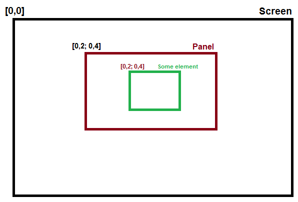
Viewing all 17825 articles
Browse latest View live


<script src="https://jsc.adskeeper.com/r/s/rssing.com.1596347.js" async> </script>