Quantcast
Channel: GameDev.net
Viewing all 17825 articles
Browse latest View live

Avoiding Obstacles in Dyanamic Environments

$
0
0

The Goal


Given a dynamic moving field of objects, leverage the existing capabilities of the physics engine to allow an entity to navigate from any position to any other position while appearing to realistically avoid the objects that may collide with the entity.

That is an awful lot to say. It is also a pretty tall order when you look at the video (below) and realize that there are dozens of objects all moving around all the time while the entity is plotting paths through them.


Why use the physics engine?


If you take apart the pieces that you need to put a game scene together where the AI has some chops, you are going to find you need:
  • A way to partition the space and make queries about what is where to reduce CPU cycles.
  • A way to make the bodies move about under your control and look reasonable while they do it.
  • A way to tell you when collisions occur and have the involved parties take action.
All of these features are present in the Box2D physics engine. The model for it is relatively easy to use and the execution speed is very good. Writing a cell space partition and basic physics system might be fun, but there are better things to do with the time (for now).

What is meant by "realistically avoid"?


When Han Solo flew the Millennium Falcon through the asteroid field in The Empire Strikes Back, he makes the famous quote "Never tell me the odds!". And as we all know, the odds are not good. So maybe "realistically avoid" is a bit of an overstatement, because if the ship can do that, it's a bit more than you should expect.

The effect that we are looking for is to not overtly cheat in how the ship files around the moving obstacles and have it fly around them using the physics it is endowed with (mass, momentum, finite turn torque, etc.).
  • The collision should not be avoided by magic such as having the rocks pass through the ship or having the ship teleport around them.
  • The rocks should not have their velocity reduced to such a low speed that they are essentially fixed objects.
  • The rocks should not move in predefined paths (although this is an interesting option)...if they get bumped they need to behave with the real physics of the situation.
The entity should be able to plot a path through the rocks that it sees near it and also a "general path" towards its final goal, if it can get there.

If the entity is sitting idly by and a rock comes hurtling at it, if it can move in time, it should get out of the way and escape to a safe location.

Sometimes collisions should occur. The AI should not (and probably cannot) be perfect without forcing the rocks to avoid the ship or otherwise "cheating". NOTE: "Cheating" is not a bad thing, the end goal is to have the effect look good; if the player is entertained, they don't usually don't care how the effect was achieved.

The Big Picture


The diagram below shows the major components of the system.


Attached Image: Major-Components-1024x653.png


Main Scene


The Cocos2d-x framework, along with the classes on the left side of the image, make up the "View" of the Model View Controller (MVC) model for the system. The Main Scene acts as the "Controller", taking the user input and sending it directly down to the model (the stuff on right side of the image).

The Viewport approach has been discussed in other blog entries. In previous versions, the Viewport was manipulated (scrolled, pinched, zoomed) inside of the Main View. In this incarnation, a "camera" was created to hide all the guts of making this work, making it more portable to other applications.

We're not going to talk about the View or Controller too much more in this article.

The General Approach


The Box2D engine allows for objects to be "solid" and have normal collision responses, but also allows for objects to pass through each other in various ways (see this link and this link for a good tutorial on this...yes, we reference other developers...they have good stuff). One special class of "intangibility" for Box2D are the "sensors". If you mark a fixture as a sensor, then everything will pass through it, but you will still get notified about each object that collides with it.

Given the above, here is the general strategy:

  1. Lay out an arrangement of closed convex geometrical objects that are all marked as sensors. A "grid" of squares was chosen this time, but it could be circles, hexagons, rectangles etc., They don't have to be on a grid either, they can be in any arrangement that meets your needs. What they have to do is reasonably cover the area that you want to navigate through.
  2. Create a special contact handler that, for each sensor, counts up when a contact begins and counts down when a contact ends. If the numbers line up (and they appear to), then the space inside the shape is "empty" if the count is 0 and "not empty" otherwise.

If you watch the video, you can see that "under" the asteroids are squares that appear/disappear as the asteroids move. This is the GraphSensorContactLayer which shows the sensors that are "not empty" and hides them when they are "empty". There are also flags associated with the entities themselves that the contact listener uses to say "ignore me". This lets the ship fly around without tripping the sensor counts (this is important for the graph search).

So, we have a grid of sensors and as the asteroids dance around, the spaces which are traversable are known and dynamically updated.

When the sensors are created, they are placed into a graph, along with information about which sensors are adjacent to each other, and a distance between them (Euclidean).

Together, this gives you a graph of the space you want to navigate across that updates using the physics engine automatically to tell you which parts of the graph can be used.

The last part, is to develop a series of search algorithms that use the graph and also are aware that nodes can be "not empty" so that they are effectively skipped in the search. This is simply a "blocked" flag on the node (or the edge, though this may complicate the search when you consider which direction the edge is going).

What the Other Pieces Do


The Model part of MVC is filled in part by the Box2D engine. On top of that are these other major components, all of which play a different part. All of these are "singletons" with a well defined responsibility in the execution model. Some of them interact with only a few of the others, some are ubiquitous.

Notifier
The Notifier has been used in many designs (see other blog entries). This singleton is an efficient global one-to-many event communication mechanism for the system. Register for an event and your <anything> can receive them as long you derive from an abstract base class and implement the interface.

EntityManager
The Entity objects are the pieces of the game/system that get instantiated and derived from. This class is a combination container (with destruction responsibility) and phone directory for the entities. In a more complex (and realistic) system, pointers to entities are not held by other entities; an ID/reference is held and when you need to communicate with that entity, you send it a message by its ID. This avoids the challenge of dead/reused pointers.

EntityScheduler
When this code base was first being developed, the asteroids got an "update" call for their AI every frame. This lead to a lot of wasted CPU cycles since they only really need to be updated once a second or so. The EntityScheduler is a class that schedules the calling of the AI updates for the entities. Each frame, it executes the Update(...) method on all the entities scheduled for that frame. By spreading out the calls to update the asteroids across multiple frames, the overall load on the system was reduced.

GraphSensorManager
The GraphSensorManager loads the graph sensors into the a sensor graph and serves as the single point called by the Box2D framework (through the SystemContactListener) to update sensors about contacts. This singleton was originally created with a much larger use in mind, but has really be reduced in scope significantly. It's most important function now is to provide a mechanism to debug which sensors have been changed. It will probably be removed (or morph into something else) in future designs.

The information about the GraphSensorManager has been discussed here to highlight a very important design/development consideration:

Just because it is good in your head does not mean it will be good in the design. You should always look back on your design and ask yourself "Did this really give me what I wanted?" and "Can I do it another way (probably in the future) that will work out better?"

SystemContactListener
The last of the big components is the SystemContactListener. This is the callback used by Box2D when collisions occur to mark which items have been hit. Based on the size of the squares, there are many (or many more for smaller sensors) collisions every single update of the physics. This is where your CPU cycles go for the most part and the part of the design that really needs the most scrutiny in the future.

The Code


Get the Source Code for this article hosted on GitHub by clicking here.

Conclusion


This article presented a technique (and a video and a link where you can download the code) for using a physics engine integrated with the pathfinding system to dynamically avoid objects in a changing environment. The initial testing (and demo) is very promising for future use. One "fly in the ointment" is that the CPU load, while not intolerable, is a bit higher than I would like.

Article Update Log


30 Oct 2014: Initial release

Why Do Mobile Games Often Fail at International Expansion?

$
0
0
According to WSJ, the global mobile game market is expected to increase eightfold from $3.77 billion in 2010 to $29.6 billion in 2017. And among all the countries, the Asia Pacific region, with China and Japan as leaders, is the biggest market for mobile game developers with 48% of the global revenue and three times more paying gamers than the second biggest region, North America.

Considering these statistics, it’s no surprise that there are countless mobile games trying to expand abroad each year; however, very few can claim success.

Part of the problem is that mobile gaming has become a modern-day gold rush. Worldwide developers flooded the market hoping to strike it rich, making today’s mobile game market extremely competitive, no matter in domestic or oversea markets.

But the biggest factor is that developers often underestimate the challenges and importance of mobile game localization.

In our experience of helping mobile games go global, here are six common mistakes they make when jumping into the international market. Avoid these, and you will greatly increase your chances of success.


Attached Image: game-localization-670.jpg


1. No explicit international strategy and plan


The most basic and early stage mistake a game developer can make is failing to understand that localization is more than word-for-word language translation.

Whenever you plan to take your game global, first establish a localization strategy that answers questions like:
  • What factors characterize an attractive market for your company? (e.g population, GDP, mobile penetration, competitors, language, regulation, cultural factors, partners...)
  • What’s your prioritized list of the top 10 world markets based on these criteria?
  • Can we test the demand of a market before going all-in?
  • What are the market needs of each?
  • Can your company address multiple markets at the same time?
  • Should you find a local partner?
  • What’s your go-to-market strategy for each country?
Lack of commitment and understanding in localization often kills an international initiative.

Therefore, make sure your company has a strong corporate champion to drive the in-depth research, explore the markets and own the execution once the strategy is done.

Without formulating the right strategy and translating it into actions, your game will fail, no matter how many languages it supports.

2. Ignoring localization in the early phase of game development


Many game developers try to postpone localization-related discussion until the end of the development cycle, but they don’t realize that they have made a huge mistake from the moment they write their first line of code.

What this typically equates to is a lot of rework and additional costs to go back and modify your code to work when you add new language and localization requirements, costing your company thousands (or millions) of dollars and months of delay in getting into overseas markets.

Instead of doing costly rework down the road, your team should make an explicit decision on internationalization upfront.

Is your code well-prepared for the pre-translation phase? Are your UI strings all externalized? Have you given careful consideration in international non-text elements such as symbols, colours, time and date formats, and currency symbols?

If your code isn’t localized in the beginning, the problem is getting worse with every line you add.

3. No “culturalization” process


To increase the odds of a title’s success in international markets, great attention must be paid to the cultural aspects.

Basic language translation is the bare minimum that any game developers should be doing. Ideally, your translators should be able to adapt your game content to the local culture because culturalization is a necessity.

“What we learned about international markets is that it’s not enough to localize the content by just translating it. Instead, we have to culturalize it,” Craig Alexander, VP of Product Development for game studio Turbine, said.

In order to create the best gaming experience, your translators have to understand foreign cultural traditions, the latest pop culture in the targeted country, local points of reference, etc.

The same applies to non-text assets. For example, while showing a peace sign is normal in the USA, a reverse peace sign suddenly becomes an insult in places like the UK.

Why did EA’s Plants vs. Zombies become one of the biggest mobile hits in China? Just look at the localised design of the zombies and the Great Wall background in the picture below. Keep in mind that you can build gamer loyalty by fully capturing a regionally exclusive experience within the game.


Attached Image: Plants-Vs-Zombies-Great-Wall.png


4. Underestimate the challenge of global mobile game distribution


If you think that all the mobile game distribution channels in every country are similar, you are making a big mistake! In the rush to launch overseas, this is often the most overlooked problem by game developers.

Do you know that China doesn’t have Google Play? Instead, it has around 200 Android app stores creating a highly fragmented market. Without a system in place to track the performance of these channels, you basically can’t have accurate strategies for distributing your app in this country.

Each of those app stores serve a different audience with their own characteristics. You need to look at their different behaviours and adapt your games to different situations. For instance, market leaders often create different versions for different app stores. In other words, if there are 20 app stores they want to target, they will create 20 different versions and marketing strategies for their games.

Due to these complexities, many western game developers work with local publishing and localization partners when they are trying to expand to China now.

When your team comes up with the localization strategy plan, make sure to discuss whether a local partner is needed.

5. Failing to localize the monetization strategy


Although your code and content may be the most obvious localization candidates, your revenue model is equally critical.

In some developing countries, like China, their game players don’t make as much money as the average US gamers. Your business model needs to reflect that reality as a result.

When Plants Vs. Zombies 2 launched in China, they initially tried to optimize for the monetization too much, making the game way too hard and expensive to play, which backfired on user’s reviews and dropped their rating from five star to two at one point. To overcome this, they learned from the experience and tried to figure out the right balance of difficulty and how to reasonably ask for money by changing the game’s economy. Now they get far fewer negative reviews than before.

When sharing his learnings at the Game Developers Conference, Leo Liu, GM of EA Mobile in China, said, "The Chinese market is so different, you have to be prepared for anything unusual from the Western perspective.”

Make sure you won’t repeat their mistakes.

6. No on-device testing and translation review prior to release


This is an amateur problem that is so easily avoidable and yet we came across it time and time again.

You work so hard on the game, create a great localization plan, translate UI strings, it launches, and suddenly, you realise something is broken. You find out that some extra long German words break some of your game UI! But the worst part of this scenario is when your CEO asks you how this happened, and you say, "I thought the translator was taking care of it…”

Never assume and never leave anything to chance. At the end of the day, if something does go wrong, and you could have easily prevented it, the responsibility is on you.

Professional translators are human and people make mistakes sometimes, especially in the complex, fragmented and rapidly evolving world of mobile.

Make sure your localization partners provide localization testing and review services on a number of mobile devices because you can’t afford to disappoint your users with buggy games. After you’ve received a poor rating, there is no way to hide poor quality in the world of mobile.

Conclusion


It’s true that international expansion is hard to get right. Therefore, clear ownership, good strategy up-front, and great execution are critical. That way your mobile game will be in a great position to take advantage of the huge international opportunity!

If you want to learn more about whether your mobile games are on the right track in terms of localization strategy, I invite you to get a Free Assessment with our Localization Managers today. We’re here to help! Simply click the banner below to join the invitation.


Attached Image: free-game-assessment-cta.png


Note: This article was originally published on the OneSky Localization Blog and is republished here with kind permission of the original author.

Making Games is Hard

$
0
0
A year and half ago, Cadence was nothing more than a post-it note on my wall. Today, the game that was supposed to take six months still isn’t done. The “gentle practice run” into the art of releasing video games has morphed into the most challenging and rewarding project I’ve ever undertaken. We’ve reached an interesting point in our journey, so I want to take a moment to reflect on that and let the world know what’s up with Cadence.

It feels like the number one enemy in any act of creation is time; there’s never enough of it. And of course time and money have their own special way with each other, so in fact you get two enemies for the price of one. When you’re lucky you manage to put this equation out of mind long enough to get some damn work done, but other times it feels like you’re in freefall and the ground is rushing to towards you at a million miles an hour. Being productive under such circumstances can be trying, to say the least. Nevertheless you know that is what you signed up for so you grit your teeth and you hustle and you find a way to miss the ground. Unfortunately, this time the ground didn’t miss.

From the outside, the story of Cadence is setting up nicely. Among our victories we can count being greenlit, getting positive feedback from players, finally understanding the game we’re making, and most of all seeing a fabulous outpour of enthusiasm at local game festivals. I’ve also been floored and humbled to be contacted by students and aspiring game developers who look up to me and find my work inspirational. That took me by complete surprise, and as much as I don’t really believe it I am still truly grateful.

One of the things I’ve been trying to come to terms with throughout my journey is the question: “What does it mean to be successful?” Time and again I hear the message that success won’t feed your demons and deliver you to happiness (wonderfully exemplified by Stanley Parable creator’s piece Game of the Year). Even though I’m still nowhere near that kind of stratospheric success I think I’m at least starting to appreciate why it might be true.

Let me first say that there are some truly wonderful moments of external validation. To watch someone experience the delight and joy of cracking your game for the first time never gets old. Or a friend telling you they overheard a stranger telling someone about your game, that’s pretty damn cool too. But the thing is, consumption and production are grossly asymmetric. These moments, gratifying as they might be, are really just a fleeting punctuation set against a landscape of gruelling grind. Day after day, month by month, you find yourself in a wrestling match with the same impermeable adversary, trying to figure out how to get your game made.

Sometimes it feels like you have the upper hand. Those tend to be the days when you’re in the zone, you can see the matrix. Everything is falling into place as hours slip past in a frenzy of productivity. Most of all it feels like you’re making progress and getting somewhere. These days are your raison d’être. Without them getting back up and throwing yourself into the ring one more time would be impossible.

Other times though it feels like you’re going absolutely nowhere and the anxiety is overwhelming and everything is taking way longer than it was ever supposed to. That would be okay if it wasn’t for the fact that your money is running out fast and it feels like things are about to explode but you can’t go anywhere because you’re a year and a half into this and the only way out is to either fail or make it happen. Yeah, those days suck.

And that’s just it, the overwhelming majority of your time spent birthing a game isn’t the quaint picture our minds like to draw: It’s not about tweaking a level that final percent so it’s just right; it’s not about the euphoric high of release, it’s not about showing it at festivals and it’s definitely not about playing games all day. Rather it’s about trying to make those connections that seem painfully obvious in retrospect but until you figure it out you don’t have the first clue.

The tutorial in Cadence is currently on its fourth iteration, and it’s still not quite right. To both the naive developer about to kick off production and the person playing the final version of the game, that journey is invisible. They will only ever see the fully-realised tutorial and assume that’s exactly how it always was for anything less simply doesn’t make sense. But making sense of things is a difficult process, one which is only conquered by living with something imperfect and broken for a long time.

I think the reason we don’t hear about this story is because honestly, it’s a bit boring: “Developer fails to make game fun. Still no idea why?” Of course each time you hit a dead end you do learn something about what doesn’t work, and gradually over time the game does get better. But when you’re so close to something the gradual change can be invisible. It only ever appears broken and unfinished.

This becomes emotionally dangerous when you start to invest your sense of self in the game. To believe that you, as a person, will be a failure if your game fails. It makes the hard days all the more desperate, a matter of emotional life and death. As much as I’ve tried to retain a sense of perspective, to tell myself it’s just a game, the process remains inevitable. I think the same could be said for any creator who invests so much passion and energy into a single project.

It’s also very easy to start believing in the corollary: if your game is successful you will be happy. But, as I’m starting to understand, the adulation of eager gamers will never be enough soothe the mountain you had to climb to get there. They are at a distance, mostly just anonymous text on the internet, delivered in euphoric spikes when you hit milestones. They don’t know the reality you live with every day and they are not there with you on the days you need support the most.

This is certainly not their fault, and they are wonderful human beings for being excited about a thing I made. But nature of the narrative in your head is insidious. It’s always possible to wish for more love of your game, and to believe that when you reach this new magical plateau you will finally find happiness and acceptance.

This was thrown into sharp relief while I was demoing Cadence at the A MAZE games festival. I had spent so long fixated on trying to make the game “commercially ready” that all I could see were the flaws. In fact I could barely even stand to look at the game anymore. This meant it was very hard for me to believe it whenever someone enthusiastically heaped praise on the game. “Obviously they are mistaken” I would think. Also they couldn’t know how dangerously close I was to running out of money.

Ultimately A MAZE was a sublime experience. I decided to catch myself poisoning praise and instead start believing it. I decided to be honest about how I felt and what was happening financially and found myself greeted with overwhelming love and support. I was no longer sheepish about the Kickstarter we were planning and most importantly I was fucking excited to make a video game again. I believed.

Unfortunately enthusiasm isn’t always enough, particularly when dealing with the slow moving world of bureaucracy. And despite the fact we’ve already done many of the hard yards preparing our Kickstarter campaign, the fact we’re in South Africa has made the equation a lot more complicated than it needs to be. Being held ransom by the slow processes of third parties and staring down a pitiful bank balance, we made what I believe is the sensible choice of putting the Kickstarter on hold until we can get everything in order.

That also means Cadence is taking a break while we engage in some bank account CPR (ie contract work). In a way I feel like I’ve let down some people, that I could have done more to keep the dream alive. But, amazingly, as soon as the decision was made I had one of my most productive spells in months. So we’re taking a breather, but we’re not going anywhere. There is a lot to look forward to: most of all we have a clear vision of where we want to take Cadence, and we can’t wait to share that with you. Making games is hard, but so are we.

Look out for the Cadence Kickstarter early 2015.


Note: This article was originally published on the author's blog "Made With Monster Love", and is republished here with kind permission.

Composing an Indie RPG Title Track

$
0
0
While I download and install Unity 4.6.21 beta, I think this is a good time to share all the work that is going into the music side of Archmage Rises.

Music sets mood, tone, and feel. Perhaps I should rephrase that: Music reinforces mood, tone, and feel. Music bypasses the (rational) mind and speaks to the imagination.

A quick demonstration of music's true power is to watch a movie trailer (say, Inception) with just video. Not quite the same without the music, is it? :-)


I met James Marantette three years ago at a game conference in Portland, Oregon. Our first conversation may have been about StarCraft—but deep inside, I realized that I had discovered a very talented composer. We ended up working together on a few tracks for my previous mobile titles—nothing on the scale of Archmage Rises. However, I’m beyond excited to report that James is willing to do all the sound and music for the game!

James is now going to show how we went from a vague idea to a title track that perfectly captures the spirit of Archmage Rises.

James Marantette:
Music is fun because we evolved to respond to it. Music tells us how we are supposed to feel. It will let us know if we are winning, losing, suffering, or conquering. That is a lot of power to have at your fingertips, and my job is to provide music that can make a real difference. Thanks to previous works and past gaming experiences, Thomas and I have a very good set of rules and guidelines that help us achieve this with marginal casualties :) Now, what if we break that? What if we break the rules just a little bit?

I’ll say this several times in this piece: Thomas and I like cello. A lot.

What if we run that cello through a tube amp, some fx pedals, and a crazy big reverb? Magic. That’s what happens. Or, you know . . . a really nasty, dirty, bad sounding instrument. But that’s the point of trying and making different choices. While the track featured in this post leans toward a more generic title track, the feel of the game will be heavily set in "a little bit of something old and a little bit of something new.” It should be familiar territory with hints and whispers of something else. Something darker, something unexplored . . . something magical.

Archmage Rises needs a score, and Thomas asked me to do it. My name is James Marantette and I’ve been working on the music for Archmage Rises for the past several months. My background was in classical violin—and from there, I got into making electronic beats on my parents’ old computer. It’s been a long time and a long way from their basement, but the same childish wonder comes out every time I sit down to create. “What will this session produce?” “I wonder what happens if I do this.”

Creating is half technique and half inspiration. It’s about breaking down mechanical barriers and letting the creative side take over and just . . . create. It’s a blur when you look back. Hours can pass by, but the end result is usually exciting. For Archmage Rises, I want to pull from elements of electronic music and orchestral scores to make a soundtrack that stands out. I start everything “in the box” (no real instruments) and will, on bigger projects, go back and track real instruments over the fake parts during the final stage of music production. I run Logic Pro and use most of the East West plug-ins for my samples—and they can get about as close to the real thing as digitally possible.

With Archmage Rises, we didn’t know what we wanted the soundtrack to sound like. We knew it needed to have a serious, darker tone—but it was important for the music to still “let loose” and become what it was meant to be with minimal interference. It’s super important to get references in any sort of collaborative work, so Thomas and I collected a lot of music we liked (and that he wouldn’t mind hearing in the game).


musico-2.png


Thomas Henshell:
One of the first questions James asked was which game soundtracks could be starting points for Archmage Rises. I sometimes listen to game soundtracks while I work: Mass Effect, StarCraft, and Sins of a Solar Empire. But my most memorable game soundtrack experience is found in Max Payne 2. I love that game. Not many people did, but I was completely captivated with it. It's a third-person shooter that is artistic, that has no respect for conventions. I played it through in one sitting on day one and have played through completion several more times. Something inside me said the cello from Max Payne 2's title track was the right place to start.

James:
With that, I took off. I put together around a dozen tracks with various instruments and moods to see what did and didn’t work. We spent a couple months looking through instruments, locking down ideas, and we both came to agree that cello should be the sound we use as our main instrument. We didn’t want vanilla cello though, and we ended up liking the sound of it running through an amp with some heavy reverb and turned way down in the mix. This gives the sound some “grit” that really lends itself to the game, while still being “pretty."

One evening I sat down, determined to write something good—something fantastic. This would be it, the night I made my best piece. I got nothing done that night and mostly browsed Reddit while listening to iTunes for ideas. So I tried the night after . . . but nothing. Then the night after. . . and that’s when I got the first glimpse of “Choices." If the game is about choice, how can I put that in a piece? (Pretty simple idea, not sure why I couldn’t have thought of that the first night—but hey! That’s part of the creative process). I decided to use two cellos and have them follow two melodies that would become one unified harmony. Two cellos making two choices. Half the time, the melody would lead them to new places; sometimes, it would bring them right back where they started. It worked.


Choicesmusic1.png
Core idea laid out with a few surrounding ideas


I wrote “Choices” in two hours. The core of the song is only about 20% of the work. Another 30% is finding a way to start and finish it while making the whole thing work. Then 40% is review, and adding small parts in where they fit. To throw out some more percentages: I spend an equal amount of time on the first 90% of the work and the last 10%. It’s that 10% that counts; it’s what makes the song sound good on my laptop speakers as well as my studio monitors. When I play it in a car or through headphones, I still hear all of the instruments and I don’t miss out on anything. The mix can be equally important to the arrangement and should always be given the time it deserves. Hopefully, the following breakdown gives you an idea of how I put a track together from start to finish.

First you have to pick your color palette: What key will you be in? What general progression do you want create? I pick an instrument, usually the one I want the core of the song to revolve around (in this case, cello). Then I sit down and play several bars on repeat and record take after take. I try different things, play with ideas, and enjoy a jam session with my computer. On “Choices,” I loaded up a cello sample library and went to town trying different arrangements with two cellos playing different parts.

Hopefully, I find something I like after a while. You see, art can be hard; it’s quite difficult to brute force it—and when someone does this, the audience can tell!

Once I have a theme or core idea, I write a full chord progression. Now I have a structure in place, and it’s time to decide on energy. Usually, I write the highest or lowest energy part first—and fill it in with either some synth pads/atmosphere or drums/staccato strings. Now I have my main part—and it just needs a beginning, middle, and end . . . like a story.

This is where I try other instruments. Find a second melody that complements what I’ve done so far—or perhaps a negative to my positive. In the case of “Choices,” I wrote the two cello lines first. I made three or four really good melodies and picked two to use in the first third of the piece. I surrounded it with slow but powerful strings and drums. I then wanted this extreme contrast where it goes from slow but strong to fast and delicate. It gives the song a needed change and ushers in the final third. This I wrote last, and it was a compilation of everything I had done up to that point. It crescendos to its peak, which mixes fast with slow and ends up just sounding fun. I was trying to have a good time with it; the game is an adventure story in a realm of fantasy, after all!
Now, keep in mind that throughout this process I was constantly sending tracks to Thomas. I religiously updated him with my thoughts every time I got some solid progression -- like the professional composer that I am :)


Thomas:
This is the point where James, excitedly, sent me a rough complete track to listen to. The track was a mess in places, but something about it was perfect. It doesn't sound anything like Max Payne 2, but it captures the feeling I wanted to extract from it. This is where it is important as a team leader to have imagination. It's not about what he sent me; it's about where he was going with it. James was totally on the right track. I gave some specific feedback on sections I thought were too long or didn't transition well, but I ultimately needed to trust his ability to polish the piece.

James:
The thing I have enjoyed most in working with Thomas is his honesty. It’s straightforward, and it cuts a lot of time out of my work when I know that something isn’t sounding right for the game. It also lets me know that when I’ve done something right, it’s really right.


Choicesmusic2.png
The end is added and overall movement is realized with additional instrumentation


Once I have the parts laid out, it’s time to go back and add any instruments that could be needed or pull out any that aren’t helping. Then I have to make final decisions on how the instruments will sound. Do I want these violins to be light and happy or dark? Is this synth easy to hear while still not drawing too much attention to itself? There are 30 tracks in my session, and each one needs some time alone with me to determine its rightful place in the mix.


Then it’s time to face the final 10%. Job one is listening to the song over and over and again--spending several hours mixing and making sure that everything is in its exact and correct place. Burning copies and listening in cars and through headphones. This is where the technical side has to take over. Creativity needs to give way to mechanical prowess and knowledge. I need to edit out the frequencies of the string section that are cutting into the drums. I need to have the piano cut through without just raising the volume. I need 35 tracks to sound like one big movement of sound. Oh, yes: Since the last chunk of work, I now have five additional tracks full of reverb and effects filling out space that was empty or tightening up drums.


Choicesmusic3.png
The song is finally organized, parts are cleaned/edited/finalized and mixing begins


My hope is that you enjoy the piece. I like feedback and always look forward to what the community has to say about my work.


Seeing the collaboration slowly come together has been exciting. I’ve enjoyed the game’s art, and it has definitely affected the music I’ve made. I’m excited to be a part of Archmage Rises and can’t wait to play it!

Thomas:
[Phil Fish voice] I'm only one guy! I'm working as fast as I can! :-)
SDG

Check out James' SoundCloud portfolio. Feel free to contact him about your project.

You can follow the game I'm working on, Archmage Rises, by joining the newsletter and Facebook page.

And you can tweet me @LordYabo

Intercepting a Moving Target in 2D for a Rotating Shooter

$
0
0
In a previous article, the problem of hitting a target with a fixed velocity was discussed and a solution described. In that case, the shooter had the ability to launch the projectile immediately at the direction where the target would eventually intercept it. While this is true for many cases, it is also true that the effect of having an AI turn and shoot at a moving target, and hit it, is more realistic and just plain awesome. It raises the bar significantly above "shoot at stuff" to "I can pick which target I want to hit, turn to shoot at it before it knows what's going on, and move on to the next target with ease." As you would expect, this does raise the bar a bit in the algorithm area.

Approaching the Problem


Looking at the picture below, it can be seen that the dynamics of the problem are very similar to the case from before.


Attached Image: post_images_hitting_targets_with_bullets2.png


The equations derived in the previous article still describe the situation:

(1) \(\vec{P_T^1} = \vec{P_T^0} + \vec{v_T} *(t_B+t_R)\)

(2) \((P_{Tx}^1 - P_{Sx})^2 +(P_{Ty}^1 - P_{Sy})^2 = S_b^2 * (t_B+t_R)^2\)

However, now instead of the time being just \(t_B\), the term includes \(t_R\), which is the amount of time needed to rotate through \(\theta_R\) radians.

Defining a few new variables:

  1. The unit vector for the "facing" direction of the shooter when the calculation begins: \(\hat{P_{ST}^0}\)
  2. The unit vector for the "facing" direction of the shooter when the shot is fired; this points towards \(\vec{P_T^1}\): \(\hat{P_{ST}^1}\)
  3. The rate at which the shooter rotates its body: \(\omega_R\)

When the body rotates at a rate of \(\omega_R\) for \(t_R\) seconds, it rotates through \(\theta_R\) radians.

\(\omega_R * t_R =\theta_R\)

Given the unit vectors defined above and using the definition of the dot product:

(3) \(\omega_R * t_R = acos(\hat{P_{ST}^0}\cdot\hat{P_{ST}^1})\)

In the previous case, the situation was "static". You fire the projectile and it heads towards a location. The only thing you need to know is the time of flight. But now you need to know how long you have to wait before you can shoot. But the longer you wait, the further your target will have traveled. So the solutions "moves" as the rotation time increases.

That is a fairly "ugly" set of equations to try and solve. The static case's quadratic solution and evaluation of its descriminant gave us a good picture of the number of solutions possible. In this case, because of the quadratic/transcendental nature of the formuals, there may or may not be a closed form solution to it. So what do we do? Instead of asking ourselves how can we find the answer directly, ask ourselves how we would know if we found an answer that worked at all.

Pick A Number Between...


If we were to pick a random number for the total time, \(t_{impact} = t_R + t_B\), we could calculate the intercept position because that is how far the target would have traveled in that time, equation (1). Since we know the final position, we can calculate how far the projectile must have traveled to hit the target and also the time to rotate to that position from (2) and (3). If the value we chose for \(t_{impact}\) is a solution, then:

\(t_{impact} = t_R + t_B\)

But, if it is not, then \(t_{impact}\) will either be greater than or less than the sum. Using this, we can propose an answer, test it, and decide if that answer lies to the "left" or "right" of the proposed solution. Then propose (read: guess) again, using the answer we just got to get a little closer. Using this approach, we can iterate towards a solution in a (hopefully) bounded number of steps. Not as clean as a simple "plug and chug" formula, but very serviceable.

Binary Search


It is tempting to use a fast-converging numerical technique like Newton's Method to try and solve this. But the shape of the space that the solution lies in is unknown. We haven't even proven that the "left" or "right" decision process won't stick us in some thorny cyclic patch of non-convergence. Shooting off towards infinity on a small derivative estimate is also something that would be undesirable and hard to bound. We want this to be executed in an AI for a game that is running out in the field, not in a lab.

So, we're going to trade something that *might* converge faster for a search algorithm that will guarantee cutting the search space in half each time, the binary search. Here is how it will work:

  1. Define the minimum value, \(t_{min}\) that will be the smallest value for \(t_{impact}\) that will be allowed.
  2. Define the maximum value, \(t_{max}\) that will be the largest value for \(t_{impact}\) that will be allowed.
  3. Start with the value that is between the minimum and maximum as the first proposed value.
  4. Loop:
    1. Calculate the final impact location.
    2. Calculate the rotation time necessary to face the impact location, \(t_{rot}\).
    3. Calculate the flight time from the shooter to the final impact location, \(t_{flight}\).
    4. \(t_{shot} = t_{impact} - (t_{rot} + t_{flight})\)
    5. if \(t_{shot} > 0\), then set the upper limit to the proposed value and propose a new value between the upper and lower limits.
    6. if \(t_{shot} < 0\), then set the lower limit to the proposed value and propose a new value between the upper and lower limits.
    7. If the value of value of \(t_{impact}\) is changing within less than a specified tolerance, the algorithm has converged.
    8. If the number of loops gets too high, fail.
  5. Return success and the final position or failure.

The Code


The following function calculates whether or not the target can be hit and then returns the result. If the target could not be hit, the return value is "false". If it could, the return value is "true" and the solution, the position vector of the impact.

/* Calculate the future position of a moving target so that 
 * a turret can turn to face the position and fire a projectile.
 *
 * This algorithm works by "guessing" an intial time of impact
 * for the projectile 0.5*(tMin + tMax).  It then calculates
 * the position of the target at that time and computes what the 
 * time for the turret to rotate to that position (tRot0) and
 * the flight time of the projectile (tFlight).  The algorithms
 * drives the difference between tImpact and (tFlight + tRot) to 
 * zero using a binary search. 
 *
 * The "solution" returned by the algorithm is the impact 
 * location.  The shooter should rotate towards this 
 * position and fire immediately.
 *
 * The algorithm will fail (and return false) under the 
 * following conditions:
 * 1. The target is out of range.  It is possible that the 
 *    target is out of range only for a short time but in
 *    range the rest of the time, but this seems like an 
 *    unnecessary edge case.  The turret is assumed to 
 *    "react" by checking range first, then plot to shoot.
 * 2. The target is heading away from the shooter too fast
 *    for the projectile to reach it before tMax.
 * 3. The solution cannot be reached in the number of steps
 *    allocated to the algorithm.  This seems very unlikely
 *    since the default value is 40 steps.
 *
 *  This algorithm uses a call to sqrt and atan2, so it 
 *  should NOT be run continuously.
 *
 *  On the other hand, nominal runs show convergence usually
 *  in about 7 steps, so this may be a good 'do a step per
 *  frame' calculation target.
 *
 */
bool CalculateInterceptShotPosition(const Vec2& pShooter,
                                    const Vec2& vShooter,
                                    const Vec2& pSFacing0,
                                    const Vec2& pTarget0,
                                    const Vec2& vTarget,
                                    float64 sProjectile,
                                    float64 wShooter,
                                    float64 maxDist,
                                    Vec2& solution,
                                    float64 tMax = 4.0,
                                    float64 tMin = 0.0
                                    )
{
   cout << "----------------------------------------------" << endl;
   cout << " Starting Calculation [" << tMin << "," << tMax << "]" << endl;
   cout << "----------------------------------------------" << endl;
   
   float64 tImpact = (tMin + tMax)/2;
   float64 tImpactLast = tImpact;
   // Tolerance in seconds
   float64 SOLUTION_TOLERANCE_SECONDS = 0.01;
   const int MAX_STEPS = 40;
   for(int idx = 0; idx < MAX_STEPS; idx++)
   {
      // Calculate the position of the target at time tImpact.
      Vec2 pTarget = pTarget0 + tImpact*vTarget;
      // Calulate the angle between the shooter and the target
      // when the impact occurs.
      Vec2 toTarget = pTarget - pShooter;
      float64 dist = toTarget.Length();
      Vec2 pSFacing = (pTarget - pShooter);
      float64 pShootRots = pSFacing.AngleRads();
      float64 tRot = fabs(pShootRots)/wShooter;
      float64 tFlight = dist/sProjectile;
      float64 tShot = tImpact - (tRot + tFlight);
      cout << "Iteration: " << idx
      << " tMin: " << tMin
      << " tMax: " << tMax
      << " tShot: " << tShot
      << " tImpact: " << tImpact
      << " tRot: " << tRot
      << " tFlight: " << tFlight
      << " Impact: " << pTarget.ToString()
      << endl;
      if(dist >= maxDist)
      {
         cout << "FAIL:  TARGET OUT OF RANGE (" << dist << "m >= " << maxDist << "m)" << endl;
         return false;
      }
      tImpactLast = tImpact;
      if(tShot > 0.0)
      {
         tMax = tImpact;
         tImpact = (tMin + tMax)/2;
      }
      else
      {
         tMin = tImpact;
         tImpact = (tMin + tMax)/2;
      }
      if(fabs(tImpact - tImpactLast) < SOLUTION_TOLERANCE_SECONDS)
      {  // WE HAVE A WINNER!!!
         solution = pTarget;
         return true;
      }
   }
   return false;
}

Note:  The algorithm takes not only the position of the shooter, but its velocity as well. This is provision for a small modification where the shooter could be moving. In development of Star Crossing thus far, it has not been necessary to put in this modification. Feel free to let us know via feedback if you work it in (and it works for you).


The Video


Instead of cooking up a video just to demonstrate the basic use of the algorithm, it is going to be more effective to let you see it in action. The video below is a clip from a game we are actively working on called Star Crossing. In the clip, the ship pulls the Defense Drone behind it like a tail gunner. The Defense Drone turns to shoot at the Snakes as the ship drags it around. Go about a minute into the video and you'll see it.

Note:  This game is in work and the art is all drawn by hand to have something to look at while the mechanics are worked out. It looks pretty...well...crayolaish...that's not even a word but it probably has the right feel. If you would like to help the project with some art skill, feel free to contact us.


The Demo


I put together a small console application as a test bed to develop the algorithm initially. The simulation allows you to tinker with the parameters and see the running of the algorithm. You can download the source code for it using the link below. It is written in C++ and should compile on any modern compiler. We used XCode on a Macbook Pro, but the code has no graphics or special libraries associated with it.

The (Rest of the) Code


Get the Source Code for this article hosted on GitHub by clicking here.

Interesting Points

  • While there is a bound on the algorithm, it usually converges in less than 10 steps in our testing.
  • (Proposed...not proven) Knowing your turn rate in radians/sec, you can modify the SOLUTION_TOLERANCE_SECONDS value so that it converges to a resoluion in terms of arc seconds from the target. That is to say, you don't have to shoot dead at the target positiion to hit it, you just have to be really close. This gives you a good way to set your tolerance and save some loops. You could change the algorithm to take a tolerance in degrees or radians to set the convergence limit.
  • You need to handle the case where the target is heading right at you. We use the dot product for this and just "fire now". This is done before the algorithm is even called.
  • Our initial algorithm shot at the location of the target instead of leading it. When we put the new algorithm into effect at first, it was not too exciting, but much better. When we put in the "shoot if it is in front of you" addition, the combo pack was devastating and we had to turn down the Defense Drone weapon power to stop it from decimating the snakes too fast. Be careful what you wish for.
  • While I haven't tried it, it seems reasonable you could pick a "better" start value for \(t_{impact}\) by using the non-rotating solution plus a little slop time (maybe the amount of time to rotate to face that position). This has the right "feel" for an initial estimate and seems worth exploring in the future.

Conclusion


This article presented an approach for predicting the future position of a moving target based on having to rotate to shoot it. A simulation of using the algorithm was also created for you to tinker with. The solution appears to work well for our current needs.

Article Update Log

30 October 2014: Initial release

What's In Your Toolbox?

$
0
0
Big things are made of little things. Making things at all takes tools. We all know it is not the chisel that creates the sculpture, but the hand that guides it. Still, having a pointy chisel is probably better to break the rock than your hand.

In this article, I'll enumerate the software tools that I use to put together various parts of my software. I learned about these tools by reading sites like this one, so feel free to contribute your own. I learned how to use them by setting a small goal for myself and figuring out whether or not the tool could help me achieve it. Some made the cut. Some did not. Some may be good for you. Others may be good for you.

Software Tools


#NameUsed ForCostLinkNotes
1Cocos2d-xC++ Graphical FrameworkFreewww.cocos2d-x.orgHas lots of stuff out of the box and a relatively light learning curve. We haven't used it cross-platform (yet) but many have before us, so no worries.
2Box2D2-D PhysicsFreewww.box2d.orgNo longer the default for cocos2d-x :( but still present in the framework. I still prefer it over Chipmunk. Now you know at least two to try...
3GimpBitmap Graphics EditorFreewww.gimp.orgAbove our heads but has uses for slicing, dicing, and mutilating images. Great for doing backgrounds.
4InkscapeVector Graphics EditorFree
www.inkscape.orgOur favorite tool for creating vector graphics. We still suck at it, but at least the tool doesn't fight us.
5PaperGraphics Editor (iPad)~$10App StoreThis is an incredible sketching tool. We use it to generate graphics, spitball ideas for presentations, and create one-offs for posts.
6SpineSkeletal Animation~$100www.esotericsoftware.comI *wish* I had enough imagination to get more out of this incredible tool.
7Physics EditorSee Notes$20www.codeandweb.comCreates data to turn images into data that Box2D can use. Has some annoyances but very solid on the whole.
8Texture PackerSee Notes$40www.codeandweb.comPuts images together into a single file so that you can batch them as sprites.
9PythonScripting LanguageFreewww.python.orgAt some point you will need a scripting language to automate something in your build chain. We use python. You can use whatever you like.
10Enterprise ArchitectUML Diagrams~$130-$200www.sparxsystems.comYou probably won't need this but we use it to create more sophisticated diagrams when needed. We're not hard core on UML, but we are serious about ideas and a picture is worth a thousand words.
11ReflectorSee Notes~$15Mac App StoreThis tool lets you show your iDevice screen on your Mac. Which is handy for screen captures without the (very slow) simulator.
12XCodeIDEFreeMac App StoreCocos2d-x works in multiple IDEs. We are a Mac/Windows shop. Game stuff is on iPads, so we use XCode. Use what works best for you.
13Glyph DesignerSee Notes$40www.71squared.comCreates bitmapped fonts with data. Seamless integration with Cocos2d-x. Handy when you have a lot of changing text to render.
14Particle DesignerSee Notes$60www.71squared.comHelps you design the parameters for particle emitter effects. Not sure if we need it for our stuff but we have used these effects before and may again. Be sure to block out two hours of time...the temptation to tweak is incredible.
15Sound BibleSee NotesFreewww.soundbible.comGreat place to find sound clips. Usually the license is just attribution, which is a great karmic bond.
16Tiled QTSee NotesFreewww.mapeditor.orgA 2-D map editor. Cocos2d-x has import mechanisms for it. I haven't needed it, but it can be used for tile/orthogonal map games. May get some use yet.

Conclusion


A good developer (or shop) uses the tools of others as needed, and develops their own tools for the rest. The tools listed here are specifically software that is available "off the shelf". I did not list a logging framework (because I use my own) or a unit test framework (more complex discussion here) or other "tools" that I have picked up over the years and use to optimize my work flow.

I once played with Blender, the fabulous open-source 3-D rendering tool. It has about a million "knobs" on it. Using it, I realized I was easily overwhelmed by it, but I also realized that my tools could easily overwhelm somebody else if they were unfamiliar with them and did not take the time to figure out how to get the most out of them.

The point of all this is that every solid developer I know figures out the tools to use in their kit and tries to get the most out of them. Not all hammers fit in all hands, though.

Article Update Log


5 Nov 2014: Initial Release

Standard Gameplay and IAP Metrics for Mobile Games (Part 2)

$
0
0
This article continues on from my previous article (Part 1).

In this article we will be looking at using analytics to measure and improve gameplay for our example game "Ancient Blocks". As before, the example game featured in this article is available on the App Store if you want to see the game in full.

The reports shown in this series were produced using Calq, but you could use an alternative action based analytics service or even build these metrics in-house. This series is designed to cover "What to measure" rather than "How to measure it".

Measuring gameplay


Gameplay is obviously a critical component in the success of a mobile game. It won't matter how great the artwork or soundtrack is if the gameplay isn't awesome too.

Drilling down into the gameplay specifics will vary between games of different genres. Our example game, Ancient Blocks, is a level-based puzzle game and the metrics that are collected here will reflect that. If you are following this series for your own games then you will need to adjust the metrics accordingly.


Attached Image: GameStrip.jpg


Game balance


It's imperative that a game is well balanced. If it's too easy then players will get bored. If it's too hard then players will get frustrated and may quit playing entirely. We want to avoid both scenarios.

For Ancient Blocks the initial gameplay metrics we are going to record are:
  • The percentage of players who finish the first level.
  • The percentage of players who finish the first 5 levels.
  • The percentage of players that quit without finishing a level.
  • The number of times a player replays a level before passing the level.
  • The average time spent playing each level.
  • The number of "power ups" that a player uses to pass each level.
  • The number of blocks a player swipes to pass each level.
  • The number of launches (block explosions) that a player triggers to pass each level.

Implementation


The example game is reasonably simple and we can get a lot of useful data from just 3 actions: Gameplay.Start for when a player starts a new level of our game, Gameplay.Finish for when a user finishes playing a level (the same action for whether they passed or failed), and Gameplay.PowerUp for when a player uses one of Ancient Blocks' special power-ups (bomb, colour remove, or slow down) whilst playing a level.

ActionProperties
Gameplay.Start
  • Level - The number of the level being played (e.g. level 7).
  • Difficulty - The current difficulty setting of the level being played.
Gameplay.Finish
  • Level - The number of the level being played (e.g. level 7).
  • Difficulty - The current difficulty setting of the level being played.
  • Duration - The duration (in seconds) the player took to finish this level.
  • Success - Whether or not the user passed the level (true) or if they were defeated (false).
  • PowerUps - The number of times a special power-up ability was used.
  • Blocks - The number of blocks the player moved during this level.
  • Launches - The number of times a player triggered a launch (matched a sequence of blocks) during this level.
Gameplay.PowerUp
  • Id - The numeric id of the power-up that was used.
  • Level - The number of the level being played (e.g. level 7).
  • Difficulty - The current difficulty setting of the level being played.
  • After - The amount of time (in seconds) into the level the user was when they used a power-up.

Analysis


With just the 3 actions defined above it is possible to do a range of in-depth analysis on player behaviour and game balance.

Early player progression


A player's initial experience of a game extends beyond the tutorial to the first few levels. It is critical to get this right. Progress rate is a great indicator of whether or not the first levels are balanced, and whether players really understood the tutorial that showed them how to play (tutorial metrics were covered in the previous article).

For Ancient Blocks the time taken on each level is reasonably short and so we are going to analyse initial progression through the first 10 levels. To do this we can create a conversion funnel that describes the user journey through these first 10 levels (or more if we wanted). The funnel will need 10 steps, one for each of the early levels. The action to be analysed is Gameplay.Finish as this represents finishing a level.

Each step will need a filter. The first filter needs to be on the level Id to filter the step to the correct level, and a second filter on the Success property to only include level play that passed. We don't want to include failed attempts at a level in our progression stats.


Attached Image: EarlyGameplayFunnel.png


All games will have a natural rate of drop off as levels increase since not all players will want to progress further into the game. Some people just won't enjoy playing your game - we are all different in what we look for and that's no bad thing. However, if certain levels are experiencing a significantly larger drop off than we expect, or a sudden drop compared to the level before, then those levels are good candidates to be rebalanced. It could be that the level is too hard, it could be less enjoyable, or it could be that the player doesn't understand what they need to do to progress.

Level completion rates


Player progression doesn't provide the entire picture. A level might be played many times before it is actually completed and a conversion funnel doesn't show this. We need to look at how many times each level is being played compared to how many times it is actually completed successfully.

As an example, let's look at Ancient Block's 3rd level. We can query the number of times the level has been played and break it down into successes and failures. We do this using the Gameplay.Finish action again, and apply a filter to only show the 3rd level. This time we group the results by the Success property to display the success rate.


Attached Image: GameExample-Gameplay-Level3-PieChart.png


The design spec for Ancient Blocks has a 75% success rate target for the 3rd level. As you can see from the results above it's slightly too hard, though not by much. A little tweaking of level parameters could get us on target reasonably easily.

Aborted sessions


An incredibly useful metric for measuring early gameplay is comparing the number of people that start a level but don't actually finish it - i.e. closed the application (pressed the home button etc). This is especially useful to measure straight after the tutorial level. If players are just quitting then they either don't like the game, or they are getting frustrated.

We can use a short conversion funnel to measure this. By using the Gameplay.Start action, the Tutorial Step action from the previous article (so we can include only people who finished the tutorial already), and the Gameplay.Finish action.


Attached Image: AbortedSessions.png


The results above show that 64.9% of players (which is the result between the 2nd and 3rd step in the funnel) that actually finished the tutorial went on to also finish the level. This means 35.1% of players quit the game in that gap. This number is much higher than we would expect, and represents a lot of lost players. This is a critical metric for the Ancient Blocks designers to iterate on and improve.

Part 3 of the series will continue by looking at increasing revenue by optimising the user journey for in-app purchases (IAPs).

Retro Mortis: RTS (Part 1) - It was found in a Desert...

$
0
0
Greetings,

Preface


(You may freely skip this Preface without risk)

Let me preface this by saying that I realize a lot of what is to follow will be built upon conjectures and subjective observations. Regardless, I believe there is sufficient truth or at least food for thought that it warrants being written (and read).

The primary objective of this article is to promote a critical analysis of old "dusty" games and determine the mindset in which they need to be approched in order to be relevant to modern development. It seeks to identify interesting design decisions that have not been replicated since or served as the origin to a more widespread usage. In better understanding how things have become, or the path not taken, it is easier to identify key elements that could be worth (re) visiting.

It is to be noted that, while this article is written in the mindset of establishing a series, it could end up being an orphan. I'd like for this article to stand on its own, but it would greatly benefit from others.


Introduction


Retrogaming, "is the playing or collecting of older personal computer, console, and arcade video games." Such activity has gained in popularity over the last decade to the point where several modern games are developed leveraging this mindset. It is not uncommon to see a series reboot by going back to their roots, or implement interesting twists that link back to earlier titles.
I was at the front seat of one such experiment a few years back, when developing a AAA game with a major publisher. Insodoing, the game ended up showcasing short 2D gameplay segments as a reverence to its own origins.

Retrogaming is often taxed with being a phenomenon anchored in the player's sense of nostalgia, arguing that these games have been idolised based on the memories of childhood that come with. While I agree there is truth to that, I believe this would be grossly underestimating the value of older games.

It is true that games developed 10-20 years ago were limited in scope by technical limitations that could be unconceivable to the modern observer, but such limitations also forced developers to be more creative.

Back then, several of the genres we now know (MOBA, RTS, 4X) simply did not exist. Some visionaries had a rough idea of what gaming experience they wanted to achieve, and it so happened that a game genre would be born from this.

The most common misconception I've seen modern players and junior designers exhibit about these precursors is the belief that they were barebone/simple experiences without much depth. From my experience, this could not be anywhere further from the truth, and oftentimes, I have come to realize that having a look at one of these "ancestors" humbles me.

As an example, one of the earliest games, Spacewar! (Released officially in 1962, but in development as early as 1953) was actually a very complex arcade game. For starters, it was a multiplayer real-time game where two ships would fight one another while using their thrusters to prevent collisions, fight against gravity, and attempt to out-maneuver their opponent. It introduced all basic concepts of firing missiles and lasers (projectiles) and damaging the opponent. It had a concept of health points, shield points, and rather complex controls.


spacewar-dos-screenshot-avoid-the-planet
SpaceWar! (DOS version, circa 1986)


But there's more to an analysis of retrogames than merely tossing random facts about Spacewar! There is actionnable knowledge that has been forgotten, especially in decade-long genres that appear to have an existential crisis and are unable to reinvent themselves. Oftentimes, this answer lies in their early installments.

Today, I'd like to discuss one of these genres: the "RTS" (Real-Time Strategy Game).

Context


There were a number of games that led to the modern appelation of "RTS", but most agree nowadays that the first stepping stone towards the modern RTS was "Dune 2". This begs to question what Dune 1 was really about, but it was actually an adventure game (turns out there's an origin to mismanaging brands earlier than the 21st century!).

Dune 2 would be the first title of many during the "conflict" that opposed Westwood Studios (Now defunct, formerly under EA leadership) and Blizzard Entertainment (now part of Activision Blizzard) between 1992 and 1998.

In a way, a lot of what RTS games are and are not today was forged by Dune 2, and the war that followed. Since the competition for this market was severe (and the demand quite high), production costs had to be minimized and feature creep restricted.

Given the history and ferocious competition for that market share, it is somewhat puzzling that a very popular game such as Starcraft II (2010) would hardly differ from a game made almost 20 years prior. The "RTS War" fell prey to the greater conflict: the war for the best visuals. And for the longest time, we haven't seen much movement on the RTS scene. Some titles have had better execution than others, but most were cast from the same mold.

Though RTS is a mainstay of game development nowadays thanks to that "war", a more educated observation is warranted to understand what was earned or lost along the way, and how it can be used today.

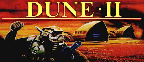
Dune II: The Building of a Dynasty


dune2.jpg


There's a reason why Dune II coined the RTS genre. It was not only because it presented the core of what an RTS should be, but rather because it provided a complete experience and terrific scope. It was, in many ways, a complex experience that needed to be broken down to understand. It even took a while for Westwood itself to break it down to its essence (C&C) before realizing what they had created in the first place.

A number of constants were designed during Dune II, but there were also several concepts that were grafted to it. In a way, it was much more than a MVP, and for the most part, it worked brilliantly.

Resource Gathering

Dune II established the core of the RTS genre by laying resources on the ground and asking the player to harvest them to fuel military unit production. While this mechanic feels natural to the genre, in the case of Dune II, it is actually there out of necessity: the Dune brand (novels, series and movie) is based around the concept of harvesting spice. Unlike most RTS games, harvesting this precious spice is the primary focus, much moreso than actual combat. Armed conflict is only a byproduct of that race for the spice melange.

While most RTS titles have inherited this mechanic, they've all done a relatively poor job at putting this mechanic in context (including Tiberian Sun that blatantly mimicked Dune in that regard). This is where Dune II excels. Not only has it created an interesting resource acquisition mechanic, but it has actually made it a core part of the game. In Dune II, resource acquisition IS part of the MVP and is not a design mechanic that supports it, and this is a big deal.


award_dune2.jpg
Harvesting precious spice...


As an example, one of the early missions is to simply gather up resources. The player has to realize that creating military units only delays his ability to reach this objective. While many other RTS games have used this as an introductory mission, Dune II comes on top here because the game has made it clear from the very first cutscene that this was to be the primary objective. Only much later in the campaign does this turn into a more global conflict, and the player is told that, in order to secure the resource, it will not suffice to try and harvest it faster, but that elimination of other houses is necessary. Thus, the war is explained as an economic decision.

The legacy of this resource system can be found in various games (namely the C&C series). It has evolved in most cases however, as we'll be able to cover in a future article. Here, Dune II has only the merit of creating the vanilla concept, as a theme-centric necessity.

Energy System

Another mechanic that became a staple of the genre (C&C and its derivatives mainly) is the concept of energy. Unlike the concept of "food" which we'll discuss with our next game, the energy mechanic was used as early as Dune II to limit rapid base building, introduce a concept of logistics, and provide strategic weaknesses.


dune2_shot9.png
The much-required Windtrap!


The Windtrap can be perceived as just "another building to build", but it achieves a lot more than that. It requires resources to build, which in turn reduces the player's ability to construct buildings quickly. This form of investment may lead the player to end up investing in units instead of buildings as a result.

Furthermore, it gives a sense that the base is not self-sufficient "as is" and gives the player something to keep watch over. They need to determine for themselves whether they want redundancy or can live with the risk of being short on energy (and the consequences of that can be quite drastic).

More importantly yet, it introduces the concept of base weakness. The enemy AI in this game is not great, but it understands that power is key. As a result, if a Windtrap is located on the edge of a base, and relatively undefended, they will risk a dedicated attack on it just to cripple the player economically. At this point, losing a few units is deemed an acceptable loss given the economic damage involved.

Since Windtraps' energy generation scales with the building's health, they don't need to destroy it completely, just damage it enough to put the base below its requirement level.

Though the player can end up repairing the damage for a fraction of the cost, it's often enough to compensate for losing units (cost of repairs + time spent under power level).

C&C carried this system along for a bit, and quite a few RTS have revisited it without much improvement to this day. While this implementation wasn't the most "fun and engaging" mechanic, it showed the potential of having to manage base logistics.

Mercenaries

This is where Dune II starts to differ from most of the titles that followed. While the game had a straightforward unit acquisition system, it also boasted a "stock-market" mercenary system to supplement it where unit availability and price would vary, and ETA to delivery would be a constant. It allowed players to pay a variable amount of spice (depending on global demand) to field quick reinforcements in numbers.

This system was a great tactical addition as it provided players with resources to spare with a means to quickly replenish their armies without having to build very complex infrastructures. It did introduce however a bit of unknown (risk) without it being random (based on player demand). Prices would shift, unit availability would differ, etc.

Even more importantly, these mercenaries were unique in that they allowed every player access to some faction-restricted units on occasion, which gave them a unique reason to exist.


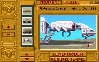
Dune2-Harkonnen-Starport.jpg
About to buy a Carryall...


As the time to delivery was fixed, it also allowed to hasten production of "high tech" units or economic ones. Building a harvester, for example, was a long and tedious task that would prevent building tanks. If harvesters were available from the Starport however, they would quickly be shipped and free your production centers for more military units.

In addition, players could save up on "upgrades" by creating defaut units from their production centers, and supplementing their forces through these mercenaries (missile tanks for example, which were generally required in fewer numbers).

Furthermore, the player could build units from the Starport only to ensure that their enemy would not have access to those. For example, if several siege tanks were being sold, the player could choose to buy all of them to deny their opponent a chance to reinforce quickly, and ensure that their ongoing attack would not be met with surprise resistance.

This is a mechanic that has scarcely come into usage, but ended up appearing as a prominent feature in some RTS games much later (Ground Control). One can imagine a game that would be built around this system however (where all players draft from the same pool of mercenaries and each order prevents opponents from picking these specific units).

Landscaping

Dune II made extensive use of terrain. Unlike most RTS that would follow, it was critical to understand how terrain affected options:

On the one hand, bases could not be built anywhere. They needed to be built upon "rocky" foundations (and ideally, be built upon concrete). This greatly limited the possibilities and allowed the level designers to control base construction. Some levels were harder simply because the player was limited in the amount of space (thus, buildings) they were allowed. The challenge was to make more with less, which was a good means to ensure players understood key concepts of efficient base building.

Furthermore, there were different types of sand. Units would react differently to different terrain types. Some units would roll faster on "hard" sand than they would on regular sand, while others were unaffected. It was important to sync your forces when attacking, and misjudging terrain could result in forces reaching the enemy base out-of-line only to die very quickly.

The inclusion of higher ground also introduced strategic depth. Since most infantry could be rolled over by most vehicles, they would rarely provide reliable firepower, except that they were the only units that could go on higher ground, and then became immune to instant-kill from tanks.
That, coupled with the fact that most infantry would resist big bullets (aside from the anti-personel siege tank) allowed players to put troopers (rocket launchers) on higher ground to guard against tanks and air units, making them a potent addition to any army. It is to be noted that, without higher ground, infantry would've been close to useless.

Though the concept of high ground has been used in a variety of RTS games, it was usually employed as a modifier to give advantage to units on the higher ground (better shot accuracy, visibility, or preventing counter-attack). It was namely used by the Warhammer 40k franchise to define specific level areas that were ideal for cover and others that were vulnerable (supplementing the concept of "choke point").

Assymetry

Dune II introduced some faction assymetry. While the bulk of the units were the same, a few "tweaks" were introduced (namely, a faster/weaker version of the trike for the Ordos, a tougher quad for the Harkonnen, stronger infantry for the Harkonnen, etc.) as well as two unique units per faction.

The Atreidis were the only house with offensive air support which forced their enemies to drastically re-think their defenses (more rocket turrets and troopers, less tanks). They also had a Sonar tank which did AoE damage which was particularly efficient vs enemy concentration of forces (such as infantry) but could also cause friendly fire.

The Ordos had a terrific tank that could confuse enemy troops and temporarily mind-control them. It could also field a stealth unit called the Saboteur to cause critical damage to structures (later re-used as the engineer in the C&C series).

The Harkonnen had a devastator tank which was simply a buffed and extremely costly version of the tanks. It also fielded atomic missiles which allowed it to strike without fear of retaliation.


death-hand.jpg
Death Hand missile ready!


Though the bulk of the forces were the same, these slight assymetries really changed the way one would approach an enemy depending on their house. Playing Ordos vs. Atreidis was nothing like playing Ordos vs. Harkonnen.

This was leveraged by later titles, originally only under a cosmetic form, but eventually led to the much acclaimed design of Starcraft 1, where each faction was entirely different. It is but one of the latent concepts brought forward in Dune II that eventually saw the light of day (with resounding success!).

Sandworms

Possibly the single most significant yet often misunderstood feature of the game is the Sandworm.

The Sandworm generally lays dormant on the map until it is discovered by either player. It is a random force of nature that will hunt down whatever it considers food. Generally, it tends to eat whatever is the biggest, strongest yet nearest unit it can see. Oftentimes, this is a harvester (Economic unit) or a big big tank.


blogduneiisandworm.jpg
Sandworm hard at work.


While it could be perceived as random (its AI actually has some randomness involved), it is actually a balancing tool. Despite the fact it was mainly added to support the theme and that it is an important aspect of the lore, it actually plays two important roles from a gameplay standpoint:

1 - Balancing: While the AI is random, the trigger is not. Whichever player discovers it first triggers it. The most likely player to discover it is - generally - the one that's doing "better" (economically). There are two main ways this worm will get discovered:

- either a player mounts an offensive and stumbles across the worm by accident

or

- a player is looking for resources beyond the ones that were available close to their base.

In both cases, this means this player is doing well: being on the offensive, or looking for more resources means you're doing better than your opponent, otherwise you'd be dealing with their attack, or they'd have already secured this new resource location and met with the Worm.

Since the player that's doing better is more likely to end up losing the first unit, it can lead to a dominant player losing its momentum, putting both players back in a situation where everything is possible: it keeps it interesting.

2 - Threat: It gives a sense of threat. The environment is dangerous, and you can't just scatter units around to get a better view and coverage. You want to pack tight defenses and mobilize your forces only on solid ground. When you do find a worm, you want your formations out of harm's way, and you'll want to protect your harvesters and keep a close watch on them. If you're crafty, you might even attempt to lure the worm to your enemy's base (I sure did!).

The Sandworm is much more than a random NPC. While the core concept was somewhat recycled in Warcraft 3, it was mostly used as a means to slow progression and level up your heroes. It didn't quite capture the depth of the original sandworm. To this day, I am unaware of any concept that plays the same role the Sandworm did, as a form of neutral adversary that keeps the match closer to an even-force fight to keep the players on their toes.

Campaign Map

Between missions, the player was prompted with a map where they would need to choose the next theater of operations. It was more than a mere cosmetic gesture, it actually changed a lot. In most cases, the enemy would be the same (given the choice to strike at 3 different Ordos territories for example) but the level design would greatly differ.

This allowed for a lot of replayability, and actual decision-making. If you did poorly on a specific map, you could try another and get away with the victory there because it worked better with your mindset.


4url.png
Harkonnen Campaign.


It also gave you an impression that there were other military officers working with you. Whenever you completed a mission, your team did not claim 1 but 2 or 3 territories instead, but you could also lose some. It was interesting to see the map progression differ depending on your actions.

On a few occasions, in later levels, you were even provided with a key decision: do you want to fight this house or the other? If you felt you had a better chance against atomic warheads than deviators, you could pick the former (House Harkonnen) at your convenience. Although ultimately, you'd end up fighting both opposing houses AND the Emperor.

This mechanic took a fair bit of time to resurface, but it was well executed in the campaign system introduced by Dark Crusade (an expansion of the Warhammer 40,000 RTS). It was successfully supplanted in 2006. It may be surprising that it took 14 years to revisit this mechanice and improve it, but it goes to show how much unexploited potential Dune II has generated with this feature alone.

Fog of War

There is not much to be said of the Fog of War except that it first originated in Dune 2. The concept of hidden information, critical to a good tactical game with high replayability and risk management, was present in this first installment. Exploration had value early in the game. To try and scout the enemy base and get an idea of what would be coming your way was a big part of every good player's plan.


ordos-raider-streak.jpg
Fog of War.


While exploring the map was critical, the concept of a shroud that regrows when the player does not have "eyes on" a part of the map was not present then. With the advent of multiplayer (which we'll discuss later) the need for shroud that regrows became prominent, and ultimately supplanted the need for a lay of the land. In Starcraft II for example, competitions reached a climax where all players were familiar with all ladder maps to the point where the original Fog of War was merely a nuisance to inexperienced players alone. One could argue that the Shroud (that regrows) surpassed the Fog of War in almost every regards, but its concept was only brought forth as a response to Dune II's implementation of the concept of hidden information.

Conclusion


All in all, Dune II was a very strong precursor of the genre. Many of its ideas were re-used, and the few that lay dormant still have a lot of potential.

Its approach to resource gathering is probably out-dated (a bunch of games did better) but it was the most on-theme.

Many of its core mechanics (Mercenaries, Energy, Landscaping and Worms) are still interesting sources of inspiration to introduce a bit of "crazy" in modern designs.

A key element to bear in mind is that Dune II was the result of top-down design, a rare case where building a game from an established media (books / movie) and leveraging from its lore resulted in creative and effective gameplay.

On the other hand, Dune II suffered from the limitations of its time, particularly in terms of UX. A number of innovations that were yet to come were simply not present at the time Dune II was made, and simple concepts such as multiple unit selection, dragging to select unit, and quick right-click action did not make it in. However a number of remakes have allowed to keep the game intact all the while implementing simple UX improvements. (I believe my favorite was Dune Legacy).

Given its Patriarch role, it is hard to compare Dune II with its own ancestors all the while staying within scope of a RTS discussion. Hopefully our next stop will allow me to bridge a more in-depth analysis of the evolution of these concepts.

Setting Realistic Deadlines, Family, and Soup

$
0
0
Jan. 23, 2015. This is my goal. My deadline. And I'm going to miss it.

Let me explain. As I write this article, I am also making soup. Trust me, it all comes together at the end.

Part I: Software Estimation 101


I've been working on Archmage Rises full time for three months and part time about 5 months before that. In round numbers, I’m about 1,000 hours in.

You see, I have been working without a specific deadline because of a little thing I know from business software called the “Cone of Uncertainty”:


image.png


In business software, the customer shares an idea (or “need”)—and 10 out of 10 times, the next sentence is: "When will you be done, and how much will it cost?"

Looking at the cone diagram, when is this estimate most accurate? When you are done! You know exactly how long it takes and how much it will actually cost when you finish the project. When do they want the estimate? At the beginning—when accuracy is nil! For this reason, I didn't set a deadline; anything I said would be wrong and misleading to all involved.

Even when my wife repeatedly asked me.

Even when the head of Alienware called me and asked, “When will it ship?”

I focused on moving forward in the cone so I could be in a position to estimate a deadline with reasonable accuracy. In fact, I have built two prototypes which prove the concept and test certain mechanics. Then I moved into the core features of the game.

Making a game is like building a sports car from a kit.
… but with no instructions
… and many parts you have to build yourself (!)

I have spent the past months making critical pieces. As each is complete, I put it aside for final assembly at a later time. To any outside observer, it looks nothing like a car—just a bunch of random parts lying on the floor. Heck! To ME, it looks like a bunch of random parts on the floor. How will this ever be a road worthy car?

Oh, hold on. Gotta check the soup.
Okay, we're good.

This week I finished a critical feature of my story editor/reader, and suddenly the heavens parted and I could see how all the pieces fit together! Now I'm in a place where I can estimate a deadline.

But before I get into that, I need to clarify what deadline I'm talking about.

Vertical Slice, M.V.P. & Scrum


Making my first game (Catch the Monkey), I learned a lot of things developers should never do. In my research after that project, I learned how game-making is unique and different from business software (business software has to work correctly. Games have to work correctly and be fun) and requires a different approach.

Getting to basics, a vertical slice is a short, complete experience of the game. Imagine you are making Super Mario Bros. You build the very first level (World 1-1) with complete mechanics, power ups, art, music, sound effects, and juice (polish). If this isn't fun, if the mechanics don't work, then you are wasting your time building the rest of the game.

The book Lean Startup has also greatly influenced my thinking on game development. In it, the author argues to fail quickly, pivot, and then move in a better direction. The mechanism to fail quickly is to build the Minimum Valuable Product (MVP). Think of web services like HootSuite, Salesforce, or Amazon. Rather than build the "whole experience," you build the absolute bare minimum that can function so that you can test it out on real customers and see if there is any traction to this business idea. I see the Vertical Slice and MVP as interchangeable labels to the same idea.


A fantastic summary of Scrum.


Finally, Scrum is the iterative incremental software development methodology I think works best for games (I'm quite familiar with the many alternatives). Work is estimated in User Stories and (in the pure form) estimated in Story Points. By abstracting the estimates, the cone of uncertainty is built in. I like that. It also says when you build something, you build it complete and always leave the game able to run. Meaning, you don't mostly get a feature working and then move on to another task; you make it 100% rock solid: built, tested, bug fixed. You do this because it eliminates Technical Debt.


debt.jpg


What's technical debt? Well like real debt, it is something you have to pay later. So if the story engine has several bugs in it but I leave them to fix "later," that is technical debt I have to pay at some point. People who get things to 90% and then move on to the next feature create tons of technical debt in the project. This seriously undermines the ability to complete the project because the amount of technical debt is completely unknown and likely to hamper forward progress. I have experienced this personally on my projects. I have heard this is a key contributor to "crunch" in the game industry.

Hold on: Gotta go put onions and peppers in the soup now.

A second and very important reason to never accrue technical debt is it completely undermines your ability to estimate.

Let's say you are making the Super Mario Bros. World 1-1 vertical slice. Putting aside knowing if your game is fun or not, the real value of completing the slice is the ability to effectively estimate the total effort and cost of the project (with reasonable accuracy). So let's say World 1-1 took 100 hours to complete across the programmer, designer, and artist with a cost of $1,000. Well, if the game design called for 30 levels, you have a fact-based approach to accurate estimating: It will take 3,000 hours and $30,000. But the reverse is also helpful. Let's say you only have $20,000. Well right off the bat you know you can only make 20 levels. See how handy this is?!?

Still, you can throw it all out the window when you allow technical debt.

Let me illustrate:
Let's say the artist didn't do complete work. Some corners were cut and treated as "just a prototype," so only 80% effort was expended. Let's say the programmer left some bugs and hardcoded a section just to work for the slice. Call it a 75% effort of the real total. Well, now your estimates will be way off. The more iterations (levels) and scale (employees) you multiply by your vertical slice cost, the worse off you are. This is a sure-fire way to doom your project.

So when will you be done?


So bringing this back to Archmage Rises, I now have built enough of the core features to be able to estimate the rest of the work to complete the MVP vertical slice. It is crucial that I get the slice right and know my effort/costs so that I can see what it will take to finish the whole game.

I set up the seven remaining sprints into my handy dandy SCRUM tool Axosoft, and this is what I got:


never.jpg


That wasn't very encouraging. :-) One of the reasons is because as I have ideas, or interact with fans on Facebook or the forums, I write user stories in Axosoft so I don't forget them. This means the number of user stories has grown since I began tracking the project in August. It's been growing faster than I have been completing them. So the software is telling the truth: Based on your past performance, you will never finish this project.

I went in and moved all the "ideas" out of the actual scheduled sprints with concrete work tasks, and this is what I got:


better.jpg


January 23, 2015

This is when the vertical slice is estimated to be complete. I am just about to tell you why it's still wrong, but first I have to add cream and milk to the soup. Ok! Now that it's happily simmering away, I can get to the second part.

Part II: Scheduling the Indie Life


I am 38 and have been married to a beautiful woman for 15 years. Over these years, my wife has heard ad nauseam that I want to make video games. When she married me, I was making pretty good coin leading software projects for large e-commerce companies in Toronto. I then went off on my own. We had some very lean years as I built up my mobile software business.

We can't naturally have kids, so we made a “Frankenbaby” in a lab. My wife gave birth to our daughter Claire. That was two years ago.


Test_Tube_Baby2.jpg


My wife is a professional and also works. We make roughly the same income. So around February of this year, I went to her and said, "This Archmage thing might have legs, and I'd like to quit my job and work on it full time." My plan was to live off her—a 50% drop in household income. Oh and on top of that, I'd also like to spend thousands upon thousands of dollars on art, music, tools, -- and any games that catch my fancy on Steam.

It was a sweetheart offer, don't you think?

I don't know what it is like to be the recipient of an amazing opportunity like this, but I think her choking and gasping for air kind of said it all. :-)

After thought and prayer, she said, "I want you to pursue your dream. I want you to build Archmage Rises."

Now I write this because I have three game devs in my immediate circle—each of which are currently working from home and living off their spouse's income. Developers have written me asking how they can talk with their spouse about this kind of major life transition.

Lesson 1: Get “Buy In,” not Agreement


A friend’s wife doesn't really want him to make video games. She loves him, so when they had that air-gasping indie game sit down conversation she said, "Okay"—but she's really not on board.

How do you think it will go when he needs some money for the game?
Or when he's working hard on it and she feels neglected?
Or when he originally said the game will take X months but now says it will take X * 2 months to complete?


pp42_marriage_conflict.jpg


Yep! Fights.

See, by not "fighting it out" initially, by one side just caving, what really happened was that one of them said, "I'd rather fight about this later than now." Well, later is going to come. Over and over again. Until the core issue is resolved.

I and my friend believe marriage is committed partnership for life. We're in it through thick and thin, no matter how stupid or crazy it gets. It's not roommates sharing an Internet bill; this is life together.

So they both have to be on the same page, because the marriage is more important than any game. Things break down and go horribly wrong when the game/dream is put before the marriage. This means if she is really against it deep down, he has to be willing to walk away from the game. And he is, for her.

One thing I got right off the bat is my wife is 100% partnered with me in Archmage Rises. Whether it succeeds or fails, there are no fights or "I told you so"s along the way.

Lesson 2: Do Your Part


Helping-Each-Other.jpg


So why am I making soup? Because my wife is out there working, and I’m at home. Understandably so, I have taken on more of the domestic duties. That's how I show her I love her and appreciate her support. I didn't "sell" domestic duties in order to get her buy-in; it is a natural response. So with me working downstairs, I can make soup for dinner tonight, load and unload the dishwasher, watch Claire, and generally reduce the household burden on her as she takes on the bread-winning role.

If I shirk household duties and focus solely on the game (and the game flops!), boy oh boy is there hell to pay.

Gotta check that soup. Yep, we're good.

Lesson 3: Do What You Say


Claire is two. She loves to play ball with me. It's a weird game with a red nerf soccer ball where the rules keep changing from catching, to kicking, to avoiding the ball. It's basically Calvin ball. :-)


redball.jpg


She will come running up to my desk, pull my hand off the mouse, and say, "Play ball?!" Sometimes I'm right in the middle of tracking down a bug, but at other times I'm not that intensely involved in the task. The solution is to either play ball right now (I've timed it with a stop watch; it only holds her interest for about seven minutes), or promise her to play it later. Either way, I'm playing ball with Claire.

And this is important, because to be a crappy dad and have a great game just doesn't look like success to me. To be a great dad with a crappy game? Ya, I'm more than pleased with that.

Now Claire being two, she doesn't have a real grasp of time. She wants to go for a walk "outside" at midnight, and she wants to see the moon in the middle of the afternoon. So when I promise to play ball with her "later," there is close to a 0% chance of her remembering or even knowing when later is. But who is responsible in this scenario for remembering my promise? Me. So when I am able, say in between bugs or end of the work day, I'll go find her and we'll play ball. She may be too young to notice I'm keeping my promises, but when she does begin to notice I won't have to change my behavior. She'll know dad is trustworthy.

Lesson 4: Keep the Family in the Loop like a Board of Directors


If my family truly is partnered with me in making this game, then I have to understand what it is like from their perspective:

  1. They can't see it
  2. They can't play it
  3. They can't help with it
  4. They don't know how games are even made
  5. They have no idea if what I am making is good, bad, or both


Board-table.jpg


They are totally in the dark. Now what is a common reaction to the unknown? Fear. We generally fear what we do not understand. So I need to understand that my wife secretly fears what I'm working on won't be successful, that I'm wasting my time. She has no way to judge this unless I tell her.

So I keep her up to date with the ebb and flow of what is going on. Good or bad. And because I tell her the bad, she can trust me when I tell her the good.

A major turning point was the recent partnership with Alienware. My wife can't evaluate my game design, but if a huge company like Alienware thinks what I'm doing is good, that third party perspective goes a long way with her. She has moved from cautious to confident.

The Alienware thing was a miracle out of the blue, but that doesn't mean you can't get a third party perspective on your game (a journalist?) and share it with your significant other.

Lesson 5: Life happens. Put It in the Schedule.


I've been scheduling software developers for 20 years. I no longer program in HTML3, but I still make schedules—even if it is just for me.

Customers (or publishers) want their projects on the date you set. Well, actually, they want it sooner—but let's assume you've won that battle and set a reasonable date.

If there is one thing I have learned in scheduling large team projects, it is that unknown life things happen. The only way to handle that is to put something in the schedule for it. At my mobile company, we use a rule of 5.5-hour days. That means a 40-hour-a-week employee does 27.5 hours a week of active project time; the rest is lunch, doctor appointments, meetings, phone calls with the wife, renewing their mortgage, etc. Over a 7-8 month project, there is enough buffer built in there to handle the unexpected kid sick, sudden funeral, etc.
Also, plug in statutory holidays, one sick day a month, and any vacation time. You'll never regret including it; you'll always regret not including it.

That's great for work, but it doesn't work for the indie at home.


1176429_orig.jpg


To really dig into the reasons why would be another article, so I'll just jump to the conclusion:

  1. Some days, you get stuck making soup. :-)
  2. Being at home and dealing with kids ranges from playing ball (short) to trips to the emergency room (long)
  3. Being at home makes you the "go to" family member for whatever crops up. "Oh, we need someone to be home for the furnace guy to do maintenance." Guess who writes blogs and just lost an hour of his day watching the furnace guy?
  4. There are many, many hats to wear when you’re an indie. From art direction for contract artists to keeping everyone organized, there is a constant stream of stuff outside your core discipline you'll just have to do to keep the game moving forward.
  5. Social media marketing may be free, but writing articles and responding to forum and Facebook posts takes a lot of time. More importantly, it takes a lot of energy.

After three months, I have not been able to come up with a good rule of thumb for how much programming work I can get done in a week. I've been tracking it quite precisely for the last three weeks, and it has varied widely. My goal is to hit six hours of programming in an 8-12 hour day.

Putting This All Together


jigsaw.jpg?w=640


Oh, man! This butternut squash soup is AMAZING! I'm not much of a soup guy, and this is only my second attempt at it—but this is hands-down the best soup I've ever had at home or in a restaurant! See the endnotes for the recipe—because you aren't truly indie unless you are making a game while making soup!

So in order to try and hit my January 23rd deadline, I need to get more programming done. One way to achieve this is to stop writing weekly dev blogs and switch to a monthly format. It's ironic that writing less blogs makes it look like less progress is being made, but it's the exact opposite! I hope to gain back 10 hours a week by moving to a monthly format.

I'll still keep updating the Facebook page regularly. Because, well, it's addictive. :-)

So along the lines of Life Happens, it is about to happen to me. Again.

We were so impressed with Child 1.0 we decided to make another. Baby Avery is scheduled to come by C-section one week from today.

How does this affect my January 23rd deadline? Well, a lot.
  • Will baby be healthy?
  • Will mom have complications?
  • How will a newborn disrupt the disposition or sleeping schedule of a two-year-old?
These are all things I just don't know. I'm at the front end of the cone of uncertainty again. :-)

SDG

Links:


Agile Game Development with Scrum – great book on hows and whys of Scrum for game dev. Only about the first half is applicable to small indies.

Axosoft SCRUM tool – Free for single developers; contact support to get a free account (it's not advertised)

You can follow the game I'm working on, Archmage Rises, by joining the newsletter and Facebook page.

You can tweet me @LordYabo

Recipes:


Indie Game Developer's Butternut Squash Soup
(about 50 minutes; approximately 130 calories per 250ml/cup serving)


soup.jpg
Dammit Jim I'm a programmer not a food photographer!


I created this recipe as part of a challenge to my wife that I could make a better squash soup than the one she ordered in the restaurant. She agrees, this is better! It is my mashup of three recipes I found on the internet.
  • 2 butternut squash (about 3.5 pounds), seeded and quartered
  • 4 cups chicken or vegetable broth
  • 1 tablespoon minced fresh ginger (about 50g)
  • 1/4 teaspoon nutmeg
  • 1 yellow onion diced
  • Half a red pepper diced (or whole if you like more kick to your soup)
  • 1 tablespoon kosher salt
  • 1 teaspoon black pepper
  • 1/3 cup honey
  • 1 cup whipping cream
  • 1 cup milk
Peel squash, seed, and cut into small cubes. Put in a large pot with broth on a low boil for about 30 minutes.
Add red pepper, onion, honey, ginger, nutmeg, salt, pepper. Place over medium heat and bring to a simmer for approximately 6 minutes. Using a stick blender, puree the mixture until smooth. Stir in whipping cream and milk. Simmer 5 more minutes.

Serve with a dollop of sour cream in the middle and sprinkling of sour dough croutons.

A Room With A View

$
0
0
A Viewport allows for a much larger and richer 2-D universe in your game. It allows you to zoom in, pan across, and scale the objects in your world based on what the user wants to see (or what you want them to see).

The Viewport is a software component (written in C++ this time) that participates in a larger software architecture. UML class and sequence diagrams (below) show how these interactions are carried out.

The algorithms used to create the viewport are not complex. The ubiquitous line equation, y = m.x + b, is all that is needed to create the effect of the Viewport. The aspect ratio of the screen is also factored in so that "squares can stay squares" when rendered.

Beyond the basic use of the Viewport, allowing entities in your game to map their position and scale onto the display, it can also be a larger participant in the story your game tells and the mechanics of making your story work efficiently. Theatrical camera control, facilitating the level of detail, and culling graphics operations are all real-world uses of the Viewport.

NOTE: Even though I use Box2D for my physics engine, the concepts in this article are independent of that or even using a physics engine for that matter.

The Video


The video below shows this in action.


The Concept


The world is much bigger than what you can see through your eyes. You hear a sound. Where did it come from? Over "there". But you can't see that right now. You have to move "there", look around, see what you find. Is it an enemy? A friend? A portal to the bonus round? By only showing your player a portion of the bigger world, they are goaded into exploring the parts they cannot see. This way lies a path to immersion and entertainment.

A Viewport is a slice of the bigger world. The diagram below shows the basic concept of how this works.


Attached Image: Viewport-Concept.png


The Game World (left side) is defined to be square and in meters, the units used in Box2D. The world does not have to be square, but it means one less parameter to carry around and worry about, so it is convenient.

The Viewport itself is defined as a scale factor of the respective width/height of the Game World. The width of the Viewport is scaled by the aspect ratio of the screen. This makes it convenient as well. If the Viewport is "square" like the world, then it would have to lie either completely inside the non-square Device Screen or with part of it completely outside the Device Screen. This makes it unusable for "IsInView" operations that are useful (see Other Uses at the end).

The "Entity" is deliberately shown as partially inside the Viewport. When displayed on the Device Screen, it is also only shown as partially inside the view. Its aspect on the screen is not skewed by the size of the screen relative to the world size. Squares should stay squares, etc.

The "nuts and bolts" of the Viewport are linear equations mapping the two corner points (top left, bottom right) in the coordinate system of the world onto the screen coordinate system. From a "usage" standpoint, it maps the positions in the simulated world (meters) to a position on the screen (pixels). There will also be times when it is convenient to go the other way and map from pixels to meters. The Viewport class handles the math for the linear equations, computing them when needed, and also provides interfaces for the pixel-to-meter or meter-to-pixel transformations.

Note that the size of the Game World used is also specifically ambiguous. The size of all Box2D objects should be between 0.1m and 10m, the world can be much larger as needed and within realistic use of the float32 precision used in Box2D. That being said, the Viewport size is based on a scale factor of the Game World size, but it is conceivable (and legal) to move the Viewport outside of the "established" Game World size. What happens when you view things "off the grid" is entirely up to your game design.

Classes and Sequences


The Viewport does not live by itself in the ecosystem of the game architecture. It is a component that participates in the architecture. The diagram below shows the major components used in the Missile Demo application.


Attached Image: Missile-Demo-Main-Components.png


The main details of each class have been omitted; we're more interested in the overall component structure than internal APIs at this point.

Main Scene


The MainScene (top left) is the container for all the visual elements (CCLayer-derived objects) and owner of an abstract interface, the MovingEntityIFace. Only one instance exists at a time. The MainScene creates a new one when signaled by the DebugMenuLayer (user input) to change the Entity. Commands to the Entity are also executed via the MainScene. The MainScene also acts as the holder of the Box2D world reference.

Having the MainScene tie everything together is perfectly acceptable for a small single-screen application like this demonstration. In a larger multi-scene system, some sort of UI Manager approach would be used.

Viewport and Notifier


The Viewport (lower right) is a Singleton. This is a design choice. The motivations behind it are:
  • There is only one screen the user is looking at.
  • Lots of different parts of the graphics system may use the Viewport.
  • It is much more convenient to do it as a "global" singleton than to pass the reference around to all potential consumers.
  • Deriving it from the SingletonDynamic template ensures that it follows the Init/Reset/Shutdown model used for all the Singleton components. It's life cycle is entirely predictable: it always exists.
The Notifier is also pictured to highlight its importance; it is an active participant when the Viewport changes. The diagram below shows exactly this scenario.


Attached Image: Pinch-Changes-Viewport.png


The user user places both fingers on the screen and begins to move them together (1.0). This move is received by the framework and interpreted by the TapDragPinchInput as a Pinch gesture, which it signals to the MainScene (1.1). The MainScene calls SetCenter on the Viewport (1.2) which immediately leads to the Viewport letting all interested parties know the view is changing via the Notifier (1.3). The Notifier immediately signals the GridLayer, which has registered for the event (1.4). This leads to the GridLayer recalculating the position of its grid lines (1.5). Internally, the GridLayer maintains the grid lines as positions in meters. It will use the Viewport to convert these to positions in pixels and cache them off. The grid is not actually redrawn until the next draw(...) call is executed on it by the framework.

The first set of transactions were executed synchronously as the user moved their fingers; each time a new touch event came in, the change was made. The next sequence (starting with 1.6) is initiated when the framework calls the Update(...) method on the main scene. This causes an update of the Box2D physics model (1.7). At some point later, the framework calls the draw(...) method on the Box2dDebugLayer (1.8). This uses the Viewport to calculate the display positions of all the Box2D bodies (and other elements) it will display (1.9).

These two sequences demonstrate the two main types of Viewport update sequences. The first is triggered by the a direct change of the view leading to events that trigger immediate updates. The second is called by the framework every major update of the model (as in MVC).

Algorithms


The general method for mapping the world space limits (Wxmin, Wxmax) onto the screen coordinates (0,Sxmax) is done by a linear mapping with a y = mx + b formulation. Given the two known points for the transformation:

Wxmin (meters) maps onto (pixel) 0 and
Wxmax (meters) maps onto (pixel) Sxmax
Solving y0 = m*x0 + b and y1 = m*x1 + b1 yields:

m = Sxmax/(Wxmax - Wxmin) and
b = -Wxmin*Sxmax/(Wxmax - Wxmin) (= -m * Wxmin)

We replace (Wxmax - Wxmin) with scale*(Wxmax-Wxmin) for the x dimension and scale*(Wymax-Wymin)/aspectRatio in the y dimension.

The value (Wxmax - Wxmin) = scale*worldSizeMeters (xDimension)

The value Wxmin = viewport center - 1/2 the width of the viewport

etc.

In code, this is broken into two operations. Whenever the center or scale changes, the slope/offset values are calculated immediately.

void Viewport::CalculateViewport()
{
   // Bottom Left and Top Right of the viewport
   _vSizeMeters.width = _vScale*_worldSizeMeters.width;
   _vSizeMeters.height = _vScale*_worldSizeMeters.height/_aspectRatio;

   _vBottomLeftMeters.x = _vCenterMeters.x - _vSizeMeters.width/2;
   _vBottomLeftMeters.y = _vCenterMeters.y - _vSizeMeters.height/2;
   _vTopRightMeters.x = _vCenterMeters.x + _vSizeMeters.width/2;
   _vTopRightMeters.y = _vCenterMeters.y + _vSizeMeters.height/2;

   // Scale from Pixels/Meters
   _vScalePixelToMeter.x = _screenSizePixels.width/(_vSizeMeters.width);
   _vScalePixelToMeter.y = _screenSizePixels.height/(_vSizeMeters.height);

   // Offset based on the screen center.
   _vOffsetPixels.x = -_vScalePixelToMeter.x * (_vCenterMeters.x - _vScale*_worldSizeMeters.width/2);
   _vOffsetPixels.y = -_vScalePixelToMeter.y * (_vCenterMeters.y - _vScale*_worldSizeMeters.height/2/_aspectRatio);

   _ptmRatio = _screenSizePixels.width/_vSizeMeters.width;

   Notifier::Instance().Notify(Notifier::NE_VIEWPORT_CHANGED);
}

Note:  Whenever the viewport changes, we emit a notification to the rest of the system to let interested parties react. This could be broken down into finer detail for changes in scale vs. changes in the center of the viewport.


When the a conversion from world space to viewport space is needed:

CCPoint Viewport::Convert(const Vec2& position)
{
   float32 xPixel = position.x * _vScalePixelToMeter.x + _vOffsetPixels.x;
   float32 yPixel = position.y * _vScalePixelToMeter.y + _vOffsetPixels.y;
   return ccp(xPixel,yPixel);
}

And, occasionally, we need to go the other way.

/* To convert a pixel to a position (meters), we invert
 * the linear equation to get x = (y-b)/m.
 */
Vec2 Viewport::Convert(const CCPoint& pixel)
{
   float32 xMeters = (pixel.x-_vOffsetPixels.x)/_vScalePixelToMeter.x;
   float32 yMeters = (pixel.y-_vOffsetPixels.y)/_vScalePixelToMeter.y;
   return Vec2(xMeters,yMeters);
}

Position, Rotation, and PTM Ratio


Box2D creates a physics simulation of objects between the sizes of 0.1m and 10m (according to the manual, if the scaled size is outside of this, bad things can happen...the manual is not lying). Once you have your world up and running, you need to put the representation of the bodies in it onto the screen. To do this, you need its rotation (relative to x-axis), position, and a scale factor to convert the physical meters to pixels. Let's assume you are doing this with a simple sprite for now.

The rotation is the easiest. Just ask the b2Body what its rotation is and convert it to degrees with CC_RADIANS_TO_DEGREES(...). Use this for the angle of your sprite.

The position is obtained by asking the body for its position in meters and calling the Convert(...) method on the Viewport. Let's take a closer look at the code for this.

/* To convert a position (meters) to a pixel, we use
 * the y = mx + b conversion.
 */
CCPoint Viewport::Convert(const Vec2& position)
{
   float32 xPixel = position.x * _vScalePixelToMeter.x + _vOffsetPixels.x;
   float32 yPixel = position.y * _vScalePixelToMeter.y + _vOffsetPixels.y;
   return ccp(xPixel,yPixel);
}

This is about as simple as it gets in the math arena. A linear equation to map the position from the simulated physical space (meters) to the Viewport's view of the world on the screen (pixels). A key nuance here is that the scale and offset are calculated ONLY when the viewport changes.

The scale is called the pixel-to-meter ratio, or just PTM Ratio. If you look inside the CalculateViewport method, you will find this rather innocuous piece of code:

   _ptmRatio = _screenSizePixels.width/_vSizeMeters.width;

The PTM Ratio is computed dynamically based on the size of the width viewport (_vSizeMeters). Note that it could be computed based on the height instead; be sure to define the aspect ratio, etc., appropriately.

If you search the web for articles on Box2D, whenever they get to the display portion, they almost always have something like this:

#define PTM_RATIO 32

Which is to say, every physical body is represented by a ratio of 32 pixels (or some other value) for each meter in the simulation. The original iPhone screen was 480 x 320, and Box2D represents objects on the scale of 0.1m to 10m, so a full sized object would take up the full width of the screen. However, it is a fixed value. Which is fine.

Something very interesting happens though, when you let this value change. By letting the PTM Ratio change and scaling your objects using it, the viewer is given the illusion of depth. They can move into and out of the scene and feel like they are moving into and out of the scene in the third dimension.

You can see this in action when you use the pinch operation on the screen in the App. The Box2DDebug uses the Viewport's PTM Ratio to change the size of the displayed polygons. It can (and has) been used to also scale sprites so that you can zoom in/out.

Other Uses


With a little more work or a few other components, the Viewport concept can be expanded to yield other benefits. All of these uses are complementary. That is to say, they can all be used at the same time without interfering with each other.

Camera


The Viewport itself is "Dumb". You tell it change and it changes. It has no concept of time or motion; it only executes at the time of command and notifies (or is polled) as needed. To execute theatrical camera actions, such as panning, zooming, or combinations of panning and zooming, you need a "controller" for the Viewport that has a notion of state. This controller is the camera.

Consider the following API for a Camera class:

class Camera
{
public:
   // If the camera is performing any operation, return true.
   bool IsBusy();

   // Move/Zoom the Camera over time.
   void PanToPosition(const vec2& position, float32 seconds);
   void ZoomToScale(float32 scale, float32 seconds);

   // Expand/Contract the displayed area without changing
   // the scale directly.
   void ExpandToSize(float32 size, float32 seconds);

   // Stop the current operation immediately.
   void Stop();

   // Called every frame to update the Camera state
   // and modify the Viewport.  The dt value may 
   // be actual or fixed in a fixed timestep
   // system.
   void Update(float32 dt);
};

This interface presents a rudimentary Camera. This class interacts with the Viewport over time when commanded. You can use this to create cut scenes, quickly show items/locations of interest to a player, or other cinematic events.

A more sophisticated Camera could keep track of a specific entity and move the viewport automatically if the the entity started to move too close to the viewable edge.

Level of Detail


In a 3-D game, objects that are of little importance to the immediate user, such as objects far off in the distance, don't need to be rendered with high fidelity. If it is only going to be a "dot" to you, do you really need 10k polygons to render it? The same is true in 2-D as well. This is the idea of "Level of Detail".

The PTMRatio(...) method/member of the Viewport gives the number of pixels an object will be given its size in meters. If you use this to adjust the scale of your displayed graphics, you can create elements that are "sized" properly for the screen relative to the other objects and the zoom level. You can ALSO substitute other graphics when the displayed object will appear to be little more than a blob. This can cut down dramatically on the GPU load and improve the performance of your game.

For example, in Space Spiders Must Die!, each Spider is not single sprite, but a group of sprites loaded from a sprite sheet. This sheet must be loaded into the GPU, the graphics drawn, then another sprite sheet loaded in for other objects. When the camera is zoomed all the way out, we could get a lot more zip out of the system if we didn't have to swap out the sprite sheet at all and just drew a single sprite for each spider. A much smaller series of "twinkling" sprites could easily replace the full-size spider.

Culling Graphics Operations


If an object is not in view, why draw it at all? Well...you might still draw it...if the cost of keeping it from being drawn exceeds the cost of drawing it. In Cocos2D-x, it can get sticky to figure out whether or not you are really getting a lot by "flagging" elements off the screen and controlling their visibility (the GPU would probably handle it from here).

However, there is a much less-ambiguous situation: Skeletal Animations. Rather than use a lot of animated sprites (and sprite sheets), we tend to use Spine to create skeletal animated sprites. These absolutely use a lot of calculations which are completely wasted if you can't see the animation because it is off camera. To save CPU cycles, which are even more limited these days than GPU cycles for the games we make, we can let the AI for the animiation keep running but only update the "presentation" when needed.

The Viewport provides a method called IsInView(...) just for this purpose. Using it, you can flag entities as "in view" or "not in view". Internally, the representation used for the entity can make the decision to update or not based on this.

Conclusion


A Viewport has uses that allows you to create a richer world for the player to "live" in, both by providing "depth" via zooming and allowing you to keep content outside the Viewport. It also provides opportunities to improve the graphics processing efficiency of your game.

Get the Source Code for the this post hosted on GitHub by clicking here.

Article Update Log


6 Nov 2014: Initial release

300 Employees On Multiple Continents: How We Work Without An Office

$
0
0
We decided to go office-less at the very start. For a small translation agency focused on working with IT companies via the Internet, this was a logical step. Now, ten years later, Alconost includes more than 300 people worldwide. Our staff is diverse: besides translators, we employ marketing specialists, contextual advertising experts, sales staff, editors, localization managers, and video production pros. But despite our growth, we still think that offices are inefficient and we feel good about the choice we made. As company co-founder, I, Kirill Kliushkin, would like to share about how we make the absence of an office work for us.

Not having an office has had a large and positive effect on our business. Our clients are located all over the world, so they often write to our managers outside of our local working hours. Because of this time difference, an ordinary, office-bound company would take days to communicate with distant clients and resolve issues. But not us. We do not hold our employees to a strict eight-hour regimen, instead asking them to answer messages quickly whenever they have the opportunity. Clients truly appreciate fast answers, even if it is just to say that “I will get the necessary information and write back to you tomorrow.” The client is happy, which means that we are happy too.

We have gone without offices not because we wanted to take a more relaxed pace. If anything, the answer is the opposite: often tasks need to be finished in minutes, not hours. Half of orders on our Nitro rapid online translation service are completed in less than two hours. We promise to reply to all client questions regarding Nitro within one hour. If we were stuck to a fixed office schedule, we could never attain the responsiveness that we have today.

Our formula: remote work + people + freedom - control


Our formula for success consists of remote work plus excellent people and an open schedule, minus overbearing control. Remote work is common enough these days – work wherever you want, as long as you get the job done. The same goes for the schedule too: we do not actually care when and how much you work. What counts is that tasks are resolved, processes launched, projects completed quickly, and the other employees not waiting because of any delays from you. Often I find it easiest to write articles or scripts at 2 or 3 AM, when the day’s problems are finally set aside and I can get more done in two hours than I have during all of the last week.

We do not ask our employees to fill out time sheets or, even worse, install tracking software on their computers to monitor time worked and get screenshots of what they are working on. Our approach is fundamentally different. Standing over an employee’s shoulder with a stopwatch and a calendar is counterproductive both for the employee and for the company. If a person is putting in the proper effort, we can see this by the tasks that get done and the satisfaction of colleagues and clients. If someone is lagging behind, we can see this too. We value the results, not the processes that led to these results. Business is what interests us, not control.

The next component of our formula is “excellent people”. Without them, nothing else works. But “excellent” is the key part. If someone just wants to sit in a desk chair for eight hours and does not care what they are working on, that person would not last long here. If work for someone is exclusively a way to earn money, that person would not fit us either.

How do I identify excellence? My way involves asking a lot of questions at the job interview – some of them personal, some of them uncomfortably so. By the end of the conversation, I have a high-resolution psychological portrait of the candidate. Looking back at all of my interviews with potential employees, I think that our conversations have usually allowed figuring out right away whether a person is the right one for us.

Mistakes can always happen, of course, and sometimes employees lose their motivation and start to drift. We battle for each employee: we try to figure out the reason for this change in attitude, inspire the employee to get back “into the groove”, and think of interesting work that could excite him or her. If we still lose the battle, we cut our losses and part ways.

Motivation vs. internal crisis


If we are on the topic of motivation, I should add a few words about the importance of motivation for employees at office-less companies. It is not a question of salary. When you are not sitting side by side with your boss, colleagues, or subordinates, it is easy to forget that you are part of a team. After working online for six months or so, an internal crisis sets in – you can forget that you work at a company and fall out of the corporate culture. Even Internet-centric companies like ours have a culture: in our case, one of care for the client, the desire to be a step ahead of the game, and the ability to answer questions that the client has not even thought of yet.

There is no one-size-fits-all technique for fighting off these teleworking blues. One effective method in our toolbox is to ask the employee to write an article for the media or to speak at a conference. While the employee is preparing the text or presentation, he or she dives into the topic and feels like part of something bigger. Another way is to simply meet and socialize informally, maybe drink a little whiskey. One way or another, managers need to think proactively about how to preserve motivation and help employees to feel socially needed, so that they do not suddenly snap one fine day and jump ship for a company with a plush office and after-work drinks on Fridays.

It is absolutely critical to be in contact with every employee and provide them with proper feedback. Don’t forget to praise a job well done, and don’t be afraid to say if a job could have been done better – but critique the work, not the person. The most important thing is to keep the lines of communication open and not be silent. I learned this the hard way, unfortunately. Last spring I traveled together with the other co-founder, Alexander Murauski, to Montenegro (another advantage of remote work, incidentally!) for three months with our families. All of the hassles of the temporary move distracted us from communication with employees. As a result, we lost a pair of workers who, if we had been “virtually” at their side, could have stayed, had we been able to help them in maintaining their motivation.


Work-Motivation.jpg


But leaving the country is not the only way of losing contact with employees. Simply concentrating too much on one aspect of the business can leave other employees feeling lonely and uncared for. Now I know how dangerous this can be.

Trello, Skype and The Cloud


Setting up workflows is much more important for an office-free company than it is for a company with employees housed in a giant cubicle farm. We realized this right away at the beginning of our company’s growth, when we needed to hire a second and later third project manager for handling client requests. We had to design processes and mechanisms to make telework just as efficient and seamless as working with a colleague at a neighboring desk.

Finding task management tools was a long effort. We tried Megaplan and Bitrix24, but later migrated to Trello, which is both very convenient and intuitive. Trello remains our project management tool of choice, although we continue to refine our processes. For localization of large projects, we often work with translators through a cloud-based platform. The rest of our communications go through email, Skype or Google Hangouts, which allow sharing screens in virtual group conferences.

All of our documents and files are stored on Google Drive. We forego Microsoft Office and other offline programs in favor of online documents only. The advantages are that documents are accessible from any device and the group collaboration/revision process is convenient.

We also have created an internal wiki to centralize and systematize our knowledge, rules, references, and procedures. Everything is in there, from step-by-step setup of Alconost email accounts to basic principles for working in Trello. Wiki articles are regularly added and updated, which helps new employees to get oriented quickly and makes work get done quicker.

Automating routine tasks and simplifying business processes is key. This saves work time, reduces headcount needs, and simply frees up resources for more creative tasks. A monotonous task that eats up five minutes every day will consume almost a week over the course of a year.

And of course, I recommend acquiring the tools you need so that you can work anytime, anywhere. With today’s devices and mobile Internet access, this is eminently doable. I remember when I spent an entire day writing video scripts, communicated with clients, and managed the company as I was waiting in line at a customs checkpoint. All I needed was my mobile phone and its five-inch screen!

Three tips for those working without an office


First: create a schedule. Wake up at the same time every day and figure out which times are most productive. People need rhythm.

Second, if you cannot work properly where you are, create the right setting so that you can. You simply cannot be productive in a two-room apartment with screaming kids and hyperactive pets. You need your own clearly marked, private space. For me, this is the study in my apartment. For Alexander, the other Alconost co-founder, the solution to two noisy children is a small room at a nearby business center.

And third: when there is no set schedule, your working day imperceptibly begins to “morph”. You do not have the clear division between personal time and working time that an office gives. Some people become fatigued by this, which is a sign that remote work is probably not right for them. When you like your work – if it is something that you are passionate about – it does not matter which of the day’s 24 hours you choose to spend doing it. Personally, I don’t even like the word “work”. I don’t “work”, I live and simultaneously pursue my business. It makes me happier – and lets me truly live.

Implementing a Meta System in C++

$
0
0
Hi everybody!

I am relatively new to game development, however I would like to share my experience in developing a meta system for C++. I faced the problem of embedding a scripting language when I was developing my own 3D game engine. There can be many solutions for embedding a specific language (for example, Luabind for Lua and boost.Python for Python). Having such a variety of tools, one obviously should not reinvent the wheel.

I started by embedding the simple and fast Lua programming language with the Luabind library. I think it is very good, you may wish to see yourself:

class_<BaseScript, ScriptComponentWrapper>("BaseComponent")
    .def(constructor<>())
    .def("start", &BaseScript::start,
    &ScriptComponentWrapper::default_start)
	.def("update", &BaseScript::update,
    &ScriptComponentWrapper::default_update)
	.def("stop", &BaseScript::stop,
    &ScriptComponentWrapper::default_stop)
	.property("camera", &BaseScript::getCamera)
	.property("light", &BaseScript::getLight)
	.property("material", &BaseScript::getMaterial)
	.property("meshFilter", &BaseScript::getMeshFilter)
	.property("renderer", &BaseScript::getRenderer)
	.property("transform", &BaseScript::getTransform)

This piece of code looks highly readable to me. Class registration is simple, at least I see no obstacles. However, this solution is for Lua only.

Inspired by the Unity script system, I decided to add support for several languages into the engine, as well as a platform for interaction between them. Yet such tools as Luabind are not quite suitable for these: most of them are built on C++ templates and generate code only for a pre-specified language. Each class must be registered in each of the systems. Any user of a system has to manually define template instantiations of every class for every scripting language.

It would be great to have just one database for all script engines. Moreover, it would be nice to have the ability to load a type's specifications from plugins within runtime. Binding libraries are not good for this – it must be a real metasystem! I could see no way for adopting an existing solution. Existing libraries turned out to be huge and awkward. Some seemingly smart solutions have additional dependencies or require special tools such as Qt moc and gccxml. Of course, one could find good alternatives, such as the Camp reflection library. It looks like Luabind:

camp::Class::declare<MyClass>("MyClass")
    // ***** constant value *****
    .function("f0", &MyClass::f).callable(false)
    .function("f1", &MyClass::f).callable(true)

    // ***** function *****
    .function("f2", &MyClass::f).callable(&MyClass::b1)
    .function("f3", &MyClass::f).callable(&MyClass::b2)
    .function("f4", &MyClass::f).callable(boost::bind(&MyClass::b1, _1))
    .function("f5", &MyClass::f).callable(&MyClass::m_b)
    .function("f6", &MyClass::f).callable(boost::function<bool (MyClass&)>(&MyClass::m_b));

However, the performances of such solutions leave much to be desired. Therefore, I decided to develop my own metasystem, as any normal programmer would, I think. This is why the uMOF library has been developed.

Meet the uMOF


uMOF is a cross-platform open source library for meta programming. It resembles Qt, but, unlike Qt, it is developed by using templates. Qt declined the use of templates due to syntax matters. Although their approach brings high speed and safe memory use, it requires the use of an external tool (MOC compiler) which is not always convenient.

Now let’s get down to business. To make meta information available to users in objects inherited from Object class, you should write OBJECT macro in the class definition. Now you can write EXPOSE and PROPERTIES macros to define functions and properties.

Take a look at this example:

class Test : public Object
{
    OBJECT(Test, Object)
    EXPOSE(Test, 
        METHOD(func),
        METHOD(null),
        METHOD(test)
    )

public:
    Test() = default;

    float func(float a, float b)
    {
        return a + b;
    }

    int null()
    {
        return 0;
    }

    void test()
    {
        std::cout << "test" << std::endl;
    }
};

Test t;

Method m = t.api()->method("func(int,int)");
int i = any_cast<int>(m.invoke(&t, args));

Any res = Api::invoke(&t, "func", {5.0f, "6.0"});

In the current version, insertion of meta information is invasive; yet development of an external description is in progress.

Due to the use of advanced templates, uMOF is very fast and compact. A downside is that not all compilers are supported because of new C++11 features utilized (for example, to compile on Windows, you would need the latest version of Visual C++, the November CTP). Since usage of templates may not be too pleasant for some developers, they are wrapped up in macros. This is why the public API looks rather neat.

To prove my point, here are benchmark test results.

Test results


I compared meta-systems over three parameters: (a) compilation and link time, (b) executable size and © function call time. I took a native function call as the reference. All systems were tested on a Windows platform with Visual C++ compiler.

These results visualized:


Attached Image: gistogram1.png
Attached Image: gistogram2.png
Attached Image: gistogram3.png


I also considered testing other libraries:
  • Boost.Mirror
  • XcppRefl
  • Reflex
  • XRtti
However, currently this appears impossible because of various reasons. The Boost.Mirror and XcppRefl look promising, but they are not yet in an active development stage. Reflex needs GCCXML tool, but I failed to find any adequate substitution of that for Windows. Xrtti does not support Windows either in the current release.

What is in the pipeline?


So, how does it work? Variadic templates and templates with functions as arguments give speed and a compact binary. All meta information is organized as a set of static tables. No additional actions are required at runtime. A simple structure of pointer tables keeps binary tight.

Find an example of function description below:

template<typename Class, typename Return, typename... Args>
struct Invoker<Return(Class::*)(Args...)>
{
	typedef Return(Class::*Fun)(Args...);

	inline static int argCount()
	{
		return sizeof...(Args);
	}

	inline static const TypeTable **types()
	{
		static const TypeTable *staticTypes[] =
		{
			Table<Return>::get(),
			getTable<Args>()...
		};
		return staticTypes;
	}

	template<typename F, unsigned... Is>
	inline static Any invoke(Object *obj, F f, const Any *args, unpack::indices<Is...>)
	{
		return (static_cast<Class *>(obj)->*f)(any_cast<Args>(args[Is])...);
	}

	template<Fun fun>
	static Any invoke(Object *obj, int argc, const Any *args)
	{
		if (argc != sizeof...(Args))
			throw std::runtime_error("Bad argument count");
		return invoke(obj, fun, args, unpack::indices_gen<sizeof...(Args)>());
	}
};

The Any class plays an important role in the library performance. It allows allocating memory for instances and stores the associated type information efficiently. I used hold_any class from the boost.spirit library as a reference. Boost also uses templates to wrap types. Types, which are smaller than a pointer, are stored in void* directly. For a bigger type, the pointer refers to an instance of the type.

template<typename T>
struct AnyHelper<T, True>
{
	typedef Bool<std::is_pointer<T>::value> is_pointer;
	typedef typename CheckType<T, is_pointer>::type T_no_cv;

	inline static void clone(const T **src, void **dest)
	{
		new (dest)T(*reinterpret_cast<T const*>(src));
	}
};

template<typename T>
struct AnyHelper<T, False>
{
	typedef Bool<std::is_pointer<T>::value> is_pointer;
	typedef typename CheckType<T, is_pointer>::type T_no_cv;

	inline static void clone(const T **src, void **dest)
	{
		*dest = new T(**src);
	}
};

template<typename T>
Any::Any(T const& x) :
	_table(Table<T>::get()),
	_object(nullptr)
{
	const T *src = &x;
	AnyHelper<T, Table<T>::is_small>::clone(&src, &_object);
}

I had to reject using RTTI – it is too slow. Types are checked only by comparison of pointers to the static tables. All type modifiers are omitted, so that, for example, int and const int are treated as the same type.

template <typename T>
inline T* any_cast(Any* operand)
{
	if (operand && operand->_table == Table<T>::get())
		return AnyHelper<T, Table<T>::is_small>::cast(&operand->_object);

	return nullptr;
}

How to use the library?


Script engine building becomes simple and nice. For example, it is enough to define an generic call function for Lua. It will check the number of arguments and their types and, of course, call the function itself. Binding is also not difficult: just save MetaMethod in upvalue for each function in Lua. All objects in uMof are “thin”, that is to say they only wrap around pointers referring to records in the static table. Therefore, you can copy them without worrying about the performance.

Find an example of Lua binding below:

#include <lua/lua.hpp>
#include <object.h>
#include <cassert>
#include <iostream>

class Test : public Object
{
	OBJECT(Test, Object)
	EXPOSE(
		METHOD(sum),
		METHOD(mul)
	)

public:
	static double sum(double a, double b)
	{
		return a + b;
	}

	static double mul(double a, double b)
	{
		return a * b;
	}
};

int genericCall(lua_State *L)
{
	Method *m = (Method *)lua_touserdata(L, lua_upvalueindex(1));
	assert(m);

	// Retrieve the argument count from Lua
	int argCount = lua_gettop(L);
	if (m->parameterCount() != argCount)
	{
		lua_pushstring(L, "Wrong number of args!");
		lua_error(L);
	}

	Any *args = new Any[argCount];
	for (int i = 0; i < argCount; ++i)
	{
		int ltype = lua_type(L, i + 1);
		switch (ltype)
		{
		case LUA_TNUMBER:
			args[i].reset(luaL_checknumber(L, i + 1));
			break;
		case LUA_TUSERDATA:
			args[i] = *(Any*)luaL_checkudata(L, i + 1, "Any");
			break;
		default:
			break;
		}
	}

	Any res = m->invoke(nullptr, argCount, args);
	double d = any_cast<double>(res);
	if (!m->returnType().valid())
		return 0;

	return 0;
}

void bindMethod(lua_State *L, const Api *api, int index)
{
	Method m = api->method(index);
	luaL_getmetatable(L, api->name()); // 1
	lua_pushstring(L, m.name()); // 2
	Method *luam = (Method *)lua_newuserdata(L, sizeof(Method)); // 3
	*luam = m;
	lua_pushcclosure(L, genericCall, 1);
	lua_settable(L, -3); // 1[2] = 3
	lua_settop(L, 0);
}

void bindApi(lua_State *L, const Api *api)
{
	luaL_newmetatable(L, api->name()); // 1

	// Set the "__index" metamethod of the table
	lua_pushstring(L, "__index"); // 2
	lua_pushvalue(L, -2); // 3
	lua_settable(L, -3); // 1[2] = 3
	lua_setglobal(L, api->name());
	lua_settop(L, 0);

	for (int i = 0; i < api->methodCount(); i++)
		bindMethod(L, api, i);
}

int main(int argc, char *argv[])
{
	lua_State *L = luaL_newstate();
	luaL_openlibs(L);
	bindApi(L, Test::classApi());

	int erred = luaL_dofile(L, "test.lua");
	if (erred)
		std::cout << "Lua error: " << luaL_checkstring(L, -1) << std::endl;

	lua_close(L);

	return 0;
}

Conclusion


Let us summarize what we have got.

uMOF advantages:
  • Compact
  • Fast
  • No external tools, just a modern compiler needed
uMOF disadvantages:
  • Supported by only modern compilers
  • Auxiliary macros are not quite polished
The library is in a rather raw stage yet. However, the approach leads to good results. So I'm going to implement a few useful features, such as variable arity functions (default parameters), external description of meta types and property change signals.

Thank you for your interest.

You can find the project here - https://bitbucket.org/occash/umof. Comments and suggestions are welcome, as “comments” I suppose.

Designing a "Playable" UI That Secretly Teaches How to Play

$
0
0
Editor's note: The majority of images in this article are animated gifs, but we've had reports that they don't always appear animated for all readers -- if you're seeing a still image try clicking on it and you should see the animation.

This article is part of a series (note that you don't strictly need to read the other posts to read this one). You can find the previous posts here:


Back in May 2013, we participated in a game jam called ToJam and we made a game in 3 days. This is how the original Toto Temple was born.

About a year later, after a lot of revisions, live events and even a partnership deal with Ouya, Toto Temple evolved into a bigger and better game called Toto Temple Deluxe!

How to play


Just in case you haven’t played the game, here’s a short introduction to the gameplay:

  1. Get the goat and keep it on your head to score points
  2. First player to reach 3k points wins the game
  3. If you don’t have the goat, steal it
  4. You steal the goat by dashing onto the carrier (this is important)

That’s essentially the goal of Toto Temple. There’s more depth to it, but it’s stuff you’re supposed to figure out by yourself. Here’s a relevant (and really important) example:

  1. Dashing is not strictly reserved for stealing the goat
  2. It makes you move quickly in a straight line, so use it to move around faster as well (don’t walk)


Attached Image: tt_getthegoat_01.gif
Notice how Yellow got to the goat before Green did?


That’s it, you know how to play Toto Temple. We’ve added a lot more content since then, but the basics are still the same.

First UI concept (jam version)


Before we talk about the UI system currently in place in Toto Temple Deluxe, let’s see where we started. The first (and only) menu we had in the jam version was this:


Attached Image: tototemple_firstui.gif
“A” to join, “B” to… un-join?


Super straightforward. You press “A” to join and when there’s at least 2 players, the “press start” option pops up and you can start the game. Note that there’s no “color selection” option (say what!?). You simply press “A” and figure out which color you got depending on which controller you picked up.

The lack of color selection might seem weird at first, but it didn’t feel that important during the jam, especially since there’s no behavior/skills differences between each color (more on that below).

Live events: Looking for trouble


Back in November 2013, the original Toto Temple was being featured at Gamercamp, a small and charming event taking place in Toronto.


Attached Image: BYKDhQlIYAEEOnK.jpg


Between the jam version and the version we presented at Gamercamp, we’ve made a bunch of tweaks in the gameplay: smoother controls, balancing the points system, etc. One thing we didn’t do, though, was making changes to the UI system. Why would we change something that isn’t broken, right?

During a live event, the ideal scenario is usually to let players figure out the game / controls by themselves. It’s a lot less work for you and it’s a good sign that your game (or UI) is well-designed.

What we noticed back then is that once in the game, most players had no clue how to navigate using the “dash” mechanic. Even after “reading” the short tutorial for controls and listening to our oral explanations, players kept moving around by running and jumping.


Attached Image: tt_dashandsteal_4.gif
See? No dash. Oh wait! Green player is on to something…


Over and over, you could hear us say: “To dash, you need to press the X button AND the direction in which you’d like to dash. So to dash up, you push the left joystick up and you press X at the same time. You can dash in all 4 directions, even left up right down consecutively if you want”.

What we think was happening is that players associated the dash mechanic with “stealing the goat”, and only with that, since it’s the main objective. They would wait to come aligned with the goat carrier before dashing. Like we mentioned above, dashing can be used to move around faster, something most players didn’t think of. It’s technically not a bad thing, since you’re supposed to learn that kind of stuff by yourself as you play, but we still felt like we could have done a better job at introducing the concept to new players.

Back to the drawing board


At that point, we noticed that dashing in multiple directions was definitely something most players had trouble with. Dashing left and right was kind of okay, though. Since your Toto was automatically facing left or right, you ended up dashing in one direction or the other by simply pressing X (no direction).

Dashing down is not often required at first (you start using it more as you start dashing to move around a lot). The real problem was dashing up. You had to dash up way more often than down, since gravity was pulling you down and you often wanted to go up in the level.

Attached Image: tt_dashrace.gif
Dashing is noticeably faster than running and jumping


Eventually, players would understand that dashing is always useful, but it was hard to enjoy the game and be competitive without knowing that important detail. We had to do something about it.

Character selection: First lesson


A short time after gathering all that new information, we got invited to demo Toto Temple at a small gaming event in Montreal called The Prince of Arcade. It was a good occasion to try and improve the game’s teaching methods and see it in action.

First idea we had to solve the dashing problem was to bring the platforming and the physics into the menu and literally ask players to dash up to join the game, instead of simply pressing “A”. It wouldn’t teach them how to play, but they would at least be aware of the key combination.

Attached Image: tt_firstdashup.gif
Dash up to join, dash down to quit


After watching players play the game all evening, we noticed that most of them would take less time to start dashing in different directions. The new “playable” menu definitely had an impact.

We didn’t know back then, but that would end up being our very first step towards a completely physical and playable UI.

Deluxe makeover


Shortly after testing out the playable menu, we got in touch with the great folks at Ouya and managed to get a partnership deal for a bigger and better version of the game.

We had plans for more levels, new modes, power-ups, and of course, a completely new UI system. Since we were going for a physical and playable approach for the new UI, we decided to literally go “outdoors” with temple-like boxes, etc.

Attached Image: ttd_join_01.gif
No more abstract boxes! Smell that fresh air?


The first version based on the new look and feel was pretty much the same thing, but inside some nice looking pillars in an outdoor scenery (see above), you know, instead of boring and flat boxes.

Since we didn’t have that big and colorful picture of the player in the background anymore, we added colored statues on top to really add contrast regarding who is in and who is not. It creates a visual mass in the top part of the screen that is easier for the eye to scan, compared to just a button being on / off. While not the main purpose, it also creates a small visual celebration. As a newcomer, it makes you feel a bit like the game is happy that you joined!

Weird behaviors


Now for some strange reasons we still don’t understand, we’ve seen a lot of player dash up to join the game, then immediately dash down to leave the game. Then dash up, then dash down. Again and again and again.

They would do that until someone pressed start, and if they were lucky, they would happen to be “in” as the game progressed to the next step. Most of the time, they ended up being “out” and we had to go back, wait for them to join, then proceed again.

The worst cases were the ones when another player would mindlessly dash down and leave as we were waiting for the remaining player to join. What the heck?

What we think is that players aren’t used to have an impact on the UI by playing around with their character. They simply don’t realize their actions are changing the game’s settings.

Attached Image: ttd_join_02.gif
We also made the background light up to make it more obvious that you’re in.


To fix the problem, we simply removed the “dash down to quit” button (see above). To leave the game, you had to dash in the “join” button again (a toggle system, basically).

It helped reduce the amount of weird “switch flicking”, but once in a while we can still see some players join and leave over and over using only the top button. It didn’t completely fix the problem, but at least they seem to understand what to do after their first try.

More content, more problems


The new “character selection” was done and functional, but we still needed new menus for that new Deluxe content (levels, modes, etc). To be honest, we haven’t thought much about that when we made the first playable menu screen.

While designing pretty much anything, you usually want to keep visual and functional unity through the whole process. Since we had “buttons” that needed to be dashed into in the first screen, it made sense that we kept the same system for the other screens.

The first menu to follow was the level selection screen, and things started to get a bit more complicated from that point in time.

On a more fundamental level, the moment we switched to a playable menu system, most controller inputs became forbidden for anything except controlling your character. Moving the left joystick would now move your character, so we couldn’t use any cursor or pointer. Pressing the A button would make your character jump, so we couldn’t use it to confirm any actions. Pressing X would do the same thing, since you’d use it to dash into the different buttons.

We already had that problem with the first version, but we simply went with the “Start” button to start the game. It was a pretty easy fix.

Level selection: More teaching


The next menu screen we ended up needing was a “level selection” screen. We were aiming at 5 or 6 new Deluxe levels (or temples), so we needed a way to choose one from the bunch.

Still with that same functional unity in mind, we came up with a first iteration using left and right buttons to choose your level (see below):

Attached Image: ttd_levelselect_01.gif
Still missing some assets, but you get the point.


While sketching the new screen, we thought: “Hey, what a good opportunity to teach even more stuff to players!”.

With this one, we were trying to teach you 2 things related to movement:

  1. You can dash up, but you can also dash left and right
  2. Those buttons are too high? Well guess what, you can jump and dash consecutively!

To help understand the directives a bit more, we even added subtle decoration details to guide your eye from the starting position of your character, all the way up to the buttons on each sides.

Here’s what worked:
  • We’ve seen a lot of players simply select the default level by pressing start right away on their first playtest. We concluded that it was okay since you usually don’t know any of the levels on your first try (the first one is as good as any other). They saw that there were other levels available, so they understood that it was possible to manually choose.
  • Most players recognized the buttons and the fact they need to bump into them, just like they did in the previous screen.
Here’s what didn’t work:
  • Players understood the “jump and dash” combination, but since they were new at the game, they were having a hard time hitting the button multiple times in a row.
  • The problem was coming from the fact that your eye wanted to look at the level thumbnails so you can pick the one you liked, but you felt like you also needed to look at your character to make sure you were aiming correctly at the button. It was weird and unpleasant.
  • Some of them also took a bit too much time to figure out that the X button could be use for something else than joining the game (they probably didn’t notice the dash animation while they were looking at their controller to spot the X button).

Attached Image: ttd_levelselect_02.gif
“Oh ok, wait. What are the buttons? How do I…” – Yellow player


Here’s what we did (see above):
  • To make it more comfortable to select a level, we added little step so you could mindlessly dash left or right and focus on the level thumbnail. It wasn’t teaching you to jump and dash consecutively anymore, but it was at least teaching you to jump (necessary to reach the button), a thing that the previous screen didn’t require.
  • We added level icons with a single thumbnail so it could be easier to see the whole picture (how many levels total).
  • We moved the “dash left / right” instruction from the middle top to both sides. They’re also closer to each button so they were easier to notice and we made them blue like the actual X button (in this case it’s U for the Ouya equivalent).
  • It wasn’t much of a problem, but we made the whole box smaller in width so it’d take less time to dash from one button to the other.

Mode selection: Final exam


The last menu to come in was the “mode selection” screen. Even if it was very simple at its core, it also happened to be the trickiest to implement.

To quickly give you an idea of the UI flow before going further, here’s the order in which you’d go through the 3 menu screens:

  1. Character selection comes first since we’ll need to know how many players will join for the next step.
  2. Mode selection is second, so you can quickly define the teams if that was your intention from the start. We want to let you set what you have in mind as soon as possible, so you don’t have to wait and “remember it”.
  3. Level selection comes last. If we ever decide to create “mode-specific” levels, the filter will already be defined.

Attached Image: ttd_uiflow.png
An early sketch the whole UI flow


For the “mode selection”, we basically needed a simple way of selecting a mode from a list, just like with the “level selection”. An obvious choice was to duplicate the screen we made for the “level selection”, but it didn’t feel right (hard to quickly differentiate one screen from the other, etc).

We also wanted to cover as much of the different controls as possible, so the other obvious choice was to ask players to dash up and down (instead of left and right) to go through the list.

With a button at the top and one at the bottom, the screen was pretty much done. Then the hard part came in and we had to design the team selection box (below).

Attached Image: ttd_mode_01.gif
Position-based team selection ftw!


As you probably remember, one of the trickiest detail we had to deal with was that most of the controller buttons are already used to move your character around.

Setting up teams without the use of a joystick-controlled cursor or the “A” button to confirm anything forced us to go in a different way. With only a small physical box at disposition, we had to design a system that was easy to understand, fast to setup and that didn’t use any controller buttons.

As you can see above, we decided to use a new variable to set things up: your position in the box. Here are the components and their uses:

  1. Avatar blocks are sitting on your head when you’re not in a team, and they automatically snap in place when you enter a “team zone”
  2. A physical “VS” block to literally separate the two teams, which also acts as a “dead zone” to make the transition from team to team clearer
  3. A “dash down” button that makes the list loop around
  4. “Press start” indicator popping up when the teams are set

We’ve never really encountered major problems with this screen so far, so we’ve kept like that since.

Quick teaching roundup


So far, here’s what players should have in mind (subconsciously at least) before they even enter the game:

  1. They should know that the X button can be used simultaneously with the joystick
  2. They should know that A is for jump
  3. They should know that X works in multiple directions, including up, left and right

They might not clearly remember everything they did in the menus, but their subconscious picture of the controls should look like this (below). Its a good thing, since it’s exactly all the buttons they’ll need to play the game!


Attached Image: ttd_mentalmodel.png


Post launch: Player requests


Toto Temple Deluxe has been published and you’ve already seen the most of the UI that went into the game. Following the release, we did like we always do: we kept interacting with fans in forums, comments, blogs, etc.

The 2 most recurring comments (or requests) we received were:

  1. I don’t have friends to play with, can you add bots?
  2. I want to be able to choose my color at the start of the game! I know it doesn’t change anything gameplay-wise, but [insert color] is my favorite color and I’d like to play with it.

Both of these are super legit requests, and after some long discussions to evaluate the costs of implementing those things, we decided to go for it even if it was expensive, long and complicated. Not very bright, I know. But we love you.

Update: Destroying a screen for 1 feature


Both “bots selection” and “color selection” are closely related to “character selection”, which we quickly identified as a problem, UI-wise at least.

Our current menu for “character selection” (if we can even call it a “selection”) wasn’t really designed to give players a choice of color or character. The pillar boxes are pretty small, and handling a bots selection system later on would also add up to the clogginess.

We tried to think of different solutions to keep our current UI for that screen, but none of them was efficient, clean or simply felt right. We then decided to start over from scratch!

Attached Image: ttd_join_03.gif
Characters automatically jump when you push the joystick to wake them up. That way, you can spot which one you are right when you’re expecting visual feedback!


Here’s what changed:
  • We kept the big statues. It’s not a change, but we loved them too much to get rid of them.
  • We now have a big public box, instead of beautiful, individual pillars (still sad about those pillars).
  • We added uncolored Totos with player numbers over their heads so you can keep track of who you are.
  • You can now choose the color you want by dashing in the corresponding button.
  • You can switch from your current color to an unselected one directly.
  • You can’t steal someone’s color, and vice versa.
  • We do not have bots yet, but this design should let you decided if, for instance, green player will join in as a bot, etc. We’ll simply cut the “join” button into two buttons: “Join” and “add as bot”. At least that’s the plan.

Conclusion: Benefits and difficulties


Making a fully playable UI was definitely a good experiment for us. Even if it wasn’t completely necessary, it helped convey the complexity of the controls to new players. We could have relied on traditional, text-based tutorials, but most player would have just ignored them to then have a hard time playing the game like it’s supposed to be played.

Making a playable UI system is great if your game needs it, obviously, but it also comes with its share of difficulties:

Benefits:
  • You barely notice that you’re learning
  • Way less boring than text and steps by steps / holding hand
  • Eases the players into your game mechanics
Difficulties:
  • You don’t have access to all controller buttons anymore
  • Hard to strike a good balance between efficiency and clarity
  • It’s easy to start adding physical buttons everywhere, but that will get really confusing really fast
Games with really simple mechanics or barely no menus may not really benefit from this kind of system. On the other hand, a playable UI could help preserve immersion and overall unity even if you don’t need it as a teaching tool.

Look at games like Antichamber by Alexander Bruce and Braid by Jonathan Blow. They both have playable menus, even if they don’t necessarily teach the player how to play the game in a literal way. Instead, they help preserve immersion, so that you’re not cut out of the game’s universe each time you need to use a menu.

Attached Image: antichamber.gif
In Antichamber, you just need to look around and point at stuff to interact with the menu

Attached Image: braid.gif
In Braid, you physically go through a door to pick a world / level


Obviously, we’re not implying that our method is the best / only way to do a playable menu. It’s just a long walkthrough (maybe too long, sorry) of our development process. If you think it could have been done better based on our game’s needs, or if you have any comments, feedback or questions, we would love to hear them!


Note: This article was originally published on the Juicy Beast blog, and is reproduced here with kind permission from the author Yowan. Thanks Yowan!

OpenGL Batch Rendering

$
0
0
Over the last 10+ years I have created many different game engines to suit my needs. In this article I describe the batch rendering technique that I use in the OpenGL Shader Engine that I am building right now. If you are interested in seeing more details on the OpenGL Shader Engine that I’m making, have a look at my website http://www.marekknows.com/downloads.php?vmk=shader

What is Batch Rendering?


Every game engine needs to generate data using the Central Processing Unit (CPU) on your motherboard, and then transfer this data over to the Graphics Processing Unit (GPU) on your video card so that it can render things to the screen. When rendering different data objects, it is best to organize the data in groups so that you minimize the number of calls from the CPU to the GPU. You also want to minimize the number of state changes which can kill your game’s performance. The group that holds the data to be rendered is called a batch.

How to Create a Batch?


In OpenGL a batch is defined by creating a Vertex Buffer Object (VBO). For details on creating a VBO and some best practises have a look here: https://www.opengl.org/wiki/Vertex_Specification_Best_Practices

I defined a Batch class the following way in C++:

class Batch sealed {
public:
private:
	unsigned	_uMaxNumVertices;
	unsigned	_uNumUsedVertices;
	unsigned	_vao; //only used in OpenGL v3.x +
	unsigned	_vbo;
	BatchConfig _config;
	GuiVertex   _lastVertex;

//^^^^------ variables above ------|------ functions below ------vvvv

public:
	Batch(unsigned uMaxNumVertices ); 
	~Batch();

	bool   isBatchConfig( const BatchConfig& config ) const;
	bool   isEmpty() const;
	bool   isEnoughRoom( unsigned uNumVertices ) const;
	Batch* getFullest( Batch* pBatch );
	int    getPriority() const;

	void add( const std::vector<GuiVertex>& vVertices, const BatchConfig& config );
	void add( const std::vector<GuiVertex>& vVertices );
	void render();

protected:
private:
	Batch( const Batch& c ); //not implemented
	Batch& operator=( const Batch& c ); //not implemented

	void cleanUp();

};//Batch

Notice that a Batch keeps track of how many vertices can be stored inside it (_uMaxNumVertices), as well as how many vertices are actually used in this batch (_uNumUsedVertices). A VBO is constructed to actually store the vertices on the GPU when a Batch is created. Each Batch can only store a particular set of vertices as defined in the BatchConfig. A BatchConfig is defined this way:

struct BatchConfig {
	unsigned  uRenderType;
	int       iPriority;
	unsigned  uTextureId;
	glm::mat4 transformMatrix; //initialized as identity matrix

	BatchConfig( unsigned uRenderTypeIn, int iPriorityIn, unsigned uTextureIdIn ) :
		uRenderType( uRenderTypeIn ),
		iPriority( iPriorityIn ),
		uTextureId( uTextureIdIn )
	{}

	bool operator==( const BatchConfig& other) const {
		if( uRenderType		!= other.uRenderType ||
			iPriority		!= other.iPriority ||
			uTextureId		!= other.uTextureId ||
			transformMatrix != other.transformMatrix ) 
		{
			return false;
		}
		return true;
	}

	bool operator!=( const BatchConfig& other) const {
		return !( *this == other );
	}
};//BatchConfig

A BatchConfig defines how the vertices should be interpreted (uRenderType); be it a set of GL_LINES, set of GL_TRIANGLES, or a set of GL_TRIANGLE_STRIPS. The iPriority value indicates which order Batches should be rendered in. A higher priority value indicates that the Batch of vertices will appear on top of another Batch that has a lower priority. If vertices stored in a Batch have texture coordinates, then we need to know which texture to use (uTextureId). Lastly, if the vertices need to be transformed before being rendered, then their transformMatrix will contain a non-identity matrix.

In this example I will be working with vertices defined this way:

struct GuiVertex {
	glm::vec2 position;
	glm::vec4 color;
	glm::vec2 texture;

	GuiVertex( glm::vec2 positionIn, glm::vec4 colorIn, glm::vec2 textureIn = glm::vec2() ) :
		position( positionIn ),
		color( colorIn ),
		texture( textureIn )
	{}
};//GuiVertex

Notice that the GuiVertex defines a 2D coordinate on the screen that can contain a color and a texture coordinate. The member functions in the Batch class are used to add vertices to a Batch and also render them when the appropriate time to do so has been reached. The implementation of the Batch class is shown below.

Batch::Batch( unsigned uMaxNumVertices ) :
	_uMaxNumVertices( uMaxNumVertices ),
	_uNumUsedVertices( 0 ),
	_vao( 0 ),
	_vbo( 0 ),
	_config( GL_TRIANGLE_STRIP, 0, 0 ),
	_lastVertex( glm::vec2(), glm::vec4() )
{

	//optimal size for a batch is between 1-4MB in size.  Number of elements that can be stored in a 
	//batch is determined by calculating #bytes used by each vertex
	if( uMaxNumVertices < 1000 ) {
		std::ostringstream strStream;
		strStream << __FUNCTION__ << " uMaxNumVertices{" << uMaxNumVertices << "} is too small.  Choose a number >= 1000 ";
		throw ExceptionHandler( strStream );
	}

	//clear error codes
	glGetError();
	
	if( Settings::getOpenglVersion().x >= 3 ) {
		glGenVertexArrays( 1, &_vao );
		glBindVertexArray( _vao );  
	}

	//create batch buffer
	glGenBuffers( 1, &_vbo ); 
	glBindBuffer( GL_ARRAY_BUFFER, _vbo ); 
	glBufferData( GL_ARRAY_BUFFER, uMaxNumVertices * sizeof( GuiVertex ), nullptr, GL_STREAM_DRAW );

	if( Settings::getOpenglVersion().x >= 3 ) {
		unsigned uOffset = 0;
		ShaderManager::enableAttribute( A_POSITION, sizeof( GuiVertex ), uOffset );
		uOffset += sizeof( glm::vec2 ); 
		ShaderManager::enableAttribute( A_COLOR, sizeof( GuiVertex ), uOffset );
		uOffset += sizeof( glm::vec4 ); 
		ShaderManager::enableAttribute( A_TEXTURE_COORD0, sizeof( GuiVertex ), uOffset );
	
		glBindVertexArray( 0 );

		ShaderManager::disableAttribute( A_POSITION );
		ShaderManager::disableAttribute( A_COLOR );
		ShaderManager::disableAttribute( A_TEXTURE_COORD0 );
	}

	glBindBuffer( GL_ARRAY_BUFFER, 0 ); 

	if( GL_NO_ERROR != glGetError() ) {
		cleanUp();	
		throw ExceptionHandler( __FUNCTION__ + std::string( " failed to create batch" ) );
	}
}//Batch

//------------------------------------------------------------------------
Batch::~Batch() {
	cleanUp();
}//~Batch

//------------------------------------------------------------------------
void Batch::cleanUp() {
	if( _vbo != 0 ) {
		glBindBuffer( GL_ARRAY_BUFFER, 0 );
		glDeleteBuffers( 1, &_vbo );
		_vbo = 0;
	}
	if( _vao != 0 ) {
		glBindVertexArray( 0 );
		glDeleteVertexArrays( 1, &_vao );
		_vao = 0;
	}
}//cleanUp

//------------------------------------------------------------------------
bool Batch::isBatchConfig( const BatchConfig& config ) const {
	return ( config == _config );
}//isBatchConfig

//------------------------------------------------------------------------
bool Batch::isEmpty() const {
	return ( 0 == _uNumUsedVertices );
}//isEmpty

//------------------------------------------------------------------------
//returns true if the number of vertices passed in can be stored in this batch
//without reaching the limit of how many vertices can fit in the batch
bool Batch::isEnoughRoom( unsigned uNumVertices ) const {
	//2 extra vertices are needed for degenerate triangles between each strip
	unsigned uNumExtraVertices = ( GL_TRIANGLE_STRIP == _config.uRenderType && _uNumUsedVertices > 0 ? 2 : 0 );

	return ( _uNumUsedVertices + uNumExtraVertices + uNumVertices <= _uMaxNumVertices );		
}//isEnoughRoom

//------------------------------------------------------------------------
//returns the batch that contains the most number of stored vertices between
//this batch and the one passed in
Batch* Batch::getFullest( Batch* pBatch ) {
	return ( _uNumUsedVertices > pBatch->_uNumUsedVertices ? this : pBatch );
}//getFullest

//------------------------------------------------------------------------
int Batch::getPriority() const {
	return _config.iPriority;
}//getPriority

//------------------------------------------------------------------------
//adds vertices to batch and also sets the batch config options
void Batch::add( const std::vector<GuiVertex>& vVertices, const BatchConfig& config ) {
	_config = config;
	add( vVertices );
}//add

//------------------------------------------------------------------------
void Batch::add( const std::vector<GuiVertex>& vVertices ) {
	//2 extra vertices are needed for degenerate triangles between each strip
	unsigned uNumExtraVertices = ( GL_TRIANGLE_STRIP == _config.uRenderType && _uNumUsedVertices > 0 ? 2 : 0 );
	if( uNumExtraVertices + vVertices.size() > _uMaxNumVertices - _uNumUsedVertices ) {
		std::ostringstream strStream;
		strStream << __FUNCTION__ << " not enough room for {" << vVertices.size() << "} vertices in this batch.  Maximum number of vertices allowed in a batch is {" << _uMaxNumVertices << "} and {" << _uNumUsedVertices << "} are already used"; 
		if( uNumExtraVertices > 0 ) {
			strStream << " plus you need room for {" << uNumExtraVertices << "} extra vertices too";
		}
		throw ExceptionHandler( strStream );
	}
	if( vVertices.size() > _uMaxNumVertices ) {
		std::ostringstream strStream;
		strStream << __FUNCTION__ << " can not add {" << vVertices.size() << "} vertices to batch.  Maximum number of vertices allowed in a batch is {" << _uMaxNumVertices << "}"; 
		throw ExceptionHandler( strStream );
	}
	if( vVertices.empty() ) {
		std::ostringstream strStream;
		strStream << __FUNCTION__ << " can not add {" << vVertices.size() << "} vertices to batch."; 
		throw ExceptionHandler( strStream );
	}

	//add vertices to buffer
	if( Settings::getOpenglVersion().x >= 3 ) {
		glBindVertexArray( _vao );
	}
	glBindBuffer( GL_ARRAY_BUFFER, _vbo );

	if( uNumExtraVertices > 0 ) {
		//need to add 2 vertex copies to create degenerate triangles between this strip
		//and the last strip that was stored in the batch
		glBufferSubData( GL_ARRAY_BUFFER,         _uNumUsedVertices * sizeof( GuiVertex ), sizeof( GuiVertex ), &_lastVertex );
		glBufferSubData( GL_ARRAY_BUFFER, ( _uNumUsedVertices + 1 ) * sizeof( GuiVertex ), sizeof( GuiVertex ), &vVertices[0] );
	}

	// Use glMapBuffer instead, if moving large chunks of data > 1MB
	glBufferSubData( GL_ARRAY_BUFFER, ( _uNumUsedVertices + uNumExtraVertices ) * sizeof( GuiVertex ), vVertices.size() * sizeof( GuiVertex ), &vVertices[0] );
	
	if( Settings::getOpenglVersion().x >= 3 ) {
		glBindVertexArray( 0 );
	}
	glBindBuffer( GL_ARRAY_BUFFER, 0 );

	_uNumUsedVertices += vVertices.size() + uNumExtraVertices;

	_lastVertex = vVertices[vVertices.size() - 1];

}//add

//------------------------------------------------------------------------
void Batch::render() {
	if( _uNumUsedVertices == 0 ) {
		//nothing in this buffer to render
		return;
	}

	bool usingTexture = INVALID_UNSIGNED != _config.uTextureId;
	ShaderManager::setUniform( U_USING_TEXTURE, usingTexture );
	if( usingTexture ) {
		ShaderManager::setTexture( 0, U_TEXTURE0_SAMPLER_2D, _config.uTextureId ); 
	}

	ShaderManager::setUniform( U_TRANSFORM_MATRIX, _config.transformMatrix );

	//draw contents of buffer
	if( Settings::getOpenglVersion().x >= 3 ) {
		glBindVertexArray( _vao );
		glDrawArrays( _config.uRenderType, 0, _uNumUsedVertices );
		glBindVertexArray( 0 );		

	} else { //OpenGL v2.x
		glBindBuffer( GL_ARRAY_BUFFER, _vbo );

		unsigned uOffset = 0;
		ShaderManager::enableAttribute( A_POSITION, sizeof( GuiVertex ), uOffset );
		uOffset += sizeof( glm::vec2 ); 
		ShaderManager::enableAttribute( A_COLOR, sizeof( GuiVertex ), uOffset );
		uOffset += sizeof( glm::vec4 ); 
		ShaderManager::enableAttribute( A_TEXTURE_COORD0, sizeof( GuiVertex ), uOffset );
	
		glDrawArrays( _config.uRenderType, 0, _uNumUsedVertices );		

		ShaderManager::disableAttribute( A_POSITION );
		ShaderManager::disableAttribute( A_COLOR );
		ShaderManager::disableAttribute( A_TEXTURE_COORD0 );

		glBindBuffer( GL_ARRAY_BUFFER, 0 );
	}
	
	//reset buffer
	_uNumUsedVertices = 0;
	_config.iPriority = 0;

}//render

As mentioned earlier, a Batch can contain vertices for only one specific uRenderType at a time. If you are adding vertices to a Batch that uses GL_LINES or GL_TRIANGLES, then what you put into the batch by calling Batch.add is exactly what you get in the VBO. However if you are adding vertices defined as GL_TRIANGLE_STRIPS then we need to add some degenerate triangles between each strip so that by the time a call to Batch.render is made, we can reconstruct the original set of triangle strips that we wanted without having all the triangle strips automatically join together to one another. See this for details: http://en.wikipedia.org/wiki/Triangle_strip

How to Use the Batch Class?


I have shown you how to create a Batch, so now let’s look at how to organize multiple Batches in a Game Engine. To do that we need a BatchManager:

class BatchManager sealed {
public:
private:
	std::vector<std::shared_ptr<Batch>> _vBatches;

	unsigned _uNumBatches;
	unsigned _maxNumVerticesPerBatch;

//^^^^------ variables above ------|------ functions below ------vvvv

public:
	BatchManager( unsigned uNumBatches, unsigned numVerticesPerBatch ); 
	~BatchManager(); 

	void render( const std::vector<GuiVertex>& vVertices, const BatchConfig& config );
	void emptyAll();

protected:
private:
	BatchManager( const BatchManager& c ); //not implemented
	BatchManager& operator=( const BatchManager& c ); //not implemented
	
	void emptyBatch( bool emptyAll, Batch* pBatchToEmpty ); 

};//BatchManager

The BatchManager class is responsible for keeping a pool of batches (_vBatches). When BatchManager.render is called from the Game Engine, it will figure out which Batch should be used for the incoming vertices (vVertices) using the BatchConfig specified. If a Batch doesn’t get filled all the way, then the vertices will be held on until a later time when they have to be rendered, or when the BatchManager.emptyAll function is called.

My implementation of the BatchManager is shown below:

BatchManager::BatchManager( unsigned uNumBatches, unsigned numVerticesPerBatch ) :
	_uNumBatches( uNumBatches ),
	_maxNumVerticesPerBatch( numVerticesPerBatch )
{
	//test input parameters
	if( uNumBatches < 10 ) {
		std::ostringstream strStream;
		strStream << __FUNCTION__ << " uNumBatches{" << uNumBatches << "} is too small.  Choose a number >= 10 ";
		throw ExceptionHandler( strStream );
	}

	//a good size for each batch is between 1-4MB in size.  Number of elements that can be stored in a 
	//batch is determined by calculating #bytes used by each vertex
	if( numVerticesPerBatch < 1000 ) {
		std::ostringstream strStream;
		strStream << __FUNCTION__ << " numVerticesPerBatch{" << numVerticesPerBatch << "} is too small.  Choose a number >= 1000 ";
		throw ExceptionHandler( strStream );
	}

	//create desired number of batches
	_vBatches.reserve( uNumBatches );
	for( unsigned u = 0; u < uNumBatches; ++u ) {
		_vBatches.push_back( std::shared_ptr<Batch>( new Batch( numVerticesPerBatch ) ) );
	}	

}//BatchManager

//------------------------------------------------------------------------
BatchManager::~BatchManager() {
	_vBatches.clear();	
}//~BatchManager

//------------------------------------------------------------------------
void BatchManager::render( const std::vector<GuiVertex>& vVertices, const BatchConfig& config ) {
	Batch* pEmptyBatch   = nullptr;
	Batch* pFullestBatch = _vBatches[0].get();

	//determine which batch to put these vertices into
	for( unsigned u = 0; u < _uNumBatches; ++u ) {
		Batch* pBatch = _vBatches[u].get();

		if( pBatch->isBatchConfig( config ) ) {
			if( !pBatch->isEnoughRoom( vVertices.size() ) ) {
				//first need to empty this batch before adding anything to it
				emptyBatch( false, pBatch );
			}
			pBatch->add( vVertices );
			return;
		}

		//store pointer to first empty batch
		if( nullptr == pEmptyBatch && pBatch->isEmpty() ) {
			pEmptyBatch = pBatch;
		}

		//store pointer to fullest batch
		pFullestBatch = pBatch->getFullest( pFullestBatch );		
	}
	
	//if we get here then we didn't find an appropriate batch to put the vertices into
	//if we have an empty batch, put vertices there
	if( nullptr != pEmptyBatch ) {
		pEmptyBatch->add( vVertices, config );
		return;
	}

	//no empty batches were found therefore we must empty one first and then we can use it
	emptyBatch( false, pFullestBatch );
	pFullestBatch->add( vVertices, config );

}//render

//------------------------------------------------------------------------
//empty all batches by rendering their contents now
void BatchManager::emptyAll() {
	emptyBatch( true, _vBatches[0].get() );	
}//emptyAll

//------------------------------------------------------------------------
struct CompareBatch : public std::binary_function<Batch*, Batch*, bool> {
	bool operator()( const Batch* pBatchA, const Batch* pBatchB ) const {
		return ( pBatchA->getPriority() > pBatchB->getPriority() ); 
    }//operator()
};//CompareBatch

//------------------------------------------------------------------------
//empties the batches according to priority.  If emptyAll is false then
//only empty the batches that are lower priority than the one specified
//AND also empty the one that is passed in
void BatchManager::emptyBatch( bool emptyAll, Batch* pBatchToEmpty ) {
	//sort batches by priority
	std::priority_queue<Batch*, std::vector<Batch*>, CompareBatch> queue;

	for( unsigned u = 0; u < _uNumBatches; ++u ) {
		//add all non-empty batches to queue which will be sorted by order
		//from lowest to highest priority
		if( !_vBatches[u]->isEmpty() ) {
			if( emptyAll ) {
				queue.push( _vBatches[u].get() );

			} else if( _vBatches[u]->getPriority() < pBatchToEmpty->getPriority() ) {
				//only add batches that are lower in priority
				queue.push( _vBatches[u].get() );
			}
		}
	}

	//render all desired batches
	while( !queue.empty() ) {
		Batch* pBatch = queue.top();
		pBatch->render();
		queue.pop();
	}
	if( !emptyAll ) {
		//when not emptying all the batches, we still want to empty
		//the batch that is passed in, in addition to all batches
		//that have lower priority than it
		pBatchToEmpty->render();
	}

}//emptyBatch

During each render frame in the Game Engine, call the BatchManager.render function when you need some vertices sent to the GPU. At the end of the frame rendering routine, call BatchManager.emptyAll to make sure you clear out any remaining Batches that the BatchManager may still be holding on to.

Things to Keep in Mind


This article focuses on grouping 2D vertices using the BatchConfig defined for each set of vertices. The iPriority value can be thought of as a Z-depth value for the objects defined by the GuiVertex data. A higher value indicates the object will be rendered on top of a lower values. If you want to extend the Batch class to support 3D data, you will need to change the definition of the iPriority value to represent the 3D meshes centroid's distance from the camera (or something similar) so that 3D objects are rendered from back to front with respect to the camera.

I have only used the BatchManager with GL_LINES, GL_TRIANGLES and GL_TRIANGLE_STRIPS. If you want to support additional rendering types then you would need to update the Batch.add function to add the appropriate degenerate vertices between each set of vertices stored in the Batch.

Conclusion


The OpenGL Batch Rendering technique presented in this article focuses on creating a Batch class that holds a particular set of vertices, and a BatchManager class which is responsible for managing a pool of Batches. When a Game Engine wants to render some vertices, the BatchManager.render call is used to group the vertices using the BatchConfig defined for the GuiVertex objects passed in. The BatchManager.render call will automatically send Batches over to the GPU when it needs to or when BatchManager.emptyAll is called to flush all the Batches stored by the BatchManager.

If you want to see the BatchManager in action, try out my free game called Zing which can be downloaded from here: http://www.marekknows.com/phpBB3/viewtopic.php?t=682

If you want to see more details of the OpenGL Shader Engine code that I use with the BatchManager, have a look at the following video tutorial series: http://www.marekknows.com/downloads.php?vmk=shader

I would be happy to hear any comments or improvements you may have to this Batch Rendering technique.

Article Update Log


20 Nov 2014: Initial release

Banshee Engine Architecture - Introduction

$
0
0
This article is imagined as part of a larger series that will explain the architecture and implementation details of Banshee game development toolkit. In this introductory article a very general overview of the architecture is provided, as well as the goals and vision for Banshee. In later articles I will delve into details about various engine systems, providing specific implementation information.

The intent of the articles is to teach you how to implement various engine systems, see how they integrate into a larger whole, and give you an insight into game engine architecture. I will be covering various topics, from low level run time type information and serialization systems, multithreaded rendering, general purpose GUI system, input handling, asset processing to editor building and scripting languages.

Since Banshee is very new and most likely unfamiliar to the reader I will start with a lengthy introduction.

What is Banshee?


It is a free & modern multi-platform game development toolkit. It aims to provide simple yet powerful environment for creating games and other graphical applications. A wide range of features are available, ranging from a math and utility library, to DirectX 11 and OpenGL render systems all the way to asset processing, fully featured editor and C# scripting.

At the time of writing this project is in active development, but its core systems are considered feature complete and a fully working version of the engine is available online. In its current state it can be compared to libraries like SDL or XNA but with a wider scope. Work is progressing on various high level systems as described by the list of features below.

Currently available features

  • Design
    • Built using C++11 and modern design principles
    • Clean layered design
    • Fully documented
    • Modular & plugin based
    • Multiplatform ready
  • Renderer
    • DX9, DX11 and OpenGL 4.3 render systems
    • Multi-threaded rendering
    • Flexible material system
    • Easy to control and set up
    • Shader parsing for HLSL9, HLSL11 and GLSL
  • Asset pipeline
    • Easy to use
    • Asynchronous resource loading
    • Extensible importer system
    • Available importer plugins for:
      • FXB,OBJ, DAE meshes
      • PNG, PSD, BMP, JPG, ... images
      • OTF, TTF fonts
      • HLSL9, HLSL11, GLSL shaders
  • Powerful GUI system
    • Unicode text rendering and input
    • Easy to use layout based system
    • Many common GUI controls
    • Fully skinnable
    • Automatch batching
    • Support for texture atlases
    • Localization
  • Other
    • CPU & GPU profiler
    • Virtual input
    • Advanced RTTI system
    • Automatic object serialization/deserialization
    • Debug drawing
    • Utility library
      • Math, file system, events, thread pool, task scheduler, logging, memory allocators and more

Features coming soon (2015 & 2016)

  • WYSIWYG editor
    • All in one editor
    • Scene, asset and project management
    • Play-in-editor
    • Integration with scripting system
    • Fully customizable for custom workflows
    • One click multi-platform building
  • C# scripting
    • Multiplatform via Mono
    • Full access to .NET library
    • High level engine wrapper
  • High quality renderer
    • Fully deferred
    • Physically based shading
    • Global illumination
    • Gamma correct and HDR rendering
    • High quality post processing effects
  • 3rd party physics, audio, video, network and AI system integration
    • FMOD
    • Physx
    • Ogg Vorbis
    • Ogg Theora
    • Raknet
    • Recast/Detour

Download


You might want to retrieve the project source code to better follow the articles to come - in each article I will reference source code files that you may view for exact implementation details. I will be touching onto features currently available and will update the articles as new features are released.

You may download Banshee from its GitHub page:
https://github.com/BearishSun/BansheeEngine

Vision


The ultimate goal for Banshee is to be a fully featured toolkit that is easy to use, powerful, well designed and extensible so it may rival AAA engine quality. I'll try to touch upon each of those factors and let you know how exactly it attempts to accomplish that.

Ease of use

Banshee interface (both code and UI wise) was created to be as simple as possible without sacrificing customizability. Banshee is designed in layers, with the lowest layers providing most general purpose functionality, while higher layers reference lower layers and provide more specialized functionality. Most people will be happy with the simpler more specialized functionality, but lower level functionality is there if they need it and it wasn’t designed as an afterthought either.

Highest level is imagined as a multi-purpose editor that deals with scene editing, asset import and processing, animation, particles, terrain and similar. Entire editor is designed to be extensible without deep knowledge of the engine - a special scripting interface is provided only for the editor. Each game requires its own custom workflow and set of tools which is reflected in the editor design.

On a layer below lies the C# scripting system. C# allows you to write high level functionality of your project more easily and safely. It provides access to the large .NET library and most importantly has extremely fast iteration times so you may test your changes within seconds of making them. All compilation is done in editor and you may jump into the game immediately after it is done - this even applies if you are modifying the editor itself.

Power

Below the C# scripting layer lie two separate speedy C++ layers that allow you to access the engine core, renderer and rendering APIs directly. Not everyone’s performance requirements can be satisfied on the high level and that’s why even the low level interfaces had a lot of thought put into them.

Banshee is a fully multithreaded engine designed with performance in mind. Renderer thread runs completely separate from the rest of your code giving you maximum CPU resources for best graphical fidelity. Resources are loaded asynchronously therefore avoiding stalls, and internal buffers and systems are designed to avoid CPU-GPU synchronization points.

Additionally Banshee comes with built-in CPU and GPU profilers that monitor speed, memory allocations and resource usage for squeezing the most out of your code.

Power doesn’t only mean speed, but also features. Banshee isn’t just a library, but aims to be a fully featured development toolkit. This includes an all-purpose editor, a scripting system, integration with 3rd party physics, audio, video, networking and AI solutions, high fidelity renderer, and with the help of the community hopefully much more.

Extensibility

A major part of Banshee is the extensible all-purpose editor. Games need custom tools that make development easier and allow your artists and designers to do more. This can range from simple data input for game NPC stats to complex 3D editing tools for your in-game cinematics. The GUI system was designed to make it as easy as possible to design your own input interfaces, and a special scripting interface has been provided that exposes the majority of editor functionality for variety of other uses.

Aside from being a big part of the editor, extensibility is also something that is prevalent throughout the lower layers of the engine. Anything not considered core is built as a plugin that inherits a common abstract interface. This means you can build your own plugins for various engine systems without touching the rest of engine. For example, DX9, DX11 and OpenGL render system APIs are all built as plugins and you may switch between them with a single line of code.

Quality design

A great deal of effort has been spent to design Banshee the right way, with no shortcuts. The entire toolkit, from the low level file system library to GUI system and the editor has been designed and developed from scratch following modern design principles and using modern technologies, solely for the purposes of Banshee.

It has been made modular and decoupled as much as possible to allow people to easily replace or update engine systems. Plugin-based architecture keeps all the specialized code outside of the engine core, which makes it easier to tailor it to your own needs by extending it with new plugins. It also makes it easier to learn as you have clearly defined boundaries between systems, which is further supported by the layered architecture that reduces class coupling and makes the direction of dependencies even clearer. Additionally every non trivial method, from lowest to highest layer, is fully documented.

From its inception it has been designed to be a multi-platform and a multi-threaded engine.

Platform-specific functionality is kept to a minimum and is cleanly encapsulated in order to make porting to other platforms as easy as possible. This is further supported by its render API interface which already supports multiple popular APIs, including OpenGL.

Its multithreaded design makes communication between the main and render thread clear and allows you to perform rendering operations from both, depending on developer preference. Resource initialization between the two threads is handled automatically which further allows operations like asynchronous resource loading. Async operation objects provide functionality similar to C++ future/promise and C# async/await concepts. Additionally you are supplied with tools like the task scheduler that allow you to quickly set up parallel operations yourself.

Architecture


Now that you have an idea of what Banshee is trying to acomplish I will describe the general architecture in a bit more detail. Starting with the top level design which is the four primary layers shown on the image below.


Attached Image: BansheeLayers.png


The layers were created for two reasons:
  • To give developers a chance to pick the level of functionality they need. Some people will want just core and utility and start working on their own engine while others might be just interested in game development and will stick with the editor layer.
  • To decouple code. Lower layers do not know about higher levels and low level code never caters to specialized high level code. This makes the design cleaner and forces a certain direction for dependencies.
Lower levels were designed to be more general purpose than higher levels. They provide very general techniques usually usable in various situations, and they attempt to cater to everyone. On the other hand higher levels provide a lot more focused and specialized techniques. This might mean relying on very specific rendering APIs, platforms or plugins but it also means using newer, fancier and maybe not as widely accepted techniques (e.g. some new rendering algorithm).

BansheeUtility

This is the lowest layer of the engine. It is a collection of very decoupled and separate systems that are likely to be used throughout all of the higher layers. Essentially a collection of tools that are in no way tied into a larger whole. Most of the functionality isn’t even game engine specific, like providing file-system access, file path parsing or events. Other things that belong here are the math library, object serialization and RTTI system, threading primitives and managers, among various others.

BansheeCore

It is the second lowest layer and the first layer that starts to take shape of an actual engine. This layer provides some very game-specific modules tied into a coherent whole, but it tries to be very generic and offer something that every engine might need instead of focusing on very specialized techniques. Render API wrappers exist here, but actual render APIs are implemented as plugins so you are not constrained by specific subset. Scene manager, renderer, resource management, importers and others all belong here, and all are implemented in an abstract way that they can be implemented/extended by higher layers or plugins.

BansheeEngine

Second highest layer and first layer with a more focused goal. It is built upon BansheeCore but relies on a specific sub-set of plugins and implements systems like scene manager and renderer in a specific way. For example DirectX 11 and OpenGL render systems are referenced by name, as well as Mono scripting system among others. Renderer that follows a specific set of techniques and algorithms that determines how are all objects rendered also belongs here.

BansheeEditor

And finally the top layer is the editor. Although it is named as such it also heavily relies on the scripting system and C# interface as those are primarily used through the editor. It is an extensible multi-purpose editor that provides functionality for level editing, compiling script code, editing script objects, playing in editor, importing assets and publishing the game. But also much more as it can be easily extended with your own custom sub-editors. Want a shader node editor? You can build one yourself without touching the complex bits of the engine, you have an entire scripting interface built only for editor extensions.

Figure below shows a more detailed structure of each layer as it is designed currently (expect it to change as new features are added). Also note the plugin slots that allow you to extend the engine without actually changing the core.


Attached Image: BansheeComplexLayers.png


In the future chapters I will explain major systems in each of the layers. These explanations should give you insight on how to use them but also reveal why and how they were implemented. However first off I’d like to focus on a quick guide on how to get started with your first Banshee project in order to give the readers a bit more perspective (And some code!).

Example application


This section is intended to show you how to create a minimal application in Banshee. The example will primarily be using BansheeEngine layer, which is a high level C++ interface. Otherwise inclined users may use the lower level C++ interface and access the rendering API directly, or use the higher level C# scripting interface. We will delve into those interfaces into more detail in later chapters.

One important thing to mention is that I will not give instructions on how to set up the Banshee environment and will also omit some less relevant code. This chapter is intended just to give some perspective but the interested reader can head to the project website and check out the example project or the provided tutorial.

Startup


Each Banshee program starts with a call to the Application class. It is the primary entry point into Banshee, handles startup, shutdown and the primary game loop. A minimal application that just creates an empty window looks something like this:

RENDER_WINDOW_DESC renderWindowDesc;
renderWindowDesc.videoMode = VideoMode(1280, 720);
renderWindowDesc.title = "My App";
renderWindowDesc.fullscreen = false;

Application::startUp(renderWindowDesc, RenderSystemPlugin::DX11);
Application::instance().runMainLoop();
Application::shutDown();

When starting up the application you are required to provide a structure describing the primary render window and a render system plugin to use. When startup completes your render window will show up and then you can run your game code by calling runMainLoop. In this example we haven’t set up any game code so your loop will just be running the internal engine systems. When the user is done with the application the main loop returns and shutdown is performed. All objects are cleaned up and plugins unloaded.

Resources


Since our main loop isn’t currently doing much we will want to add some game code to perform certain actions. However in order for any of those actions to be visible we need some resources to display on the screen. We will need at least a 3D model and a texture. To get resources into Banshee you can either load a preprocessed resource using the Resources class, or you may import a resource from a third-party format using the Importer class. We'll import a 3D model using an FBX file format, and a texture using the PSD file format.

HMesh dragonModel = Importer::instance().import<Mesh>("C:\Dragon.fbx");
HTexture dragonTexture = Importer::instance().import<Texture>("C:\Dragon.psd");

Game code


Now that we have some resources we can add some game code to display them on the screen. Every bit of game code in Banshee is created in the form of Components. Components are attached to SceneObjects, which can be positioned and oriented around the scene. You will often create your own components but for this example we only need two built-in component types: Camera and Renderable. Camera allows us to set up a viewport into the scene and outputs what it sees into the target surface (our window in this example) and renderable allows us to render a 3D model with a specific material.

HSceneObject sceneCameraSO = SceneObject::create("SceneCamera");
HCamera sceneCamera = sceneCameraSO->addComponent<Camera>(window);
sceneCameraSO->setPosition(Vector3(40.0f, 30.0f, 230.0f));
sceneCameraSO->lookAt(Vector3(0, 0, 0));

HSceneObject dragonSO = SceneObject::create("Dragon");
HRenderable renderable = dragonSO->addComponent<Renderable>();
renderable->setMesh(dragonModel);
renderable->setMaterial(dragonMaterial);

I have skipped material creation as it will be covered in a later chapter but it is enough to say that it involves importing a couple of GPU programs (e.g. shaders), using them to create a material and then attaching the previously loaded texture, among a few other minor things.

You can check out the source code and the ExampleProject for a more comprehensive introduction, as I didn't want to turn this article in a tutorial when there already is one.

Conclusion


This concludes the introduction. I hope you enjoyed this article and I'll see you next time when I'll be talking about implementing a run-time type information system in C++ as well as a flexible serialization system that handles everything from saving simple config files, entire resources and even entire level hierarchies.

Retro Mortis: RTS (Part 2) - Then a Blizzard came...

$
0
0
-=- Full "Retro Mortis" Series Article Index -=-
Retro Mortis - RTS (Part 1) - It was found in a Desert...
Retro Mortis - RTS (Part 2) - Then a Blizzard came...


Greetings,

While not mandatory, it would be advisable to have read the first part of this article before proceeding.

Context


During my last article, I've entertained that Dune II was the original precursor of the RTS genre, and have argued that it had led to a "conflict" that opposed Westwood Studios (Now defunct, formerly under EA leadership) and Blizzard Entertainment (now part of Activision Blizzard) from 1992 to 1998.

The fierce competition during these years helped shape what would become of the modern RTS. I thought it only fitting to take a look at Blizzard's response to Westood and see where things went from there.

Please note that without Patrick Wyatt's invaluable recollection, this article would not have been made possible.

Warcraft: Orcs and Humans


WCMix.png


Warcraft was a great game that received positive reviews and generated a lot of traction back in the days. When broken down to its essence however, it differs slightly from Dune II. It shines by its ability to condense and simplify the genre, through execution, not feature-creep. In many ways, what makes it great is also a big part of the reason why RTS became streamlined (for better and for worse)

Multiplayer


Warcraft's primary innovation is the concept of multi-player. In Blizzard's original vision of the RTS, it was a game that was meant to be played competitively. Limited by the technology of its time, it still managed to boast a modem-bound multiplayer system. It even allowed crossover multiplayer on different platforms (PC vs MAC).

Since this was the first foray into the RTS multiplayer experience, it was provided "as is" with limited support. There were no specific gameplay features attached (ladders would only come with future installments).

To make room for its multiplayer, Blizzard also helped define the core differences between the Single and Multi player experiences.

Single Player...
...has an engaging storyline (much more characterization and context than Dune II).
...has a variety of threats and encounters (mirror matches (human vs human), npcs (scorpions, ogres), etc.)
...has a variety of objectives (rebuild a town, survive for a given duration, limited forces (no base), etc.)

Multi Player...
...is a head-to-head match-up where both forces have an equal chance of winning.
...places the burden of "fun" on how players seek to defeat one another and assumes balanced opponents are facing off.


Warcraft_Orcs_v_Humans_01.png
A heated multiplayer match...


Obviously, multi-player would still need to come a long way before it became anywhere close to balanced. Multi-player match-ups in Warcraft: Orcs and Humans were generally one-sided where the player that better understood the game mechanics would quickly come on top. There were no "league" systems or any regulation of any kind.

Though Warcraft: Orcs and Humans was possibly the first serious foray in multiplayer RTS games, this game mode would be honed by future installments, especially Warcraft II: Tides of Darkness, Starcraft and Starcraft II: Wings of Liberty. (Warcraft III being left out intentionally)

Economy


Resources changed a lot with Warcraft. From mere "spice laying on the ground" they've evolved into two distinct sources: Trees (Forest) and Gold (Mine). Yet, the biggest change in the economy is the introduction of the complex economic units: Peasants (Peons).

Peasants are "complex" because they provide the player with meaningful decision-making (and cost of option). They're both able to build structures (using resources) and harvest resources (acquiring resources). They affect the resource flow positively AND negatively. Choosing to order a peasant to build a structure has several implications:

  1. It removes the peasant from the task it was performing: this is a cost of option as the player is accepting that the ongoing labor will no longer result in resources being acquired. Since the unit is immobilized for a certain duration, the effect can be quite dire.
  2. It consumes resources based on the structure cost. This is another cost of option as these resources cannot be used elsewhere from here on.
  3. It provides the player with a new structure (when construction is completed). Depending on what that structure is, it can help the player economically or militarily, but generally will require further investments. The building generally provides further cost of option (building a footman? at what cost?).

The complexity of these units, and their relatively inefficient collection rate (compared to Dune 2) insured that players' armies would now have a significant portion of "civilians" (peasants/peons), which in turn introduced a higher level of vulnerability but also some redundancy.

Unlike Dune II, where the base economic unit was armored, and focused, peasants are extremely frail and can be everywhere (and often need to be scattered). The loss of a peasant, though not as threatening as an harvester, was much more common. While the Dune II harvester could be escorted by big guns, the peasants cannot be escorted individually, instead, peasants need to be thought of as "supply lines" which we'll discuss below.

The concept of complex economic units was upheld and refined through various Blizzard games but also many others going so far as to put a lot more emphasis on these units in games like Supreme Commander.

***

In Warcraft: Orcs and Humans, resources are a physical entity which adds tactical depth. For example, trees also act as collisions which means that players need to be particularly careful about where they get their wood. Opening their flank in the early game before proper forces are made can lead to unwanted encounters.

Wood thus acts as a natural protection barrier which thins out as one's base grows, but it still requires proper management to avoid a few obvious pitfalls.

Likewise, proper harvesting of wood around an enemy base may reveal a particularly "weak spot" to invade from, so it is not uncommon to employ peasants to cut lumbers nearby the enemy base to provide more opportunities.

Mines, on the other hand, are extremely focused. They represent a narrow object on the map that needs to be controlled at all costs. Securing a distant mine becomes a critical objective as the mines are finite in nature: whatever gold your opponent gets you won't be able to get.
Furthermore, mines require peasants to harvest and return home without any "proxy" base to gather from. This results in rather long supply lines that need to be defended from enemy incursions. As a general rule of thumb, the further the mine, the harder it is to defend that supply train, and the more casualties the player will register.


warcraft-orcs-humans-pc-1292255002-033_m
That's what happens when you fail to defend your supply lines...


Several series have made good use of complex resources. For example, the Age of Empire series retained the "trees" aspect as most resources occupy physical space. The gold mine system was also refined in various ways, namely by Starcraft which added the concept that a focused resource should require a dedicated investment (refineries need to be built upon Vespene Geysers in order to be controlled).

Logistics: Roads


An often forgotten mechanic from Warcraft: Orcs and Humans that was not present in either sequels was the inclusion of "roads". These were mandatory to construct buildings and expand the base. In a way, they played the same role as energy, minus its vulnerability. One would have to pay good money to have roads etablished. This emphasized the need to keep a closed base (use as few roads a possible given the cost).

In a way, roads are the children of the concrete slab in Dune II. The slabs were initially established to insure buildings would be sturdy, but ultimately, it was a means to build proxy bases cheaply (without the use of a MCV).

Unfortunately, the roads pale in comparison to the slabs, and did not add much in terms of gameplay. What it did however is provide a sense of community and strong lore: the players are building encampments, not just buildings here and there. Though the implementation was relatively poor, it was found to be lacking in later installments.


rh6138.png
Roads, building communities since 1994!


A number of RTS games with a bit more focus on city building have used the roads to great effect afterwards by merely assessing the UX aspect. Having the ability to drag in order to build more than one road every 3 clicks turned out to greatly diminish the negative frustrations associated with road building, and adding a speed boost on units that walked over roads gave it a gameplay purpose.

It is unclear why this was truly added to Warcraft: Orcs and Humans (perhaps playtesting revealed the dangers of "proxy barracks"?) but though its implementation suffered, it remains one of the most under-utilized mechanic in common RTS. Most games that have employed them had a direct link with Roman lore (roads were critical to their multiple campaigns) and I remain perplexed that logistics are not playing a more important role in modern RTS. That being said, its original potential was probably overshadowed by poor UX implementation and lack of tangible purpose: the roads were, essentially, a pain to build, and did not provide much advantage beyond cosmetics.

Food


While Dune II sported a flamboyant limit on building construction, Warcraft: Orcs and Humans decided to put emphasis on units. Dune II had a loose text message to determine that the max unit count for the entire game had been reached which basically pooled all in-game units into a zero-sum game: you would have to kill units if you were to build more of them.

This archaic form of handling unit capacity in games was around for a fair bit of time. For example, the turn-based strategy VGA Planets originally had the same approach: there is a maximum of 500 units in the game, no matter what. There comes a point where the max is reached, and the game handles it in a different way (in VGA Planets, it uses a system of points, which is mostly influenced by the amount of units you destroy, to determine who gets to build units when a "slot" frees up). Dune II was simplistic: whenever a unit would get destroyed, any unit currently "ready to deploy" could fill that slot, but the algorithm that determined which was arbitrary.

Warcraft fixed this design issue by implementing a "by faction" cap. Assuming the maximum amount of units any game could have was, say, 100, this was split across both factions (50 for orcs, 50 for humans). In Warcraft: Orcs and Humans, each "farm" building provides a few units of food (4 if I remember correctly) which means you can create 4 units for each farm. Likewise, your army can never be larger than 4 times the amount of farms you have, or larger than your ultimate faction capacity (half of the game's units). You can, technically, construct more farms than your actual cap, but they will only serve as redundancy in case other farms get destroyed.

What Warcraft recognized is a flaw in Dune II's (and many other games of its time) design: because base construction was limited, but not unit construction, it could lead to very aggressive build-ups. Since Warcraft insisted on competitive play, they couldn't allow it, and farms were a means to favor the defender: Assuming both factions always have the same amount of farms, the faction with the fastest reinforcements will be the one closest to the fight, de facto: the defender. This ensured that no amount of early aggressiveness could fully annihilate an opponent in the early game (unlike the "4pool" in Starcraft for example).

Also, since all units consumed exactly one "food", players were encouraged to build their tech tree and get the "best units" to fill these slots as quickly as possible. Having a fully capped army of footmen was not desirable when facing off against several raiders (orc knights).

The food system, however, left base growth rampant. Though limited by the construction of roads, a base could freely expand limitlessly.
Food was also very abstract when compared to energy. It was "just a number" and a very static resource. It worked well in its own right, but did not provide much depth.

In many ways, food was not necessarily the best solution, but it was certainly the simplest. It allowed to handle several of the design flaws of the original Dune which simply had no means to handle unit capacity properly, and prevented early rush tactics from being too efficient.

A quick aside here on the feature that "almost was" (as was recently revealed through Patrick Wyatt's blog): farms were originally meant to be part of a drastically more complex approach to unit development which would've resulted in peasants being "spawned" from farms over time, and then trained at the barracks into military units or used as is as economic units. In what he calls a "design coup", the concept was drastically simplified into this abstract concept. One can't help but wonder what might have happened should the original system had been implemented.

This barebone "Food System" has been used extensively by the Warcraft and Starcraft franchises, but also in other games such as the Warhammer series. It represents a very abstract means to achieve growth limitation and regulate army sizes. Though somewhat mainstream nowadays, it is important to note that it was found accidentally as a means to simplify an existing design that was deemed too complex at the time. It feels it has become the defacto common denominator of the RTS genre, though that may be a questionable status.

Asymmetry


Warcraft: Orcs and Humans' assymetrical design is much more smoke and mirrors than gameplay. All orc units look drastically different than their human counterparts, but they serve mechanically the same roles. Though some units vary slightly (archers have a slightly longer range but lower damage output than spearmen, and magic units have a slightly varying range) they are fundamentally the same.


hqdefault.jpg
With Blizzard, there's no cheap color swaps...


The only real mechanical differences comes in the form of spells, and despite this, most are actually the same (they only look different). For example:
  • Both sides have a spell that allows them to reveal portions of the map (Dark Vision vs Far Fight)
  • Both sides have a minor summon spells which summons creatures that are fairly similar (the spiders' damage is a bit more random)
  • Both of them have a spell that can deal damage to a 1X1 area (over time dmg of 10) (Poison Cloud vs Rain of Fire)
  • Both of them have a major summon spell which summons a powerful mob (The Demon is strong in melee and random, whereas the Water Elemental is ranged and has flat dmg)


war_162.png
Spawning scorpions


The only spells that trully differ are these:
  • The Orcs can raise the dead (temporarily) to add a few skeletons to their army and increase their damage output when there are fresh corpses nearby
  • The Orcs can sacrifice half the life of a unit to make them temporarily invincible (tanks).
  • The Humans can use "healing" which is particularly helpful economically as it allows to maximize the use of "surviving units" and give an extra boost to forwards in the fray.
  • The Humans can use "invisibility" which allows them to hide units so long as they don't attack and allow them deep into enemy lines.
All things considered, orcs and humans play much more alike than the different factions in Dune II, but because they are aesthetically different, it is easy to fall prey to this ruse and choose sides. What Blizzard brought forth with this installment is that it was equally important to support faction identity with pieces of lore and cosmetic overhaul. This is a thought they would build upon when designing their highly-acclaimed Starcraft a few years later.

Unit Upgrades


Dune II had a system for upgrades which allowed players to unlock further units in the tech tree, but it never really capitalized on this system. Warcraft: Orcs and Humans built upon it by adding upgrades that would affect units directly. They went so far as to having buildings that would only be used to improve units as a whole (loosely based on the House of IX building in Dune II).

From upgrades that would improve units' defenses and attacks up to outright new spells unlocked for spellcasters, these upgrades could easily lead to victory and defeat when misunderstood.

They added an economic layer to the game where knowing when to make units more powerful vs creating a new unit was necessary. Because an upgrade's value could be measured by the amount of units it would be applied to, it was possible to min/max this strategy when weighting the upgrade's cost, and a number of players started to understand that it was fertile grounds for very advanced strategies.

Random Map Generator


Borrowing from the Civilization series, the "Skirmish" mode had a random map generator which could potentially result in unlimited replayability.
As time would prove however, the value of this random map generator was limited in that it did not necessarily generate "fair and balanced" scenarios. Later installments would use "ladder maps" instead which had undergone serious level design efforts.

UX


Patrick Wyatt himself, lead programmer and producer of the game, would say that the feature he's ever been the most proud of was the multi-unit selection created for Warcraft: Orcs and Humans. He could very well be coined with the invention of that feature altogether, which no RTS has shunned ever since. Dune II was simply cumbersome to control, and it called for grouping. Though initially the feature was developed without limitations, some design constraints eventually led to multi-selection affecting only 4 units, thus making the feature much less useful, but nonetheless stellar. Suffice to say this one achievement was to become a staple of the genre.


warcraft-orcs-humans-pc-1292255002-035_m
Multi-selection at work.


Yet he also created the control groups (using control + numbered key) which would also become yet another staple, allowing players to command specific groups of units to improve the player's grip on the game.

As Patrick puts it, the player's attention is the rarest resource in a RTS, and these additions came a long way to minimize the burden put on their shoulders and allowed them to better interface with the game. One could argue that, aside from multiplayer, Warcraft: Orcs and Humans' greatest legacy was its sheer focus on User Experience, which given the case, was no small feat.

Streamlining


Warcraft: Orcs and Humans started a process that several other RTS would refine which I like to call "streamlining".

The good about streamlining is that it makes things easier to use and understand, it lowers the barrier to entry and minimizes the amount of fore-knowledge one has to have in order to learn and play the game. In most cases, this is desirable as it effectively allows to do more with less.

The con with streamlining is that it sometimes eliminate depth. This often occurs when features were not implemented properly. With new installments, designers look at what worked and what didn't work and they axe features that didn't work without stopping at "why" they did not work. While this undeniably improves the quality of each subsequent installment it can also kill under-developed ideas that might have truly improved the game significantly.
  • *Warcraft: Orcs and Humans removed the concept of mercenary units which was present in Dune II's starport (and would later be re-discovered by Ground Control).
  • *It removed the sandworm.
  • It removed energy (though that's one system Westwood would not let rot).
  • *It gave up on a lot of the subtleties of landscaping.
  • *It simplified (and almost removed) faction assymetry.
  • *It greatly simplified the campaign map.
  • It made the minimap visible de-facto (without the need of a specific building).
  • It reduced the amount of units per faction from 13 to 7-8.
  • It reduced the amount of buildings from 18 to 8.
Many of these decisions were for the best as it reduced unecessary complexity and resulted in a better management of "depth", but a few inevitably resulted in the loss of mechanics that could've been expanded instead. (I've put an asterisk next to the ones I humbly believe would've been worth revisiting). Some of these, such as the need for more assymetry, resurfaced years later with resouding success (Starcraft, for example).

Assessment


I postulate that Warcraft: Orcs and Humans was instrumental to the evolution of the RTS genre. Its legacy is twofold:
  • On the one hand, it brought the RTS genre to the then rising multiplayer scene, forever associating RTS with PvP competition, and implementing the user interface tools to support that experience (multi-selection, control groups).
  • On the other hand, it streamlined the original RTS design, focusing on very specific elements of the core gameplay to lower the barrier of entry to the genre, democratizing its use. However, it may have inadvertantly crystallized the core gameplay mechanics for titles to come along the way (sometimes relegating fresh ideas to the oubliette as a result)

Warcraft: Orcs and Humans is not an exercise of originality, it's an example of execution. Given the risk associated with making this game PvP, the developers chose to stick with simpler designs to create a new dimension: competitive gameplay.

In many ways, this streamlined experience is also largely responsible for establishing the RTS as a genre. Had the game explored many new features, people might have missed how "alike" the core mechanics were and never made any subsequent installments, but Warcraft: Orcs and Humans insured that Westood, Blizzard (and others) would duke it out to figure out who could come up with the best game in this vein.

Data Visualization in Games: Leaderboards

$
0
0
In one of my earlier gaming memories, I'm playing Centipede on an old, busted arcade cabinet. Not at an arcade though, but at a doctor's office. I guess it's a bit strange now to think that a doctor's office had a small arcade in it, but at the time it made sense. I remember visiting that particular doctor's office a few times and caring only to play that game. The memory of actually playing the game is faded now. But even as I write this over two decades later, the anticipation I felt before playing it is just as palpable. Even today, few games can elicit such excitement as going to the doctor's office did. The game itself was irrelevant. In fact, the game probably wasn't Centipede. What stuck with me, what caused my Christmas-eve-night eagerness for the next opportunity to visit the Doctor's office, was a leaderboard.


leaderboard-1.jpg


Leaderboards can create powerful emotional responses. As for my six-ish year old self, they can create motivation to play a game - regardless of the game. I wanted so bad to play not because the game was fun (it probably was, but I can't even remember the game). I wanted so bad to play because I wanted to see my three initials in that high score screen. I was excited to return because I hoped my name would stay on that list, even if they probably unplugged it often and the high scores likely got wiped (but I didn't understand that). Leaderboards provide far more than just motivation. Not all players care to see their name on a global leaderboard, but competition is only one facet.

Data Visualization with Leaderboards


Leaderboards are a visualization of achievement. Their goal is to make comparisons between some player (or item's) ranks. Typically this is a comparison of you against other players, but leaderboards do not require comparisons against others. Single player games, for instance, often will list your current score compared against your previous scores. Whether you compare yourself against yourself or against others, you're doing fundementally the same task - measuring progress.

This is a broad statement because implementations of leaderboards can be found not just in arcades, not just in single or multiplayer games, but also in non-games. Reddit.com is a great example of a leaderboard in a non-game context (in other words, gamification). Each post is upvoted, or downvoted into oblivion, and each vote will cause its position on the 'leaderboad' (i.e,. the site) to change. Reddit is a social leaderboard for content. Even if you never post something yourself, you can still affect a post's position.


reddit.jpg
Reddit is the social leaderboard for content on the internet


By visualizing data, you give data power. The method of visualizing it shapes how people interpret it and their emotional responses. I'll focus specifically on games, but all the same concepts apply in non-game (i.e., gamification) context. I want to discuss leaderboards from two perspectives: How leaderboards can be visualized and their effect on players.

Leaderboard Effects


Leaderboards serve many purposes, but three powerful ones are:

  1. Measuring Progress / Achievement: Leaderboards provides a way to visualize your skill progression. As you become a better player, you get higher scores, and you're able to compare it with past performances.
  2. Status: Many players are motivated to keep playing and improving because seeing your name on a leaderboard provides status. Most players feel pretty good when they see they're better than a bunch of other players.
  3. Providing a sense of what's possible: In a global, absolute leaderboard, the highest score gives you a sense of what's possible. If you know the best player has 300,000 points and you're 'stuck' at 200,000, you will know it's at least possible to increase your skill to reach that higher score. The caveat here is that if the leaderboard displays cheaters (like pretty much every iOS game center leaderboard I've seen), you completely lose this benefit - and this goes from being a positive to a negative. If the highest score is outside of the realm of possibility, or *everyone* has it, then it's not a realistic measure of potential skill.

How to Visualize Achievement


Leaderboards aren't the only way to visualize achievement of course (badges are another popular method), but they are one of the most effective for encouraging engagement. The obvious leaderboard visualization, and a fairly inefficient one in today's games, is the traditional arcade-style high score screen with ten to twenty names listed. For a local arcade cabinet, this can be effective. However, for a persistent, multiplayer game with social components, there are more effective visualizations. Few players will be the top twenty in the world, and not all players are motivated to appear on a global leaderboard.

Types of Leaderboards


If many people play a game, then of course few people will be in the global top twenty. Many players will even be discouraged because they know they will not (and have no desire) to reach the top tier. For non-local multi-player games, relative leaderboards can be more effective.

Relative

With relative leaderboards, the leaderboard is centered on you. You can see people above and below you, but the goal isn't necessarily to reach the top. Progress is much easier to see, as you will be able to more easily rise above the people that were ranked higher than you.

Geographical

Another way to present leaderboard information is to group is by geography. This could be based on region (e.g., US or Europe), or at a smaller state, city, or even local level. Maybe it's not realistic to compete against the world, but you'll probably be able to achieve a higher ranking at a city level than you would at a national level (at least, initially).

Local Leaderboards

Even if a game is multi-player, it does not necessitate a multi-player leaderboard. A local listing of your own high scores and progress is powerful. Not all players are motivated by the status a public leaderboard provides, but nearly all game players are interested in seeing progress to some degree.

Temporal

By grouping by time, leaderboards can stay fresh. Maybe you couldn't get to the top twenty last week, but perhaps you can this week. If the rankings are changing by time, it can also make the game feel more active. Dedicated players that show up day after day (or week, or month - whatever the interval is) have high status. For instance, on Reddit users that constantly comment and receive a lot of upvotes will often have more of an impact on the conversations than an unknown user. The flip side - and another advantage - is that with a time-based ranking system, more players have more chances to show up in the leaderboard.

Ladder Systems

Games like Starcraft and League of Legends (and most other skill-based games) have a ladder system. In it, there are various 'tiers', or 'leagues'. Each tier may have numerous divisions (instances of the tier - for example, there may be 1,000 'Bronze League' divisions which each contain 100 players). The lower tiers usually have a ton, while the final tier may have only a single division. You advance to the next tier by ranking high in your current one. This is a sort of hybrid of a relative and absolute leaderboard. Absolute, in the sense that you may be number 99 out of 100 - but relative in the sense that you're in a 'group' and not compared absolutely to the top tier of players (unless, of course, you're in the top tier).

Ladders systems provide a way for players to increase their position in a leaderboard, but do so at a rate that is neither too fast or slow. If you're good, then you'll quickly get to a point where you stop progressing quickly - and if you're bad, you'll drop down in ranks and get to a point where you can rise up by increasing your skill.

More Leaderboards


These aren't the only types of leaderboards. The type that produces perhaps the most motivation are leaderboards that pit groups against each other. For example, teams (or guilds, or clans, or groups in a real world company) that have a ranking. The members of each team want their team to be at the top, and often can be more motivated to be engaged vs. their non-teammed, solo counterparts.

Other types in your social graph, how you and your friends compare to each other. There is really a virtually limitless way to slice and categorize the data. Each slicing, each way you present a leaderboard, will change not just how the player perceives their achievements and progress; but will also affect their motivation. By showing friend comparisons, for instance, there is social proof which can be stronger than competing against anonymous players. However, some players are more motivated to improve their own skill and may find local leaderboards that track their individual progress more effective.

When you start combining different types of leaderboards, you can create powerful incentives for playing (e.g., grouping by time and location). Allowing sorting can provide another powerful way of exploring the data. Providing too many options, too many leaderboards, is probably a bad idea. However, being cognizant of your game's goals and understanding your game's audience and their goals, providing different types of leaderboards can create incredibly strong impulses to play. In the case of my younger self, the presentation of achivements through leaderboards can be even more powerful than the game itself.

Humble Bundle Distribution

$
0
0
A few people have asked this question by email and I was happy to offer short answers, but perhaps a long answer is warranted. How should marketers or even game makers view bundling platforms?

I’ve met a few people who have openly stated their dislike for the service. “They cannibalize the market”, “they profit at our expense” are some of the comments I’ve heard on forums and in discussions with game developers when the conversation is brought up. These are valid observations but I think context is key to start off this discussion.

We live in the days of conglomerate communities. It isn’t a wild idea to seek out a gaming community with 10 million+ active users, but this wasn’t always the case. Actually until very recently, developers were forced to distribute through physical retailers therefore relying on publishers. I’d say extremely quickly, we had a market maturation where reliable affordable platforms came about where you could distribute and market your product. Yes, the 30% publisher fee was swapped out for distribution fees on Steam, Apple, Sony or the Microsoft games network, but at least it gave more control to the developer. I urge people to look at bundling services which allow mass distribution as a “solution” best suited for a specific set of “problems”.

Price


Obviously Humble Bundle isn’t going to be realistic for a title which costs $50 per unit at normal rate. Imagine selling your $50 game and making less than 30 cents per sale. There’s no way around it, it’s just a bad decision. That being said, there are a bunch of older games a developer might have in their collection which could be revitalized through a Humble Bundle. I also always urge developers to consider their game as a means to build legacy around their studio. If you have older games which aren't selling anymore (even if you charge $30 each) you’re not losing potential sales because you can’t lose what do you don’t have! After a certain period of time – maybe 6 months, maybe 2 years – consider distributing your title.

If your decisions are purely driven by profit, I’ll give you an outline of what you can expect. Say you sell 500 units per month at $20 through a service which only takes 5% for distribution. This leaves $9,500 of profit.

Humble Bundle gives you an opportunity to be apart of their bundle. We’ll use Humble Bundle Indie #11 which sold 494,153 units. Let’s say your game earns 25 cents per sale earning you $123,538.25. There. Just do it.

Age


One of the worst decisions you can make in regards to bundling is selling a game you’ve just released. I can’t recommend enough you wait for market maturity. For some of the smaller titles I’ve worked on, it was reasonable to actually participate in a bundle less than 4 months after launching the title. See below.


Sales-by-Month-1024x650.png


My criteria is simple; when you’ve reached end of your big buzz, stimulate the late buyers with the incentive of a lower price. The example above, I admit, was a bit pre-mature, but I couldn’t turn it down.

I obviously approach this discussion with the perspective that a game should have life breathed into it and with as many people exposed to its content as possible at an affordable price.

Cross Title


When Electronic Arts distributed a bunch of their titles through Humble Bundle my jaw dropped as I desperately grasped for my wallet. The games available were so fantastic and all for dirt cheap. Later on the same day I purchased the Bundle, I called a friend of mine who used to be an Executive at EA to find out what would drive the tactic. He intelligently said “The bundle is built around Battlefield 3 (it required you to pay a slightly higher amount to get it). With Battlefield 4 coming out next week, the marketing team likely wants to get attention on the franchise. They can push out the older version, get a huge number of people interested in the gameplay style, then upsell them the new version in the coming week.”

Most times that I write about Electronic Arts, I usually receive disapproving responses. We can’t deny that this is a brilliant ninja marketing move though. They took their old franchise title (BF3), distributed a potential 2.1 million units (not everyone might have paid the threshold to unlock it), got people interested, excited and aware of their upcoming Battlefield installment and made a profit doing all this - genius.

Social Sharing


I am a huge fan of the holistic approach. I really encourage you to read my article on the k-factor to understand the way in which marketers can actually facilitate and foster a social sharing viral reaction from their customers. So consider this; when you flood the market and push your game to a huge volume of people, even if your current k-factor is cut in half, your going to have “earned” sales through customers who enjoyed the game purchased in the bundle and recommended it to their friends.

For the most part, sales beget sales. This can be seen through simple means such as games that are selling in larger volumes on Steam get first page exposure in the “Top Sellers” section thus driving more awareness and sales. On a deeper level, mass distribution through bundles drives awareness by more YouTubers (I’m a huge advocate of YouTubers) and reviewers checking out topical products (games more people are going to know about) thus fueling your game and its content as “trending”, leading to more exposure.

If you look at the decision to distribute your game through a bundle as an isolated event purely analyzed by direct earning potential, you’re going to be scared away. When you understand the “marketing mix” this decision creates and supplements, you likely can’t find a better way to gain attention for your game. Too many people write on the theoretically of important topics, and I refuse to conform – so here’s some practical market data.


Proportions-1024x1015.png


Here is a really standard indie title’s sales. Important take away;
  • Bulk Distributors (Humble Bundle) contributed to 11% of the total revenue
  • Bulk Distributors earned 63% of total sales volumes
There’s probably far more valuable data you can pull out of this, but for the sake of this discussion, I hope it gives you insight to the returns you can expect from Humble Bundle Distribution.

Summary


In short, Humble Bundle distribution for your game is a fantastic move when done carefully. Consider;
  • The age of your title; is it too early to discount so early in its life?
  • The price; how much are you discounting and will you earn more through the decision?
  • Your marketing mix; how will this decision synergize with your other efforts?
Originally posted on Video Game Marketing

Generalized Platformer AI Pathfinding

$
0
0

Preamble


If you're writing a "jump and run" style platformer game, you're probably thinking about adding some AI. This might constitute bad guys, good guys, something the player has to chase after etc... All too often, a programmer will forego intelligent AI for ease of implementation, and wind up with AI that just gives up when faced with a tricky jump, a nimble player, or some moving scenery.

This article presents a technique to direct AI to any arbitrary static location on a map. The path an AI takes may utilize many well-timed jumps or moving scenery pieces, as long as it starts and ends in a stationary location (but this doesn't always have to be true).

We'll cover the basic idea and get an implementation up and running. We'll cover advanced cases including moving platforms/destructible walls in a future article.

This Technique is used in the game Nomera, at www.dotstarmoney.com or @DotStarMoney on Twitter.


e3iKSJ7.png


Before going any further, make sure you cannot implement a simpler algorithm due to constrained level geometry. I.e: all collision for levels is done on a grid of squares (most 2D games). In these cases you can get solid AI pathing with simpler techniques, this method is primarily for those who want their game AI to be human-like.

Getting Ready


Before we begin, it's good to have a working knowledge of mathematical graphs and graph traversal algorithms. You'll also need to be comfortable with vector maths for pre-processing and finding distances along surfaces.

This technique applies to levels that are composed primarily of static level pieces with some moving scenery, and not levels that are constantly morphing on the fly. It's important to have access to the static level collision data as line segments; this simplifies things though this technique could easily be extended to support any geometric objects you use for collision.

The Big Idea


In layman's terms: As a developer, you jump around in the level between platforms, and the engine records the inputs you use from the point you jump/fall off of a platform, until the time you stand on the next one. It counts this as an "edge," saving the recorded inputs. When an AI wants to path through the level, he treats the series of platforms (we'll call them nodes from here on out) as vertices, and the recorded edges between them as a graph. The AI then takes a path by alternating walking along nodes, and taking the recorded input along edges to reach a destination. There are many important distinctions we'll need to make, but for now, just focus on the broad concepts.

The technique we'll use is a combination of two algorithms. These are, creating the pathing graph, or "creating the data structure AI will utilize to path through the level" and traversing the pathing graph, or "guiding the enemy through the level given a destination". Obviously the latter requires the former. Creating the pathing graph is summarized as follows as follows:

  1. Load the level static collision data and compute from it a series of nodes.
  2. Load any recorded edges (paths) for the level and add these to their respective start nodes.
  3. Using the enemy collision model and movement parameters, record paths between nodes and add these to the graph.
  4. When exiting the level, export the recorded edges for the level.

This might not totally make sense right now, but we'll break it down step by step. For now it's good to get the gist of the steps.

Now a summary of traversing the pathing graph:

  1. Recieve a destination in the form of a destination node, and distance along that node; Calculate similar parameters for the source (starting) node.
  2. Compute a path, using any graph traversal algorithm from source to destination where the path is a series of nodes and edges.
  3. Guide the AI across a node to an edge by walking (or running, whatever the AI knows how to do) to reach the correct starting speed of the next edge in the path.
  4. Once the AI has reached the start location of the next edge in the path to some tolerance in both position and velocity, relinquish automatic control of the AI and begin control through the edges frame by frame recorded input.
  5. When recorded input ends, give control back to the automatic movement for whichever node upon which the AI stands.
  6. Repeat the last three steps until the destination has been reached

Kinda getting the feel of it? Lets break down each step in detail.

Implementing Pathfinding Step by Step


Creating the Pathing Graph


The pathing graph is made up of platforms/nodes, and connecting nodes to nodes are recordings/edges. It is important to first write hard definitions for what constitutes a platform, and what constitutes a recording.

A node/platform has the following properties:
  • It is a subset of the line segments forming the level geometry.
  • Assuming normal gravity, all segments in the node are oriented such that their first vertex has a strictly smaller x coordinate than their second. (this would be reversed for inverted gravity)
  • Each subsequent segment in the node starts where the last segment ended.
  • Each segment in the node is traversable by an AI walking along its surface
What does this add up to? The following key idea: A node can be traversed in its entirety by an AI walking along its surface without jumping or falling and an AI can walk to any point along the node from any other point.

Here is a picture of a level's collision geometry:


gMek452.png


And here it is after we have extracted all of the nodes from it (numbered and seperately colored for clarity). In my implementation, node extraction is performed when the level is loaded, this way when a level is built you don't have to go back and mark any surfaces. You'll notice it's basically an extraction of "all the surfaces we could walk on:"


MGnhyFZ.png
NOTE: this image has a small error: 26 and 1 are two different nodes, but as you can see, they should be the same one.


Depending on how your level geometry is stored, this step can take a little extra massaging to transform the arbitrary line segments into connected nodes.

Another important aside, if you have static geometry that would impede the travel along a node (like a wall that doesn't quite touch down to the ground), you'll need to split nodes along this barrier. I don't have any in my example, but this will cause major complications down the road if you don't check for it.

Once you have the nodes, you've completed the first step in creating the pathing graph. We also need to establish how we quantify position. A position, as used in determining sources and destinations for pathfinding, is a node (by number in this case), and a horizontal displacement along that node from its leftmost point. Why a horizontal displacement instead of an arc length along the node? Well let's say an AI collision body is a square or circle walking along a flat surface approaching an upward slope. Could its surface ever touch the interior corner point of the slope? Nope, so instead, position is measured as a horizontal displacement so we can view nodes as a "bent, horizontal line".

To complete the second and third step, we need to clarify what an edge/recording is.

An edge has the following properties:
  • An edge has a start position, and destination position on two different nodes (though it could be the same node if you want to create on-platform jump shortcuts!)
  • An edge has a series of recorded frame inputs that, provided to an AI in the edge starting position and starting velocity, will guide the AI to the position specified by the destination position
A couple of things here: it is extremely neccessary that whatever generated the recorded frame input series had the EXACT collision and movement properties as the AI whose edge pathing was being created. The big question here, is where do the recorded frame inputs come from... you!

Heres the jump:

In Nomera's game engine in developer mode, recording can be turned on such that that as soon as the player takes a jump from a node, or falls off of a node, a new edge is created with starting position equal to the position that was fallen off of/jumped from. At this point, the player's inputs are recorded every frame. When the player lands on a node from the freefall/jump, and is there for a few frames, the recording is ended and added as an edge between the starting node and the current node (with positions of course).

In other words, you're creating snippets of recorded player inputs that, if an AI is lined up with the starting position, the AI can relinquish control to these inputs to reach the destination position.

Also important, when recording, the player's collision and movement properties should be momentarily switched to the AI's, and the edge marked as "only able to be taken" by the AI whose properties it was recorded with.

The second step in creating the pathing graph is just loading any edges you had previously made, where the third is the actual recording process. How you do the recording is entirely up to you. Here is a screenshot of Nomera with the edges drawn on the screen. The lines only connect the starting and ending positions and don't trace the path, but it gets across the technique:


9JQtXym.png?1


In the upper left you can see marks from the in-game edge editor. This allows deletion of any edges you aren't particularly proud of, or don't want the AI to try and take. It also displays the number of frames the input was recorded for.

Of course, an edge needs more properties than just the recorded frames, and starting and ending positions. As has been previously mentioned, the velocity at the start of the edge is critical as will become more obvious later. It is also beneficial to have easy access to the number of frames the edge takes, as this is useful in finding the shortest path to a destination.

At this point, you should have the knowledge to build a pathing graph of platform nodes, and the recorded edges connecting them. What's more interesting though, is how AI navigates using this graph.

Traversing the Pathing Graph


Before we dive into how we use the pathing graph, a word on implementation.

Since we're essentially recording AI actions across paths, it's a good idea to have your AIs controlled with a similar interface as the player. Let's say you have a player class that looks something like this:

class Player{
    public:
    
    // ...
    
    void setInputs(int left, int right, int jump);
    
    // ...
    
    private:
    
    // ...
}

Where "left, right, and jump" are from the keyboard. First of all, these would be the values you record per frame during edge recording. Second of all, since the AI will also need a "setInputs" control interface, why not write a REAL interface? Then it becomes reasonably more modular:

enum PC_ControlMode{
    MANUAL,
    RECORDED
}

class PlatformController{
    public:
    
    // ...
    
    void setManualInput(int left, int right, int jump);        	
    void bindRecordedInput(RecordedFrames newRecord);
    
    int getLeft();
    int getRight();
    int getJump();
    
    void step(timestep as double);
    
    // ...
    
    protected:
    
    PC_ControlMode controlMode;
    RecordedFrames curRecord;
    
    void setInputs(int left, int right, int jump);
    
    // ...
    
}

class Player : public PlatformController{
        
    // ...   
    
}

class AI : public PlatformController{
     
    // ...
    
}


Now, both AI and player classes are controlled using an interface that's extendable to switch either between manual control or recorded. This setup is also convenient for pre-recorded cut scenes where the player loses control.

Okay, so we want black box style methods in our AI controller like:

	createPath(positionType destination);
	step(double timestep);

Where the former sets up a path between the current position and the destination position, and the latter feeds inputs to setInputs() to take the AI to the destination. In our step by step outline, createPath forms the first two steps and step, the last three. So let's look at creating the path.

A path will consist of an ordered sequence, starting with an edge, of alternating nodes and edges, ending in the final edge taking us to the destination node.

We first need to be able to identify our current position, be it in the air or when resting on a node. When we're on a node, we'll need a reference to that node and horizontal position along it (our generic position remember?)

To build the path, we use a graph traversal algorithm. In my implementation, I used Djikstra's algorithm. For each node we store, we'll also store with it the position we'd wind up in given the edge we took to get there (we'll call this edgeStartNodeCurrentPositionX for posterity's sake). Therefore, edge weights are computed for a given edge like so:

	edgeFrameLength = number of frames in the edge recording
	walkToEdgeDist  = abs(edgeStartX - edgeStartNodeCurrentPositionX)
        
	edgeWeight = edgeFrameLength * TIMESTEP + walkToEdgeDist / (HORIZONTAL_WALKING_SPEED)
        
	if(edgeDestinationNode == destinationPositionNode){
		edgeWeight += abs(edgeEndX - destinationPositionX) / (HORIZONTAL_WALKING_SPEED)
	}

As you can see, our final edge weight is in terms of seconds and is the combination of the time taken in the recording, and the time taken to walk to the start of the edge. This calculation isn't exact, and would be different if sprinting was part of enemy movement. We also check to see if we end on the destination node, and if so, the walking time from the edge end position to the destination position is added to the weight.

If we can calculate our edge weights, we can run Djikstra's! (or any other graph traversal algorithm, A* is fine here if you use a "euclidian distance to the destination" type heuristic).

At this point, you should have a path! We're almost there, and to cover the 4 steps of the outline, there's not a lot to do. Basically, we have two procedures that we switch between depending on whether or not we stand on a node, or are being controlled by an edge recording.

If we're on a node, we walk from our current position in the direction of the edge we have to take next. Now I mentioned previously that we also need to know the starting velocity of recorded edges. This is because, more often than not, your AI might have a little acceleration or decceleration when starting or stopping from walking. One of these transitional speeds may have been the point when the target edge began. Because of this, when we're walking towards the edge start location, we might have to slow down or back up a bit to take a running/walking start.

Once we reach the start position of the edge we're going to take, more than likely, our position will not match the edge start position exactly. In my implementation the position was off rarely more than half of a pixel. What's important is that we reach the edge start position within some tolerance, and once we do, we'll snap the position/velocity of the AI to those of the edge start position/velocity.

Now we're ready to relinquish control to the edge recording.

If we're on an edge, well, each frame just adopts the controls provided by the edge recording and increase the number of the recorded frame that we read. Thats it! Eventually, the recording will finish, and if the recording was frame perfect, the AI will land on the next node and the node controls will take over.

Some Odds and Ends


There are a few things you can do to tune this technique for your game.

It's highly recommended that you add an in-game path recording and deleting interface to help you easily build level pathing: Nomera takes about 10m to set up level pathing and its pretty fun too.

It's also convenient to have nodes extracted automatically. While you technically could do it yourself, adding automatic extraction makes the workflow VASTLY easier.

For fast retrieval of node parameters, Nomera stores all of the nodes in a hash table and all of the edges in lists per node. For easy display, edges are also stored in a master list to show their source/destination lines on the screen.

If you didn't notice already, static interactive pieces like ladders or ropes that aren't collidable objects are automatically handled by this technique. Let's say you need to press "up" to climb a ladder, if that "up" press is recorded and your AI uses a similar interface to the one previously proposed, it will register the input and get to climbing.

Wrap Up


We've looked at a way to guide AI around a platforming level that works regardless of collision geometry and allows AI to take the full potential of their platformer controls. First, we generate a pathing graph for a level, then we build a path from the graph, and finally we guide an AI across that path.

So does it work? Sure it does! Heres a gif:


Ynhun7J.gif
These guys were set to "hug mode." They're trying to climb into my skin wherever I go.


If you have any questions or suggestions, please shoot me an email at chris@dotstarmoney.com. Thanks for reading!

Update Log


27 Nov 2014: Initial Draft
4 Dec 2014: Removed a line unrelated to article content.

Tips for Developers: How to Make a Good Sequel to Your Game

$
0
0
The team of Renatus Media shared tips for game developers based on its own experience with creating a sequel called Bubble Chronicles Diamond Edition. This formed a solid base for a guide meant for every game developer who is considering whether to make a sequel or not.

Bug fixing


First things first. Before getting down to something new, you should get a clear understanding of what was right and wrong with your previous project. Analyze all the main metrics that you’ve got to find the weak points. It is essential to avoid stepping on the same rake twice with your sequel and the best way to improving the quality of your second game. Think of the sequel as a unique chance to fix all “bugs” that slipped out of your sight during the launch of original title.

Here’s a check list of flaws that are most often found in an original game:
  • bad setting
  • style of drawing doesn’t match the audience
  • wrong architectural solution
  • weak monetization system
  • ill-chosen platform for game launch
As soon as you know the problem by face, proceed to step-by-step planning of its solution, outlining in detail what you expect to get afterwards. Do not trust words like ‘success’, think like a businessman and find real numbers to support your plan - estimate ARPU, lifetime value, and 1/3/7/14/30 day retention of your soon-to-be sequel.
Say you’ve blamed it on the style of your game, concluding it does not quite match the target audience. The next thing you should do is have art properly redrawn, and watch the game metrics fly up high. That’s the most probable scenario, as art is believed to be one of the key components in winning users’ affection and loyalty. Keep that in mind.

Two games for the price of one


A sequel is the case when two games can benefit from one release.

You’ll be surprised to see a huge gap between the budget of a from-scratch project and a sum you’d spend on development and marketing of a sequel. First, you can use an old base of loyal users from the original game for promotional purposes. Second, the launch of a sequel will bring attention to the original title as well and there will always be curious players who would want to take a shot at the original game to compare both experiences. Another money-saving aspect is development: slight modifications of game engine, server side and art will be enough for getting a good sequel and perfect for your pocket.

Addressing the fans of the original game is the most efficient solution in marketing strategy, but you should do it properly. Find the right words and tools which would convey that your new game has everything they’ve liked about the original one and even more. Convince them that your sequel is a better version of it.

And don’t discount players who disliked the original title. There’s a chance they might like your sequel, so it’s definitely worth a try. Encourage them to test your second product - let them know you’ve polished your game, and all flaws are gone now.

Our main advice is: resist the temptation of over-skimping. There always has to be something new about your sequel.

Not everything new is well-forgotten old


The right combination of old and new is what makes a successful sequel.

Players will hardly enjoy a blatant duplicate of the original title. Remember: every game must be unique and irreplaceble, in which case it will reach the right audience and justify all your efforts and investments.

Creation of a unique game experience requires a series of modifications in the first game. They can be conditionally divided into several types.

1) Structural.

Ask yourself: Is the structure of my game a perfect match for the genre? Is its functional used to the full extent? A ‘No’ answer to any of them means that the game structure needs to be updated.

Don’t get too far in modifying the structure: every genre has its standards that must be respected. Ignore them and you’ll lose the bulk of users right away. Users feel more comfortable playing the games with a familiar interface, ways of interacting with other users, and things like that. But if you’re a daredevil planning some fundamental changes, please make sure to explain every new feature/mechanic to your users.

Imagine you are a player, follow the same way as he will for many times and add necessary functionality. Don’t be afraid of overburdening your tutorial with details - your goal is to make things simple for your users. Then they will stick with your game.

Bubble Chronicles Diamon Edition by Renatus is a good example of how fundamental changes can be good for your sequel. Here, the classical energy system of the original game (1 life for 1 level) has been substituted for a bank of energy spent on making shots. The unlimited capacity of the bank gives users an opportunity to refill it at any time, with any energy amount, and playing levels for as long as they have it. The studio was first to introduce this system into a bubble shooting game. With it, all main metrics of the sequel got 2-3 times higher as compared to the original title.

2) Gameplay.

Modification of gameplay is another good way of creating a sequel. The main thing here is to maintain the balance in your product: gameplay should be flexible and appropriate for the target audience.

There are a few alternatives that can lead straight to a well-balanced sequel.


Option #1: integration of additional features (new boosters, additional game modes, complications of game mechanics). For example, the sequel Two Dots 2 features a totally new game mode, where the player needs to get anchor tiles down to the bottom.


Option #2: blending of several game mechanics. Yes, you can experiment with mechanics to follow the latest game industry trends. A perfect blend may make your game a hit, but how can you tell when it’s perfect? Our advice is to choose from a range of mechanics that are meant for the same groups of users as the original one. Otherwise, your pursuit of making a sequel ‘for everyone’ could end up with a sequel ‘for no one’.


And always remember about the game balance while changing the gameplay. Your game should be equally simple and complicated. Players will quickly lose interest in your sequel if it’s too easy to play or too hardcore to master.

3) Technical.

We live in the time of rapid technology advancement. Considering that it’ll take you 6 months or more to launch a sequel after the original game, your second product should be optimized in accordance with state-of-the-art capabilities. And make sure to correct all major issues. Most importantly, pay attention to the technical properties of game build: try to reduce its size and speed up loading.

And here are some more examples of high-quality sequels that have augmented the original title’s success: Cut the Rope 2, Farmville 2, Candy Crush Soda Saga.

Follow these tips and soon your game will be in the list, too.
Meanwhile, ask questions, comment and share your own experience of creating sequels.
Let’s make games together!
Viewing all 17825 articles
Browse latest View live


<script src="https://jsc.adskeeper.com/r/s/rssing.com.1596347.js" async> </script>